

This week’s main reviews are The Holy Roller #1 from a team that includes Andy Samberg and Somna: A Bedtime Story #1, a stunner from new publisher DSTLRY. Plus, the Wednesday Comics Team has its usual rundown of the new #1s, finales and other notable issues from non-Big 2 publishers, all of which you can find below … enjoy!
 The Holy Roller #1
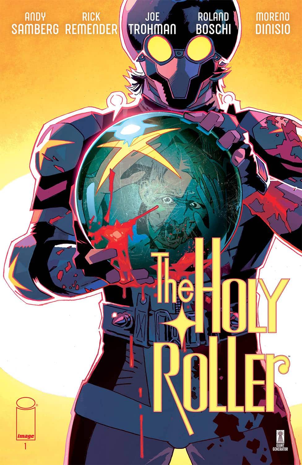
Writers: Rick Remender, Andy Samberg, Joe Trohman
Artist: Roland Boschi
Colorist: Moreno Dinisio
Letterer: Rus Wooton
Publisher: Image Comics – Giant Generator
Review by Jordan Jennings
Holy Roller #1 is an exploitation-style comic from the minds of Rick Remender (Uncanny Avengers, Black Science, Tokyo Ghost), Andy Samberg (SNL, Brooklyn 99) and Joe Trohman (Guitarist for Fall Out Boy). In the first issue we follow Levi Cohen as he returns home for the first time in 20 years. He discovers his town has become something more sinister and darker than before. Antisemitism is on the rise and becoming more blatant in the town with billboards advertising on evangelical values of guns and God. The local synagogue has been turned into a drive-thru convenience store.
It’s pretty damn bleak.
Things get worse when Levi’s childhood bullies catch wind of his return and seek to punish him for his Jewish heritage. It gets ugly real quick and it becomes apparent that things are only going to get harder for Levi.
The writing trio present an atmosphere full of pervasive sense of American grime, grit and decay. It is a reflection on the modern American landscape—hate infiltrating small towns and becoming corrupted by the economic decay at the hands of capitalism. Holy Roller wears its 70’s revenge and exploitation movie influences on its sleeves. It follows very similar story beats to those styles of films with the protagonist facing a brutal beating at the hands of their oppressors and their subsequent revenge against that same very group.
The influence of the writers on the story is somewhat easy to parse out. Samberg’s comedic influence is present in the comic in the form of an extended sequence between Levi and his Greenpeace captain that feels straight out of Lonely Island, but this is tempered by Remender’s penchant for violence and dark humor.
For revenge-style stories to work there needs to be character moments to establish stakes and give us a reason to care about the protagonist. Remender gets that. These characterization moments feel very grounded especially in what we see in the interactions between Levi and his estranged father, David. The two are estranged from each other and Levi has only returned to his hometown out of a pervasive sense of guilt for his dying father. David, a devout Jew, wishes for his son to understand his heritage and to see why the antisemitism and violent changes happening even in their small town is serious. Levi doesn’t see himself as Jewish and that plays a large part in Levi’s character. His motivations are that of a man that is ashamed of his lineage and at odds with his past. This internal conflict gives the story its weight and emotional center.
The writing in Holy Rollers is strong and strikes a balance between emotionally difficult scenes and humor. I found it to be captivating. Remender summarizes the comic’s premise clear in the elevator pitch in the back matter of the first issue, “KINGPIN meets INGLORIOUS BASTERDS meets BATMAN!”. It is as advertised, and I enjoyed it for that.
To compliment the emotional beats of the script is the dynamic art by Roland Boschi. Boschi’s figure work alone carries this emotional resonance and makes the characters’ motivations and heartbreak hold true. This energy is further aided by his command of pacing using varied layouts.
There is a sequence of pages where Levi returns home to see his ailing father that features these close-up panels on Levi’s feet or eyes that show the emotional weight of the moment. These are then coupled with a few instances of repeated, silent panels that hammer the awkward unease between Levi and David. The layouts in this scene are almost formalist in nature with frequent 6 panel grids. These are contrasted with later action pages that utilize varied panel sizes and layouts to show the frantic and breakneck nature of the action. This varied panel layout and size crafts an eye-catching story and one that readers will be sure to love.
Boschi’s line work is paired with Moreno Dinisio’s colors. He employs a gouche painting style to his colors that give the art texture and provides the lighting and shadows to the naturalistic color palate. This creates a more grounded realistic look to fit the tone of this gritty story. Rus Wooten’s letters provide effective sound effects that give scenes that extra umph needed be it the electronic wall of sound of an arcade or the wet crunch of a skull being crushed by a bowling ball.
I am going to be upfront, Holy Rollers #1 is probably not for everyone. If you do not care for exploitation films or revenge stories, this comic is going to fall flat. However, what Remender and company has cooking up here is a story that knows what it is and leans fully into it. It is a lot like a Quentin Tarantino movie in that regard. Holy Rollers #1 is excellent in its execution and that makes for an entertaining read. I look forward to the next
Verdict: BUY
 Somna: A Bedtime Story #1
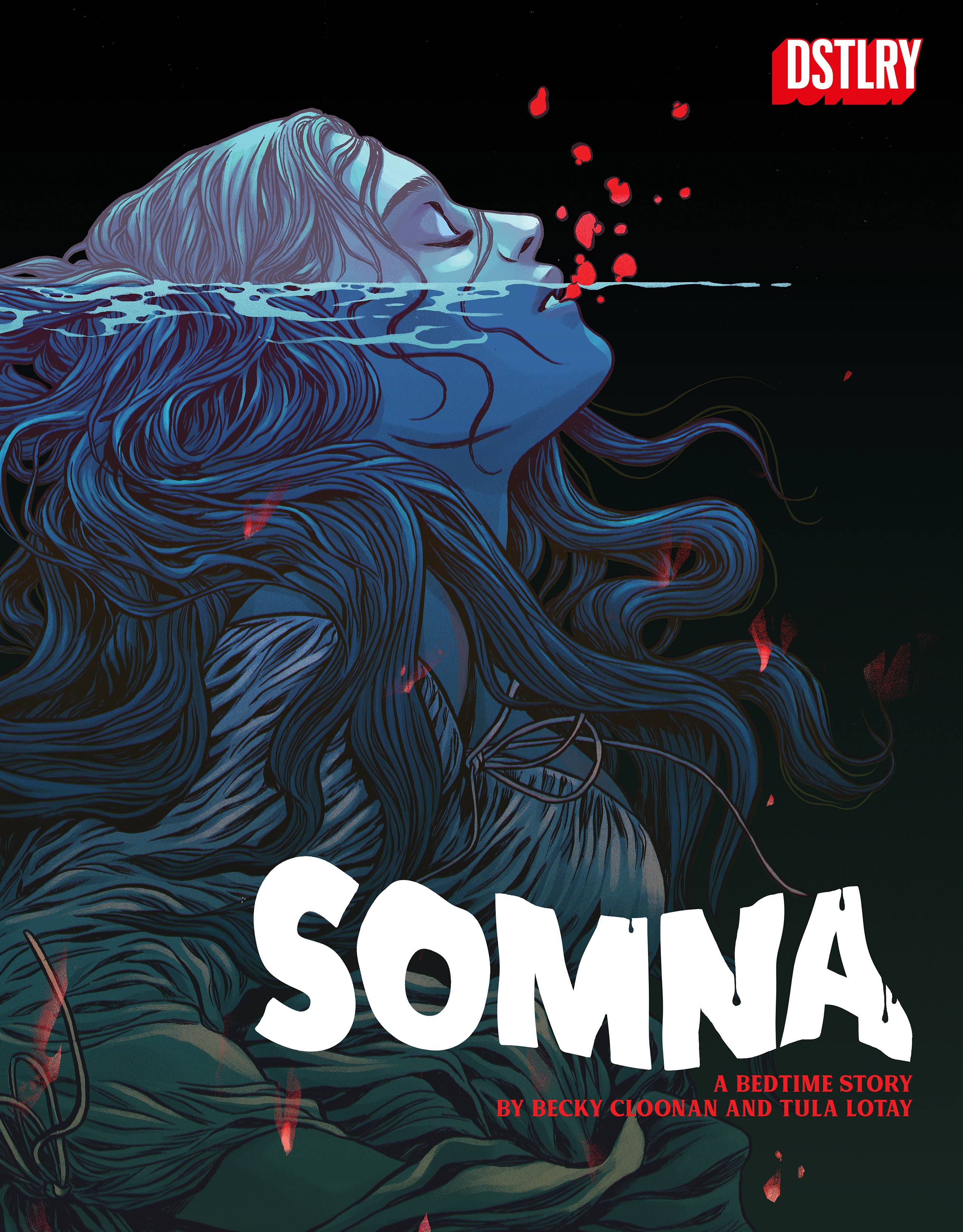
Story & Art: Becky Cloonan & Tula Lotay
Colors: Lee Loughridge, Dee Cunniffe, & Tula Lotay
Letterer: Lucas Gattoni
Publisher: DSTLRY
Review by Sean Dillon
Wednesday Comics Reviews
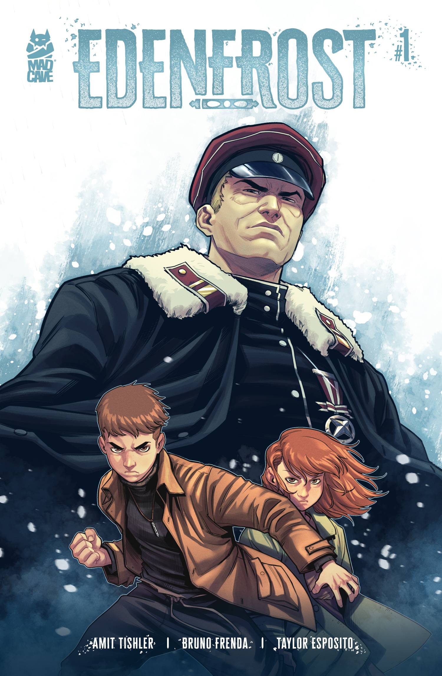
 Edenfrost #1 (Mad Cave Studios): Edenfrost is a piece of historical fiction set during World War II that sees two Jewish children, Alex and Yuli, having to run for their lives after the destruction of their home. Orphaned and displaced, they are hunted by Nazis. Helping them escape the destruction of their home, saving them, was a mysterious golem. This provides some hope amidst their struggle; a fantastical element amidst the horrors of antisemitism and the violence visited upon Jewish people during this time. This first issue gives some insight into Yuli and Alex’s relationship while setting up the larger conflict around them. Writer Amit Tishler bounces between Yuli’s internal dialogue and some solid back and forth between the characters on the page, lettered by Taylor Esposito. The art is stellar; Bruno Frenda does fantastic expression work, really showing a range in moods and a softness to these children facing terrifying times. The color work that Frenda does makes me jealous because the way these characters are rendered is captivating; I wanted more pages to just sit and study. This first issue is a great introduction to this world and to the work that the team is doing here because this book is gorgeous. —Khalid Johnson
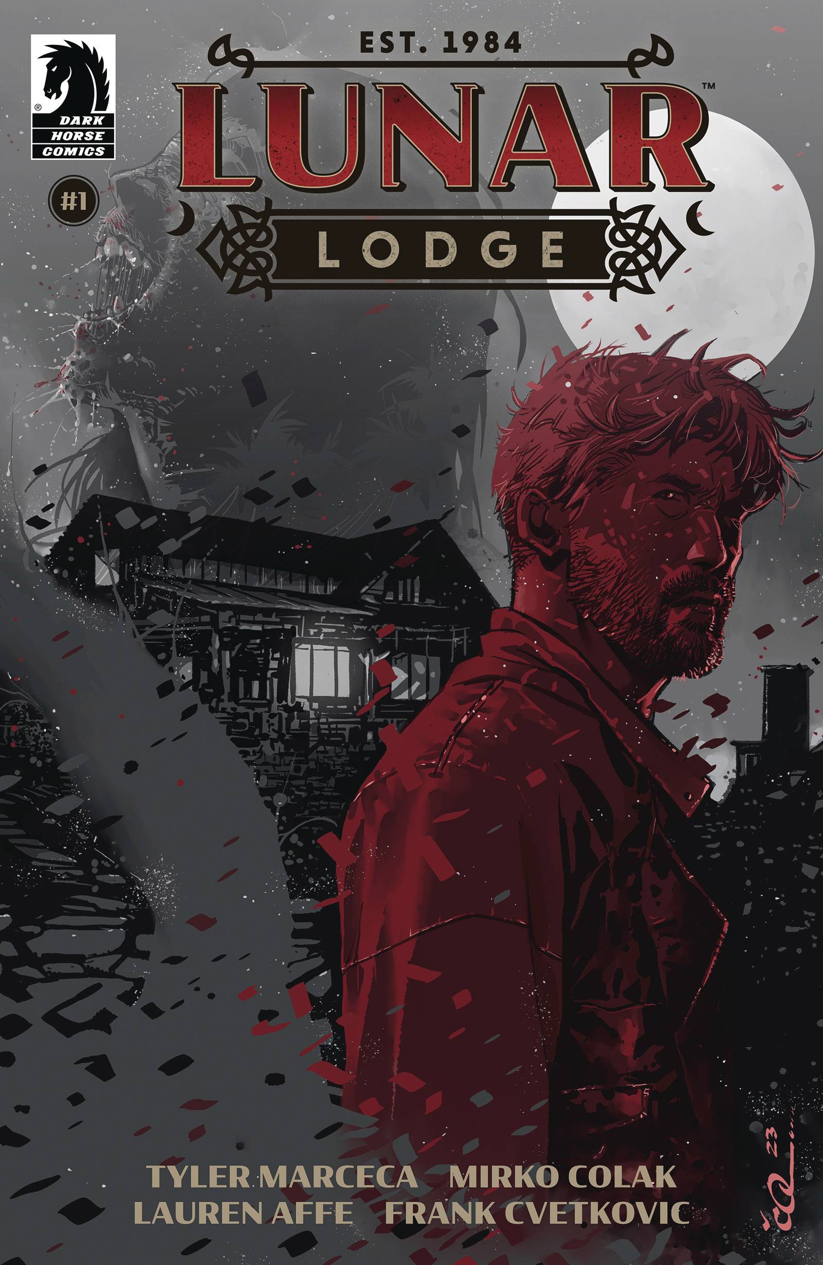
- Lunar Lodge #1 (Dark Horse Comics): The highest praise I can give a first issue is “old school Vertigo vibes” and dang if Lunar Lodge doesn’t come out of the gate like the hot new launch from that much-mourned imprint. After setting its hook with gorey opening pages, the book goes quiet, leaving space for the reader to fill in on their own. The marriage at the story’s core is lightly sketched, leaving the reader with more questions than answers—exactly what you want in a first issue. With deft ease and teasing hints, Lunar Lodge introduces an entire cast of characters the reader is ready to follow into their own story, but stays focused on the sad, possibly paranoid husband following his wife down the rabbit hole. The moment you’re sure you know where it’s going, it lands a last-page twist that changes your take on everything you’ve read so far. With sparse dialogue and evocative art, Lunar Lodge introduces a world that feels lived in and full, with a personal story at its core to draw the reader in, and down, and through. Lunar Lodge was written by Tyler Marceca, with art by Mirko Colak, colors by Bryan Valenza, and letters by Frank Cvetkovic. —Bob Proehl
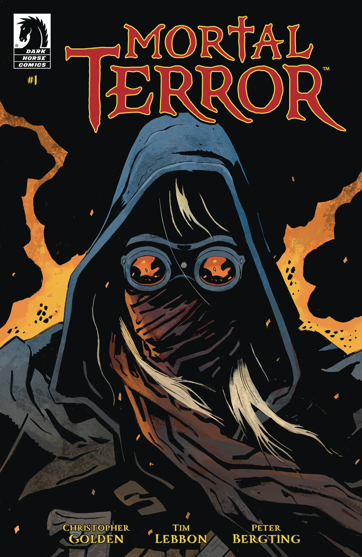
- Mortal Terror #1 (Dark Horse Comics): Hark, hear the mortals sing of woe and war with the undead realm! Dracula is, like hurricane, upon us and different than before! Similar to Mortal Terror #1, I offer no easy roads to understanding, but provide enough for stalwart readers to comprehend when reflecting once, twice, thrice! With story scripted from the pens of Christopher Golden and Tim Lebbon, a tale spun of no less than three narrative threads awaits! Be it gothic, trope reversed, and political in nature, the tales of Lucy Westenra, Jonathan Harker, and Renfield unfold at a brisk pace without respect to one another, so as to engage the reader sans exposition. Behold artist Peter Bergting’s strong compositional work built atop small, plentifully paneled layouts that forces the negative space of black to become home and any instance of light, angular as such, to become danger– death! Beyond the warm textured realm of colorist Chris O’Halloran’s palette to Dracula’s reversed world, horror begins and ends with his color holds. Utilizing red color holds for those dying alive and aflame and blue color holds for flashback, so much deft wizardry is hidden with selective and resolute design; it’s commendable. Similarly, letterer Clem Robins keeps it simple and effective with white balloons and black outer strokes for both dialogue and sound. Concerned with placement, shape language, and fitting such large lines into the least amount of screen space possible, Robins turns a would-be confusing, heady read into a breeze of undead politicking free from lore-heavy captioning that mars other likewise titles. For those who enjoy this team, this style, this genre, do so at your leisure. For me, while the teamwork is tantalizing and worthy of note, I’ll peruse elsewhere for this is simply not my cuppa. —Beau Q.
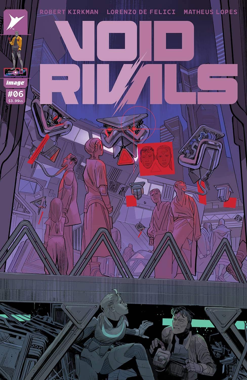
- Void Rivals #6 (Image Comics – Skybound): I enjoyed this opening arc, especially in how it sets up compelling stories down the road. This issue drops a lot of little seeds for what’s to come in the Energon Universe, but the story itself is pretty straightforward: two warring factions, who are more alike than they think, are being manipulated by their leaders for reasons thus-far unknown to us. Robert Kirkman comics have always read quickly to me, and this is no exception; his dialogue is snappy and funny, while his pacing keeps the book from dragging. Lorenzo De Felici does a great job of making these characters feel expressive, especially with characters who are completely masked. Sure, the eyes on the helmets help, but it’s Felici’s poses and staging of the action that sells the emotions (as well as Rus Wooton’s letters, which features these cool sketchy sfx when panels get action packed). Matheus Lopes utilizes a muted palette that isn’t afraid to branch out into brighter tones when the page calls for it. Overall, this is an interesting set-up for this series, and a good launchpad for the growing Energon Universe. —Cy Beltran
The Prog Report
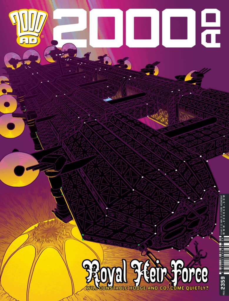
 2000AD Prog 2359 (Rebellion Publishing): The absolutely fantastic current arc of Judge Dredd, Poison, comes to an end this week. The buildup in this mystery story has been fantastic, and this week’s finale more than pays it off. We learn who killed Hershey, how, and why…and we get to see Dredd respond to it. There’s some really gnarly visuals throughout this one, too, making it a very memorable comic. The creative team here is writer Rob Williams, artist P.J. Holden, colorist Peter Doherty, and letter Simon Bowland. I’m already missing this story. As always, you can nab a copy of this week’s Prog here. —Zack Quaintance
Read more entries in the Wednesday Comics reviews series!


