
Civil War II has concluded and we’ve got our thoughts and two brand new ongoings in the post-Civil War II Marvel Universe. Marvel NOW! 2.0 has begun in final days of 2016 but what comics are worth your hard-earned Holiday dollars? Find out in The Marvel Rundown!
 Civil War II: #8
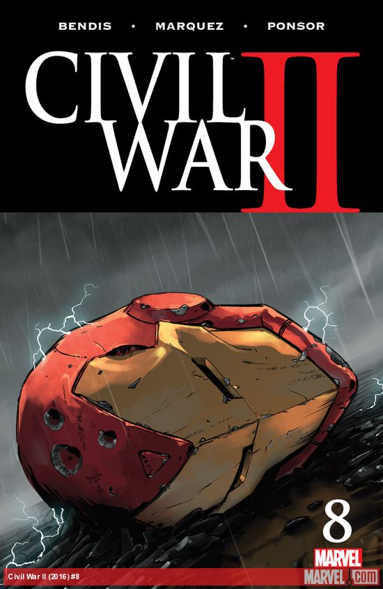 Civil War II: #8
Writer: Brian Michael Bendis
Artist: David Marquez
Colors: Justin Ponsor
Letters: VC’s Clayton Cowles
Production: Victor Ochoa
After several delays and a high amount of anticipation, it’s hard to not be disappointed by the latest issue in Marvel’s newest event series; Civil War II: #8. The comic follows a string of issues that were unkept in pacing, featuring battles in fits and starts loaded with as much dialogue as can fit on-panel. Attempting to track the timeline of the series would prove exhausting and pointless when the tale is framed around one final battle between Carol Danvers and Tony Stark that fans have been waiting for since the first issue hit store shelves.
Without trying to give anything about this issue or series away it’s important to mention that comics have a hard time establishing real, meaningful conflict in any given story. When every single story published is part of an established shared universe where cast members frequently die and come back to life, the illusion that a story is going to change the landscape of the universe is very hard to establish. In Civil War II: #8 these big changes don’t feel earned, the big fight scene is vague enough to make readers scratch their heads on what the outcome of the fight was until it is explained to them in dialogue several pages later. In addition, the fight between the two of them has been teased for so long and not delivered in past issues that the story is difficult to invest in, this issue might have served readers better had it picked up the paces after climactic battle seen in this issue.
No other comic this year will be such a thinly disguised advertisement for the rest of the line trying to get readers to buy new books. This important issue serves as a poster board for the new Marvel comics, taking away the opportunity to even ground the narrative from other issues and forgoing meaningful interactions for the slightest hints at an upcoming ongoing series. This is the last issue of an event series, so there are some last minute surprises in the comic but like the rest of the series, readers aren’t provided with information to invest in any of these changes.
It’s hard to be this mad at a comic that looks this slick. Penciller David Marquez has proven himself as an artist capable of sitting amongst the Marvel elites. The artist’s ultra-slick pencil style wonderfully depicts each and every character, elevated by the distinctive colors of long-time collaborator & colorist Justin Ponsor. The letters from VC’s Clayton Cowles and production from Victor Ochoa makes this a comic where I want to take the staples out out of the spine and tack it on my wall. Layouts are innovative and readable, the colors are vibrant and beautiful, the letters emphasize certain characters speech patterns and the production adds to the presentation of the entire package.
Those curious about the fate of the Marvel Universe could flip through the issue & take in a glance at the art and changes teased by the publisher. $4.99 is a steep price point for a comic and one that’s hard to recommend for a reading experience as frustrating as this issue.
Verdict: Browse for the art! There’s plenty of other exciting things going at Marvel and big, exciting new books to enjoy to be overly disappointed in this finale, read on!
 Rocket Raccoon #1
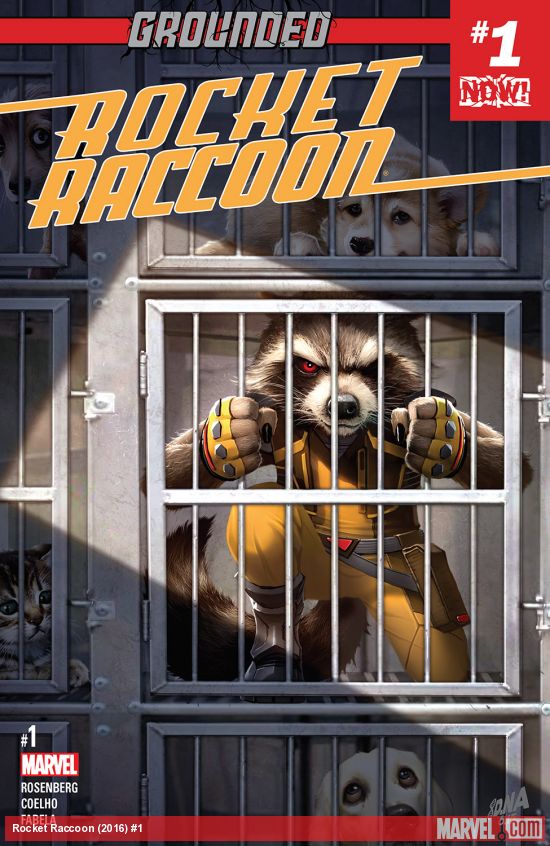 Rocket Raccoon #1
Writer: Matthew Rosenberg
Artist: Jorge Coelho
Colors: Antonio Fabela
Letters: Jeff Eckleberry
Like the other Guardians of the Galaxy, Rocket Raccoon is Grounded. As stated last week the idea that the Guardians aren’t able to get off-planet (via ship) remains a little silly but that doesn’t mean that a good story can’t be told here, let’s dig in.
If the Grounded storyline really amounts to anything significant, it’s that the Guardians of the Galaxy are split up right now, more specifically for Rocket, it means no Groot. For a book with such a cute, lovable lead, this debut is surprisingly downbeat especially compared to the first issue Skottie Young’s Rocket Raccoon and Groot series from just a few years ago. This book essentially utilizes Rocket to explore some of the strange, seedier aspects of our own culture. I’ve seen this very same template applied upon many Howard the Duck stories, offering reader insane, unwholesome experiences through the lens of a raccoon, in that sense this debut issue seems to be breaking some new ground with the lead character.
Unfortunately, this story template and idea of throwing Rocket in a major city to fend for himself is a very isolating, sad start to an ongoing series. Seeing the lead caged on the cover of the debut issue already teases an innate sadness present in this debut. Interestingly, this same tone was hinted at earlier on in the most recent issue of Guardians of the Galaxy and the debut of Star-Lord. Aspects of Chip Zdarsky’s and Joe Quinones’ Howard the Duck definitely read as an influence on this title as well.
Jorge Coelho is a bold artistic choice for the debut. Coelho captures the tone of the series nicely, rendering some of the darker aspects of a major city with grit. His depiction of Rocket is bursting with energy and all the hair’s on the lead’s head are never quite in the same place from panel to panel, adding to a sort of visceral style in the series. Given Rocket’s anti-establishment vibe permeating throughout the comic, Coelho does seem like the perfect choice for the series’ debut. Antonio Fabela’s sparse palette fits the comic nicely as does the unique lettering from Jeff Eckleberry.
This may not be the Rocket Raccoon series that most would expect with an absence of Groot and sinister look at 2016, it also doesn’t seem to be the series I’m looking for at the moment told with this character.
Verdict: Browse. Rocket Raccoon delivers biting satire on modern culture that likely won’t connect with every reader in his new ongoing series.
 Hulk #1
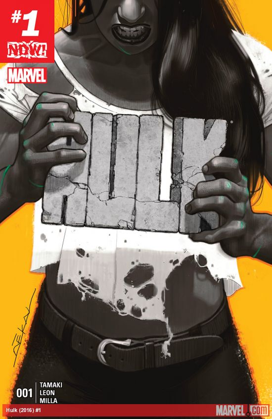 Hulk #1
Writer: Mariko Tamaki
Artist: Nico Leon
Colors: Matt Milla
Letters: VC’s Cory Petit
I first read a preview of this series a few weeks ago and emotional implications of the book didn’t quite ring true to me, but after the conclusion of Civil War II: #8 I couldn’t be happier with the opening sequence of the comic. Jennifer Walters is shaken up by the horrific events that she was right in the middle of from the Civil War II and is having trauma trying to rebuild her own life and acclimate to society.
The series takes an in-depth look at Jennifer Walters’ fractured mental state in-depth without resorting to cliches. Walters interactions with every other human being is laced with an intense paranoia that gives this comic a wholly unique vibe. However, this series also combines those aspects with Walters lawyering career, Civil War II paranoia and the bright tone of recent Marvel ongoings like Patsy Walker: Hellcat, Charles Soule and Javier Pulido’s She-Hulk series and Spider-Woman. Combining those three elements makes for a really unique cocktail for a book that feels interesting and distinctive from the many Marvel ongoings published right now.
Nico Leon’s art might seem pedestrian at first glance, but the paranoia channeled from Jennifer is summoned through the artist’s tortured pencils. The comic also has a pleasant demeanor when the script calls for it, displaying some of the brighter aspects of Walters’ life as well. Milla’s colors are vivid and wild when Jennifer is going through aftershocks of past events but contained in a normal office setting earlier on in the book.
Verdict: Buy! Hulk #1 gives Jennifer’s life a new direction and personality and I can’t wait to explore more of her post-Civil War II state of mind.
The hits just keep coming! Next week is Deadpool the Duck #1, U.S.Avengers #1 and Unstoppable Wasp #1! See you in the New Year for some fresh Marvel debuts!


Call out names and say which plot points were bad! Just saying the final issue of an event was a cynical cash grabbing advertisement is like saying water is wet. Until the comics journalists and critics stop letting these guys off the hook for fear of retaliation, the comics will never be any good.
I’m not letting these books off the hook in this column, these opinions are fully-formed and in-depth to help you make your purchasing decisions. Come back next week for more thoughts.
HULK issue 1 does not look like a Marvel super-hero comic. I will be interested to see if it develops an audience.
Steve
Here as in the site in total? You’re not looking hard enough.
Comments are closed.