

While many remember The Death of Superman story line at DC, I remember the death of Superman’s red trunks in during The New 52 with more anger– it seems as though the publisher is trying to leave behind a key element of the character’s design. Artist Tom Derenick (Batman/Superman) has posted a better look at Jim Lee’s Superman redesign that he drew. Lee has added some additional details to this new Superman, combined with new elements as well such as additional red lines on the book and an odd red belt buckle and triangles?
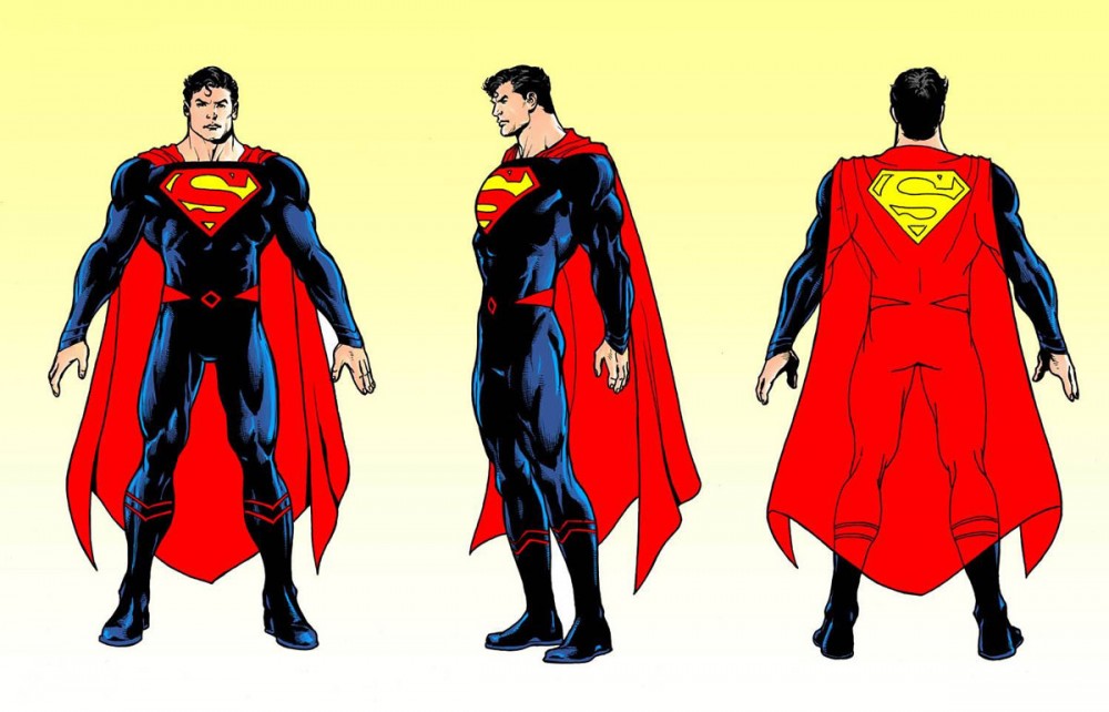
One of the biggest departures from the last design is actually the collar that Superman left behind. Also, the additional lines on the sleeves are back from the original costume. The outfit overall is an odd blend of the old and the new– with Superman’s yellow emblem still present on the back of the cape. DC loves to tinker with the tiniest details of Superman’s costume.
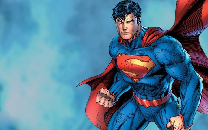
Fans were shocked when Superman’s red trunks vanished in the wake of the New 52. Good ol’ Clark Kent used to wear his heart on his sleeve and his underwear on the outside– but The New 52 look for the included a more casual Superman with t-shirt and jeans. Afterwords, Superman nestled into a more traditional outfit that lacked a key element of the costume: the red trunks.
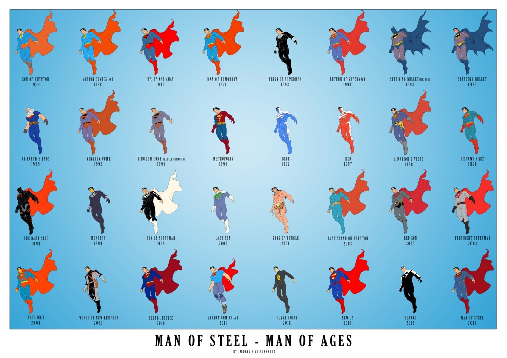
Here’s an infographic from Imbong Hadisoebroto that illustrates some of the recent changes to the design:


The more serious they try to make Batman and Superman’s costumes, the sillier they look.
Nothing says “stuck in the past” to me like people hung up on wanting to bring back briefs. But then, I’ve also always been a “no cape” person even before The Incredibles.
Is it sad that today’s superhero fan can make exception for superpowers but can’t get past the red undies or a cape?
‘Realism’ is a fickle thing.
I think it’s still worth noting that Golden Age superheroes wore trunks over tights like acrobats or circus performers. Not wearing the trunks would be… very revealing for a man. I guess we’re now so far from Superman’s original cultural context that most people are incapable of seeing his old costume as anything but “underwear on the outside.”
For what it’s worth, I think Derenick’s turnaround here looks a lot better than the cover by Janin released previously. Maybe it’s just that he used a lot more ink for shading, so the overall impression isn’t such a blue onesie.
I agree with Tim. Whenever anyone tries to “fix” Superman, they tend to break him even more.
Superman, to me, is a cartoon character, and changing his costume so drastically is kind of like getting rid of Bugs Bunny’s ears. Bugs has had many designs over the years but nobody has ditched the ears.
Superman is an old-fashioned character – he’s the guy superheroes are named after! – so his costume should have an old-hat feel. And Kate it’s not about being “hung up” on it – the red trunks aren’t going to make me read the lousy Super-books either way. But the traditional costume had a very simple red-blue-yellow rhythm that worked well and endured for decades, and tinkering with it, uh, has *not* resulted in any kind of successful, enduring looks.
Could maybe Jim Lee not design the new costumes on any iconic characters? Seriously, they just look cheesy as hell.
I can believe a man can fly before I can believe a man in American society would wear the trunks. It’s not about science, it’s about what the trunks look like to an observer. Arguably, he could have one of those frilly Victorian collars, since what he wears apparently doesn’t matter, right?
“Arguably, he could have one of those frilly Victorian collars, since what he wears apparently doesn’t matter, right?”
It does matter. He’s an icon. What he wears is practically synonymous with who he is. More people wear Superman merchandise than have ever read a comic book.
If red underoos don’t look realistic, then don’t fucking draw him in a realistic style. Pretty simple.
Red boots
Red boots
Red boots
Comments are closed.