
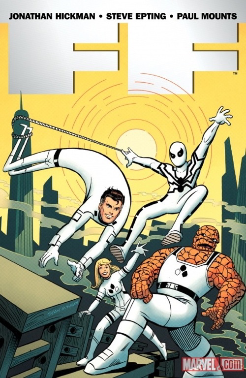
Legendary Archie artist Stan Goldberg started his career in the Golden Age coloring countless covers for Atlas, but in the Silver Age he was a colorist for Marvel, working on such things as the cover to the very first issue of THE FANTASTIC FOUR and designing the color schemes for much of the seminal line. So it’s fitting that he’s been tagged to draw a variant cover for the new FF #1 featuring the new lineup, which features Spider-Man. The interiors are by Jonathan Hickman and Steve Epting while other variant covers are by Daniel Acuna, Gerard Parel, and Marko Djurdjevic.
Speaking of Goldberg, as you might guess from this assignment, he’s no longer working with Archie, a fact which has been going around cartoonist circles for a few weeks. Goldberg, 78, is one of the last of the Silver Age Archie artists working, and recently drew the “Archie gets Married” storyline which vaulted the company back into the spotlight.
We’re told that since leaving Archie he’s had several work offers and is currently taking a well-deserved vacation in Mexico.
")


That’s awesome. I’d buy the book for sure if the whole thing looked like that.
Stan Goldberg NOT working for Archie? That just doesn’t seem right.
Satn Goldberg doing a variant cover for FF #1. That seems right.
Maybe and announcement of the the return of Archie-style Millie the Model is forthcoming?
Wow, Stan Goldberg leaving Archie is kind of weird. I’m enjoying a fair amount of Archie material these days, including the wedding series he drew. I hope it was amicable (retirement, or partial retirement), not like Dan DeCarlo’s exit.
Yuck -those white costumes really do suck.
Perspective fail.
Stan Goldberg’s variant cover is a lot of fun and better colored than 99% of the crap that Marvel is putting out nowadays.
Who’s the colorist?
The Thing looks like he’s doing step aerobics.
Lannie, I’m the colorist. :-)
I kept it simple and delicate in an effort to compliment Stan’s art.
It was an honor to color his work! I think it’s a fun cover, which I’m sure was the whole point. :-D
These might be the ugliest costumes I have ever seen? White? How impractical can you get?
You know, I love Stan Goldberg, and I actually like the new costumes, but I really don’t care for this cover.
Just to point out one thing, why is Spidey’s web wrapped twice around that whole building, trapping Reed’s feet? I realize that we’re not supposed to read this image totally literally, but this seems to be a weird mix-up of cartoon symbolism and literalism. It doesn’t work for me. Just my opinion, of course.
Best Wishes to Goldberg in the next stage of his career!
hello i have some original sketches from stan of his work signed i want to sell
Comments are closed.