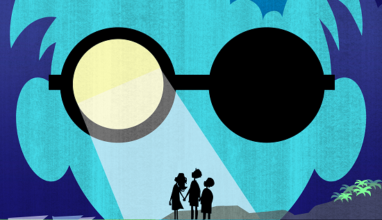
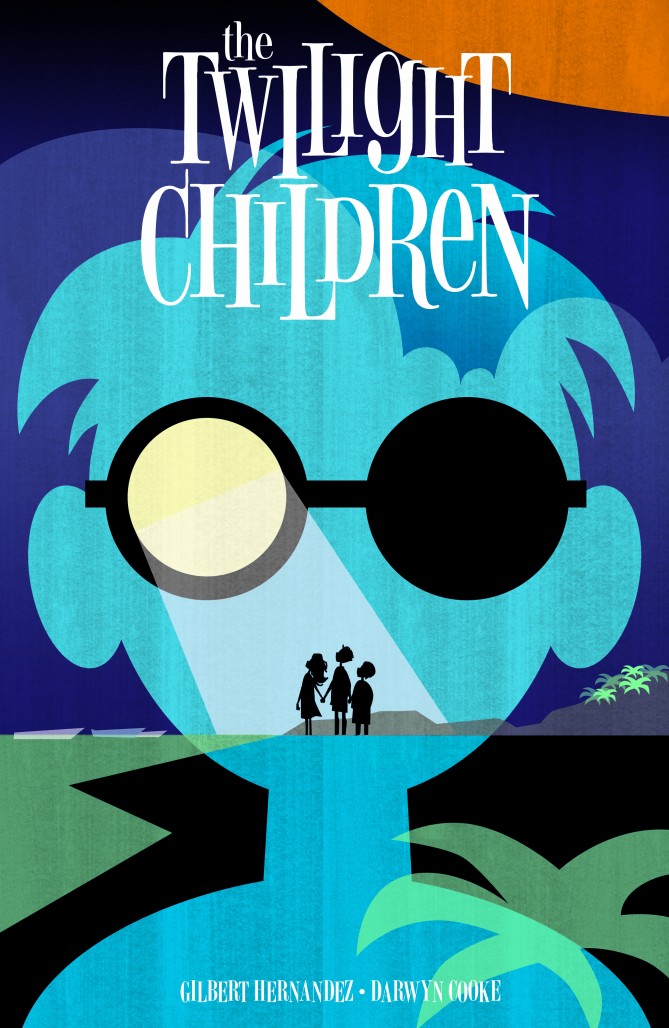
Out of all the Vertigo titles that were announced as part of their line relaunch, The Twilight Children was one of the most mysterious yet most anticipated. The series’ writer, Gilbert Hernandez, forms one-third of the team behind the incredible character driven stories that filled the pages of Love and Rockets. Darwyn Cooke, the series’ illustrator, has become known for his cartoon-influenced style with heavy black outlines and exaggerated faces that never fail to precisely express the emotions of the characters he draws. The concept is centered around the effects a glowing ball that washes up on the shore of a small coastal town has on its citizens. It all sounds like magic. That is why it is ultimately disappointing that this first issue fails to come together in the way that I had hoped.
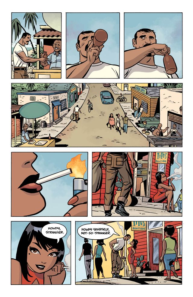
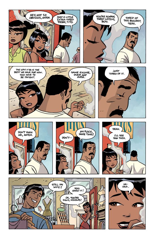
To clarify, The Twilight Children #1 is not an unmitigated disaster. Hernandez is a master of writing character interactions that reflect the depth and complexity of the human experience. In the opening scene, flirtatious banter between village fisherman Anton and a young woman, Tito, seamlessly flows into argument as Tito accuses Anton of being too “obvious.” We find out why at the bottom of the page, when Tito exchanges a joke with her husband, who pokes fun at the idea of her having a secret tryst while not knowing how close he is to the truth.
Hernandez crafts similar situations quite masterfully throughout the book, and Cooke’s expressions throughout deserve praise. Their exaggerated facial features make them more capable of expressing a full range of facial features. Look at how Anton’s disappointed annoyance flows into resignation between the second and fourth panels of the second page above. Look at how Tito’s face proves capable of expressing irritation in the third panel of the page before turning to exasperation in the sixth panel. The guilt on Tito’s face in the last pictured panel is palpable. A great of deal of this is in the eyes, which is where Cooke clearly spent a great deal of his time. Everyone in this book has different eyes, which makes one of the major twists in the book all the more disconcerting.
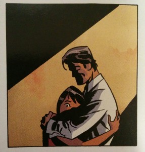
I’d be remiss if I didn’t discuss colorist Dave Stewart‘s work though, because it is stellar. He captures the laid back feel of this beach town through soft pastels. Then, as the ball appears and day turns to sunset, the colors gradually grow cooler with the passage of time. The greens of the ocean and yellow of the sands shift to dark blues and greys as the moon replaces the sun. The technique is not revolutionary, but it is incredibly effective and emphasizes the moods expressed by Cooke’s lines. The book is at its best in panels like the one below, where Tito and her husband embrace after she lies and says she’ll miss him while he’s away on business.
Cooke’s heavy use of blacks combines with Hernadez’s script’s silent hand and Stewart’s dramatic colors to create stunning harmony.
The book is filled with strong moments like Anton and Tito’s interaction and the subsequent halfhearted embrace between Tito and her husband. Unfortunately, however, the creative team behind The Twilight Children fails to effectively tie these individual moments together. On a second read of the book, when I already had some understanding of what was happening throughout, the scene transitions came together in a more understandable and natural way. However, on my first read, I found myself jarred time and time again. At the end of one scene, a group of kids stumble across a glowing ball in the surf and call out to Bundo, the village drunk, who tells them to go grab the sheriff and some men. On the next page, the book cuts to sunset, and a group of men try to entrap the ball in a net. They fail, and as it turns out, most of the adults in the village have had experience dealing with these balls before. Knowing that context casts the scene in a more understandable light, but without it, it seems incomprehensible that the villagers would try to drag the ball to shore while foreign government scientists, unfamiliar with the phenomena, express fear that the ball is irradiated.
The scene would have read much more naturally if Hernandez had created a more natural transition by devoting some time to the police trying to figure out what to do about the ball before they attempt to catch it in a net. It would have read equally as well if Cooke, in his illustration, had given a little more space to Bundo’s reaction to the ball, showing his face turn from an expression of shock to one of recognition, as he too has had experiences with the glowing balls of light. We, as readers, needed to know how familiar the villagers were with the glowing ball, at least to some extent, in order for the subsequent scene to work. The addition of one panel would have made the scene entirely differently, and those small missteps are where The Twilight Children #1 ultimately trips over itself.
There’s a tension in writing mysteries, and a large part of it is knowing when to give and when to withhold. There’s another more subtle trick to writing mysteries, and that is knowing what to give and what to withhold. I think, ultimately, I am disappointed with The Twilight Children #1 not because it is a bad book, but because it isn’t a perfect one. Perfect is an impossible standard to hold anything to, but The Twilight Children came so close to grasping the sun, only to fall into the sea. Do I still recommend picking it up? Absolutely. I criticize this book out of love because I believe it has the potential to be the breakout hit of this new Vertigo line.
It just needs to push a little harder to reach that unattainable goal.







Yeah, we will have to give it another issue to really get going. Which is sad, because this issue was gorgeous. Cooke and Stewart delivered just stunning work every panel. Unfortunately the story is nothing to get excited about yet. And I’m a gigantic Gilbert Hernandez fan.
Honestly, it read to me like the Palomar side of Love and Rockets but without the sexual overtones, which is fine with me. It’s probably the best thing with a Vertigo label I’ve read in years and years.
I think Beto’s Vertigo work is kind of an interesting animal, as he leans a little more Lynch and less Almodovar or Waters. I prefer when he’s in the latter mode, but its hard not to celebrate any new work from the elder Hernandez. Easily the highlight of my comics reading week, Two Brothers aside.
Comments are closed.