
It’s always nice to review something which shakes things around a little, and I’m sure nobody would have expected Task Force Rad Squad to show up on The Beat. Written by Caleb Goellner and drawn by Buster Moody, with colours from Ryan Hill, you can try the first issue of TFRS by clicking through here – it’s a pay-what-you-want model.
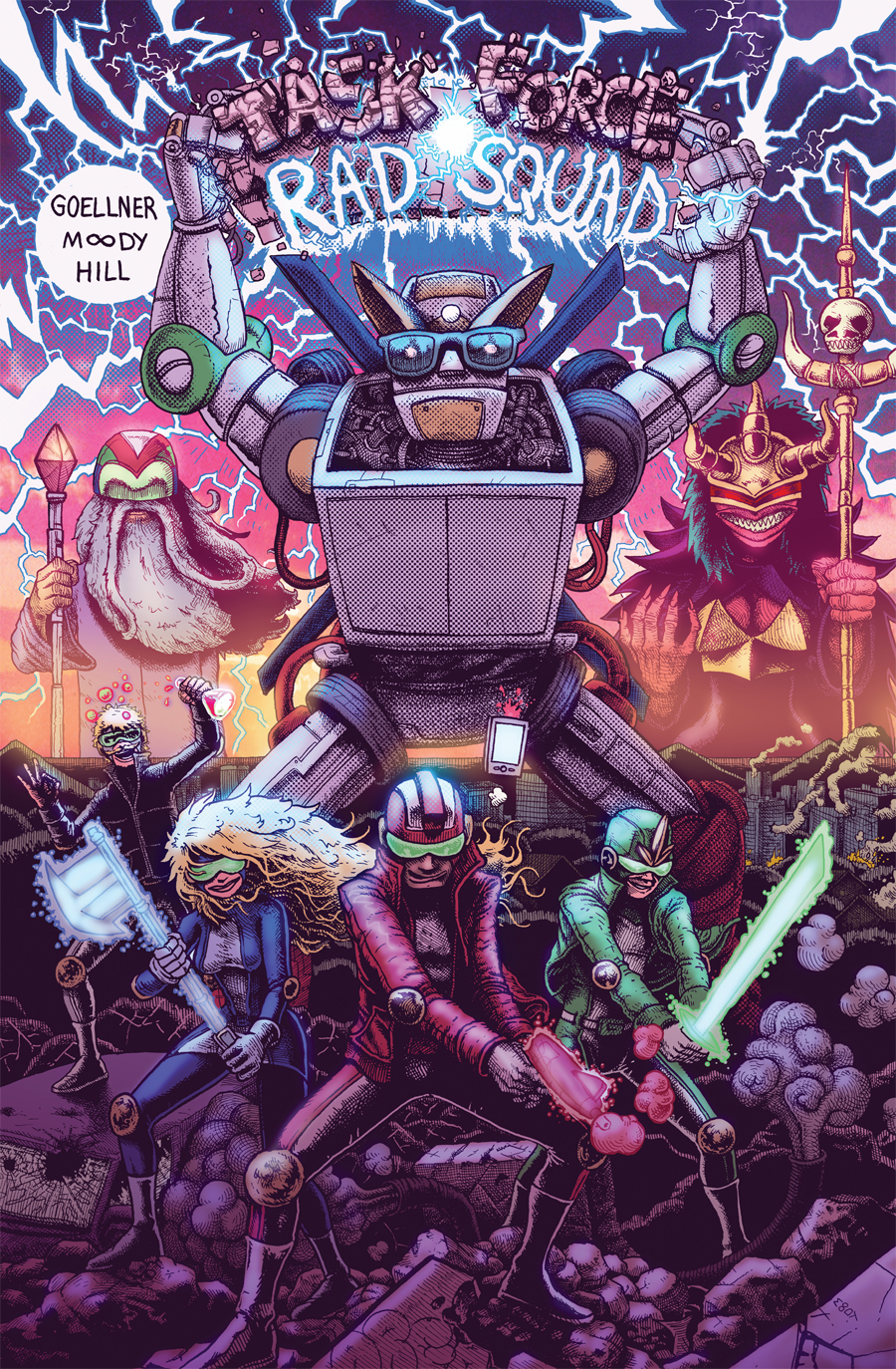
Taking open influence from the world-building, humour and off-kilter detail of Brandon Graham’s work and mixing it with the style and energy of Bryan Lee O’Malley, Task Force Rad Squad plays as a silly homage to 1990s action TV – Power Rangers most obviously. Following a team as they bicker with each other and exchange meaningless toyetic catchphrases and power-jokes, it’s a druggy, high-energy kick of agreeable nonsense.
It’s the first work published by the creative team, which shows at times – there’s a staged awkwardness in much of the story which is intended, but also distracting. The need to hit certain beats at certain points (so as to mirror the progression of the TV show) means that parts of this opening issue are somewhat predictable, and the jokes don’t all land as strongly as they should. Although aimed at those who watched the shows it makes loving parody of, the artificiality of those shows rubs off a little onto the comic.
At the same time, it’s dead good fun, really. Half the joke is how overblown and fake the situation feels, and the characters are made to be hyper unaware of everything around them. More interested in self-serving minor victories than anything else, the characters are a bunch of wonderful misanthropes who turn on one another at the turn of a page, and have a unique surreal obliviousness which plays nicely to the monster-fighting action which forms much of the narrative. Goellner writes them all with differing perspectives and traits which all centre around said monster-fighting, and imbues an unpredictability into the dialogue which keeps things zipping along nicely.
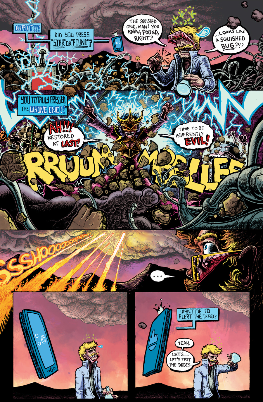
Moody’s art is the real powerhouse, brought to bright and blocky life by Hill’s colouring. There are some moments where the action scenes feel somewhat static, but the majority of this comic is a hyper-detailed, endlessly manic design board, with each new page throwing up several new ideas at the reader. There’s a feeling throughout that, although ridiculous, this is a world which Moody has carefully planned and constructed, where everything fits together and makes sense within themselves as a whole – he may draw evil cakes, but those evil cakes have the most logical and practical designs of any evil cakes ever before seen.
It’s really enjoyable to see somebody take hold of a creative idea and shake it for everything it’s worth. There are hundreds of small details thrown into backgrounds and hidden in foregrounds, but the simplest and most enjoyable aspect of his work on this issue would be the lettering. A good half of every piece of SFX is integrated into the art in some way, and the fonts and colours range with no particular reason given. The fight scenes benefit hugely from the use of drawn-in effects noise, and only adds to the idea that this is a big television cartoon brought straight into the comics medium.
The creative team seem to have settled into a fairly immediate cohesion with one another. As the story moves forwards, the pacing slips a little but the storytelling and character interplay get stronger. It’s very very silly indeed, but it’s also pitched right into my wheelhouse, and irresistible as a result. Moody creates a bulky, kinetic experience which Goellner and Hill then take and expand into something with a lot of passion and fun in the centre. It’s not something that’ll be for everyone, but it made me break into giggles persistently.
@stevewmorris


Now this looks entirely crazy — in a way that I like.
make more!
Comments are closed.