
Shortbox is a international comic box curated by Zainab Akhtar, with support from Clark Burscough. I was suspicious at first upon hearing the concept. It sounded an awful lot like Loot Crate or Comic Blind Box, a concept I’m not fond of I’ve often described as an expensive landfill delivery system that never seems to provide any comic book of real interests. However, after reading Zainab’s pitch for Shortbox, those fears were quickly whisked away. I was lucky enough to get one of those first round of boxes (for which I reviewed the content here). The focus is on comic book, good ones, with a side of tiny extras along the way. I had much faith in her ability to select interesting comics and dispense with the unnecessary fluff.
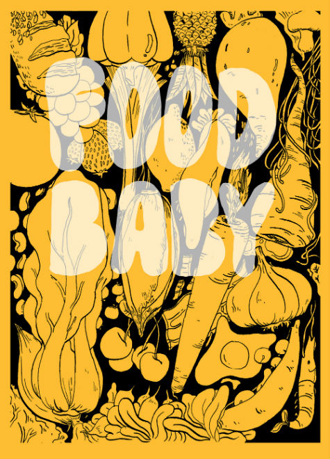 Food Baby by Lucy Bryon is a comic about food and mostly on the passion of cooking. A colour comic filled with recipes and suggestions on how to improve your recipes. Bryon begins her book with a very poignant story of her childhood and her lack of a sense of smell that seems close to anosmia (referred to as “vegetations”), but that was helped through surgery. The first event she recalls was going to a farmer’s market and smelling for the first time she felt excited about food. The rest of the book focuses on how to improve your recipes with easy tips and tricks.
This early story allows to get a better understanding of Bryon’s enthusiasm for cooking. This passion is the main driver of the comic. She really wants to help you, if not eat better (fried chicken nuggets aren’t particularly healthy) at least eat tastier food. Adding flavours to your dishes. Bland food is boring and depressing. There are countless ways to improve your cooking and Bryon is here to teach you some of the ways to make your food better. She shows you how to make hummus, roasted veggies and chicken nuggets. She also describes in details how to improve your ramen.
While this may be a personal bias, I felt like this was the least interesting comic in the box. Perhaps this is because I cook often and felt the recipes showcased felt too basic for me. Adding flavors to packaged ramen didn’t really land with me. I might integrate one or two suggestions though. Regardless, I appreciated the energy and enthusiasm every page of this comic had even if the content itself wasn’t to my liking. Bryon’s art is quite refreshing, there’s an energy to her characters that is appealing. It’s worth a read.
—
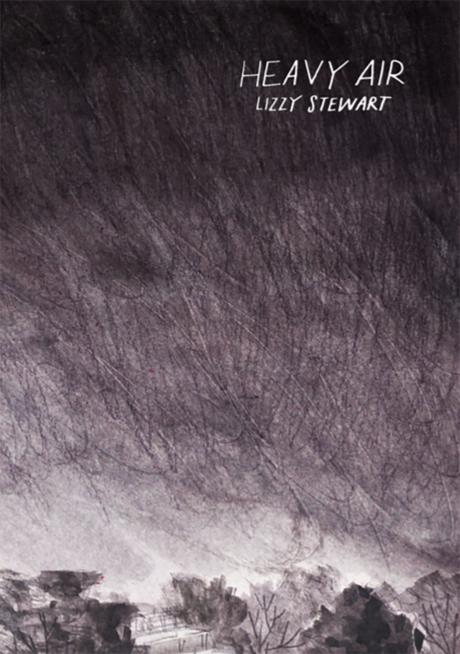 Heavy Air by Lizzy Stewart is the story of a young girl trying to find her brother before a big rainstorm. They happen to find an injured fox for which they try to make a shelter since he’ll be stuck in the rain. It feels almost pointless to describe a story, Heavy Air is an atmospheric comic, with an impending sense of doom permeating the entire book. It’s remarkable how Stewart manages to convey efficiently the idea of the rain, that feeling of stillness before some massive weather event takes place. She also manages to install a sense of dread, this feeling that something terrible is about to happen, but you don’t quite know what it will be. It isn’t a weather event that brings about the end of the world, but the decisions made by people without consideration as to whom they affect.
Stewart’s art here is quite interesting, her characters are drawn in pencil with black outlines only over her background images. Her background images are drawn and her characters superimposed on it. The effect is eerie and really adds to the sense of dread in this comic. It’s as if people are just shells, floating in an environment they’re not fully a part of. The entire book is grey, save for a few splashes of brown and red on a few key pages. It evoked memories of another cartoonist whose work I admire, Isabelle Arsenault’s comic, albeit in Black & White. This was my first exposure to Lizzy Stewart’s work and while I don’t have much to say about it, I really enjoyed it. I’ll keep my eyes peeled for her next projects.
—
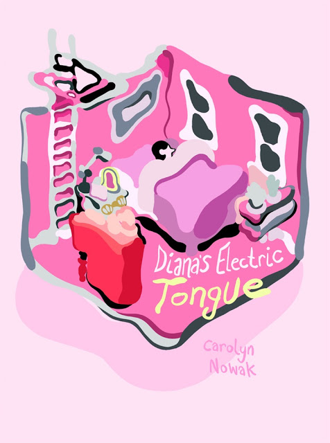 Diana’s Electric Tongue was perhaps the comic I anticipated the less in the box and turned out to be perhaps my favourite. Carolyn Novak’s sci-fi romance comic deals with a young woman (the titular Diana) trying to move on after a very difficult breakup with her boyfriend. She purchases a companion android, a sort of instant adoring friend/lover that respond to various command as well as interacting with you on his own (Saying “Vault” with open up a privacy mode for example) and uses him for comfort and, well companionship.
Novak creates a fully realized sci-fi world in her short comic. Everything is familiar yet different. Vehicles and fashion for example are just different enough one barely notices its futuristic nature. I’m reminded of Spike Jonze’s movie Her in which the fashion was slightly off yet remained in the realm of the possible trends that could emerge. Novak masterfully creates her world, she understands that the future isn’t so different than the present, it just have a different coat of paint on. It goes beyond the fashion of course, Nowak brings up issues within this science fiction world, distrust of the AI that powers the companion. Novak avoids the typical pitfalls these types of stories often falls into, the AI will turn out to be evil, or corrupted by the evils of man, by simply acknowledging that there are complex issues at the heart of AI and that distrust of the other is always present, no matter what the others may look like. Now doesn’t rely on science-fiction tropes too much, she anchors her story in the drama of her protagonist broken heart.
There’s an interesting sense of geography of rooms and building in it that I found particularly appealing. Many pages gives a sort of Birdseye view of the house the characters live in. It provides an overview of what is going on in their house in one efficient image and keeps moving the story along. We see Diana with her companion in their room talking, or Diana and her roommate chatting in the living room while her companion is recharging his batteries in another room.
I particularly enjoyed how free flowing Nowak’s art is. Her shapes are loose but elegant. It’s hard to describe that feeling, but the lack of rigidity in the shapes make for a softer reading. I’m inclined to contrast with, say a Chris Wares comic where so much attention has been given to the perspective and the architecture of a room it makes it almost sterile, but here Nowak focuses more on the story, on getting your eyes from point A to point B quickly. It’s very nice. The colours in this comic are gorgeous. Nowak gives thanks to Lisa DuBois in the back of the book, I’m not sure if she coloured the whole book herself or if she provided guidance, but it looks fantastic. There’s these shades of pastels and pink hues on almost every pages. It gives each pages a lightness and a sweetness that is quite surprising given the subject matter explored in the book.
Overall a very satisfying read and one of the best comics I’ve read so far this year.
—
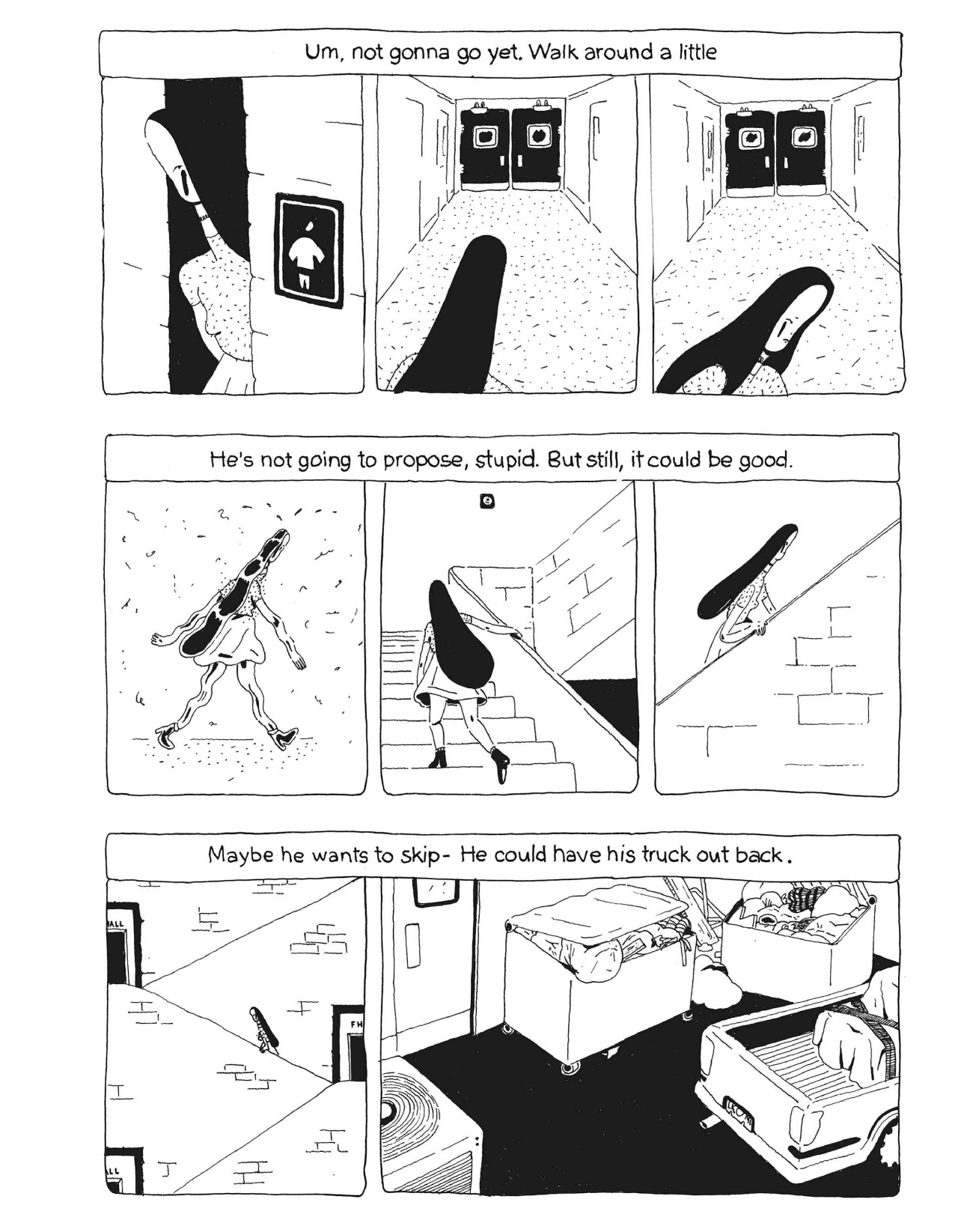 T’ by Bailey Sharp looks at the uncertainty and the otherworldliness of life as a teenager in high school.
I remember those feelings of inadequacy and thinking that any decisions might change the course of my life forever, how everything seemed so important. T is in a similar situation. She receives a text message from her boyfriend that simply says “T, I need to talk 2 u. Meet at lunch” and she panics. What does it mean? what does he want to talk about? Is it over between the? T agonizes over what to respond to him and as she takes more and more time to respond, the situation aggravates exponentially. This feeling of urgency and inability to decide lends a surreal tension in the entire comic. What if she says the wrong thing, could it break her relationship? It’s downright incredible that Bailey Sharp was able to create such a suspenseful tale out of what is essentially a regular everyday occurrence, not responding quickly enough to text messages.
The layout of the comic is quite interesting. Each pages is laid out with three strips of roughly the same size with panels on each strip of varying sizes. While the format of the comic is quite large, those three panels don’t take up the entire page. This leaves a lot of blank space all around the page. While it felt a bit jarring to see so much empty space, it allows for the page to breathe and from a story perspective, the reader can decipher that T’s perception of the world as a teenager is limited, with plenty of empty spaces she can’t yet fill properly.
Sharp’s character designs have this unique distorted perspective that makes them very unique and interesting. Some have longer legs, tiny arms or oversized heads. It calls back to the uniqueness of adolescence, how every teenager feels in their own way, like a freak. Each characters in this book looks slightly odd, but it is never distracting or out of place. It emphasize that strangeness and let it roams. It’s clever.
—
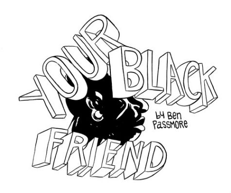 Ben Passmore’s Your Black Friend depicts the conundrum at the heart the political race politics. The explosions of discussions on systemic racism and inequalities have become so prominent as to be unavoidable. Your Black Friend explores the conflict of those caught in it. Passmore uses a black man as he navigates life in a race-conscious environment. People of Colour (POC) realities are different than those of white people. This often isn’t done in bad faith, but is a result of the structures of supremacy and systemic racism hovering over everyone. His white friends may mean well, but sometimes it’s not enough, some are unable to see how their behaviour and micro aggression contributes to those structures. Staying silent, not confronting overt racism and systemic racism is an issue. But Passmore’s characters is also critical of other phenomenon within his own community (wearing a scented afro pick isn’t the proper way to effect systemic changes. Maybe African roots isn’t the answer either). Passmore doesn’t provide answers, but a roadmap to critically think about our own relationships with race. How can we get away from a status quo of supremacy? Passmore posits that discussion and mutual understanding are necessary to break down systemic racism, to reach a better understanding of what everyone is going through. Words are not enough though and we all have to make our part in creating a better world. His approach is critical in understanding the current political current and a must-read for everyone.
I believe a colour edition of this comic is due to be released at some point in the future. I felt the work was very effective in Black & White and am wondering how adding colours will affect reading. The stark contrast of the black and white really added depths to the themes explored in the comic and am wondering if a colour version might change this. I’ll keep my eyes peeled. Passmore’s figures are drawn expertly to convey the subtleties of his narratives. All of his characters have distinctive features that allows each of them to be complex and recognizable. You can sense the unease of his main character when he’s in an awkward situation. That complexity allows for a more ambiguous and engaging reading.
Passmore includes a small essay where he is critical of his own work. Your Black Friend is an open letter, a contribution to a discussion. He’s addressed this on his twitter page by responding to the various people asking him about this comic. It’s quite insightful as to why he made this comic, what he wanted to say. I’d encourage those interested in taking a look at what he has to say. It will be more interesting than reading me talking about what he’s saying.
I hope my discussion on the comic is appropriate, I’m a straight white male from Canada. Even my family name is Leblanc, so I can’t even begin to pretend I understand fully the issues facing POC anywhere. But I do know comics, and Your Black Friend was powerful and possibly one of the best I’ll read this year. Consider getting yourself a copy via radiator comics if you can, or even getting it digitally by supporting Ben Passmore’s Patreon page. It’s well worth your time.


Looks like a well-curated anthology, albeit in separate pamphlets. Now that it’s out and reviewed, wouldn’t it be useful to give it a second push (maybe via Top Shelf or Alternative) with a Previews listing? I’d be interested.
– “Adding flavors to packaged ramen didn’t really land with me”
I can relate, as I always replace the package’s flavor bag with my own concoctions, but then, how many people around you don’t even think of effecting such changes? That comic could be for them.
– “Even my family name is Leblanc”
Will non-Canadians all know it means “Thewhite”? (By the way, is your byline’s “Phillippe” a Barbra/Fredric kinda deal? Horselover sez: Philippe or Philip!)
Comments are closed.