
Cartoon Brew, the respected animation blog, ran the promo art for the new Looney Tunes show we mentioned yesterday day, and the reaction can be summed up by the title of the post: Embarrassing Promo Art for CN’s Looney Tunes Show. Hm well…with the classic Warners characters, you are damned if you do and damned if you don’t…the original cartoons, by Chuck Jones, Friz Freleng and so on, were masterpieces of the 20th century. They can’t be remade or reinvented. But the characters remain popular and so new material has an audience. So……..
We seem to recall that Kyle Baker worked on one Looney Tunes resurrection. Perhaps he can be called back into duty.


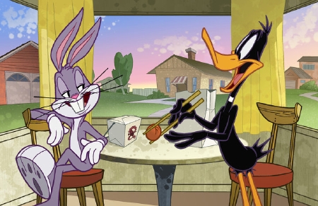
Daffy looks like his usual self above.
Bugs… the body is too small for the feet and head. And his face looks feminine. (Is that eyeshadow he’s wearing?)
How new was the stuff I grew up watching back in the 80’s. I know some of it had to be older just because of the cultural references, but it seems they were able to generate new stuff that was at least in the spirit of the original cartoons.
Was that still Chuck Jones and company working on things, or do I just think I was watching newish stuff on Saturday mornings?
If you ever watched the old Looney Tunes, Bugs was always feminine. I think there was a lot of question on Bug’s sexuality.
Bugs was always HOTT in a dress. Or when doing a monster’s nails. Monsters is really the most interesting people.
The art may leave some cold … but it looks pretty good where I’m sitting.
Bug’s eyelids were always a shade lighter, weren’t they?
The proportions of both characters are way off, unfortunately. There are model sheets for the characters; the animators should use them.
SRS
Ben, the last new Looney Tunes were made in 1969. There were some new title sequences and bridging sequences animated for the numerous iterations of the Saturday morning Bugs Bunny Show, but the cartoons themselves were more than 20 years old by the 80s – and the best of them, including my two all time favorites What’s Opera Doc?” (1957) and “Rabbit Seasoning” (1951) 30 years plus.
Still better than Loonatics, right?
the pic is fine.
if you are complaining, you are an old grump who is waay over-analyzing it and should probably not be enjoying cartoons in the first place.
Seems perfectly ok for me. Minor changes that don’t betray at all the characters. That’s called evolution. Stick with the old stuff if you can’t bare to see anything slightly different.
This is de-evolution, the drawings are poorly constructed and crude. Anyone with even rudimentary drawing skill and an appreciation for animation should be able to see that. It’s just a result of badly lowered standards that anyone could call these worthy of the original shorts program or even worthwhile entertainment. Maybe I am a little grumpy, but expecting quality and personality from the animation industry had become a very frustrating pursuit.
Boys can wear eyeliner too!
The art is fine … I’m looking forward to this cartoon.
I’m certain there were similar complaints leveled against Bruce Timm’s model sheets for BATMAN: THE ANIMATED SERIES. People actually liked them, once they saw the show, and the world didn’t end.
Bugs looks terrible. Daffy looks okay. Background is pretty awful. Let sleeping toons lie. Come up with new stuff and stop remaking old stuff badly.
Comments are closed.