
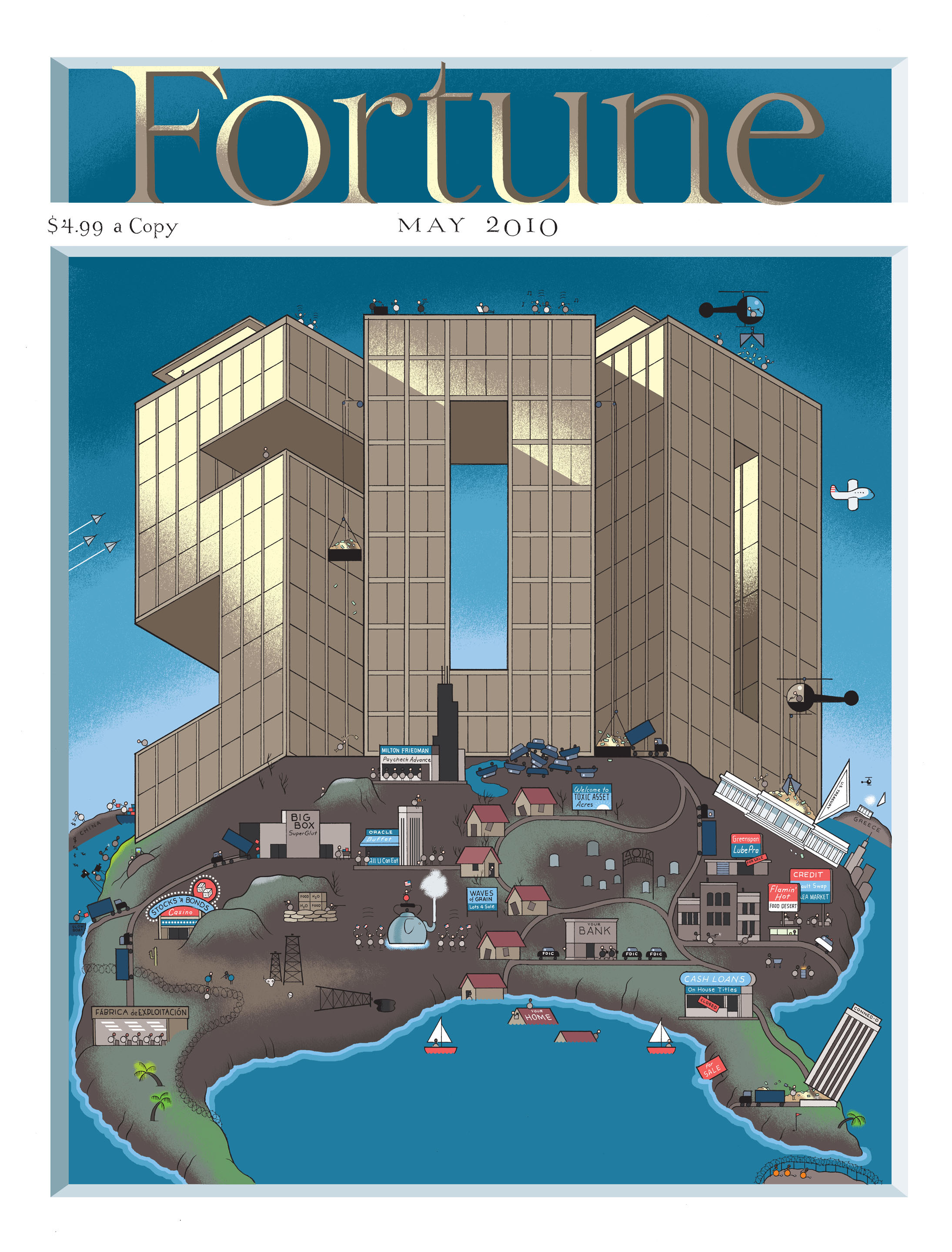
As he mentioned on his C2E2 panel, Chris Ware recently finished a cover for Fortune magazine, only to see it killed, perhaps because of all the jokes in the tiny spaces of the cover. This is really what the internet was invented for, don’t you agree? (Click for larger, rejected version.)


Brilliant cover! Amazing how Ware manages to incorporate so much of what’s gone wrong with the American business system. Can see why it wouldn’t go over too well with the Fortune crowd.
Ha! Yeah why didn’t they accept it?
Fan-freakin-tastic, Chris never ceases to impress.
The financial people that write and read Fortune have no sense of humor.
amazing cover. Again, Fortune magazine is not really journalism. It’s about Money, and the rich people who have it. And like many rich people, it does not have a sense of humor about itself.
love the sinking houses, if they’d printed it, that would have been the only issue of fortune I ever bought.
Odd that there weren’t several rounds of sketches and comps sent back and forth between Ware and the publisher’s art department. They’d have been able to make changes, or know what they were getting into WAY before the final art was delivered. Something about this story seems off.
The Fortune 500 cover has an incredible history and they usually cast a wide net for possible artists. Yes, Ware’s cover was rejected but they probably rejected at least 5 other versions from other people too.
Some cool visual history:
http://www.spd.org/2010/04/fortune-500-covers.php
this is incredibly awesome.
AMERIC-UH!!!!
What a fantastic statement…This guy needs to leave Fortune and get a job doing political; cartooning…Like doing the portraits of our politicians or of his bosses
It looks like one of those Mad Magazine fold-in back covers. Has anyone tried to do that to see if Ware added still another message that way?
@Patrick O’Connor I printed it out and folded it. I think he embedded a message. You’ll have to print and fold for yourself.
North America as huge pile of dung – great.
I think by Chris’s standards this is only ok. You’d be a brave person to reject his work though.
Maybe they rejected it because he spelled “cemetery” wrong.
That is amazing. Chris Ware, you have my heart.
Wonderful. And makes me think Chris may have reviewed the early 60s covers referenced in an earlier comment.
http://www.spd.org/2010/04/fortune-500-covers.php
When I was commissioned to design the cover, I understood that other covers were being assigned, as is the standard practice. Mine was a result of a close collaboration with the Fortune art department and nearly 50 sketches or revisions were done before the final art was completed. Chris Ware, of whose prodigious technical chops I am also a fan, as a celebrity designer was able to create his work without such scrutiny and took that opportunity to make clever, if not obvious, political statements. While I am in agreement with him on the issues, I nevertheless take pride showing respect for my client and expressing my political views in the appropriate arena.
I love the helicopter with the money drops!
i’m contactng you beacause there might be something hot out there on the advertisement list for magazine mercedes and other top nocth cars as well as hybrids clean energy bio fuels have to be advertised more it was so special prviate published adds i say add more to your advertisement list today and get this out there, tnanx, tnank you, nicholas silvestre,
I love the fascinating island
inaccuracies me the island is wonderful, amazing
I LOVE that cover! Sad it got rejected.
No kidding it was rejected — It’s primary statement is that the rich are getting richer and partying while the rest of the nation suffers and dies? Why is anyone surprised that a magazine that survives by making people feel positive about wealth wouldn’t want that on their cover?
Chris Ware: Good at cartooning, bad at recognizing when he’s trying to sell someone the one thing they absoluetly don’t want.
Comments are closed.