

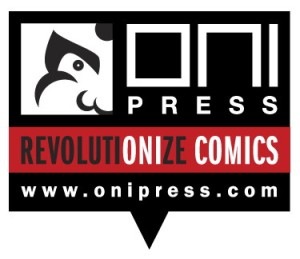
Two is a trend! Oni Press has just announced a new logo replacing the Dave Gibbons-designed original. The new logo was designed by Oni Press art director Keith A. Wood and will first appear on THE SECRET HISTORY OF D.B. COOPER, which comes out in March.
It’s all part of a branding overhaul, director of marketing Cory Casoni told Publishers Weekly. And just the start of a bunch of announcements and new releases.
Oni’s original logo (and name) come from the Japanese oni, a kind of demon popular in folklore .
So far this logo doesn’t spin or dance. But it is quite striking.


It took me 30 seconds to figure out what it was. The eye/cheek thing looks like a weird bluebird and the nose looks like a butt. I hope I’m not just particularly obtuse.
I like most of the logo’s design. I like the top part above the “revolutionize comics”, and the triangle in the middle after the site url, that makes it look somewhat like a speech bubble.
Seeing as the bar is red….which company would be the blue Oni¿
//Red Oni, Blue Oni joke
Thomas, it took you pointing out that it was an eye, cheek, and nose for me to see it. I kept seeing the bluebird with what look like testicles on its neck. It’s far too busy for my tastes.
Nice typographically based logo mark. My only suggestion would be to re-crop the oni face to include some of the smiling mouth on the oni face, as that is a real defining aspect of that face’s recognition. I can get behind this, although I would also like to see a version less the URL.
Way too confusing. I too, saw a bluebird. That HAS to be a problem, no?
It’s the year of new ugly logos! Even JCPenney’s new logo (announced this week) is horribly uninspiring and blah. Geesh!
Fussy and overdone.
The new logo is fine but the old one was PERFECT
I recognized it as a face rightaway, and it’s a nice enough design,but I’ll definitely miss the old logo.
“I kept seeing the bluebird with what look like testicles on its neck.”
+1
Hey peanut gallery, it’s modular.
http://www.onipress.com/blog/wp-content/uploads/2012/01/ONI_PRESS_LOGOS.jpg
Here’s how it looks on the title page of the new colorized COURTNEY CRUMRIN #1:
http://i41.tinypic.com/316w6m0.png
I like it. With the exception of the confusion regarding what illustration within the logo is supposed to be about, it’s clean and it works.
Note to Oni, though: casual readers aren’t going to be familiar enough with either Gibbons’s original illustration or the Japanese word Oni to identify the picture in the box. (And honestly, it reminds me of the Comic-Con logo illustration — in a bad way.)
A new illustration for the box can be swapped in quickly and easily, so I grade this one a B with the current illustration with a likely upgrade to at *least* an A-minus when it gains a better illustration.
And note to DC: Even with my reservations about the illustration in Oni’s new logo, THAT’S the way you do it.
Oh, and one more thing to Oni: a vertically-oriented variant of the logo (likely minus the slogan) would probably be appropriate for the more confined space requirements of a floppy cover as opposed to the back-cover-ready orientation of this logo for the trades. Absolutely no grade down from the current B/pending A-minus of my grading, though.
Uuuuugly! Oni and DC shouldn’t try fixing what wasn’t broke to begin with.
Bleh… another logo misfire.
I saw this as a face right away.
This is all I see when I look at this…
http://modculture.typepad.com/photos/uncategorized/2008/06/30/obey.jpg
I preface this with the fact that I love Oni but the designer (and the people that signed off on it) lack any comprehension on what constitutes a logo. The ‘logo’ is a masthead. They had a perfectly fine logo before. Timeless in fact and they chucked it for a piece that they’ll probably ditch in 5 years.
If you scrap the bottom half, (the slogan & the website) then it’s a logo. The other big sin in the piece is I don’t register ‘comics’ or ‘revolution’. If you want the look of revolution, hire Shepard Fairey.