Well, by now it’s looking more and more like the new DC logo is for real. Rich reports that it was introduced to the DC staff last week:
I’m told that the consensus is that the logo works well as an animated item, but less well as a static logo, that might appear on printed books, signage and the like. And certain editors more committed to print, found themselves in an usual alliance against the new logo. I’m told that that the plan (at least it was, last week) is to announce it very vocally, visibly, animatedly and colourfully, on Wednesday this week.
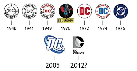
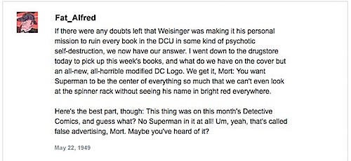
Outcry has been loud and prolonged. Yet Chris Sims won our hearts for keeps with The History of the DC Comic Logo, As Seen Through 70 Years of Internet Comments
Personally, it was explained best to us by an ex-DC employee we saw over the weekend:
“I guarantee that the new DC logo will be accompanied by a sound.”
Maybe some kind of flippity-dippity post-it sound? Or a swooshy woosh. Or a THX-style rearrrrrwwhooooommmmmmmmmmmm.
We live in an animated world. According to Rich, logo designer sensei Rian Hughes thought the new one was OK, so I guess it’s time to just move on to things we can fight, like SOPA and PIPA and HFCS.




“I guarantee that the new DC logo will be accompanied by a sound.” – Well, since the initial reaction for a lot of folks seeing it was “Bwah-Ha-Ha”, he or she was right on the money.
As usual, DCE continues to focus on the wrong things, like a pointless new logo design.
Nothing better than making fun of people who don’t like something, huh?
The accompanying sound will be weeping.
I am sure that the pure genius behind this new logo will eventually be revealed.
The Web is full of so much piling-on regarding this thing that I’m beginning to feel a little defensive on behalf of the new logo. “Come on, guys, it ain’t so bad!”
Even if it is not the nicest logo, I dont see why people are freaking over this….it is just a logo! Lets focus on the products they produce instead!
It needs more lines and seams. Maybe a high collar and some armor too….
I honestly like the spin and is’nt too soon to be getting a logo update? imo if they insist on a change they should go with something more New Frontier-ish cause DC is sort of the more “Nostalgic and Good Ol’ Days” as opposed to Marvel who is trying to be “Hip and Edgy”
… and not enough pouches.
The logo needs more random pouches!
It really surprises me that a company full of great artists could design such a shit logo.
I’m with Jason. Not enough segments and parts!!!!
Eh, they had a star in the logo for 30+ years, couldn’t they have at least kept that aspect of it?
Seeing them all side-by-side, the “spin” is by far the most eye-catching, and only it and the bullet really qualify as eye-catching. The flapper is the most boring one by a fairly big stretch. I mean, I’m not going to stop buying DC’s comics because their logo is ugly, but knowing I’ll be filling my collection with that ugly logo is kinda disheartening.
While it’s a pain to draw this new logo, it does look cool, has a certain wtf to it. Doesn’t have the charm of the 1976 one though, but I can imagine it being revered.
The DC Bullet is CLASSIC. The relatively new DC SWOOSH in my humble opinion a EXCELLENT updated version logo. But this DC peel thing? WTF? I’m sorry it looks like a mid 70’s mom and pop printing company logo. It’s totally devoid of any style.
“I guarantee that the new DC logo will be accompanied by a sound.”
Will the comics come with a link to an MP3 file, or just charming Josie Long-style instructions on how we can make the DC Sound for ourselves?
Poor ol’ DC logo designer – “Too…many things… I can do in Illustrator… can’t resist…”
Meh, I think it’s dull and an unnecessary change but it’s up to them if they want to waste their time doing stuff like that.
If the sound we hear is “REJECT SOPA!” then the new logo will be worth it.
76 was a good year…
I think the sound for the DC Peel will sound much like a bare thigh peeling away from a leather seat on a hot summer day.
“I guarantee that the new DC logo will be accompanied by a sound.”
Is that sound graphic designers looking at this and facepalming?
And for everyone saying “well, it relates to comics because it’s showing a page being turned”; have you looked at how a page in a paper comic being turned looks like lately? My comics aren’t made out of thick transparent plastic.
A missed opportunity for DC.
Can we get Scott Lobdell to write the new logo?
DC Comics resolutely refuses to do anything right or take any aesthetically-pleasing direction in any of their initiatives.
That said, their relentless campaign of self-sabotage is in turn, sabotaged by the freelancers working on the handful of series which are, almost inexplicably, readable and entertaining. Triple-agents.
Or in other words: as bad as this logo is, it doesn’t hurt the comics themselves.
I took the “peeling” effect of the logo as a reference to Superman peeling off his suit to reveal his costume. That interpretation could be too superhero-specific.
SRS
Wasn’t there a lawsuit filed by DC Shoe company over the most recent logo? Maybe they’re in some situation that they are having to pay royalties for the current logo as a result.
Not saying I love the new one, but at least it might explain why they’re moving away from the recent one.
It’s only from the Milton Glaser design onwards that the DC logo really represents the company as a corporate entity. Earlier designs were just a way of catching the attention of buyers – not necessarily even readers; by the late Forties and Fifties the word “Superman” would be likely to reassure parents that a comic was OK to give to kids. Besides, for most of its history the company wasn’t even officially named “DC Comics”.
What’s the motivation behind the change? If the motivation is just some exec trying to make points with his/her boss by changing something major so they can say they are “shaking things up,” then I’d say that’s a bad motivation.
Will the new logo sell more comics or video games and put more butts in seats in theaters? No.
Is the new logo eye-catching and distinctive? No. In fact, from a graphics design ponit of view, it looks like a Friday-afternoon rush job.
Frankly, I don’t see why DC feels compelled to change their current logo. It’s contemporary, distinctive, and it won’t get lost in the design elements when one sticks it in an ad, on a product, or whatever.
Hint to logo designers: One tipoff that your logo kinda sucks is when, after you’ve completed the main design structure of it, you feel compelled to add the name of the company under it just to make sure people know it’s a logo.
I agree that I’d like DC to spend their time, energy and focus on hard things like improving their books and coming up with a digital strategy. It’s easy to get distracted with a logo.
I can see tons of posts now with people’s comments on what they think of the accompanying sound effect. sigh.
Plus it’s god-awful!
My faves – the 1940 version and the Glaser bullet.
The new logo is just really ugly….no better word for it. I mean, it takes a moment to realize that there’s a D somewhere in there……I know it’s for the digital crowd, but isn’t the whole point of a logo, that it should be applied across various media? Seems to me this logo won’t work in print….
Still looks like a maxi pad.
Proving once again that designing a great comic book logo that has style and personality is no Schnapp. Ira Schnapp that is.
It is necessary. I hate to admit. It’s about the digital comics and rebranding. They’re delving more into tablets and this logo is just another nail in the coffin for brick and mortar stores (pains me to say)…I wondered why they didn’t launch the logo with the New 52, but it makes sense. They didn’t want to alienate too many of the old readers. So they allowed the bridge of the old logo, which is only seven years old? It’s only a logo…right?
Let me just weigh-in on this typcal Internet uproar: you guys don’t know design. The new logo is amazing.
And this is coming from a graphic designer NOT a comics reader. You see, there’s your problem.