
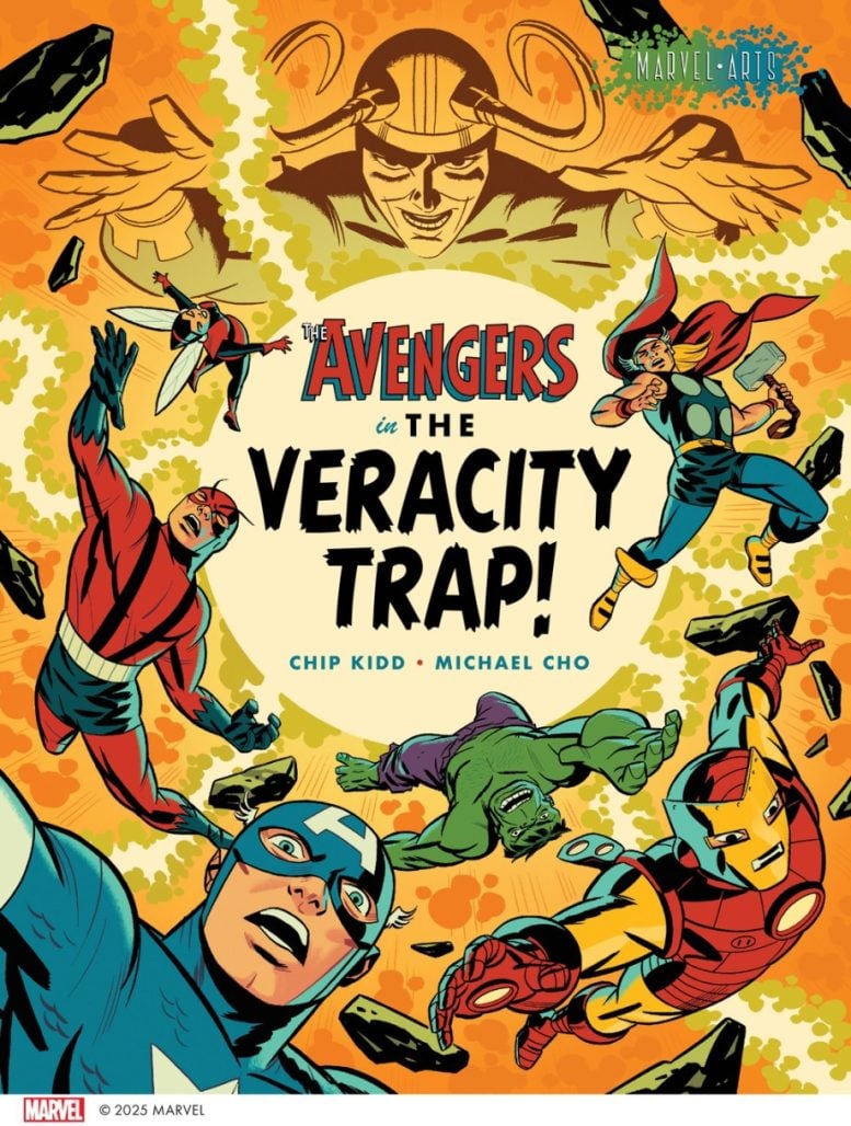
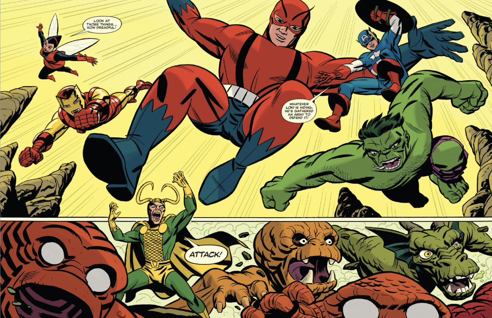
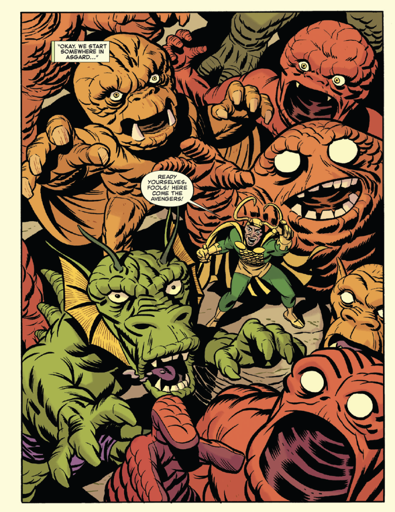
The upcoming graphic novel The Avengers in The Veracity Trap! brings to life the Silver Age incarnation of The Avengers in a battle with their perpetual nemesis Loki. It’s an exciting homage to stories of that era made with obvious love and affection by writer Chip Kidd and artist Michael Cho. Cho, with a visual style that draws obvious inspiration from Alex Toth and Jack Kirby among others, is a natural fit for a book like this. He’s drawn gorgeous variant covers and a few smaller stories for Marvel in the past. However, Avengers in The Veracity Trap! represents the longest story he’s drawn for the publisher and a showcase for his considerable abilities. He took a moment to discuss with The Beat his love for the characters, what it was like to collaborate with Kidd, and answers the question asked by every Silver Age Marvel fan.
D. MORRIS: Avengers in The Veracity Trap! thrives so much on nostalgia and a deep love for these characters, so can you talk a little about your history with The Avengers? And do you have a favorite story or era of the comic?
MICHAEL CHO: I guess you can tell how much I love the Avengers? It’s a kid thing, to want to see the best and shiniest superheroes together in one book. As a 9 year old getting into comics, I was always trying to figure out which team is better, the JLA or the Avengers. Personally, I was a child of 80’s Marvel and the Jim Shooter era, but I gravitated towards the OG Avengers lineup and read as many of their stories as I could find, collected in reprints or paperback collections. Those were the best and brightest, shiniest heroes to me and I loved that lineup.
As for my favourite Avengers stories? Oh god, that’s a long list. Where do I start? Avengers #4, “Captain America Lives!” is an all time favourite and one I re-read over and over as a kid. Though, I do wish the inking was better on that one.
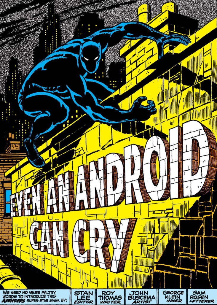
I also loved the introduction of the Vision in Avengers #58, “Even An Android Can Cry!” which I discovered in a torn-up treasury sized edition. John Buscema’s art in that story seemed like the work of Michaelangelo or another Italian renaissance master. The splash page of that book with the Black Panther and the lettering on the brick wall is a masterpiece.
I also loved Kurt Busiek and George Perez’s run during the “Heroes Return” era in the early 2000’s. I was just getting back into reading superhero comics after a long absence and I was thrilled to see these two incredible creators at the top of their game, making stories that had so much love and joy to them.
There’s plenty more, but those are just a few off the top of my head.
MORRIS: What was the secret origin of this project?
CHO: Chip could probably tell this better than me, but Charlie Kochman at Abrams approached him to see if he’d be interested in writing a book for the Abrams Marvelarts line. Chip agreed and suggested collaborating with me on it. He told me that he had seen the covers I was doing at the time for the Mighty Marvel Masterworks collections, which featured reprints of the earliest Marvel stories and wanted to do something in that vein.
We spit-balled what characters we should do and I suggested the original silver-age Avengers as I had a pitch featuring those characters that was in limbo at Marvel around that time. So they were on my mind.
Chip soon sent me a treatment which, when I read it, I thought was completely bonkers. It was a delight and the kind of pitch where you have no idea what’s going to happen in the next paragraph. I think I was on paragraph 3 when I started cackling with glee. Initially, the idea featured a whole bunch of other Marvel characters in the 2nd half, but Charlie expertly steered the ship to more manageable waters.
MORRIS: Something on my mind while reading the book is how it used the unique properties of the comics medium in telling the story. Since you and your collaborator Chip Kidd have backgrounds in design, what was the creative process between you both in bringing this story to life?
CHO: This is a fun question. And I’ll point out that my “background in design” is not anywhere near the level of Chip’s.
The creative process on this was pretty organic, but that doesn’t quite express how weird and fun it was. Chip wrote a treatment and a script, but we had a lot of tweaking and rewrites and collaborative moments along the way. Chip writes scripts in a really unique way – it’s laid out in InDesign (of course) and he writes in panels with little visual attachments. He’s also an immensely generous collaborator and allowed me a huge amount of room to contribute to the storytelling.
My only request to him before he started writing the script was to stick to 4-6 panels per page, so that I could add or subtract panels as necessary for the pacing. My main focus when I draw comics is in the pacing, and getting the “beats” right. So Chip graciously wrote sequences where he knew I would combine, trim or add panels for flow.
A few fun things that happened along the way which I’m happy to share with readers of the Beat:
-
We tried to cram as many splash pages into the book as possible, and each of the Avengers (and Loki) got a splash as they were introduced. In the script, Chip would attach examples of classic Marvel pin-up pages to show the impact he was going for. AsI saw these, I suggested we keep the “A Mighty Marvel Pin-up!” caption box and character logos from those pin-ups and incorporate them into the story. I think it worked out really well and added to the flavour of the book.
-
There’s a 2 page spread near the end of the book that shows off a crazy Kirby-esque machine. Naturally, since we incorporated the pin-ups into the book, I thought this was a great opportunity to do a cutaway diagram type thing, like the old spreads showing “the Secrets of the Baxter Building!” or something like that. So, we wrote captions explaining all the various elements of the machine as well, to do a little callback to those wonderful pages.
-
For the pages taking place in the “real world”, we wanted to give it a unique look to differentiate it from the “comic world”. Chip’s initial note suggested something to the effect of “oh you know, you can just draw it like Alex Ross”. Yeah, ok…. *insert daunted face*
-
Chip is a wonderful outside-the-box thinker and had some amazing ideas along the way that never made the final cut. At one point, the ending was a pull out 4-page gatefold spread. He even sent me and Charlie a little video explaining how it would be printed, so we could wrap our heads around the idea.
-
The book jacket is reversible (another Chip Kidd special), so if you take off the dustcover, you can refold it and use whatever cover you like best.
-
At one point, we toyed with the idea of variant covers for this book. Variant covers for a hardcover book. Seriously.
-
Every inch of this book is designed. If you lift up the front flap, you can see a word balloon from Loki hidden on the front endpapers, which is the actual start of the story – another Chip idea. And the rear endpapers feature the start of a whole new Avengers adventure versus the Frog Men from outer space. I drew that last, and it was a breeze because I was so warmed up.
MORRIS: You’ve done comics work for Marvel before but I don’t believe anything this big. How exciting for you was it to work on a story this big?
CHO: Fun! Fun! Fun! That was my mantra while working on this.
The thing was, when I put out my first graphic novel a decade ago, I was looking forward to drawing more stories. But then, my wife and I decided to have another child and I knew there was no way I could draw interiors regularly while also raising kids. Other artists can do it, but they’re way faster and more organized than I am. Hence, I stuck to cover assignments as much as possible. But I knew, once my son entered school, I would be able to return to telling stories. So, when that time came, I started dipping my toes back in the waters by writing (with my collaborator Anthony Falcone) and drawing a short 10 page Captain America story here, a 10 page Spider-man story there and a 20 page Batman story a couple years back. So I was thrilled to move up to drawing a 64 page deluxe graphic novel. Now, I think I’m ready to do that 250 page miniseries I’ve always wanted to do.
MORRIS: Finally with this being such a love letter to Silver Age Marvel, I feel obligated to ask the eternal Silver Age Marvel question. Who wins in a fight; The Hulk or The Thing?
CHO: That’s easy. The Thing. Because he never gives up. He’s like Cap that way. Even if he’s beaten, you can’t call him a loser because he didn’t quit. The Hulk is a rage monster but the Thing is all heart and fights to defend what he loves. And we all know love always triumphs in the end.
The Avengers in The Veracity Trap arrives on bookshelves August 5 from Abrams Comicarts.


