

On August 8, the industry lost another giant. Artist Ernie Colón passed away at the age 88, leaving behind a legacy that secures his place in the pantheon of comics as a master of his craft.
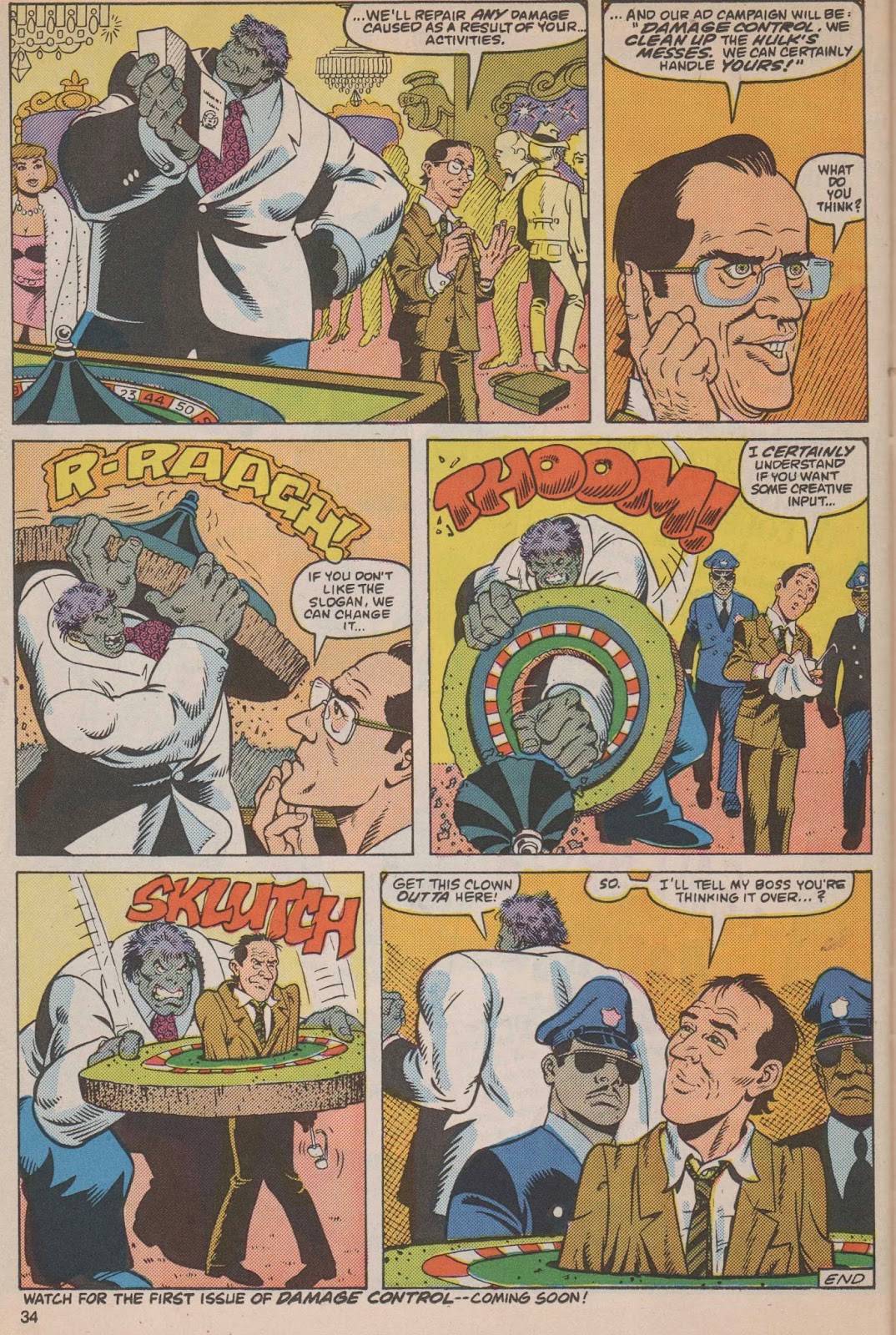
Colón has been recognized by many corners of the comics world for co-creating Amethyst for DC Comics and penciling the very first issues of Marvel’s Damage Control. They’re impressive in their own right, but what was truly impressive about the Puerto Rican-born artist was just how eager and skillful he was in switching and mastering different art styles within different genres. He could switch from superheroes to horror in an instant while making sure each carried their own signature features in the process. Colón housed many artists within him, and they all combined to make one Ernie Colón.
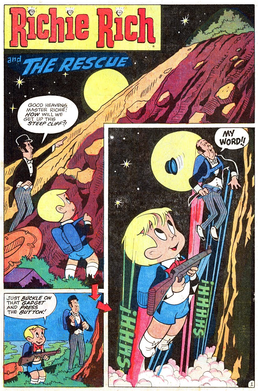
Horror and kids comics were among Colón’s strong suits, with entries in Creepy and work on licenses such as Richie Rich and Casper The Friendly Ghost being prime examples of it. He started working in comics in the 1960s, lettering and then penciling for the Harvey publishing house. This led to work in the Warren Horror magazines, where he adds Eerie and Vampirella to his resumé.
Comics journalism also features in his well-earned legacy with books such as The 9/11 Report (2006) and A Graphic Biography: Che (2009) as samples of yet another stylistic turn in his career. He also worked on a graphic biography of Anne Frank, which was published in 2010, and adapted several literary classics such Frankenstein (as part of the Science Fiction and Fantasy paperback, 1997) and Don Quixote (1990).
Listing the many works and projects he lent his storytelling skills to would require the undertaking of a task not unlike that of charting the whole of DC’s and Marvel’s multiverses. Instead, I want to look at a few samples of Colón’s work to appreciate just how impressive his mastery of art styles truly was. While we’re at it, we’ll just go ahead and celebrate the work of a comics artist that should definitely be more discussed than he has been in recent years. Ernie Colón is the kind of creator we have fewer and fewer of; a creative force that was fluent in as many comic book languages as possible. Truly the embodiment of mastery of craft.
Here are some samples of Ernie Colón’s complete mastery of comic book art:
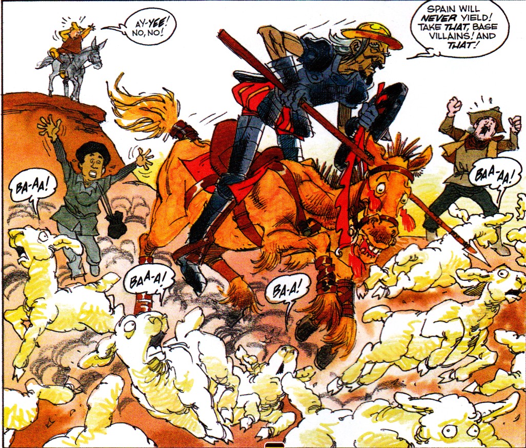
- “Don Quixote,” Boy’s Life Magazine (1990), adapted by Seymour Reit and Ernie Colón
Colón’s take on the world of Don Quixote showcases how freely he mixed art styles and how comfortable he felt within them. Here we see the absolute wackiness that constantly surrounded Quixote and how normal it was for him to be on this frequency. Colón takes a MAD-like approach to the characters and the animals, making them feel cartoonish, as if they’re just one stroke shy of animation. The animals’ faces, their wide-eyed sense of panic and chaos gives each living thing on the panel its own personality, characteristic of funny books from the 1980s and early 1990s. It’s a very comedic tone Colón goes for here and it manages to get Don Quixote right. Very few artists manage to capture the look and feel of Quixote’s made-up fantasy world, knights and monstrous windmills included. Ernie Colón did.
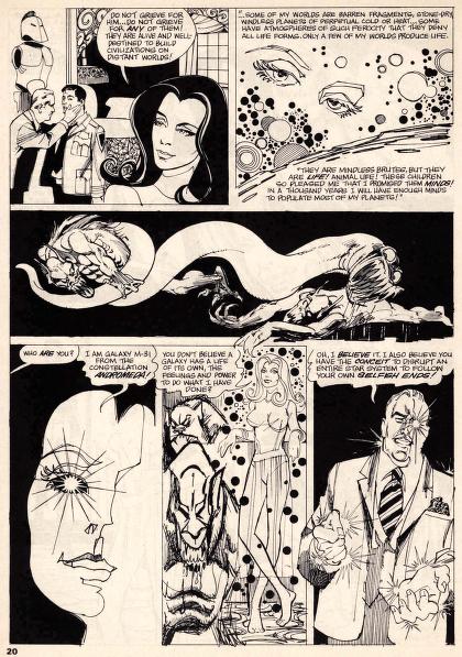
- “The Mind Witch,” Vampirella #7 (1970), by Nick Cuti and Ernie Colón
In this page we get to see Colón flexing different muscles at the same time. There’s monsters, slices of cosmic horror and dark magic threatening with spilling into reality, and some heavy inks holding it all together. The page just feels classic horror magazine. It also feels like a definite switch in style when compared to the Quixote comic. Characters in this Vampirella story are made to navigate a dream-like scenario where witches alter reality and conjure ghastly imagery to strengthen their hold on the living realm. Colón uses whites and blacks to peel back different layers of horror in each panel, with a serpentine monster dividing the page in two laid bare for added terror. And yet, Colón manages to show much without giving up the mystery driving the story. This is a great example of the type of horror Colón could get on the comics page.

- The 9/11 Report: A Graphic Adaptation (2006), by Syd Jacobson and Ernie Colón
While this book is mostly an adaptation of the 9/11 commission report, Ernie Colón’s pages are representative of exhaustive research in service of authenticity. Colón took from news reports and photographs from the day of the terrorist attacks to not only visualize the report’s findings but to also experiment with negative space and precision. This makes it, in my opinion, comics journalism. Colón finds a way to expand upon the things the report might suggest but not confirm. Just looking at the page above, you feel a very calculated approach to the quality of the images and the panels that put this page together. There’s tension and anticipation, which is not an easy thing to do with factual reports done with all the dryness one expects from government texts. Colón does play with how certain scenarios might’ve played out during the parts where no pictures or testimonials exist, but it still feels well-thought out and appropriate given the subject matter. Just a masterclass in versatility and visual research.
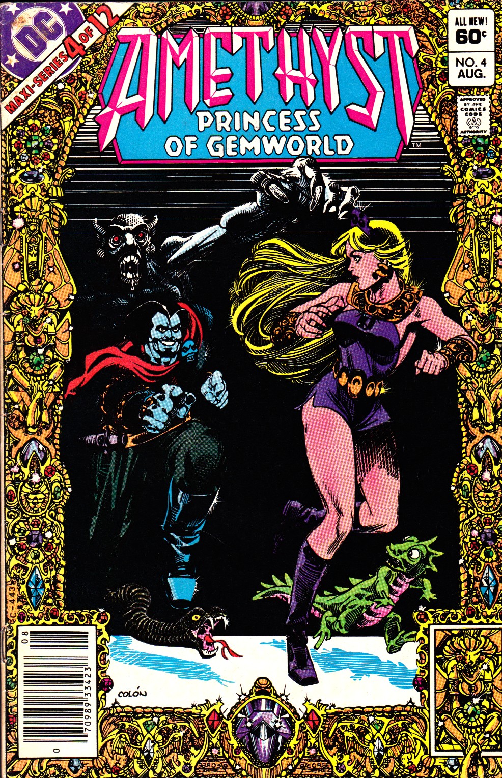
- Amethyst: Princess of Gemworld #10 (1983), by Dan Mishkin, Gary Cohn, and Ernie Colón
There was point in time where DC comic book covers looked very much like the Crisis on Infinite Earths covers almost across the board. George Pérez stands out as the master creator responsible for this trend. His cosmically epic covers captured the grandeur of their stories they contained and, in essence, they were just impressive. I would put Ernie Colón in the same category as Pérez when it comes to crafting these type of covers. Take the above Amethyst cover from the maxi-series. It shares in the event-like feel of Pérez’s covers, but it manages to serve the story’s classic fantasy elements, making it unique. Here we see some of that negative space play discussed earlier coupled with colorful horror imagery. The jeweled border with its bright colors on a gold frame perfectly balance the cover and speaks volumes to Colón’s eye for composition. The use of negative space here carries over to his later work in The 9/11 Report.
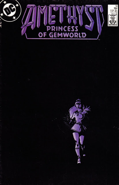
Colón should be considered an expert in negative space composition and I can think of no other cover to offer as evidence than that of Amethyst #10, post-maxi-series. This cover shares a lot with George Pérez’s cover for Infinity Gauntlet #4, which shows Thanos daring the reader to “Come and get me!” with space standing still, perhaps in anticipation, in the background. If Pérez’s cover is about the menace of a singular being, Colón’s Amethyst cover is about impending doom. Something bad is going to happen in Amethyst #10 as Colón’s cover brilliantly portrays. Amethyst is consumed by shadows and darkness is all that surrounds her. Negative space is taken as a visual storytelling technique here and it makes the cover one that ranks up there of composition and skill with Pérez’s Infinity Gauntlet #4 cover.
This is but a small sample of an artists extensive, versatile, and intricately varied body of work. Few manage to master so many art styles so completely as Ernie Colón, with signature traits in each one. Whether it was horror or superheroes, you knew what an Ernie Colón comic was. He was as much a master as an exceptional student of comics art and he should stand as an example to follow in today’s comic book world. Colón earned his legacy and deserves to be further discussed.
Descanza en paz, Ernie Colón. Rest in peace, Ernie.
Check out the Ernie Colón Unlimited blog for more scans of Ernie’s comics, which was a tremendous help in the making of this article.


My first discovery of Ernie Colon was a practical one: as a young horror-comics maven, Ernie (along with the late Tom Sutton) was the only reason to continue buying the Warren horror books during their Dark Ages of ’68-’70, when Warren slashed their operating budgets leaving only two worthwhile artists drawing the books amid a sea of reprints and hacks. Ernie’s approach to comics was more from the cartoonist’s side than an illustrator’s, which no doubt explained his amazing versatility (the excerpt from the 9/11 book is absolutely stunning!) as well as his mastery of creative exaggeration, which he employed for both humorous and dramatic effect, depending on the project. Now I’ve gotta dig up my cobwebbed copies of AMETHYST – not my type of book, but the art made it worhwhile. Sure hope I managed to squirrel away a copy of AMETHYST 10 – that cover is spectacular!
We need an Amethyst omnibus right now
The jewelled frame was by George Perez (you can see his signature twice in the bottom center), Ernie Colon did the interior art within the frame. What an amazing team they made on those covers. I’m proud to own the original art for #10 of the maxi series :)
He was always brilliant, always pushing himself, always feeling that the last thing wasn’t good enough and the next would have to be better. I was VERY lucky to have been his collaborator, and luckier to be his friend.
Thanks Ricardo for the mention of Ernie Colon Unlimited. Guess who’s behind it? :) That’s right, me, the sacarstic fench guy who used to write the Marvel month to month sales analysis here. That’s a small world. And look who’s in the comment section, JC Lebourdais, an old SCARCE magazine fellow from France.
Howdy!
Comments are closed.