

DC Vertigo’s High Level has a high concept to match its title. It tells the story of a world that’s fallen. Scavengers like the fiercely independent and capable lead character, Thirteen, eek out an existence by selling off whatever treasures they can find– or steal– from the wastes and warehouses in the Outlands. However, some of them dream of a better life in High Level, a mysterious place that’s either a prison or a paradise, depending on who you talk to. No one who’s moved there has ever come back. And now, Thirteen might just have to travel to High Level herself.
In advance of High Level #2‘s release next week, the Beat spoke to the book’s creative team, including writer Rob Sheridan, artist Barnaby Bagenda, colorist Romulo Fajardo Jr., and letterer Nate Piekos to find out how they put a page of this wildly imaginative and stark-raving-gorgeous book together.
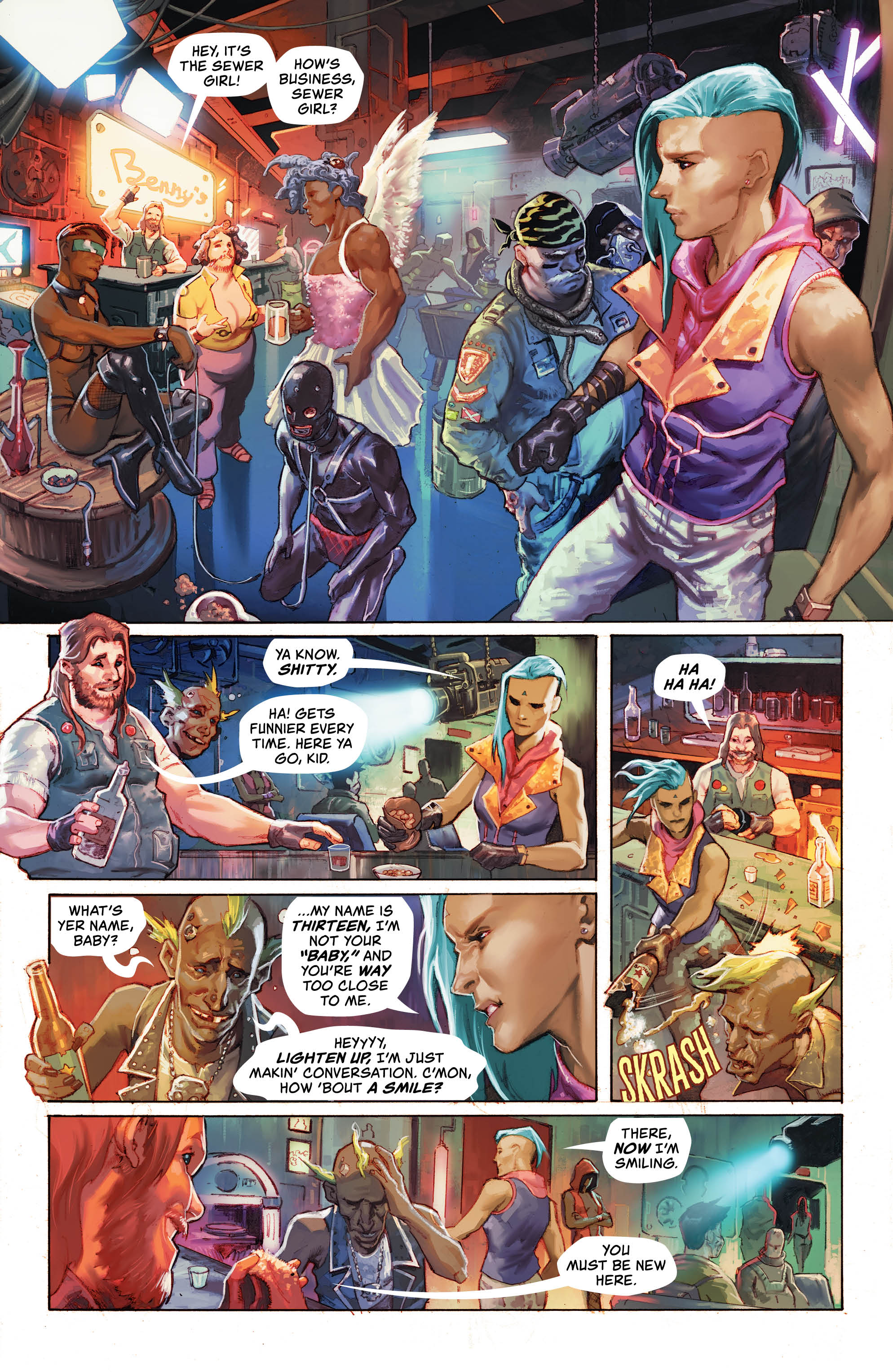
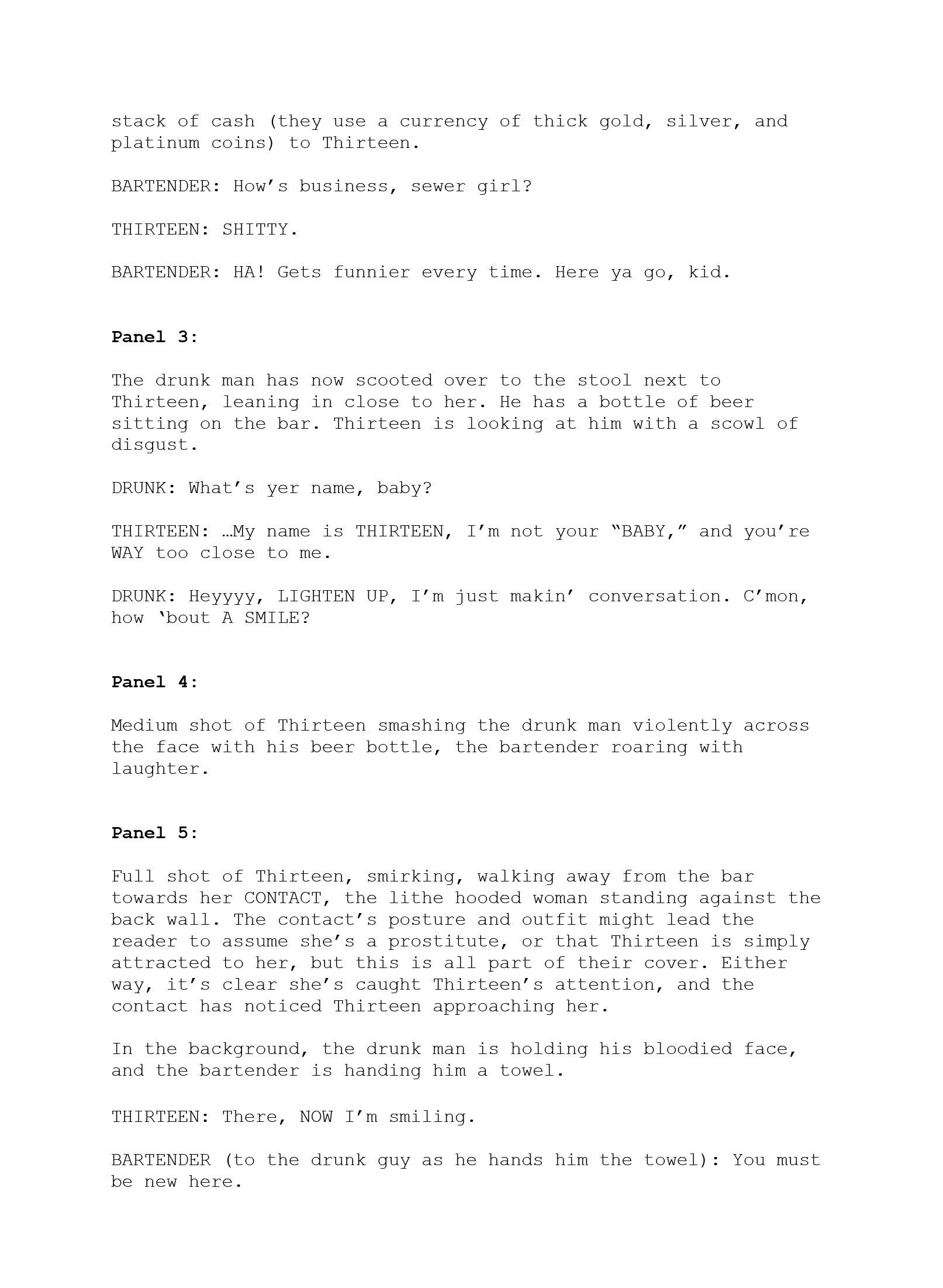
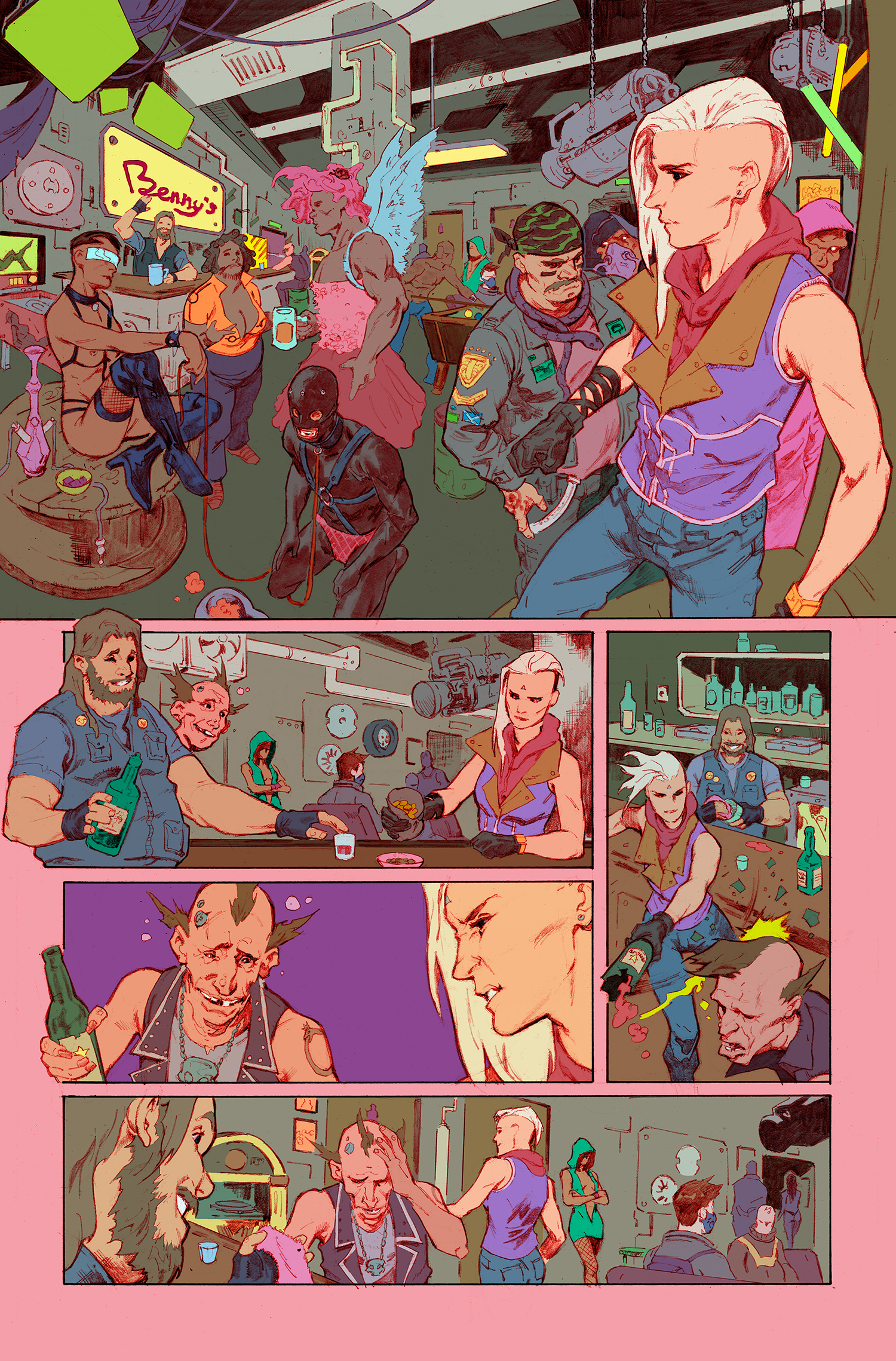
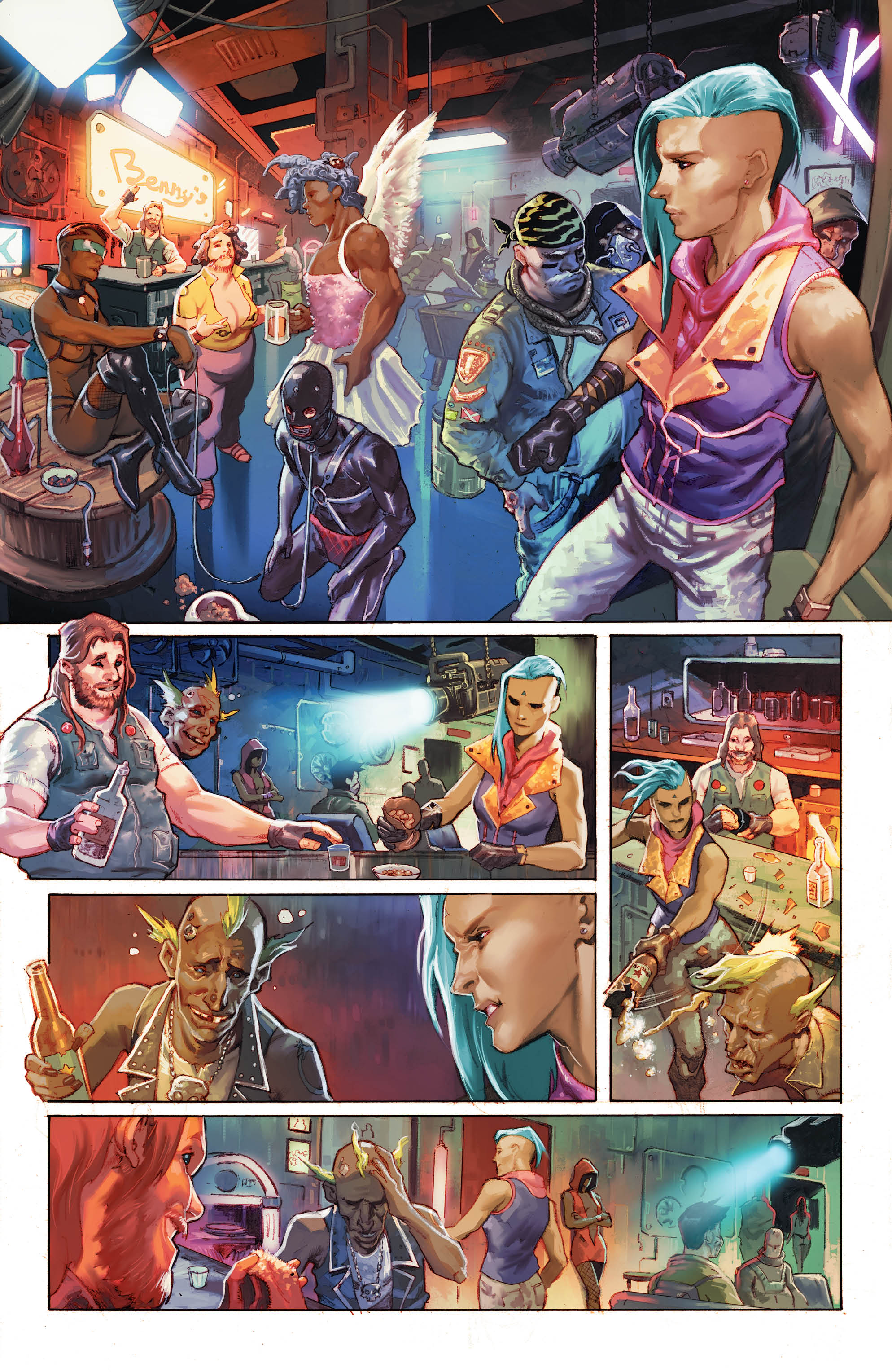
On this page from High Level #1, we see Thirteen returning from a scavenging job to Benny’s, where we get a feel for what social life in the world is like and get a stronger sense of Thirteen as a character. Let’s take it apart and build it back up from start to finish.
The Script
Alex Lu: Taking it from the top Rob, I’m interested in how you found the scripting process of High Level to be. How does your visual background, working as an art director, director of photography, illustration, and more come into play as you put words to paper here?
Rob Sheridan: I really love the scripting process. Comic book scripting is a style of writing that has a lot more in common with directing than with writing a novel, so it was a really smooth transition from my background in visual storytelling. Aside from just the dialogue, you have to think about the flow of the action, the pacing of each page, and then describe a vision of the world for the artist to interpret. Having worked as a director, editor, and stage producer, I’ve spent years thinking about how visuals, action, and drama flow to tell a story. Translating that into the pages of comics is an absolute blast.
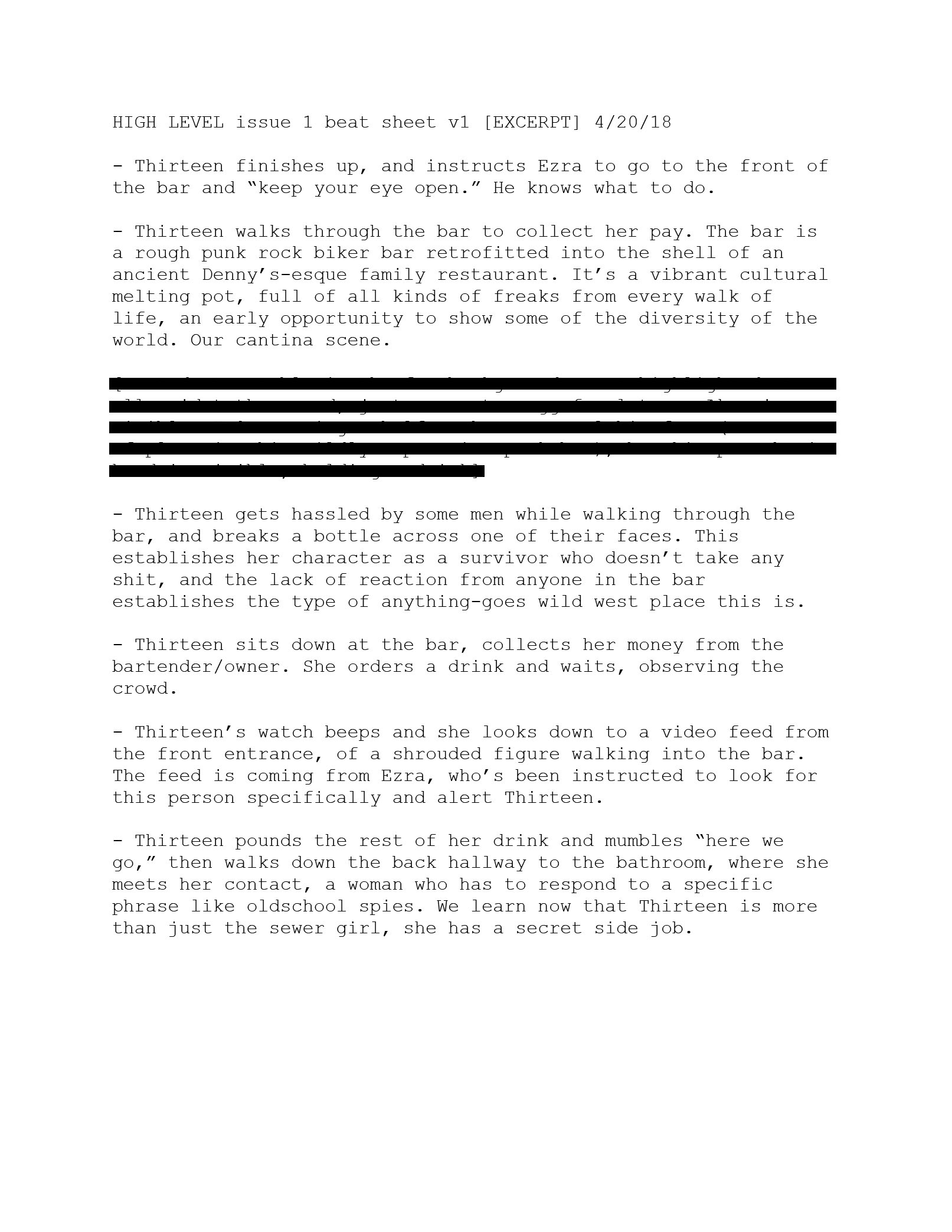
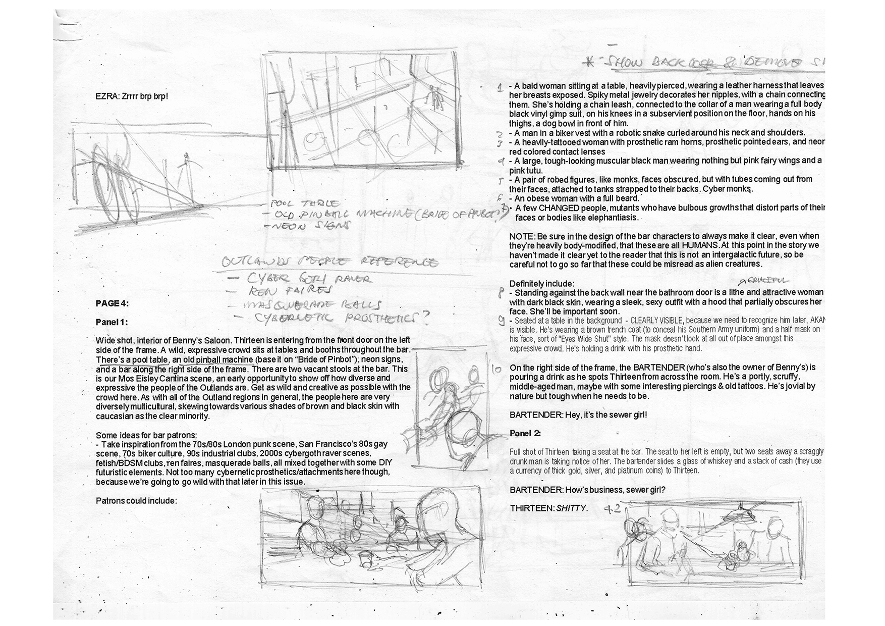
Lu: The first thing that we see here is your beat sheet for what will ultimately be page 4 of High Level #1. At this stage of writing, what are you focusing on as you lay out a page in broad strokes like this?
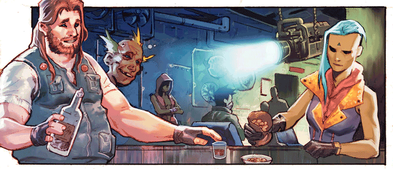
Sheridan: The beat sheet process is intended to get my general ideas of what needs to happen in the issue in a rough linear order, so my editors and I can start seeing if it works on a macro level: Does it have a good flow to it? Does the protagonist go through a change, internally or externally, from the beginning to the end? Does it have a satisfying cliffhanger? Those types of things. Then we whittle it down to what can realistically fit into 22 pages and how that breaks down page by page. It usually involves a lot of cutting and visual tricks to fit as much into a page as possible, with the goal of having each page (or pair of pages) tell sort of a contained story in itself. This page is a great example of a complete scene that’s captured on one page, with an elegant lead-in to the next scene (as Thirteen walks away towards the contact she meets in the next page).
Lu: I’m fascinated by how much thought you put into the visuals of the world before Barnaby and Romulo started putting art on the page. You list off a variety of disparate outsider subcultures as aesthetic inspiration while simultaneously telling your collaborators not to veer too far into augmentation, necessarily. What were you hoping to inspire in Barnaby and Romulo by evoking these groups and how was what you envisioned while writing the script similar or different compared to the world that they ultimately created?
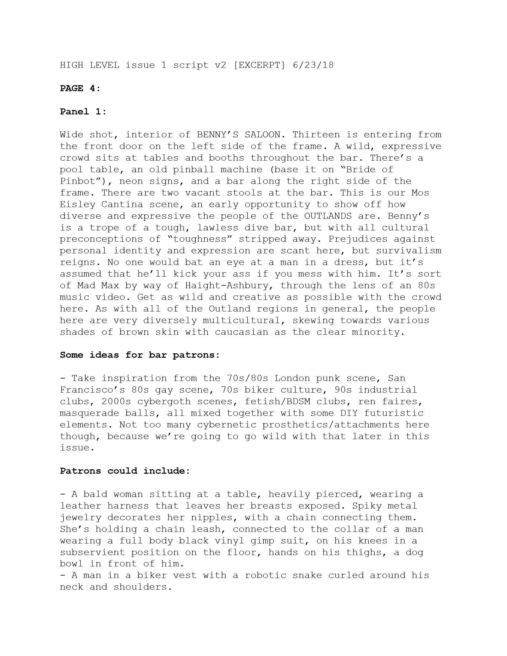
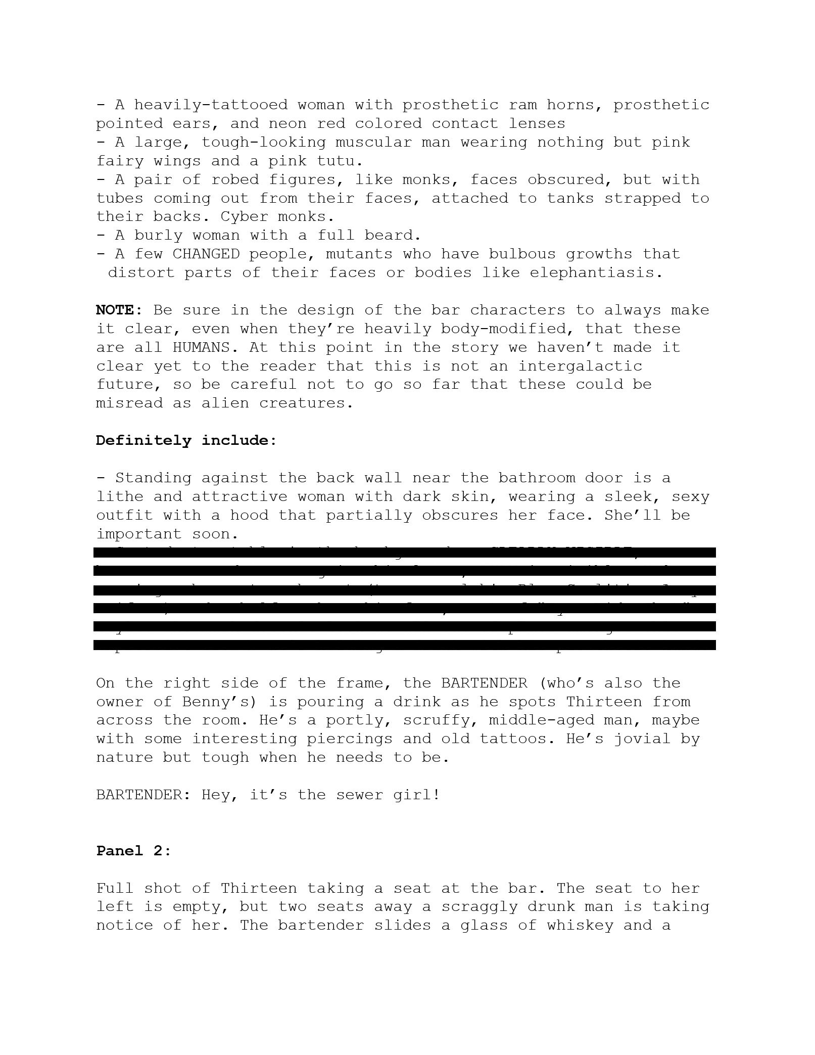
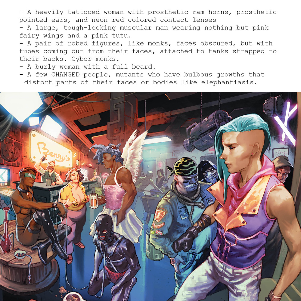
Sheridan: As an art director, I see things very visually, so I have a really clear picture of everything in my head. This first issue is the tone-setter for the world and the series, so I had some really specific looks in mind that I wanted to convey here. By listing off some of the characters that could appear in this bar, I wanted to really flesh out the specific cultural flavor of this place for Barnaby and Rom. It had to feel like a cyberpunk version of a “road house” tough biker bar trope, but culturally very expressive and open and colorful. It was a potentially difficult balance to communicate visually, but they managed to capture it perfectly: A place where no one is judged for whoever they want to be, but you wouldn’t want to piss off the wrong people.
Barnaby has been incredible to work with – we’re on the same wavelength, where when I describe something in the panels he seems to truly understand the feeling of it, and goes way beyond the descriptions to flesh out all kinds of details that really make every setting feel tactile and lived-in. It’s not easy to find collaborators who take your ideas and then improve upon them, but that’s what Barnaby and Rom do.
Lu: You talk a couple of times in the documents we have here about this being your team’s version of the “cantina scene” from Star Wars. In your mind, what’s the importance of having a scene like that in a sci-fi story like High Level?
Sheridan: In the first issue of a comic, you really want to hook people, and tease them as much as you can about where the story might be headed and what else there might be to discover in the world. That can be tricky when you’re trying to tell a classic adventure story – as we are – where the world tends to start out very small and reveal much more as the story goes along. If you think about the early Tatooine scenes of Star Wars, it’s a lot of desert landscape and a lot of Luke and Ben and droids. You haven’t seen many aliens, you don’t know how diverse the galaxy is, which makes sense for the beginning of Luke’s journey. But then they go to the Mos Eisley cantina, and suddenly the universe opens WAY up just in this one bar scene. It was a brilliant way to show early on that this is a massive universe much, much bigger than Tatooine. So I wanted a scene like that early on in High Level, to show how interesting and diverse the culture of the Outlands is, all in one page. It’s a very effective and efficient world-building mechanism.
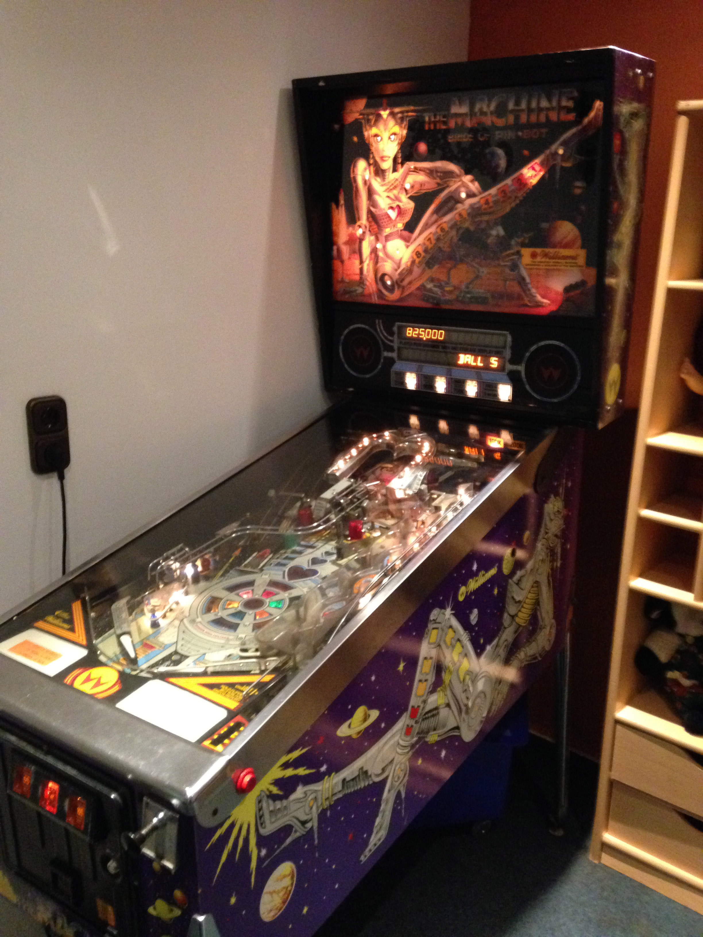
Lu: A small detail that we’ll see carry over into Barnaby’s initial art notes for this page is the pinball machine. It’s more in the background in the final art, but you seemed to put some thought into what you wanted with that machine, asking Barnaby to base it on “Bride of Pin-Bot.” What’s the significance of that pinball machine specifically for you?
Sheridan: I really wanted this world to have an 80s retrofuturism feel, tactile and hard-wired, disks and cables and TV monitors. Part of the way we achieved that in the story was by making Onida a scavenger community that raids storage pods left preserved from the mass migrations of the old world. The progress of technology was disrupted generations ago, and there’s no infrastructure left – no power grid, no internet, no new tech being mass-produced. So the people of Onida have found all this old stuff that they don’t have any context for and created their own DIY remix culture out of it. So I wanted to include 80s (and current-day) staples of dive bars, like pool tables and pinball machines, to ground this place firmly in our history, while also mixing in elements of our future. And when I pictured this 80s retro-futuristic cyberpunk dive bar, no pinball machine channels the vibe better than the fantastic 80s sci-fi robot babe art and design of the Bride of Pin-Bot machine. They have one at a pinball bar in Seattle I frequented while I was writing issue 1, so it was vivid in my mind and a perfect fit for Benny’s. I love that Barnaby actually took that note and drew in the shapes of the actual artwork onto the machine, even if it’s barely noticeable. That amazing attention to detail is what I love about Barnaby’s art and how he works.
The Artwork
Lu: Barnaby, having had a chance to play with this sort of high concept sci-fi world before in Omega Men, as you came into High Level were there things you wanted to draw here that you didn’t get a chance to include as much in your previous work?
Barnaby Bagenda: In my previous works I did a lot of sleek, hi-tech sci-fi themes while High Level is the opposite. A more dirty, post-apocalypse junkyard salvage look, but colorful which I’ve never done before.
I was excited to try a new technique for High Level by adding grey markers to block some parts of the drawing and then using drawing pens (both black and white) to highlight or add effects. So in a way, it’s a mixed media approach rather than just pencils like in my past work.
Lu: Comics scripts can run the gamut from basically giving the artist full reign over the visual worldbuilding to directing where every coaster should be placed on every coffee table in the world. I think Rob’s script falls somewhere in the middle, giving room to innovate and take the worldbuilding where you want it to go, but offering a lot of suggestions for inspiration and what the world might look like. What stood out to you most about reading Rob’s script for the first time, Barnaby?
Bagenda: Rob’s writing is fast-paced, and he really focuses on visual aesthetic and the attitude of the characters.
He has a very strong sense of what details he wants represented in the world of High Level. For instance, there’s this desert scene in Onida that I drew where I added hills and mounds just for a filler but he suggested they be removed because Onida was based on a real place near Canada and it is just a plain, flat desert. This kind of feedback is helpful and it helps me to create the world he envisions.
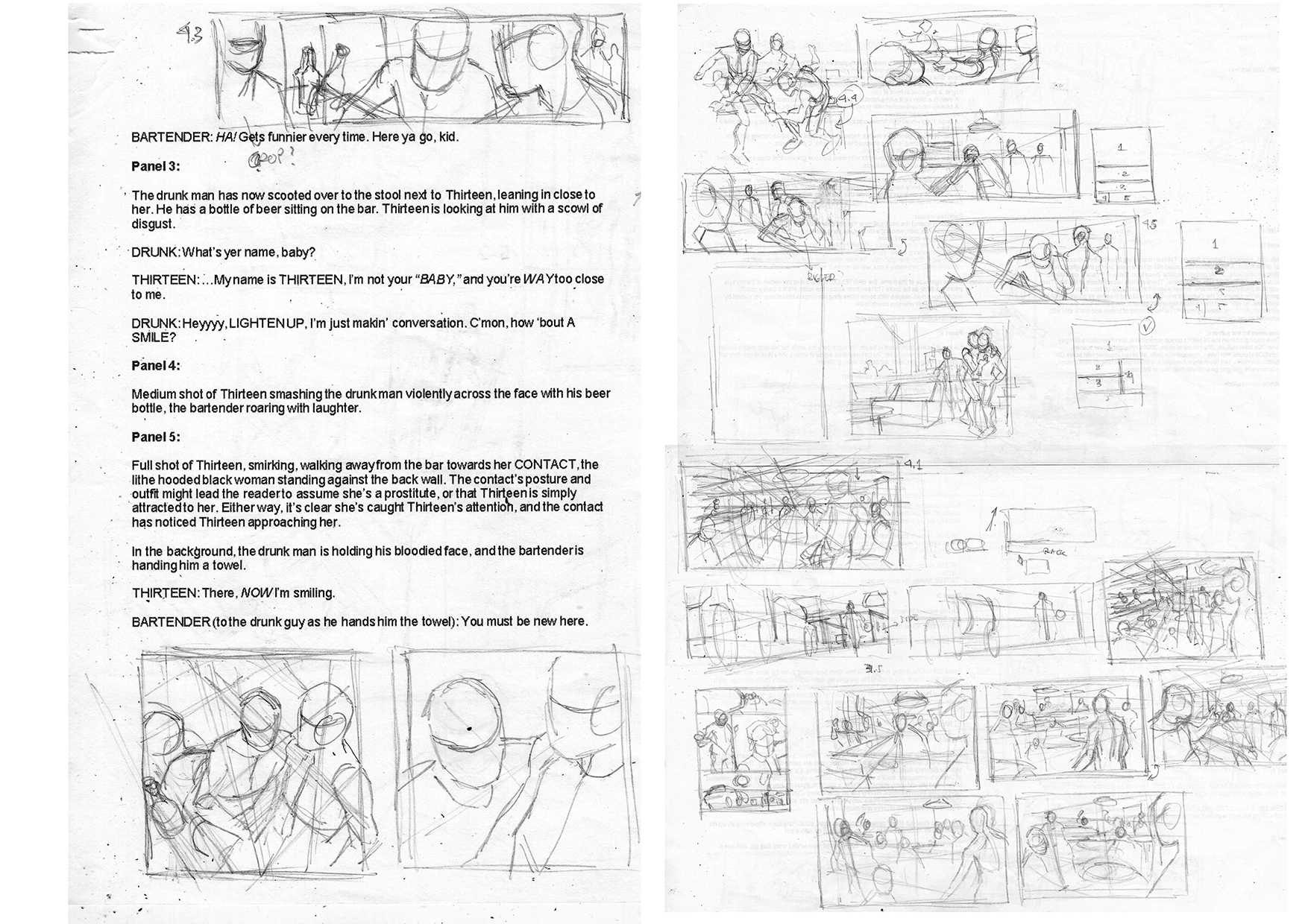
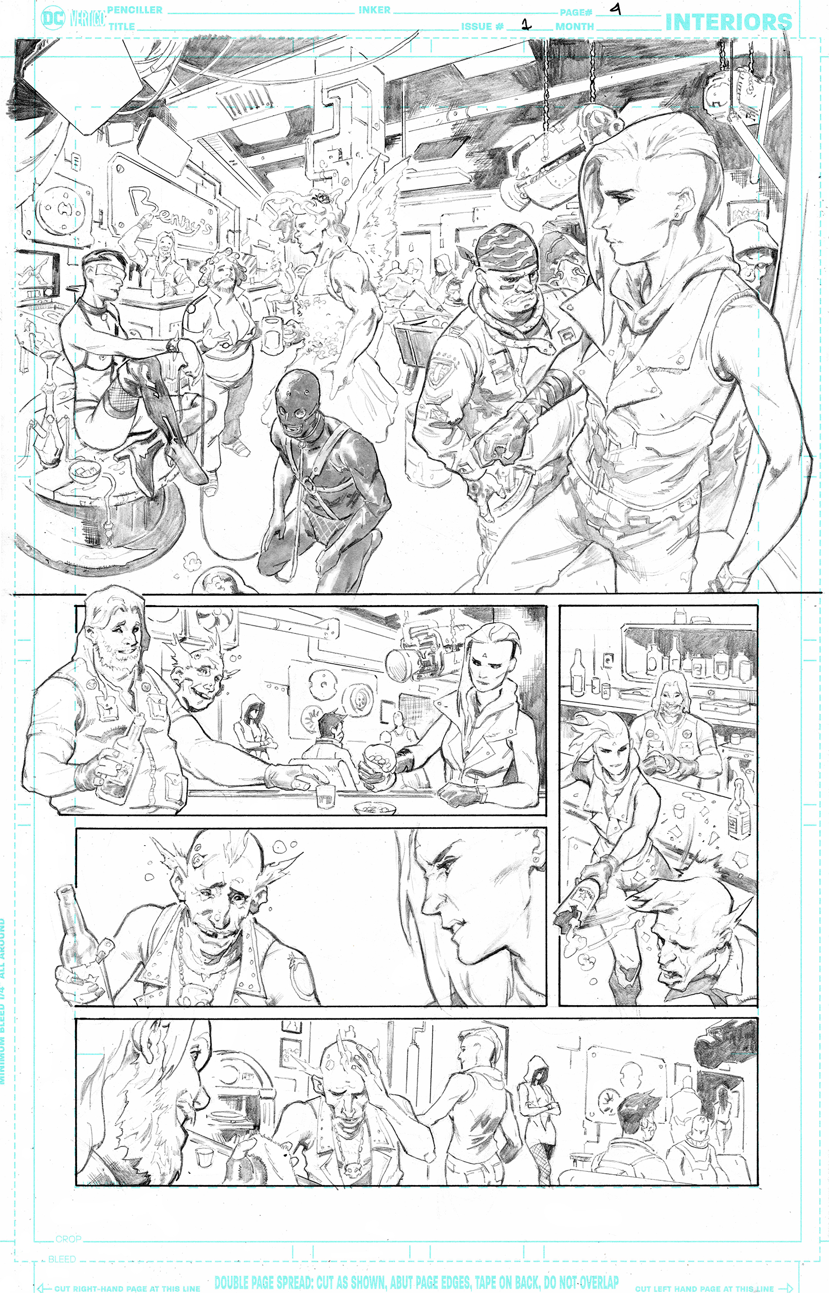
Lu: As we can see in these process pages, you spent a lot of time working out the layout for this page in general and for the specific angles we see certain shots—especially that big establishing shot of the bar. What are some the challenges that come with building a crowded scene like this and how did you ultimately come to the decision to lay out the page as you did?
Bagenda: Sometimes I do spend a lot of time making several alternative shots or angles to choose from for each panel. At other times, I already knew which angle I want to use without making alternatives, or in some cases the writer already describes the specific shot. But most importantly, I just want to make the page easy to read. The biggest challenge when building crowded scenes is to find a way to fit all those characters into one panel.
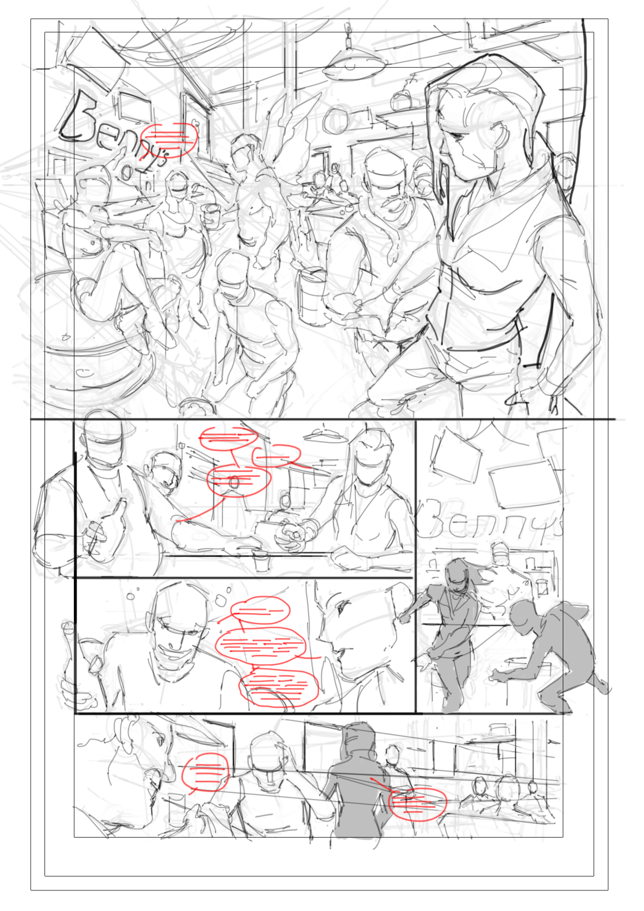
Lu: What I find really interesting about your final layouts, prior to inks, is that we can see you blocking out the lettering long before any final lettering is done. How do you guesstimate how much lettering space you’ll need to leave in a panel composition?
Bagenda: Well I kind of guesstimate the amount of words and sentences that might be put on the page and hope for the best. I just want to make sure that I leave enough room for the word balloons without overlapping the art.
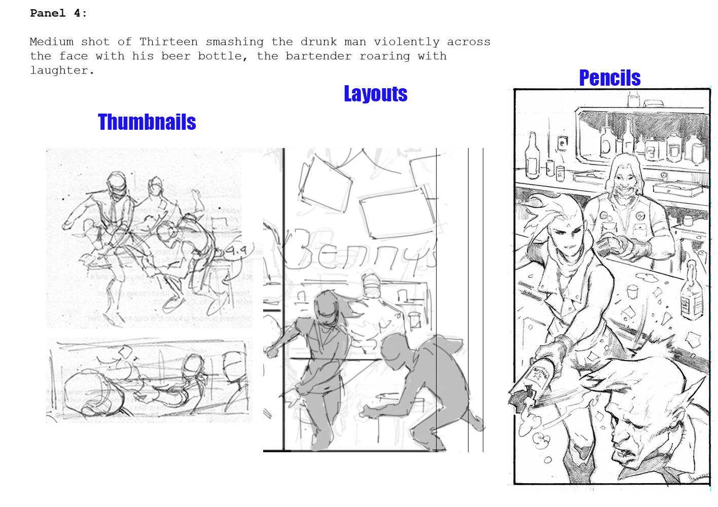
Lu: The one big shift between your final layouts and inks is the perspective change in panel 4. What inspired you to change the shot at this stage?
Bagenda: I wanted to emphasize Thirteen smashing the outlanders head with a closer angle. In the original layout I had wanted to portray Benny (the Bartender) as an old man wearing a cowboy hat but I decided to change it because it looked too cliché.
Colors
Lu: Romulo, having colored Barnaby before on Omega Men, what lessons did you take away from working with him on colors for that project that you could apply to High Level?
Romulo Fajardo Jr.: Working with him really defines my coloring style. It not only helped me with Omega Men, but also all the other books I have worked on since then.
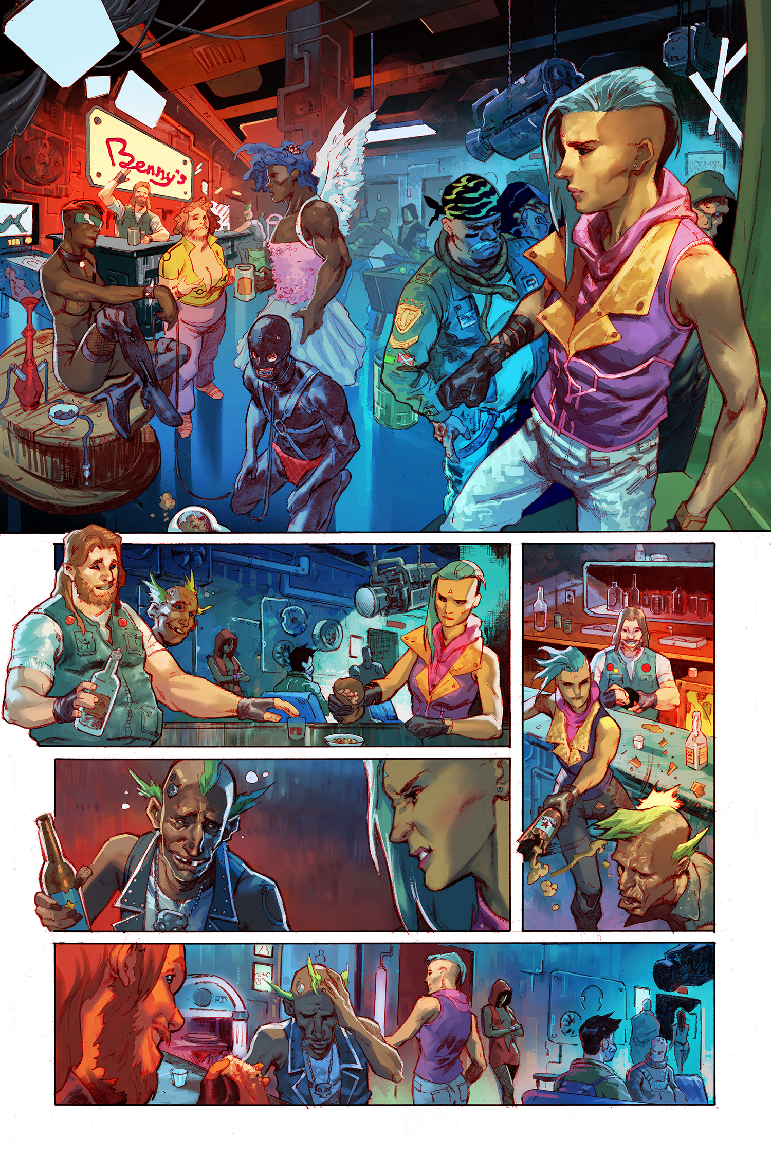
Lu: As we move into colors on this book, the first thing we see are these flats. Because this scene is as bombastic and intense as it is, there’s so much work that needs to be done at this stage already. But with that said, how much of an idea did you have of how you wanted the final page to look at this stage of the process?
Fajardo Jr.: My wife’s doing the flatting for me. While she’s doing that, I’m gathering some references on the internet for me to have an initial idea of what the page should look like. Actually, I already had an idea for this page. I remember when I first saw Akira when I was a kid. I wanted it to look like Neo Tokyo. Lots of lights and full of vibrancy.
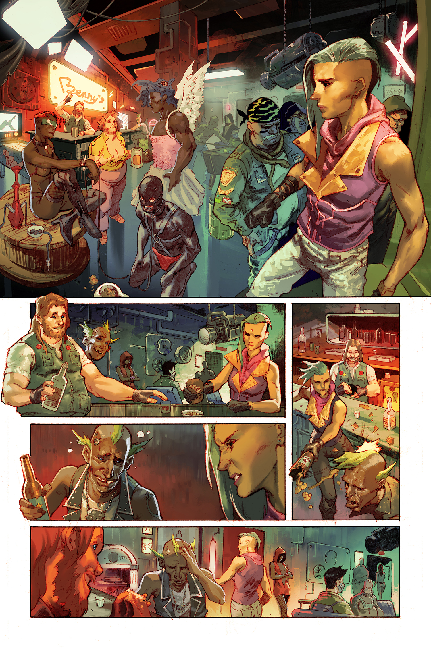
Lu: As we move forward from the flats, we see you adding light and shadow, working out the mood of the page. Can you talk us through the process here and what you’re doing as you move from image 2 to image 3 and then to image 4, where the values seem to extend further and the page as a whole seems to get warmer?
Fajardo Jr.: I really want the readers to look at where the story would go. So I put a lot of warm color on different places like the bar, and emphasis on Thirteen as she is the focus of this story.
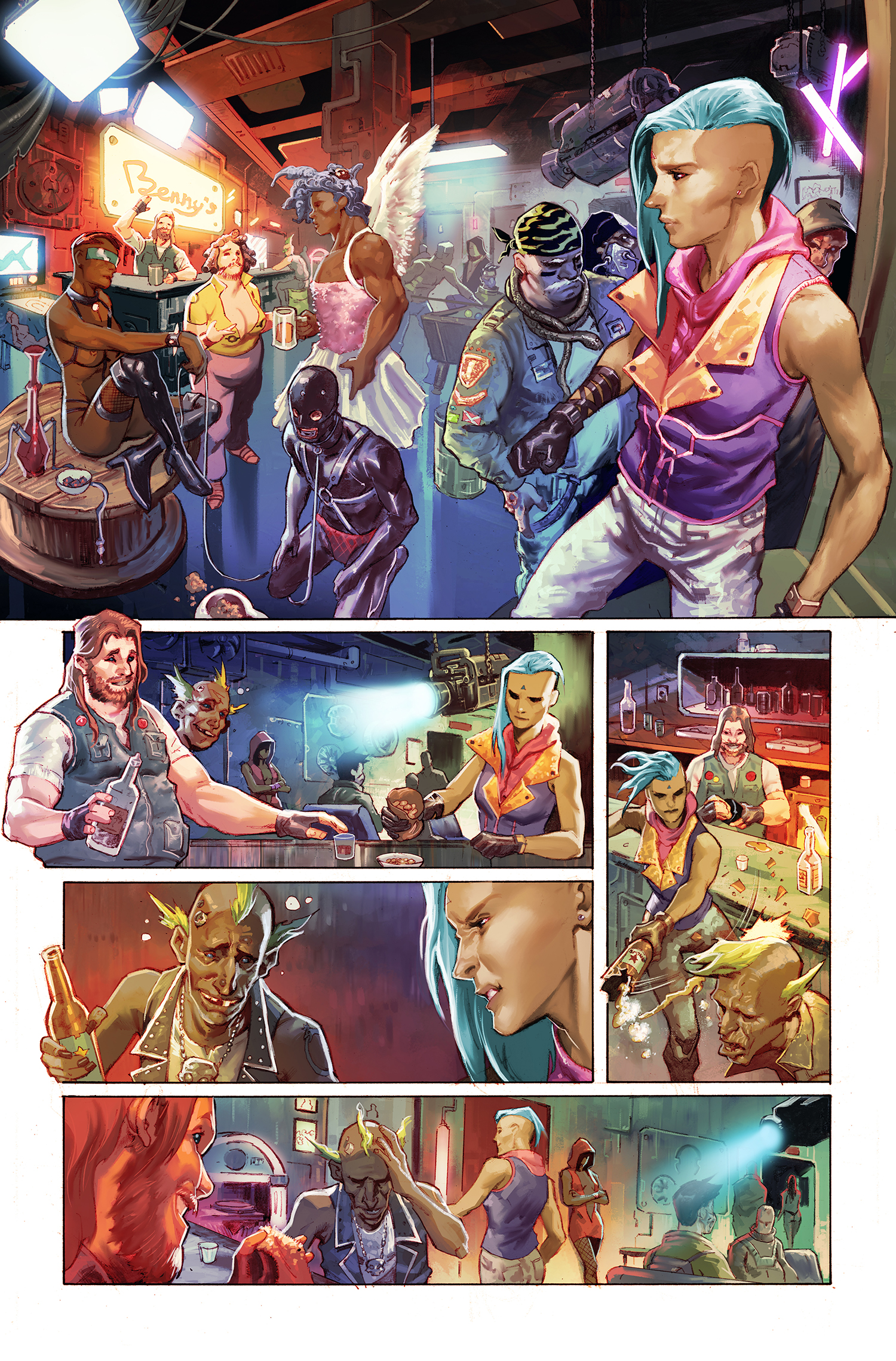
Lu: By the end of all this, we have a very vibrant page! What feelings did you want to invoke in the reader through your use of color in this scene?
Fajardo Jr.: After I finished rendering the page (image 4), It felt lifeless and it didn’t feel like what I had initially thought.
So what I did is I added a few adjustment layers and popped the characters more to make it look it like the Neo Tokyo I envisioned.
The Letters
Lu: Nate, when you approach lettering a page—especially one that’s both as crowded as this one is and simultaneously pivotal to the story itself, how do you figure out where the words should go on the page? A lot of trial and error or perhaps a strong intuition built up from your experiences?
Nate Piekos: Editor Andy (Khouri) likes to provide what are called, “placements,” which are a quick, hand drawn idea of where balloons and sound effects could go. I take those into consideration, and make sure that the reading order is the best, and clearest it can possibly be. That’s paramount. Then, it’s about what looks best design-wise, and a lot of that depends on the style guide I’ve cooked up for a particular book. In this case, the odd-shaped balloons without outlines. This project has a very painterly style of art, so part of my job is make the lettering mesh as much as possible.
Lu: Looking over the lettered versus the unlettered artwork, it seems like Barnaby introduces the hooded figure who helps find Thirteen work in panel two of this page, but her lurking figure there ultimately becomes partially obscured by the lettering. We get to see more of her lurking form in panel 5. Obviously at this point of the story, her character isn’t supposed to draw too much attention, but because she does become important on the next page, the lettering here changes the visual storytelling of this scene a little bit. What factors do you take into consideration when making lettering choices like this one?
A lot of the time, ultimately, it’s about how much space you have to fit lettering on a page. The hooded figure appeared a few times in backgrounds on this page, so I made an executive decision to cover her there and use that negative space between the characters in the foreground to fit lettering. I also kind of liked the fact that the balloon only covers part of her head…making her seem less important, as if to say, “nothing to see here…”


This was a really terrific article, thank you.
Thanks for doing this! I really enjoyed reading it – hope you can do it for a few more series in the future!
Comments are closed.