A piece at business site Fast Company has unveiled the new DC logo — and yeah, it’s been chosen because it can be animated and — probably — make a sound. John Rood and Amit Desai, senior vice president of franchise management, roll out the new malleable, adaptable, interactive logo:
Thus the dowdy grey gosling has been revealed to be a firebird of infinite potential — necessary, Rood says, because DC’s characters must now be branded beyond their core demo.
The “DC” logo reads as a “D”-shaped page that pulls back to reveal a “C” that could either be an obvious letter or infused with elements of a property or character. Digital devices (computers, tablets, smartphones, touch-screen displays, gaming consoles) will enable users to peel back the “D” to expose a character, image, or story. The “C” can be customized to the colors and qualities of the property it’s promoting: silver and gray for the corporation, blue for DC Comics, or–as suggested by the graphic below–sparks for The Flash, green for Green Lantern, or a mist for Batman. All are unified by a common font–the serendipitously named Gotham Bold.
The logo’s adaptability will facilitate a fresh and innovative way to reflect ongoing corporate and creative initiatives. “The peel element can tie back to the storytelling content or character we’re showcasing, and leverage those colors,“ says Desai. “The ‘C’ can be a vessel to showcase stories and character. It’s unexpected, requires a little thnking and some storytelling behind that mark.”
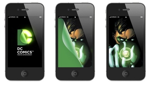
Tellingly — the outlet used to showcase the new logo is not a comic book but an iPhone:
Is there anything this logo cannot do? Maybe tell transmedia stories or create a motion comic.
The new logo will appear on comics starting in March.

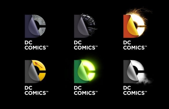





Seems a much more interesting logo once it’s been customized…
DC, thanks for providing plenty of material for my logo design class. Like the “gap” logo fiasco I have another example of what not to do.
The Watchmen/DC logo is hilarious. No doubt the sequels are coming then.
The customization aspect is cool, but “D” still looks less like turning a page and more like a logo for a sticker company…
Prequels, Gary, prequels.
A mist for Batman?
I thought the blue steel one was Superman because he is blue and the man of steel.
I thought the black rubber fetish looking one was Batman because he is a man in black rubber fetish suit.
And they all look awful unless your company makes tools and hardware to be sold exclusively at Dollar General.
Even when shown alongside these (well-executed) super-heroic “C’s,” that page-turning element, to me, still doesn’t read like a page or a reveal. The treatment makes it look heavy, wet, rubbery…flaccid…like a vinyl sheet and not a comic book cover.
It also looks like someone discovered a new trick in Photoshop and decided to craft an entire identity around it.
I pine for Milton Glaser’s “bullet” logo!
Even MORE dependence on illustrative elements to carry the mark. I am not anti-illustration (it’s half the work I do), but it still feels like this whole mark system is based on a trendy/current style, and will look dated very soon. I even think I would object less if the “peel” was more like the opening of a page rather than the peel of vinyl or rubber.
That looked dated in about 1987.
“…It’s unexpected, requires a little thnking (sic) and some storytelling behind that mark.”
Yes, it’s all that, alright. But in print, which is where a lot of ‘DC Comics’ sales still occur, this new branding still looks like a grey tongue with a ‘C’ behind it.
I actually like it! Silly me!
“Is there anything this logo cannot do? Maybe tell transmedia stories or create a motion comic.”
Maybe be legible and distinctive? Nah …