

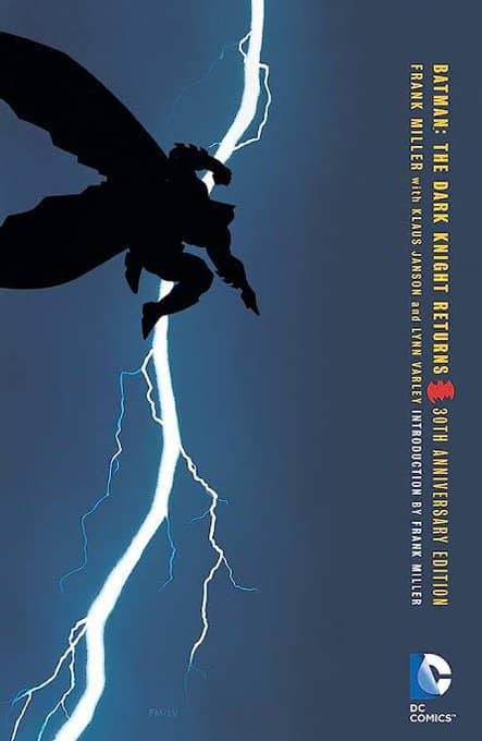
Frank Miller’s cover for The Dark Knight Returns #1 is one of the best known, most iconic covers in comic book history. But everything you knew about it is wrong.
It started with a tweet from Mark Ferguson comparing the cover to the famous “black or gold dress” optical illusion. Is Batman facing frontwards or backwards?
This is this years is the dress black or gold then.
Is Frank Miller’s Batman front or back facing?
(My preference is front facing, but it does work both ways.) pic.twitter.com/ahgkJBOmmV
— Matt Ferguson (@Cakes_Comics) November 28, 2023
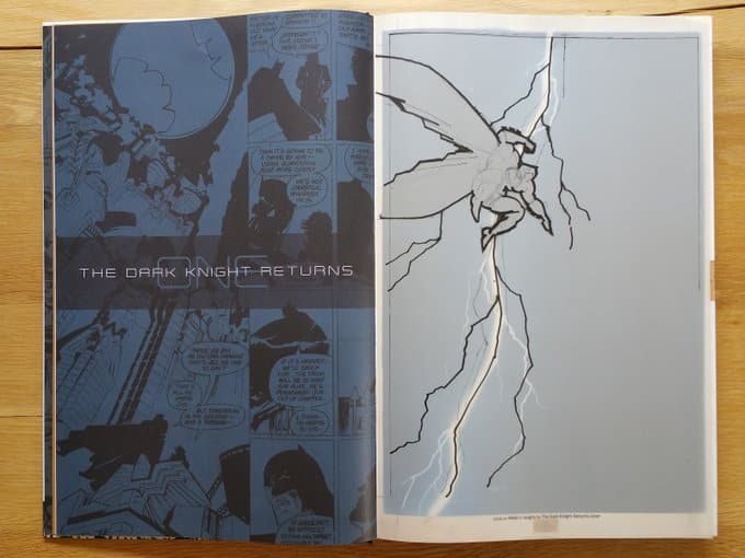
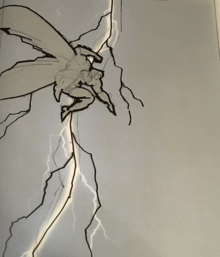
Most people have assumed he was leaping away from the viewer. But in a stunning twist, DC’s Gallery Edition includes the original sketch for the cover…and Batman is clearly drawn jumping towards the reader!
This led to great philosophical pondering on Twixxer:
https://twitter.com/KrakenKaptain/status/1729438625807397030
As you can see, it is a total optical illusion and and can be viewed either way!
Perhaps the interpretation of Batman leaping away from the reader – and into the lightning – is somehow more appropriate for the tone of the book, which upended our ideas of not just Batman but superhero stories themselves and ushered in the grim and gritty era that (let’s be honest) lives on to this day. A bold leap into the unknown.
Or you could argue that Batman leaping AT you was more appropriate for the tone of the book, a freight train of vengeance coming right for you. The symbolism works either way, too.
The cover pose has been referenced in film (Batman v Superman) and animation, which went with the leaping away version:
Question: Does anyone picture it as front facing in the animated movie? It's still a silhouette, but I think the motion leans more towards back facing pic.twitter.com/zWLO8YODoV
— Chris Wells (@ChrisWells4571) November 28, 2023
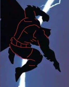
I’d throw in here that Frank Miller, like many artists, isn’t in his comfort zone when drawing feet. I couldn’t find an image of it but there’s a drawing in the original Ronin (I think) where he put the big toes on the wrong side of the feet. You can find plenty of other examples.
In this case the emotion of the drawing is what draws attention and feels right, no matter what the draftsmanship issues. Many comics pros weighed in with their own wonderment:
I’ve never thought of it any way but back facing, but now looking at it through a front facing lens, that would be a VERY Frank Miller pose!
World = Rocked https://t.co/nMTrN3btLZ
— Mitch Gerads (@MitchGerads) November 28, 2023
There was also this cynical take:
and what's worse is you just know by tomorrow some godawful clickbait site will have dragged a whole pointless article out of this…
"Comic book fans STUNNED when they realise…" blah blah blah…
— SteelBookBluRay (@SteelBookBluRay) November 28, 2023
But I make no apologies! Twitter is a steaming garbage heap that might be gone on Thursday. But I am the Blogger, and I bear witness.
Whether Miller consciously meant it as an optical illusion or not, I will leave his next interviewer to discuss. Perhaps it’s the very ambiguity of the pose that has made the cover so iconic and memorable. The mind tends to gloss over things that are simple, but images that disturb our understanding of the world tend to linger. Just another reason comics are great.


ill be Batman Damned
Even with the lines filled in it doesn’t look right front-facing.
Slow news day, Heidi?
Made ya click
Wait, am I the only one who thought it was front facing? It always looked like he was attacking with the lightning at his back like in horror movies.
I always thought he was jumping sideways. (BTW, why are people still using that awful service that used to be known as Twitter?)
Of course he’s front facing. Why was there any doubt about it? Why would would. An artist depict the back of a character on the cover moving away for no contextual reason, that makes zero sense.
Comments are closed.