

This week’s main reviews are a pair of barbarian comics: Barbaric – Wrong Kind of Righteous #1 and Conan The Barbarian #5. Plus, the Wednesday Comics Team has its usual rundown of the new #1s, finales and other notable issues from non-Big 2 publishers, all of which you can find below … enjoy!
 Barbaric: Wrong Kind of Righteous
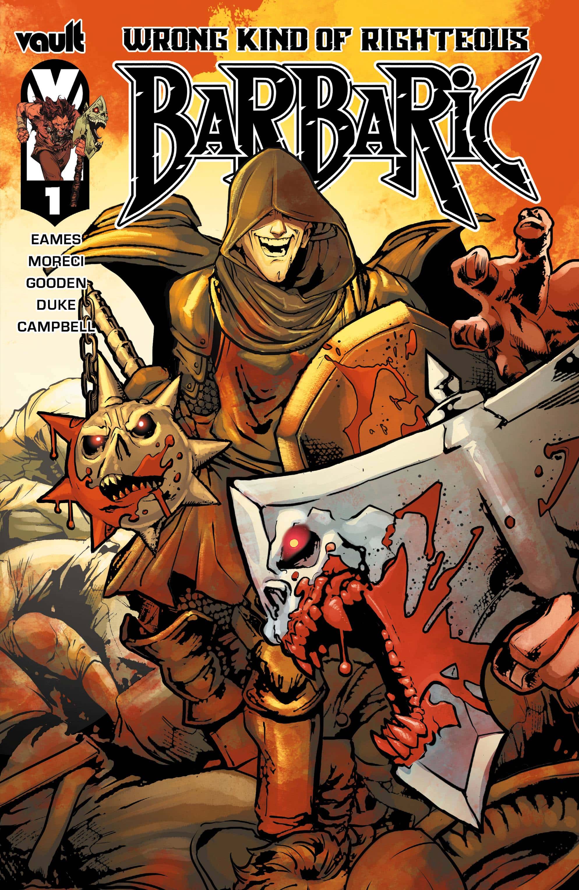
Writers: Nicholas Eames and Michael Moreci
Artist: Nathan Gooden
Colorist: Addison Duke
Letterer: Jim Campbell
Publisher: Vault Comics
Review by Zack Quaintance
This week’s one-shot story, Barbaric: Wrong Kind of Righteous, is not only a great (mostly) standalone tale, it also opens up new possibilities for Barbaric comics moving forward. Not that Barbaric really needed that. Barbaric is a true smash hit original series, a rare indie comics success story in today’s harsh and unforgiving market. But it’s still exciting to see new concepts that buildout the world.
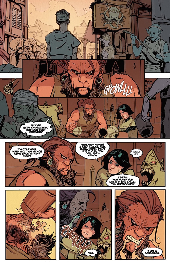
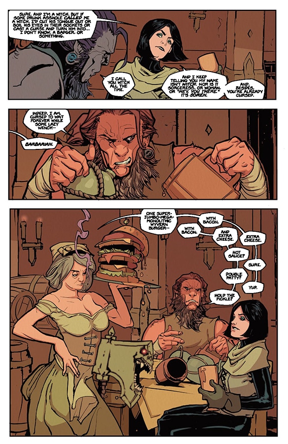
This gritty fantasy book is built on a concept that’s so good, you can’t believe you haven’t seen it before. Main character Owen is a barbarian who has a talking axe, and that axe enjoys (I mean, really truly deeply enjoys) getting drunk on the blood of enemies who deserve to die. The axe is very vocal about this, hiccupping his way through blood benders in most issues. This is a concept that has also found an audience and started to give rise to seasonal miniseries (think Hellboy, in terms of the publishing model).
With Barbaric: Wrong Kind of Righteous, though, we see something so clever, that it seems likely to become a staple of this world moving forward. In this one-shot, Owen and his ax come up against a paladin…who wields a talking flail. For the first time since the series debuted in June 2021 (giving rise now to three full volumes and a tangential mini), Ax encounters another talking weapon.
Which, perfect.
There’s a number ways that the creative team could have played this. This one-shot features the usual series creative team (writer Michael Moreci, artist Nathan Gooden, colorist Addison Duke, and letterer Jim Campbell) just joined by fantasy writer Nicholas Eames. They could have made the flail one-up ax, or overwhelm him, or just generally be a villainous foil. But they go a more interesting route than that. Flail is a foil to Ax because it has an opposite reaction to the killing that its master is doing. Whereas Ax relishes Owen’s violence, Flail is a reluctant and vocally resentful participant. It’s darkly funny to watch him careen into his foes, smash them, and hate it. I’m chuckling about it as I type this.
To get back to my first point, though, I feel like the idea here is so good that we’re going to see more of it. There’s definitely an argument to be made for restraint (and I’ve praised this series in the past for being restrained, as much as it can be with a drunken talking ax, anyway), but I think Barbaric: Wrong Kind of Righteous may open up more stories with more talking weapons with other, clever personality twists. And as a fan of Barbaric from the start, that’s exciting.
Verdict: STRONG BUY
 Conan The Barbarian #5
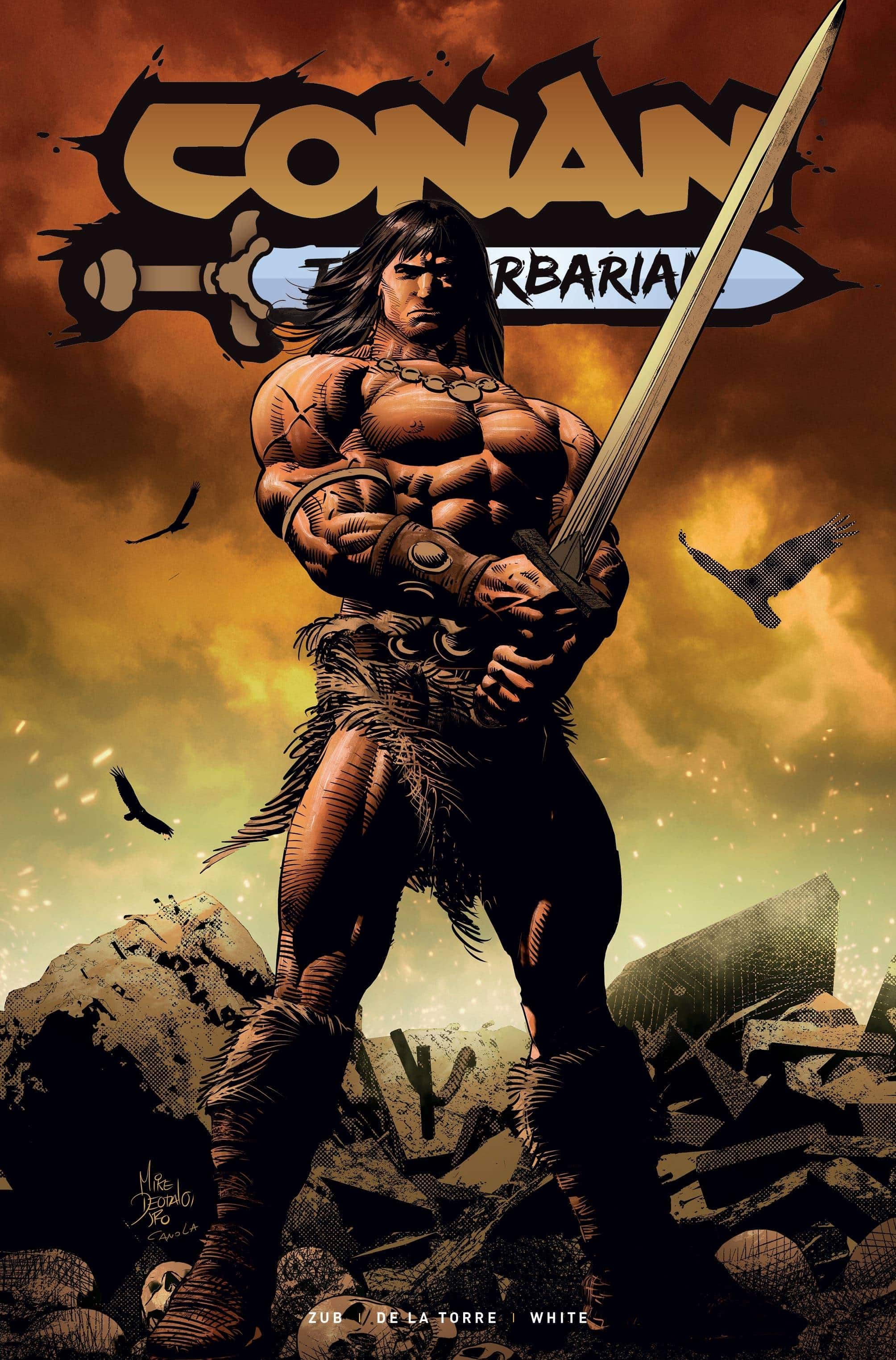
Writer: Jim Zub
Artist: Doug Braithwaite
Colorist: Diego Rodriguez
Letterer: Richard Starkings
Publisher: Titan Comics
Review by Jordan Jennings
Jim Zub’s run on Conan the Barbarian continues in Conan The Barbarian #5. This issue begins a new arc for the Cimmerian as he continues to travel the land looking to find something more. Something that can fill that void in his body and spirit.
While Conan is busy getting to the bottom of every cup of ale that he can get his hands on when he is enlisted for a couple heists. While Conan is not much of a sneak, he is quite heavy, and the thief’s guild knows how to use him well. Conan and the crew are enlisted to steal from the Temple of Thieves and things are not what they seem.
Zub utilizes an omnipotent narrator to help move the story and provide insight into the mind of Conan. The narrator invokes Conan’s literary past and helps enforce the pulpy “Swords and Sandals” nature of the story. I love this vibe from the comic, and it just scratches that itch. Additionally, like all good barbarian comics Conan is more than just smashing skulls, we get treated to a heist story that is a delight and interesting to see unfolding. Zub’s characterization of Conan is equal parts violent and reserved. He presents Conan as someone whose mind is always troubled and who seeks to find some sort of peace.
The art by Doug Braithwaite and colors by Diego Rodriguez goes a long way to provide that pulpy vibe. The figure work is dynamic and full of weight. Everyone feels like a Franzetta novel cover, and I love that. Braithwaite employs a dynamic pacing by mixing up the layouts and does some interesting things with page composition that is a delight to read. The earth-tone color palate by Rodriguez gives the comic this gritty feel but the comic does not get lost in murky colors or shadows. Everything is clean and easy to follow in both action and suspense.
This is the first issue for Braithwaite and Roriguez, and while their styles are not one-to-one with the prior art team, Rob De La Torre and Dean White, they fit the overall tone and provide a cohesive fit with the overall direction of the series. This will work nicely when the story is collected in larger formats.
I would be remised to not mention Richard Starkings letters. An industry staple, Starkings is no stranger to lettering a comic and yet he manages to find new ways to meet the tone and energy of the story. The letters have an old school feeling but are still easy to read and guide the reader through the pages with great ease.
Overall, Conan the Barbarian #5 is a great comic for fans of the Conan or genre. Even more so, it is a great jumping on point for Titan’s Conan. If you missed out on the series and want to check it out, this is an excellent place to start.
Wednesday Comics Reviews
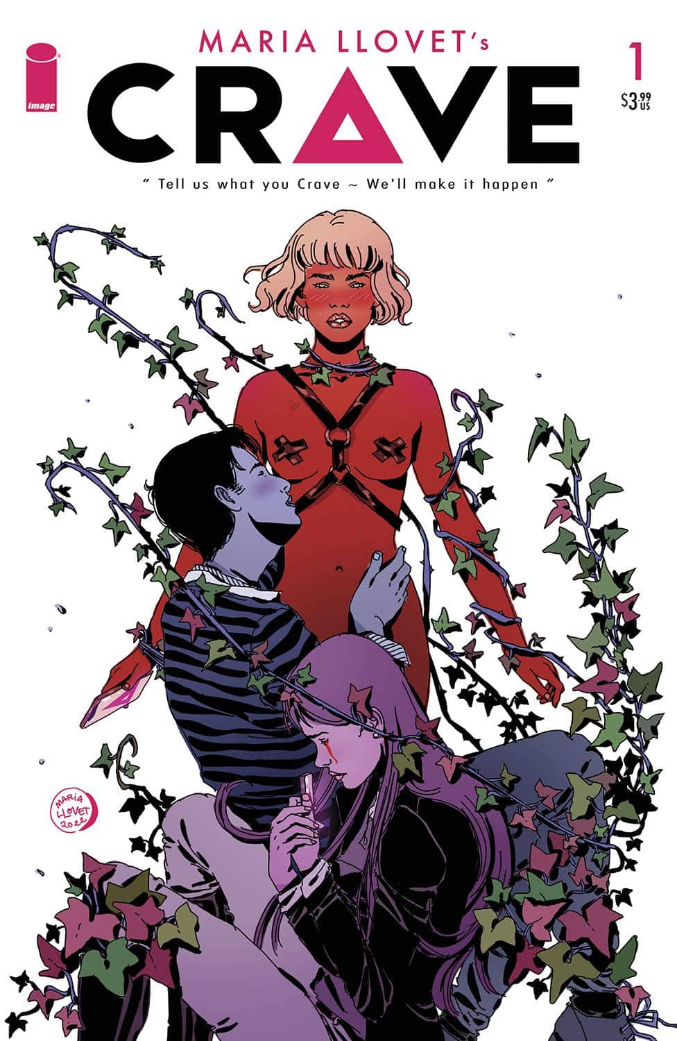
- Crave #1 (Image Comics): Crave is both the title of the story and the app that helps people satisfy their “cravings”, quickly becoming the craze of a university campus. People tell the app what they want, who they want and the app identifies the probability and the steps one would need to take to get what they crave. Amidst the debauchery of these university students, there are some interesting questions and discussions about social media and how our data is utilized; all the while people are being presented data on how to get with the person(s) they desire. This, paired with the criticism of data theft and how it functions with social media, paints a picture of how people are reaching their desires. This is certainly applicable to our everyday lives and how there’s practically no app that isn’t utilizing our data in unforeseen ways, or selling us ads with every swipe. There’s the messiness of breakups coupled with the desire to try something new. It speaks to the nature of the desires that we keep suppressed, even the reality of settling and the people left in the wake of those desires. From moment to moment there’s an interplay between wide shots and closer, much more intimate panels, priming the reader for the use of the app and illustrating the gratification that comes as a result. From lips to steamy makeouts, there’s an inference, an implication of desire. Writer, artist, and letterer Maria Llovet does it all in this book and has such a clear voice both narratively and visually. The art is distinctive, using a sort of verticality in how the panels are set up, the way that the colors aren’t trying to be neat within the lines along with the loose nature of the linework itself, almost feeling like contour. Llovet gets across a mood of desire and that of these college students’ being swept up in all of it, throwing caution to the wind in the pursuit of their pleasures. Crave #1 is a fantastic first outing full of tension, rejection, and the looming cautionary tale around the ethics of social media and how our data is disseminated and is well worth the read if you’re looking for something a little risque. —Khalid Johnson
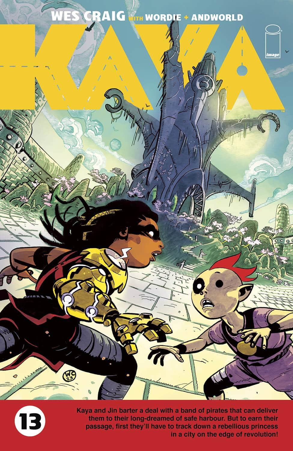
- Kaya #13 (Image Comics): For those about to gallivant, Kaya #13 is one of those jump-on points oft spoke of and fraught with less connective tissue to previous installments, but enough meat and bone to sail you, dear reader, directly into its new arc, Kaya and the Temple of Shazir. Artist/writer/designer Wes Craig promised pirates, a rebel princess, and a city nearing revolt, which we will no doubt get to in this arc. But in Kaya #13, there’s a booby trapped pirate labyrinth and less pirates than advertised; similarly, no princess, no city…yet. While Craig spends the majority of the issue pulling in new readers with a short sewer adventure, the pacing is rushed after the action with most of the narrative dropped into two pages before sending us quick as possible to the real show on a cliffhanger. Such pacing troubles can make or break other series, but Kaya relies heavily on Craig’s excellent visual pacing and always lush, sometimes turgid environments. For me, Craig’s inks have leaned harder and harder into inkwash rendering that brings volume to already voluminous form. Without these watercolor strokes rounding out sanded edges and colorist Jason Wordie’s color choices, the world of Kaya could feel empty with so much existing in negative space outside of splash pages. This can be felt mostly in a dialogue scene where the background detail drops, and Wordie paints mood into a colorful wind setting the arc’s tone in this prologue. AW’s Tom Napolitano had a helluva task fitting Kaya’s wide sans-serifed font into these empty gutter captions that have followed Craig’s layouts for almost a decade now, but fit them he did! Personally, I’m not a fan of inflating the font size for exposition even if the character is bombastic, but especially so in an infodump scene! So for those about to join the Kayavan with #13, you’ve been warned or welcomed; whichever you choose. —Beau Q.
The Prog Report
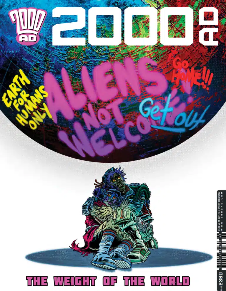
 2000AD Prog 2360 (Rebellion Publishing): Lots of new beginnings in this week’s Prog, including a new Judge Dredd lead starring a rigid robot judge called The Clanker (by writer Ken Niemand, artist Nick Dyer, colorist John Charles, and letterer Annie Parkhouse), and the return of a favorite of mine for a new arc, Enemy Earth (by writer Cavan Scott, artist Luke Horsman, and letterer Simon Bowland). Both of these were great. Clanker is a fun (“fun”) character, a robotic extension of everything that makes the judges interesting…being put into conflict with the judges. And Enemy Earth is a blast. I especially enjoy Horsman’s art, which is maximalistly-kinetic and cheeky and just all around great. It all adds up to a Prog that makes for a good jumping on point. As always, you can nab a copy of this week’s Prog here. —Zack Quaintance
Read more entries in the Wednesday Comics reviews series!


