Granted, most of Pantone’s colors do not work well with CMYK or RBG systems (Pantone uses 14 different pigments), so the following is an approximation with little concern for hue, colorfulness, chroma, saturation, lightness, and brightness. I’m not a professional, and besides, I’m typing this on a laptop where the color can change just by tilting the screen. Your eyesight may vary. I did copy the hex colors from their HTML, so you can see an approximation. If you’re a hero or villain, you are always welcome to consult with Pantone on your distinct color(s). That’s what the Minions did.
Here are Pantone’s descriptions, paired with a comics character:
A Unisex Palette
Colors this season transcend cultural and gender norms. Vivid brights give way to excitement and optimism, though quiet stability prevails in this season’s palette. For Spring 2016 there are truly no perceivable distinctions in color choices between the men’s and women’s collections, both of which focus on a desire to breathe and reflect, then play.
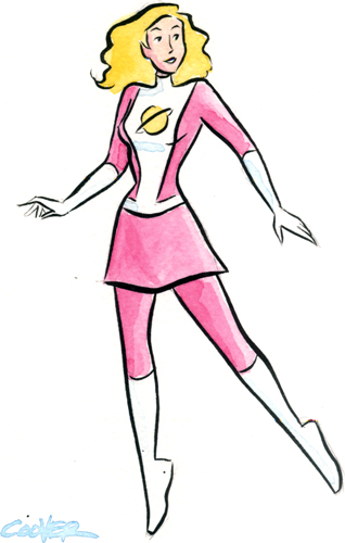
Saturn Girl, by Colleen Coover
The soothing, calming nature of colors in the Spring collections are led by Rose Quartz, a persuasive yet gentle tone that conveys compassion and a sense of composure. Like a serene sunset, flushed cheek or budding flower, Rose Quartz reminds us to reflect on our surroundings during the busy but lighthearted spring and summer months.
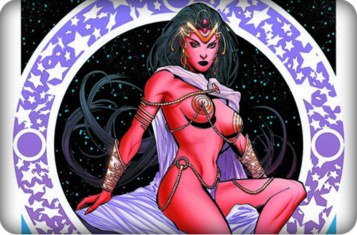
Dejah Thoris, by Lui Antonio
The fashion and design communities, and consequently, consumers, have been in love with orange for several seasons. Coming to the fore this Spring is Peach Echo, a shade that emanates friendlier qualities, evoking warmth and accessibility. It is an all-encompassing, tempered companion in the playful orange family.
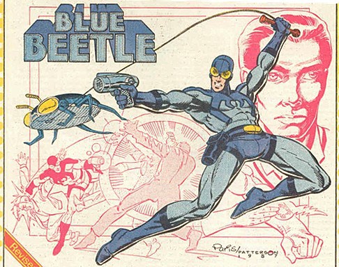
Blue Beetle by Paris Cullins and Bruce D. Patterson
Weightless and airy, like the expanse of the blue sky above us, Serenity comforts with a calming effect, bringing a feeling of respite even in turbulent times. A transcendent blue, Serenity provides us with a naturally connected sense of space.
A maritime-inspired blue, Snorkel Blue plays in the navy family, but with a happier, more energetic context. The name alone implies a relaxing vacation and encourages escape. It is striking yet still, with lots of activity bursting from its undertones.
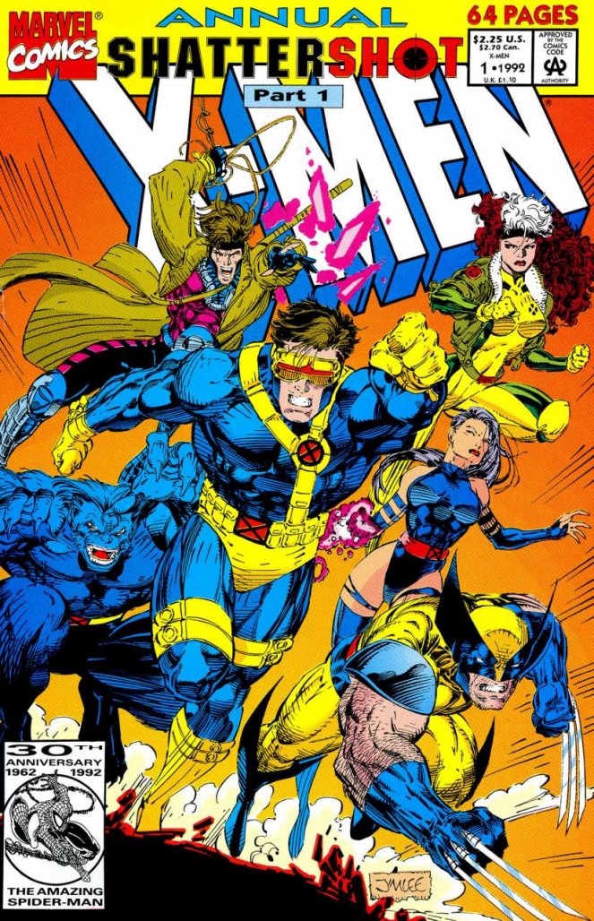
X-Men by Jim Lee
While the majority of the Spring/Summer palette trends toward calmness, a few diversions from the theme emerge that offer a contrast. With Buttercup, designers reveal a shining beacon transporting its wearer to a happier, sunnier place.
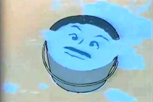
Zan by Hanna-Barbera
A shade of aqua that leans toward the green family, Limpet Shell is clear, clean and defined. Suggestive of clarity and freshness, its crisp and modern influences evoke a deliberate, mindful tranquility.
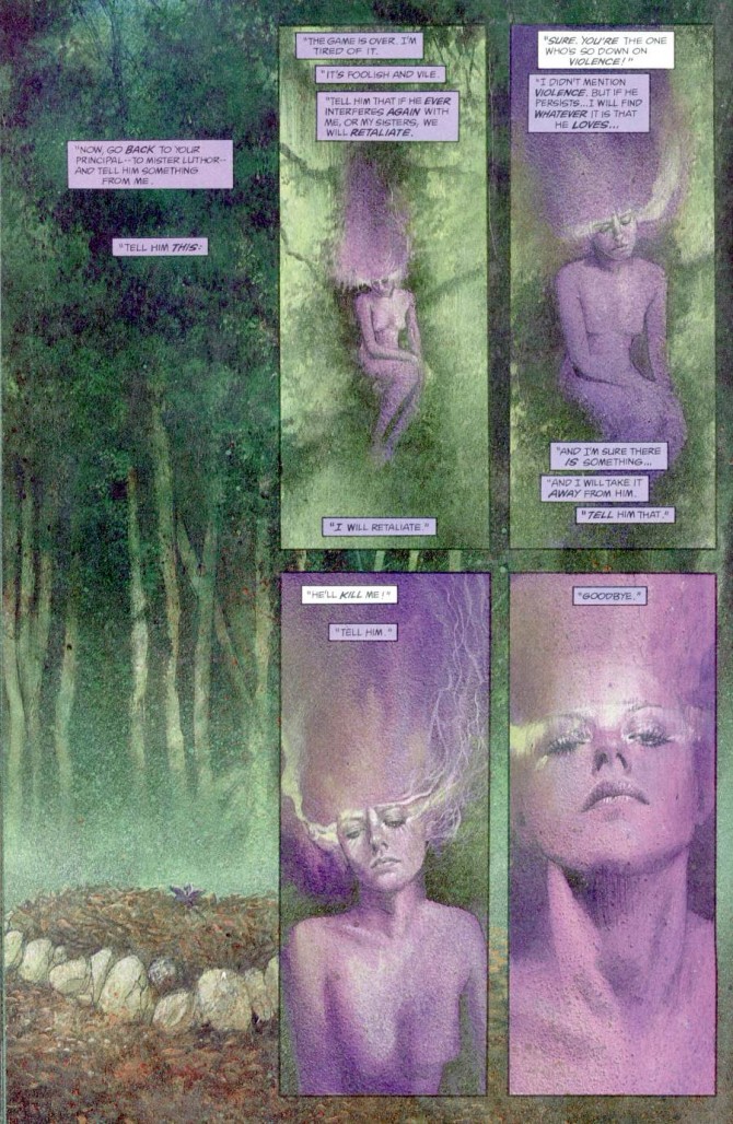
Black Orchid by Dave McKean
As in most any season, the need for neutrals arises. Essentially a basic, the subtlety of the lilac undertone in, Lilac Gray, adds a distinctive edge to this classic gray shade.
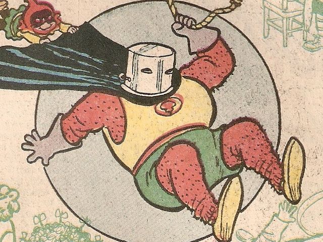
The Red Tornado by Sheldon Mayer
The high energy Fiestais a harbinger of excitement, encouraging free-spirited exploration to unknown but welcoming locales. A strong and fiery, yellow-based red, the vivid Fiesta provides a stark contrast to the calming, softer nature of this season’s palette.
Keemia Alvarado by Javier Pulido
A transitional color that will take us through the seasons, Iced Coffee manifests as another strong neutral for the season. With its natural earthy quality, the softness and subtlety of Iced Coffee creates a stable foundation when combined with the rest of this season’s palette.
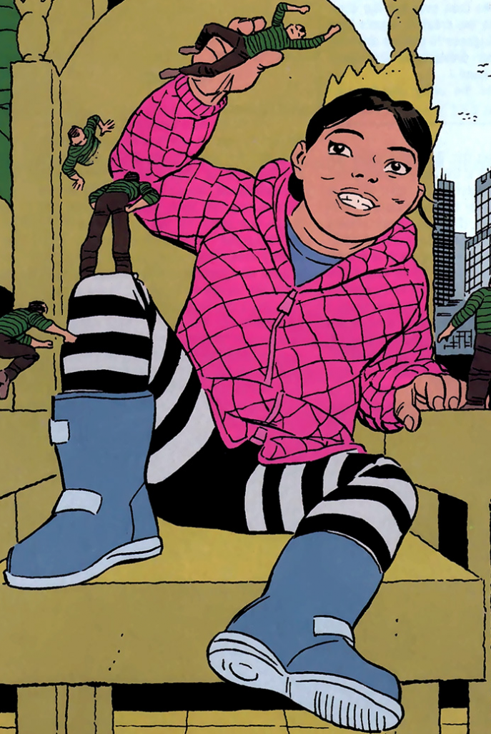
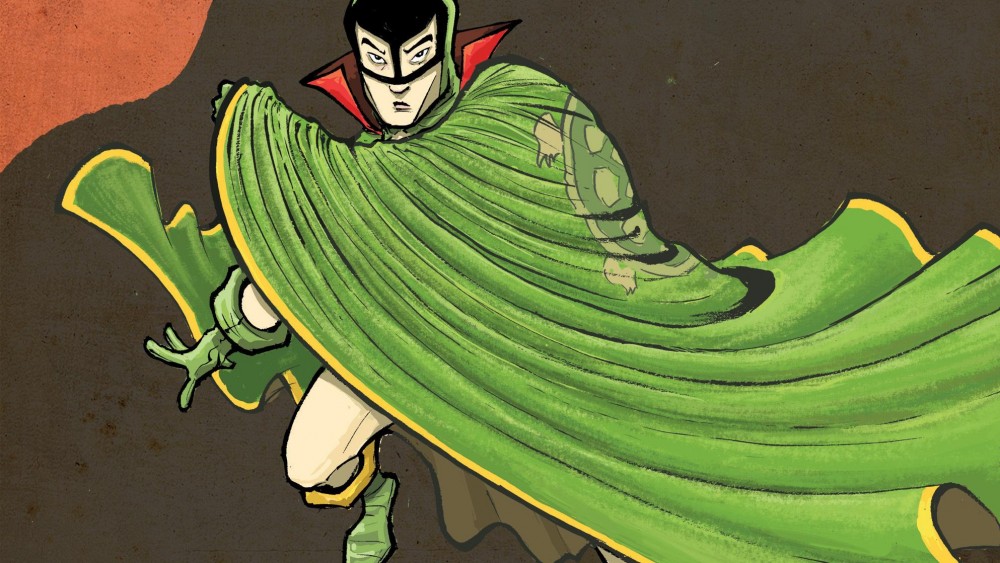
The Green Turtle by Sonny Liew
Green Flash calls on its wearer to explore, push the envelope and escape the mundane, radiating an openness that combines with the rest of the palette in unexpected but serendipitous ways. The popularity of this brilliant hue is representative of nature’s persistent influence even in urban environments, a trend continuing to inspire designers.


