

This is the third season of a column that judges a book by its cover. Catch up on the current season here, or view the complete archive.
I’ve been writing about covers the week after release, because it’s easier to spot last-minute changes, but I was curious if people would rather I wrote about them the Wednesday of release. So I ran a poll on Twitter, and the results indicated the latter (by quite a large margin).
So this is an EXTRA edition of By Its Cover, allowing me to catch up without skipping a week of covers.
This edition is also special because DC Comics just sent me next week’s variants — featuring their new variant cover trade dress — for me to obsessively analyze like I do. The very first minimal-text variant snuck out last week, and I wrote about it here. But the layout has already changed a little bit since then.
Most noticeably, the “80 Years” stamp is out and the DC logo is in. This is a fair trade-off, since the transparent logo is much quieter than the stamp. I like the design inside the stamp, but the stamp itself was so loud, it was like having an extra barcode box. And plenty of textless album covers had the label’s logo in the corner, so why not.
The other, more subtle change is that the title and credits are now centered instead of aligned right. Sometimes it’s centered between the barcode and the right edge, other times it’s centered between the barcode and the artist’s signature.
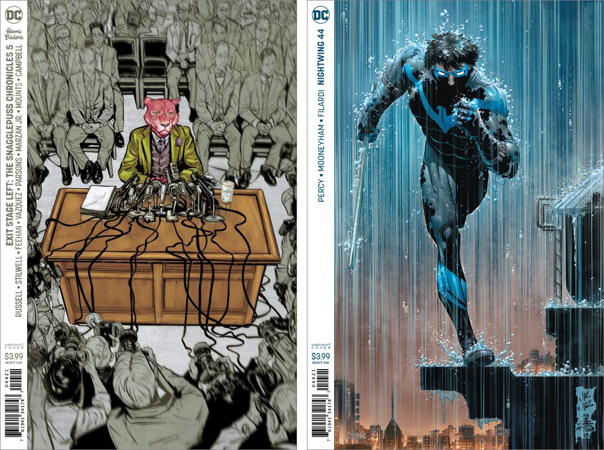
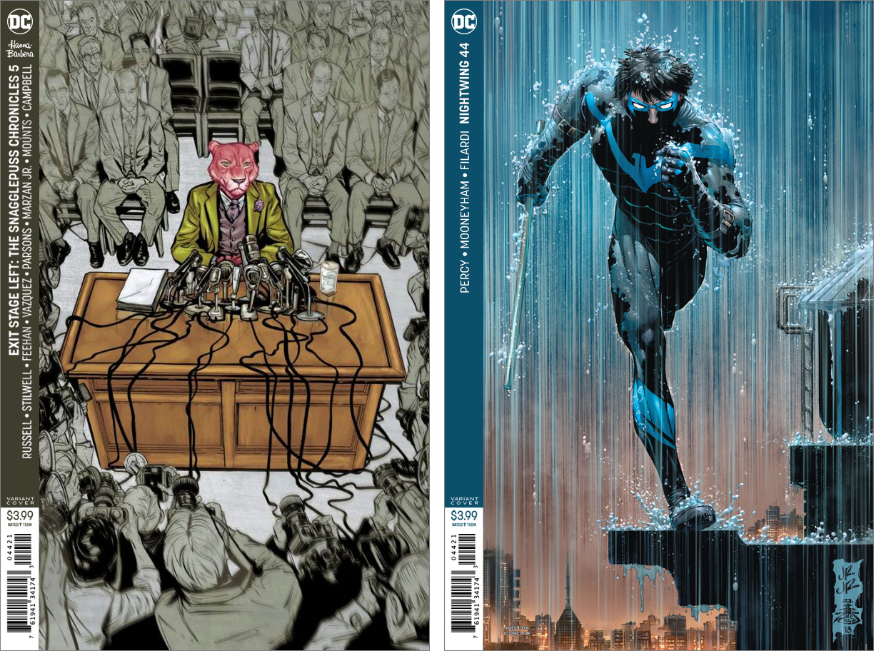
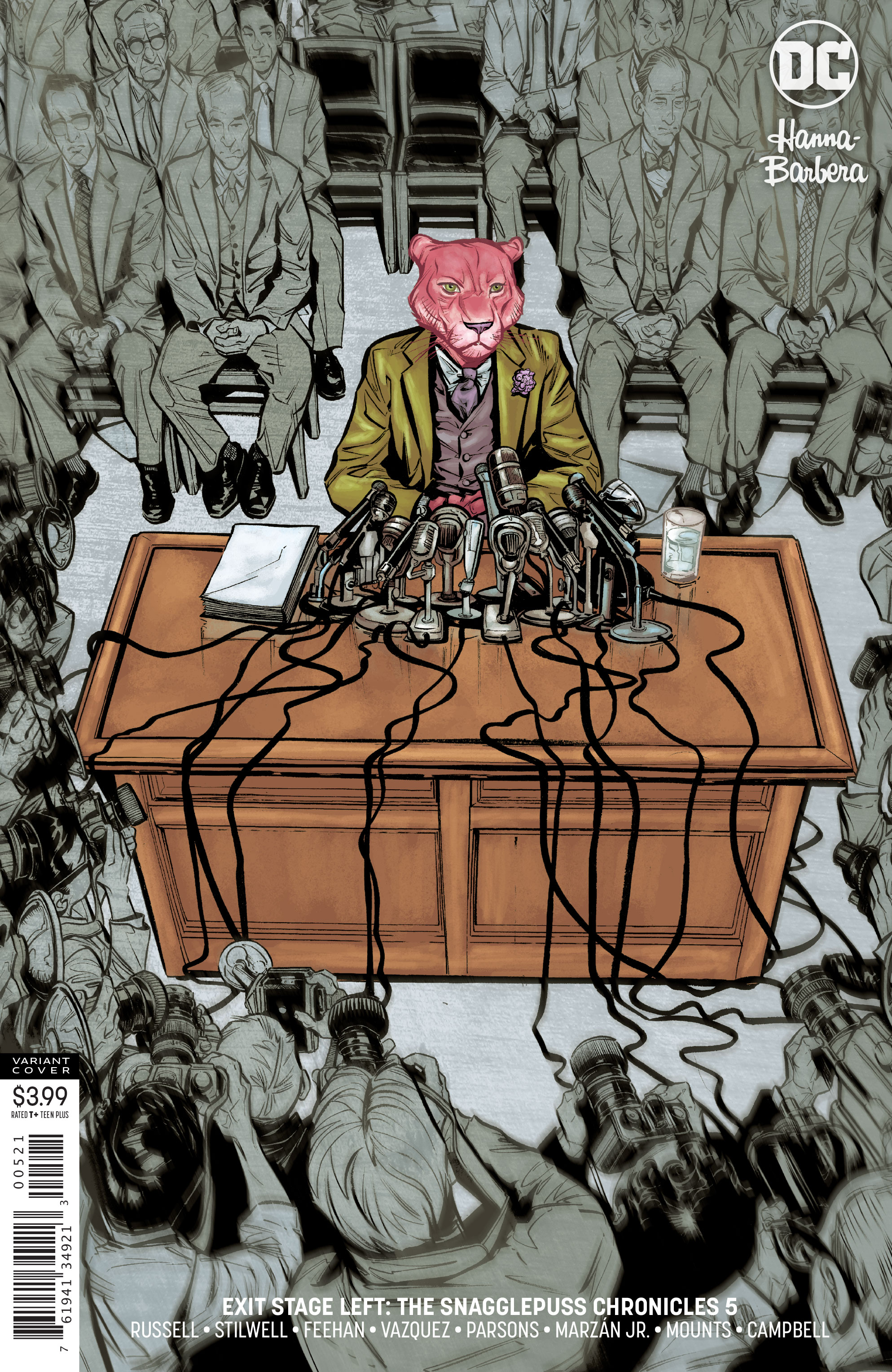 EXIT STAGE LEFT: THE SNAGGLEPUSS CHRONICLE #4 by Joëlle Jones.
Joëlle Jones’ cover is my favorite of the bunch. Coloring the surrounding characters in gray does a perfect job of placing the focus on Snagglepuss, and the centered composition looks very album cover-esque.
This batch of covers normally has the logo on the left unless the art needs it on the right, but I can’t figure out why it’s on the right in this one. Not that it’s a big deal, it’s just the sort of thing I think about.
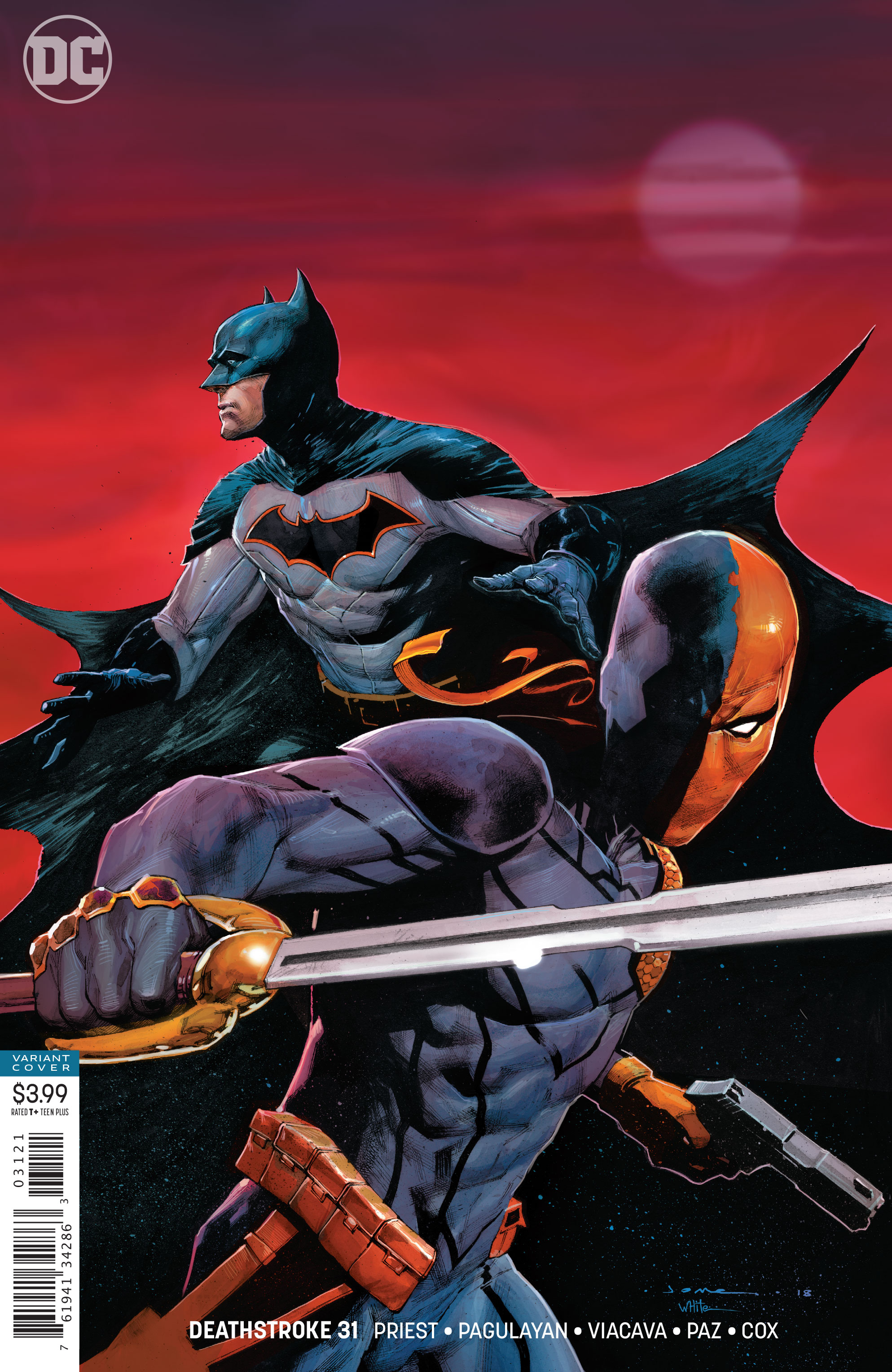 DEATHSTROKE #31 by Jerome Opena
Jerome Opena’s illustration is really well drawn, but the big empty space in the upper 1/3 suggests it might’ve been designed as a with-text cover. It just feels like something’s missing, which is also why I don’t critique the pre-logo images from solicitations.
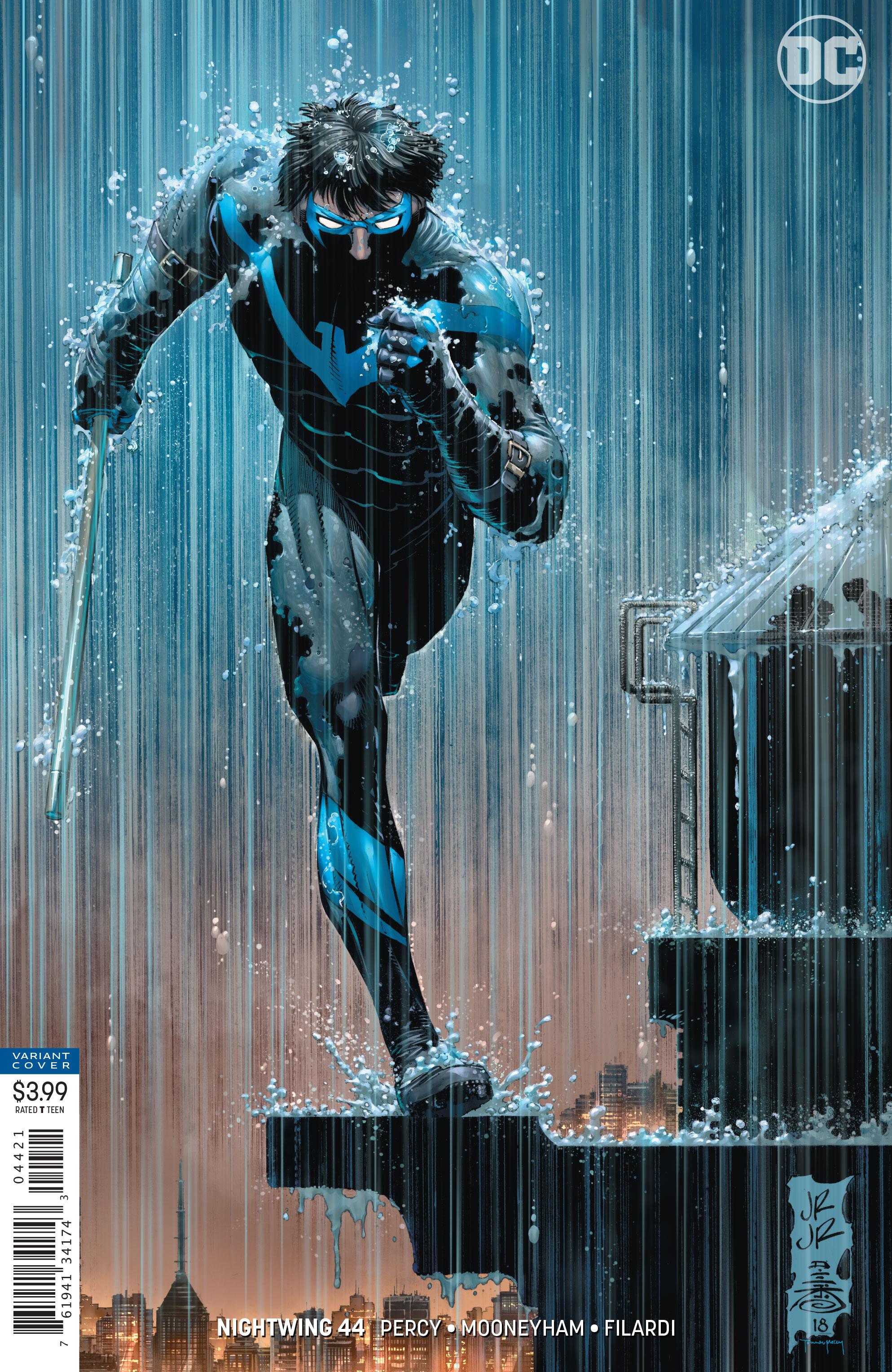 NIGHTWING #44 by John Romita, Jr.
John Romita, Jr. is one of the most underrated modern cover artists. It bothers me whenever he does interiors and doesn’t get to do a cover, because he does some really great covers.
But like the above, this one looks like it might’ve been designed with text in mind. The upper right 1/4 is so empty, it looks like maybe a half-sized logo was meant to go there. Putting the DC logo there helps a little bit, but I still kind of want to nudge Nightwing further right.
Also, whoever colored the sky and rain on this did a wonderful job. I particularly like the way the linework of the rain has been colored so it fades from blue to orange with the sky.
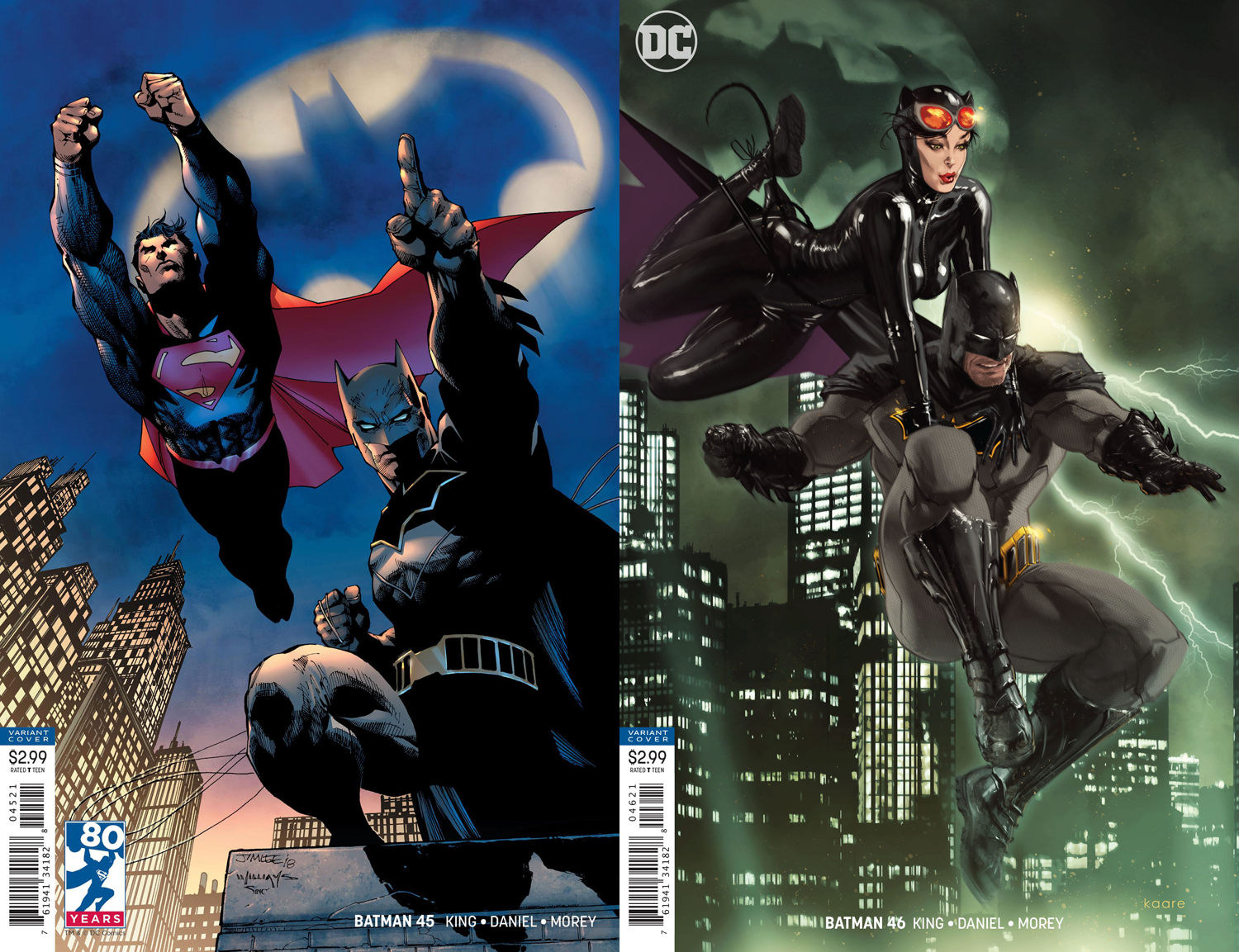
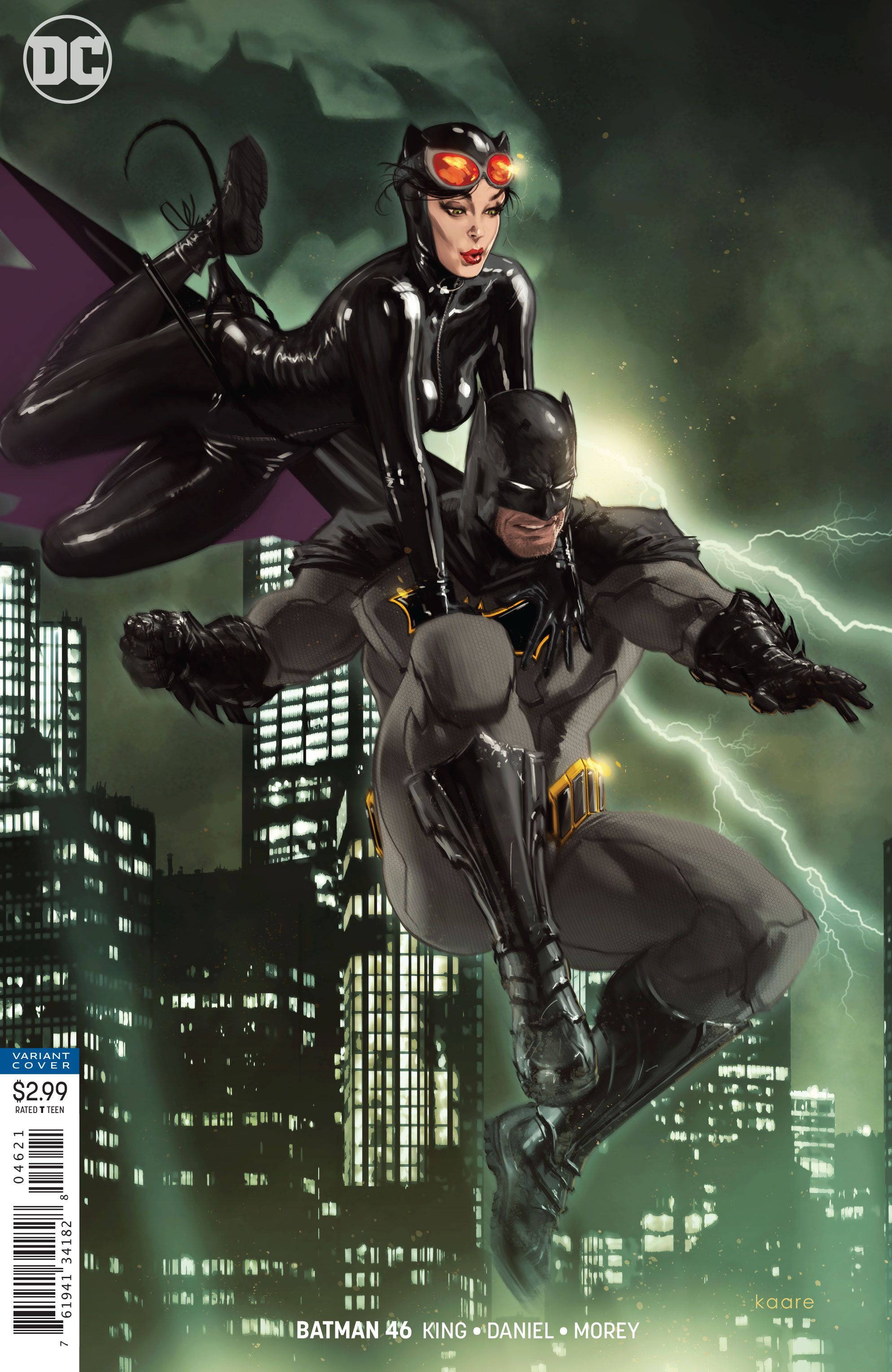 BATMAN #46 by Kaare Andrews
Kaare Andrews’ cover also has some empty space in the upper right, but it’s a little less dramatic, partly because it’s balanced by nearly-empty space in the bottom left.
I mean, there are buildings there, but they’re colored a shade of green that matches the darker shade in the opposite corner. Still, I might’ve moved the DC logo to the opposite corner.
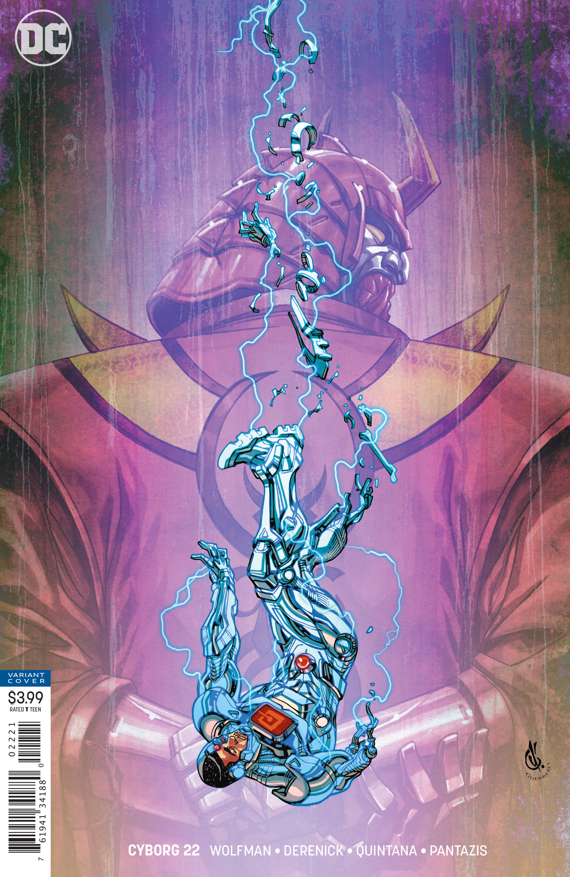 CYBORG #20 by Carlos D’Anda
This is my least favorite of the bunch, but it’s not because of Carlos D’Anda‘s composition, which I think looks interesting. The problem is that the color palette has flattened out the image.
Lightning is very dramatic against black, and becomes less dramatic the lighter the background is. But the pink is lighter than the lightning, which makes it look like the villain (or a tractor beam behind the villain) is glowing , while the lightning is not.
I think it would’ve been more dramatic to color the villain so dark that he almost wasn’t invisible, something you make out upon closer look. Maybe his eye could be glowing a little.
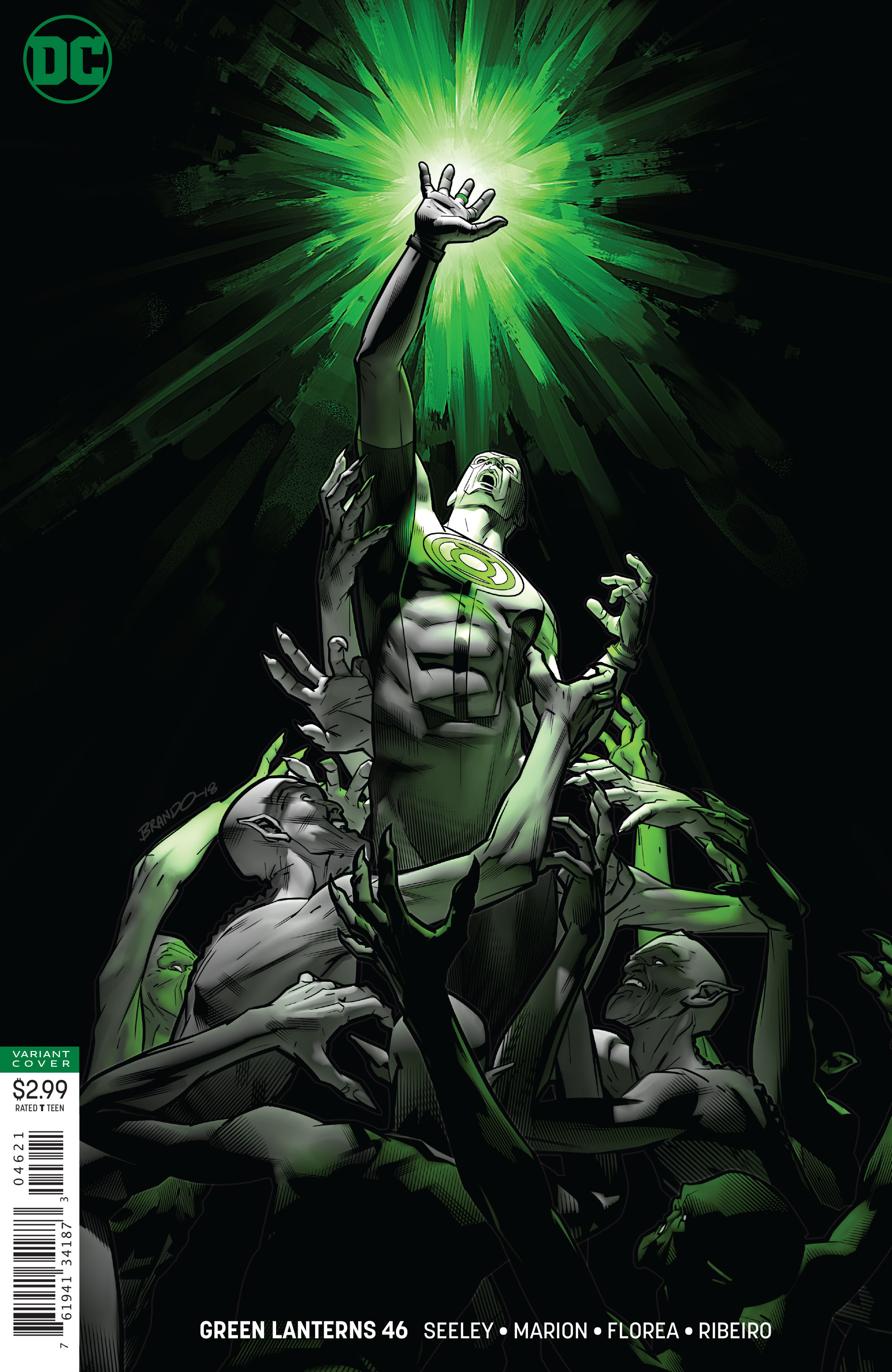 GREEN LANTERNS #46 by Brandon Peterson
Brandon Peterson illustrates perfectly how dramatic a glowing object can look against a dark background. There’s also some wonderful secondary lighting and cast shadow on the figures, which ads a lot of depth and dimension. The triangular composition gives the image a very classical feel.
As I mentioned previously, I adore textless covers, and I love that DC is trying to get as close as they can within a specific set of restraints (i.e. they can’t put the barcode over the ad on the back). But because I obsessively analyze covers, I couldn’t help but wonder: is there a better solution?
For example, I think of Joe Cocker’s 1969 album With A Little Help From My Friends. At first glance, it looks like it’s part of some unofficial trilogy of ’60s textless albums.
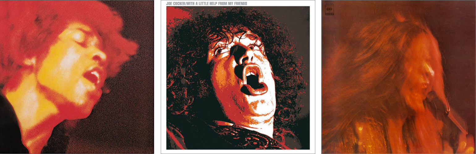
But upon closer inspection, the artist and title are listed in the upper left corner, outside of the image and in the white gutter! What a dirty cheater!
But what if we tried that with the DC covers?
Y’know, just extend the white box of the barcode upward, so it becomes a gutter. Or in the case, a fake book spine. Suddenly the images look like textless covers, don’t they? As an added bonus, the covers also accidentally pass the Hibbs Test.
I also tried out a variation where the “spine” is colored to match the background. While this helps de-emphasize the text even more, it does so at the expense of emphasizing the barcode. I think I prefer the white version, where the text and barcode are on the same level, and there’s a single color indicating the edge of the image.
But what do you think?
This Week’s Covers
Every week I pick a handful of covers that I consider particularly well-designed, not just well-illustrated. My personal criteria for a well-designed cover is that the illustration and design elements compliment each other rather than fight each other, and that the resulting image stands out from the crowd.
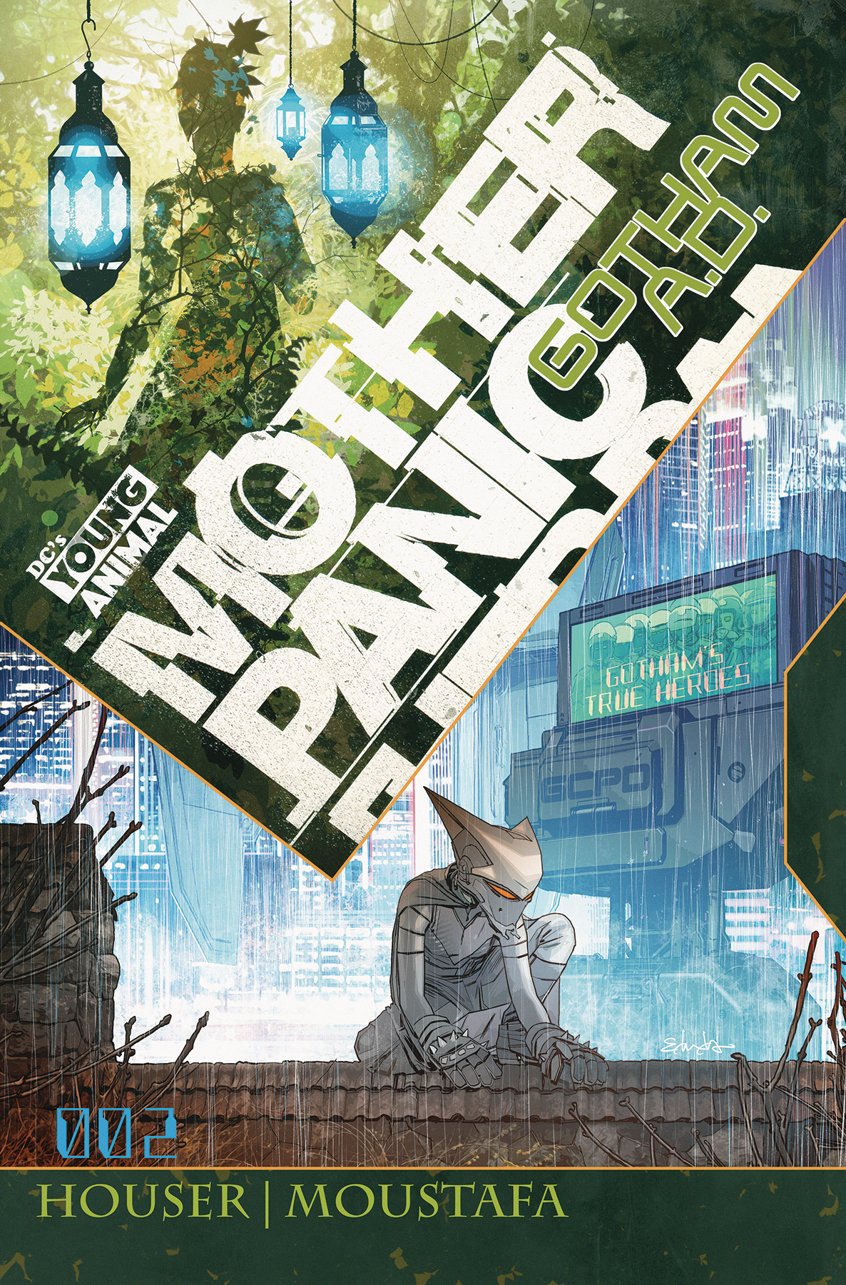 MOTHER PANIC: GOTHAM A.D. #2 by Tommy Lee Edwards
Wow this is some eye-catching text placement. It’s warped in such a way that it feels like it could fall apart at any moment, and I just can’t look away.
Once I pry myself away from the logo, I notice how the two images nicely contrasts nature against the city, with just the right touch surreal.
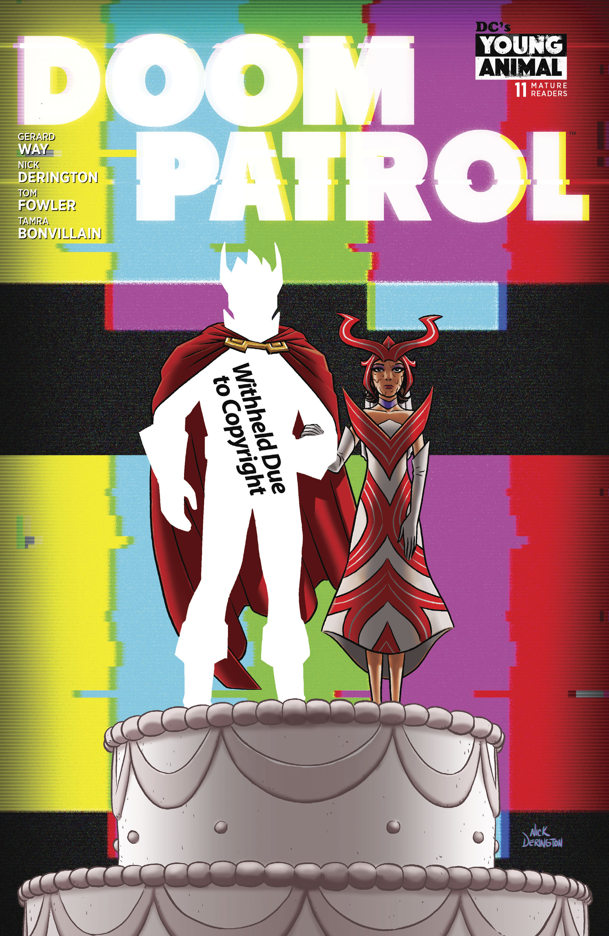 DOOM PATROL #11 by Nick Derington
Doom Patrol‘s covers have been consistently weird and fun. I haven’t picked up this series yet, so I have no idea what this image means, I can’t wait to read it.
The “withheld” idea is something I wish I’d thought of, because I see it all the time while browsing Google Books.
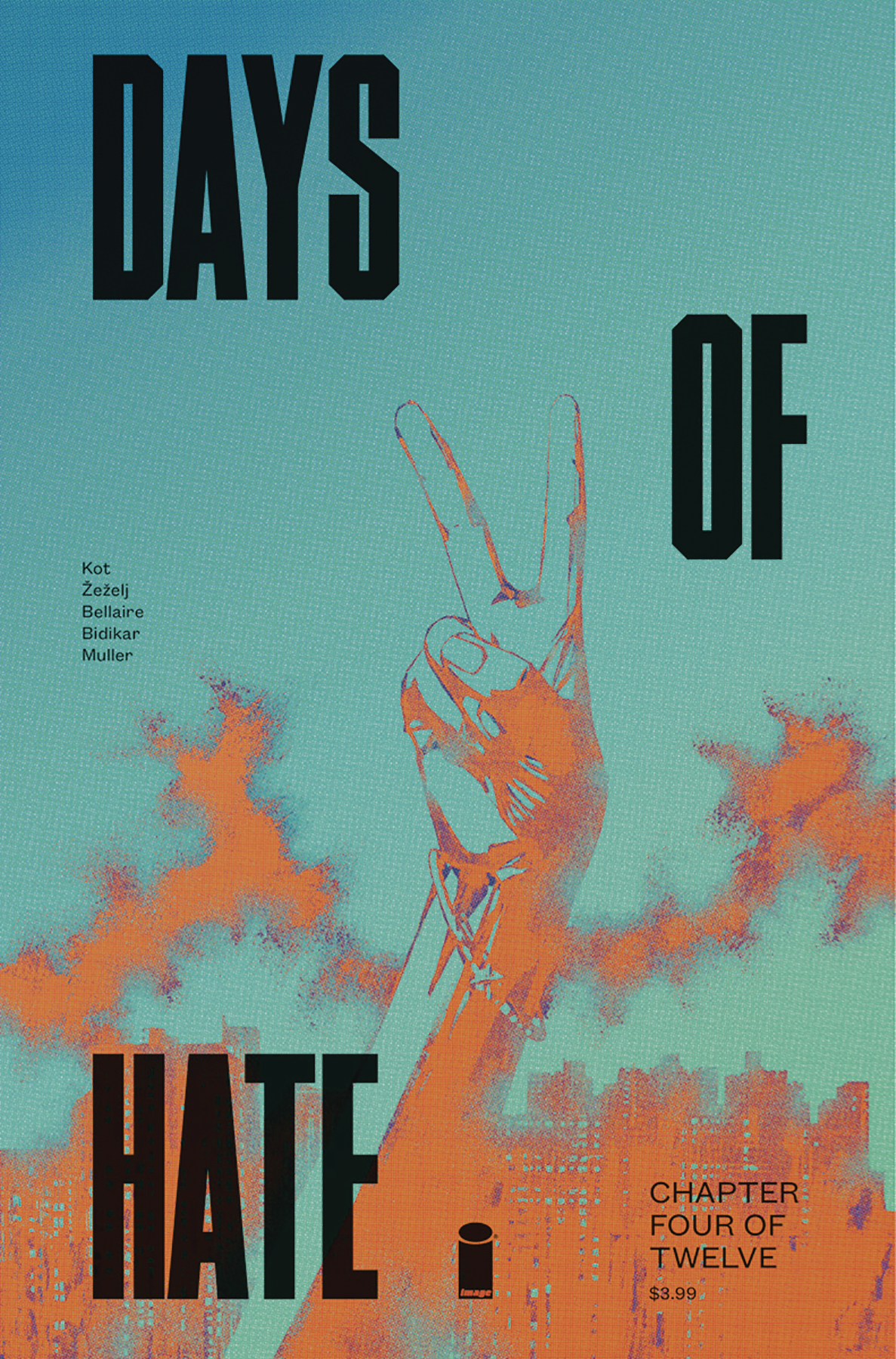 DAYS OF HATE #4 by Danijel Zezelji and Tom Muller
I wasn’t a fan of the logo treatment on the first three issues, where it looked like the book was called “Days Hate Of,” but this is working really well. It’s just the right amount of chaotic yet structured. The colors look like somebody has poisoned peace.
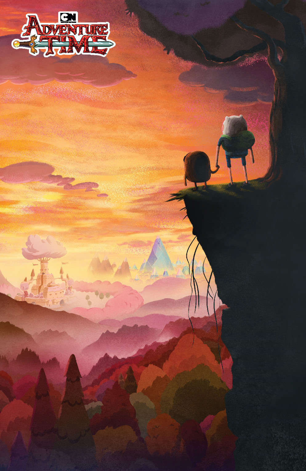 ADVENTURE TIME #75 by JJ Harrison
This is a perfect cover for the final issue of a series. Finn and Jake holding hands is sweet, but there’s also a hint of sadness. Bright and colorful, with a hint of darkness. And a town in the distance whose large tree and plants look like an atom bomb explosion.
I’m not sure if this is the final text placement, but I hope they’re keeping it minimal like this.
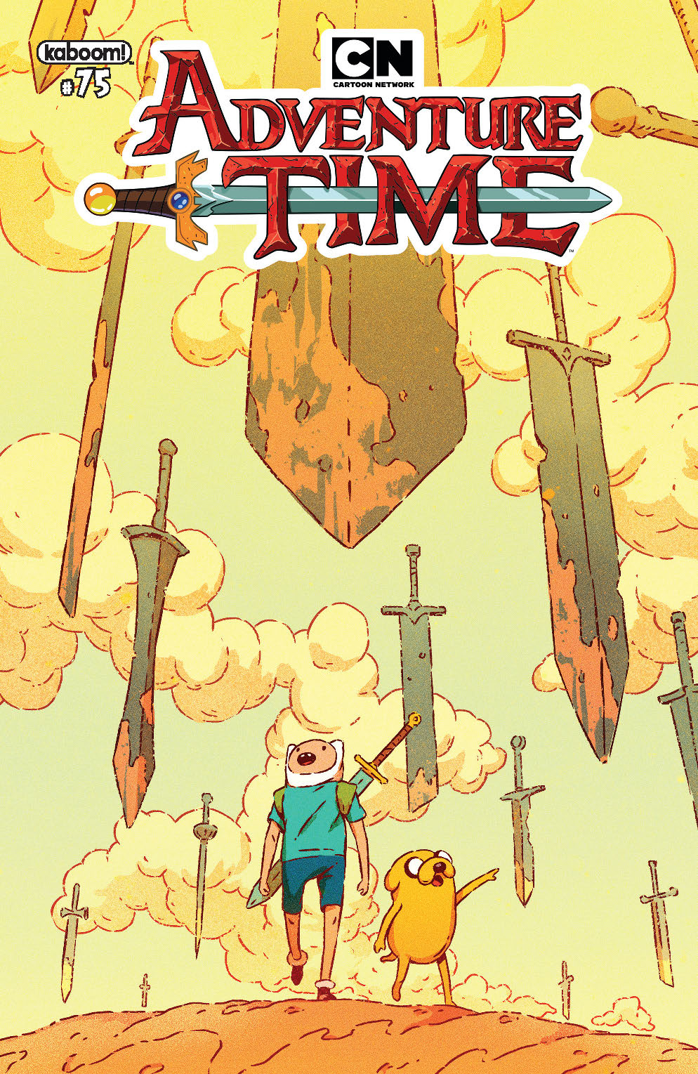 ADVENTURE TIME #75 by Plus Bak
What I love about this image is the pure sense of wonder, a feeling I don’t think we see enough of on comic covers. Not just the surreal beauty of these old floating swords, but the expressions on the characters’ faces. They’re in awe. It’s like a Calvin & Hobbes ending vs. the bittersweet cover above.
I just wish the trade dress wasn’t fighting the image. Am I the only one who notices the “CN” in the logo should be centered with the image? But the color palette of the logo and image aren’t complimenting each other either. This would be a great candidate for a textless cover.
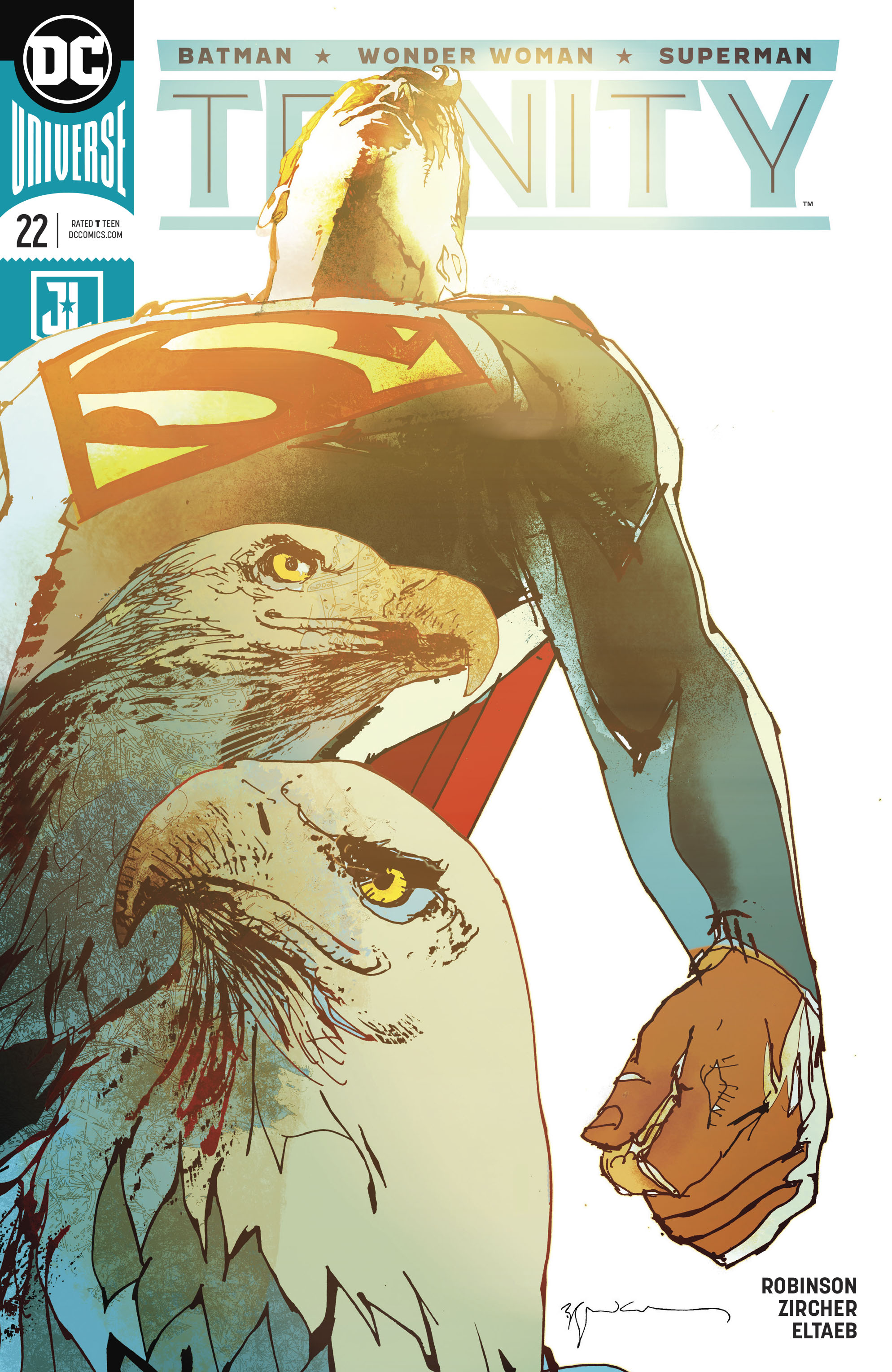 TRINITY #22 by Bill Sienkiewicz
I talk a lot about how the traditional comic trade dress often feels like it’s fighting the art, but here it’s like Sienkiewicz has swung right back.
You’re going to mess up centered compositions? Take that, trade dress.
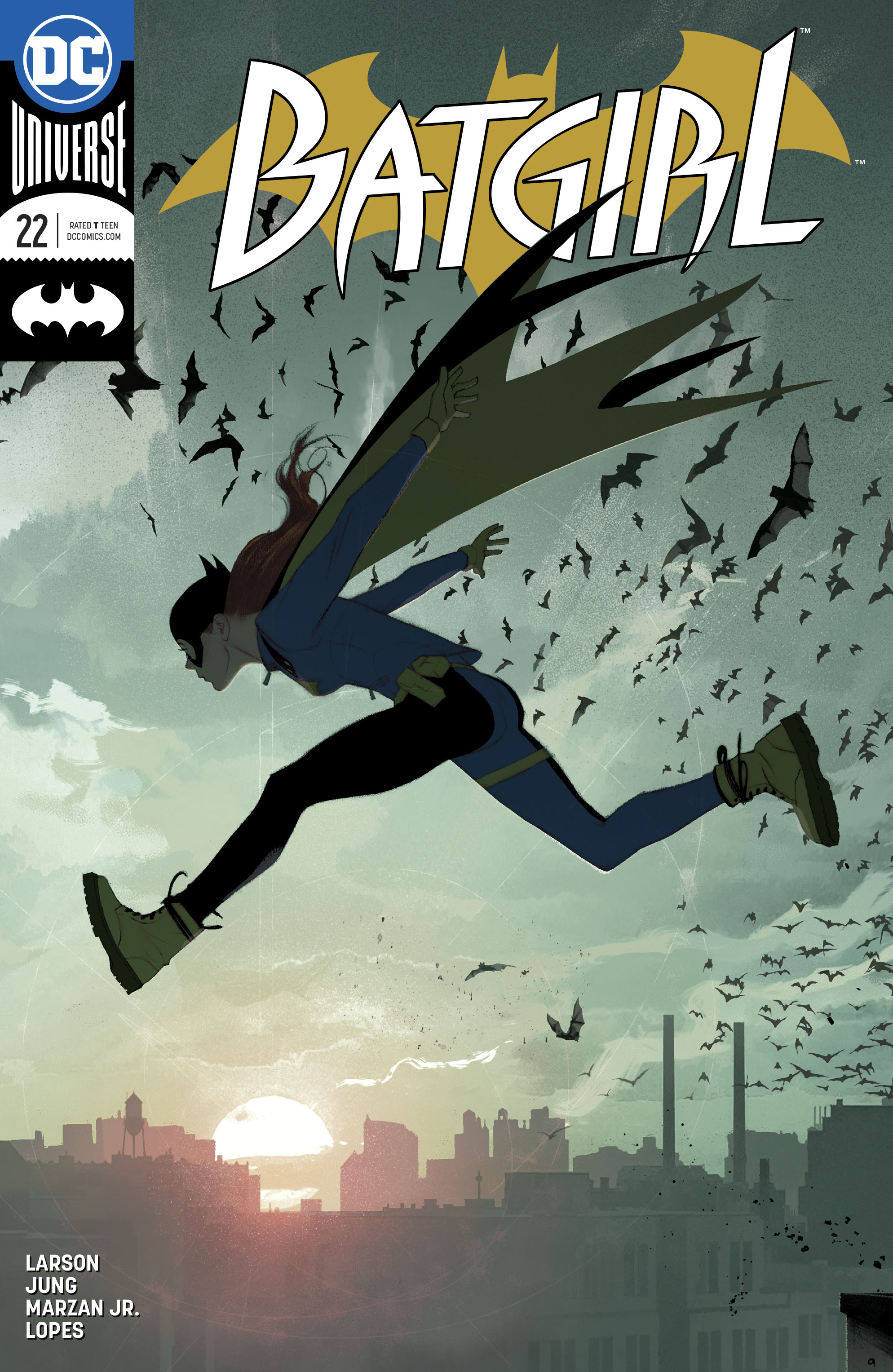 BATGIRL #22 by Joshua Middleton
Middleton’s composition doesn’t strike back at the trade dress, but also doesn’t particularly care it’s there.
Like the Adventure Time cover above, this one is dramatically back-lit, but has a very different tone. The color palette adds a sort of low-key realism that feels strangely candid, like superheroes are normal and this is just another day on the job.
This would’ve been a great minimal-text variant.
NEXT WEEK: Textless Wraparound Covers


Hadn’t noticed your previous “By It’s Cover” articles. Really pleased by this one. The interrogation-of-process-from-an-informed-perspective sort of article is exactly what I want to read about comics!
Wish there was an article like this every morning on The Beat!
First time reader as well. Very informative analysis of the cover art! I like a good trade dress if done well, but I also am really liking some of the textless and virgin covers recently. I like your proposed solution of putting all the relevant text in a gutter down the side. It does help focus on the art, but I think it might constrain the art a little too much horizontally.
As much as I like Jim Lee’s art, doesn’t Batman’s head look really twisted up on that cover? Or is he just so barrel-chested that it’s an optical illusion that his head is sticking off-centered out of his collar bone?
I like the stripe along the left side, but I would make the text start at the top, which is how US book spines are traditionally set. I could also see this stripe as semi-transparent over the art, similar to classic nineties Vertigo trade dress.
I could also see the bar code put horizontal so that there’s essentially a stripe with it and the title and credits along the bottom. But either stripe makes the art only three-side bleed, which is possibly against the goals of this change in trade dress.
Comments are closed.