
![]()
This is the third season in a column that judges a book by its cover. Catch up on the current season, or view the complete archive.
Before DC’s minimal-text variant covers, before Image’s “We Believe” variant covers, Marvel kicked off this year’s trend of textless/minimal covers in late January with Young Guns variants.
These covers place all the important information on back (like the “We Believe” covers that aren’t wraparounds), and display the cover artist’s name on front.
Round 1 ran from January 31 to February 28 with one variant cover each by six different artists. It consists of:
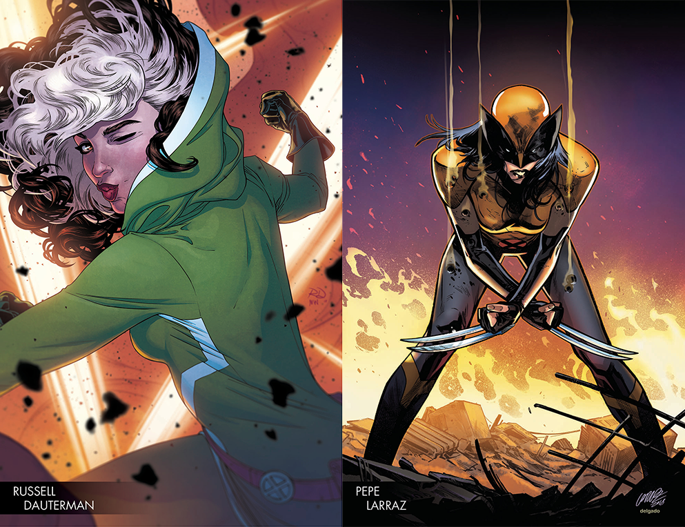
Avengers #678 by Russeell Dauterman
X-Men Red #1 by Pepe Larraz
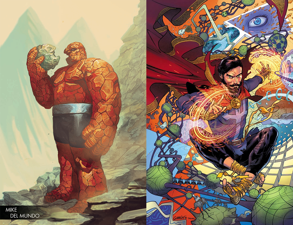
Marvel Two-In-On #3 by Mike Del Mundo
Doctor Strange: Damnation #1 by Javier Garron
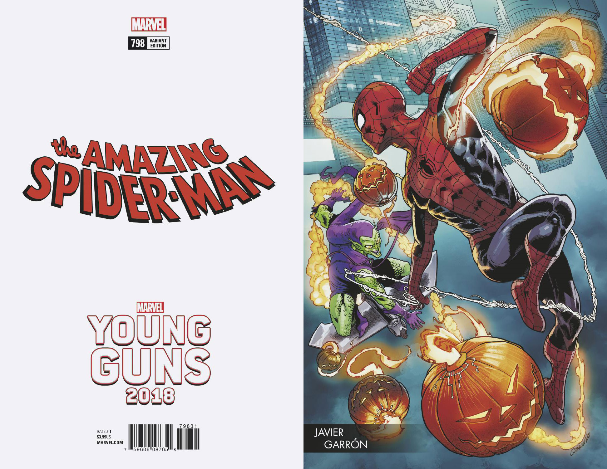
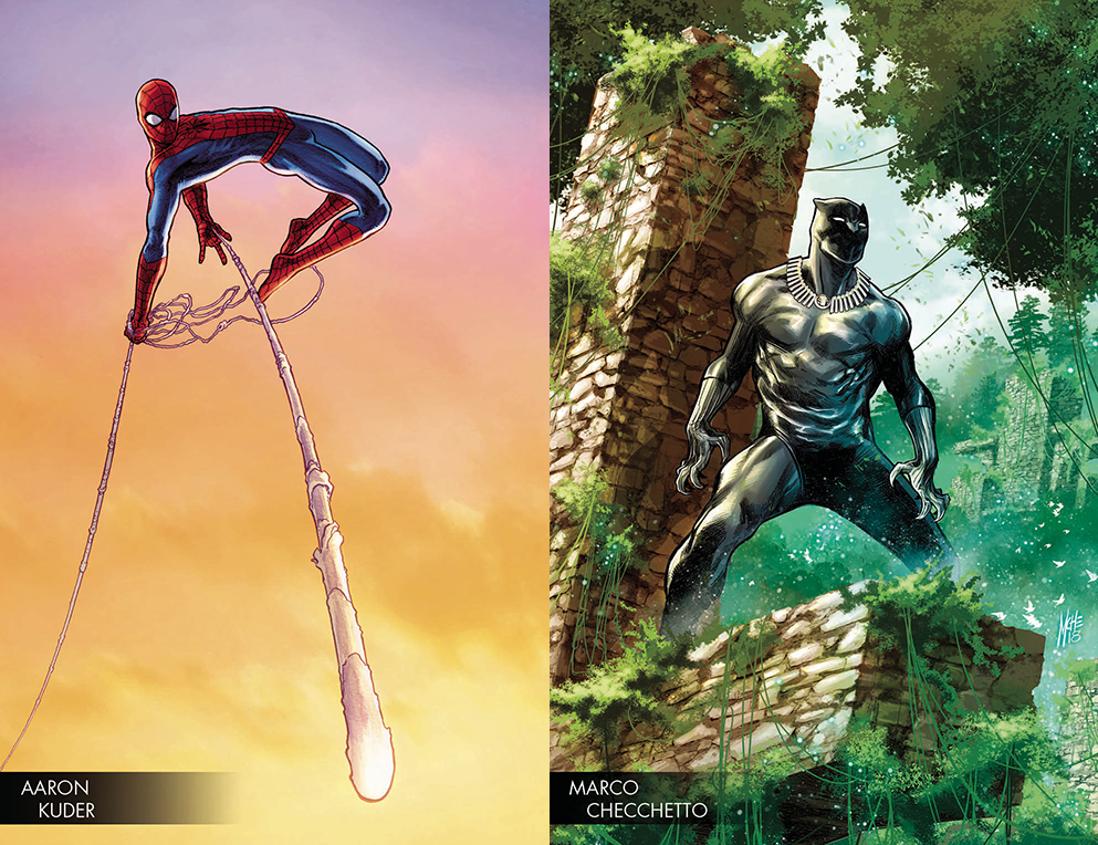
Amazing Spider-Man #797 by Aaron Kuder
Black Panther #170 by Marco Checchetto
Round 2 began on April 4 and is still in progress, this time with each of the six artists is doing two variants. But I’ll take a look at those once the round has finished. Let’s focus on Round 1.
The common theme in all these covers is that they remind me of Marvel’s trading cards from the ’90s. But I was having a lot of trouble putting into words what specifically makes them feel more like trading cards than the Image or DC covers.
Each image focuses on a single character, so there’s that. But it’s more than that.
The gradient behind each artist’s name also reminds me of trading cards, though those typically went along the entire width of the card. (The Dr. Strange cover was published with the artist’s name, but all I could find was this pre-text solicit image. Sorry.)
Also, most of them go for a full shot of the character, which was sort of the default for trading cards. Rogue is the exception in this set, cropped close, but the trading cards also had the occasional close-up. The hero is also usually centered, with Spider-Man being the exception there.
I like that these have a trading card vibe. It makes me nostalgic. But it also makes it difficult to analyze and discuss them, because these compositions don’t have a lot going on. There’s no second layer of meaning to them, it’s just a shot of a hero looking heroic. There’s a bit of a portrait feel to them, as if the hero posed for a photographer or a painter.
Round 2 deviates from this template, so we’ll have more to talk about next time.
This Week’s Covers
Every week I pick a handful of covers that I consider particularly well-designed, not just well-illustrated. My personal criteria for a well-designed cover is that the illustration and design elements compliment each other rather than fight each other, and that the resulting image stands out from the crowd.
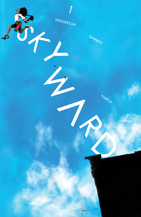 Skyward #1 (2nd Printing) by Jock
Wow, this is such a great image. I’m a big fan of images interacting with logos, and here the logo is helping to create a sense of movement and excitement. Jock is great at killer images that look different from what everyone else is doing.
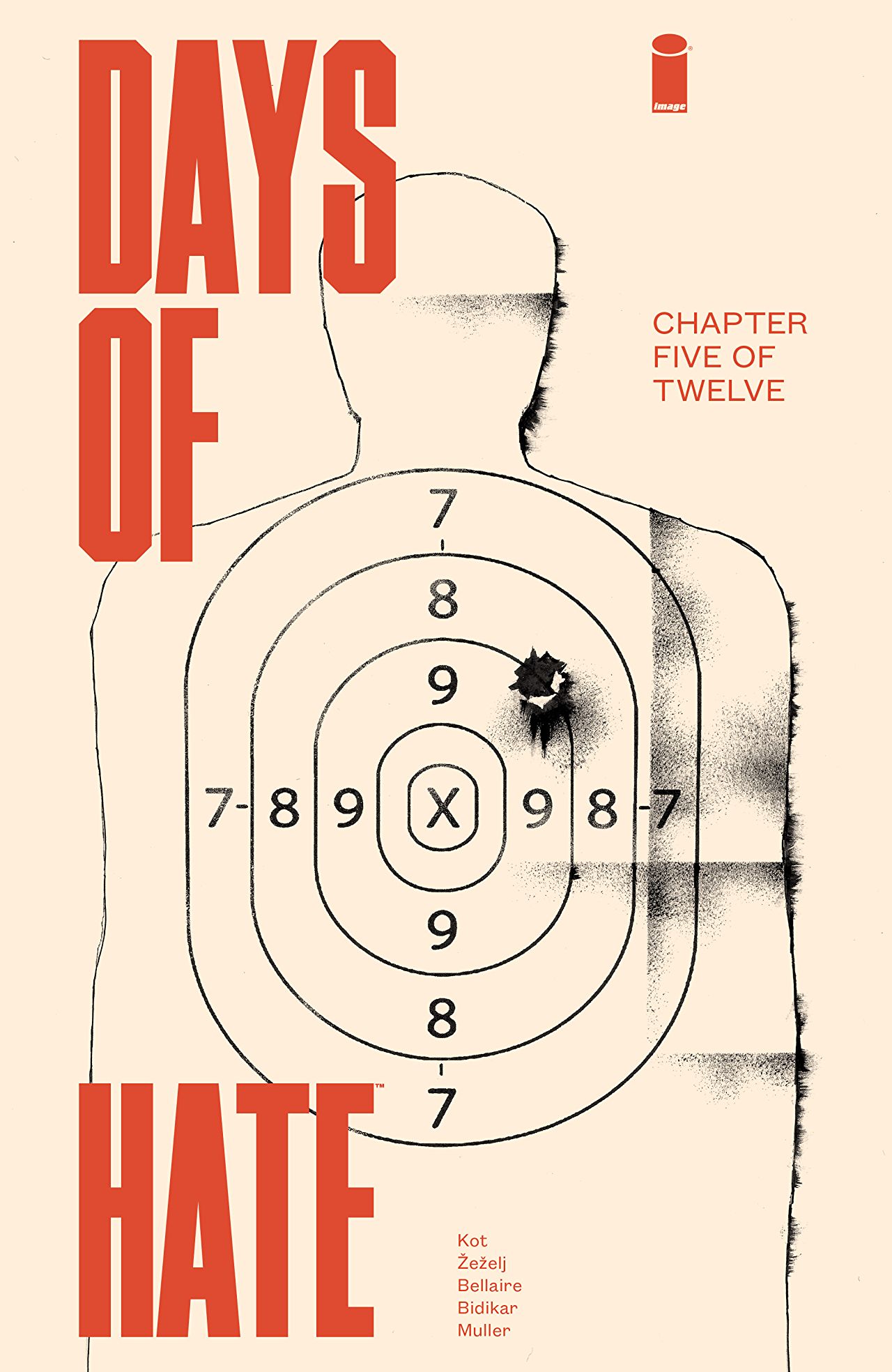 Days Of Hate #5 by Danijel Zezelj (and Tom Muller)
I love the warped Swiss design going on here, where there are multiple blocks of left-aligned text, but they’re placed on the page in a slightly off-kilter manner.
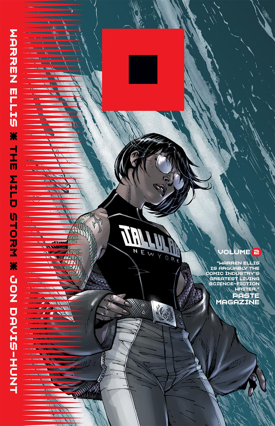 The Wild Storm (Vol. 2) by Jim Lee
Does anyone know who designed this? The solicit only credits Jim Lee. I have no idea what the cube symbolizes that has replaced the traditional logo, but it’s a pretty striking sight. I also like how the red design elements compliment the greenish illustration.
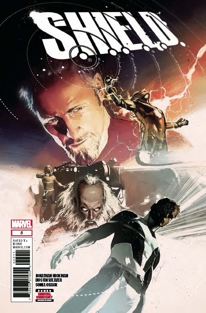 SHIELD by Gerald Parel
I love this logo, the way it calls back to Steranko’s X-Men logo, but also has these interesting swirls breaking into and out of the logo, and strange cryptic writing. Does anyone know who designed this?
The art is stylistically energetic and wonderful, but it’s doing a poor job of leading me around the page. It feels like a group of cool poses in search of a composition.
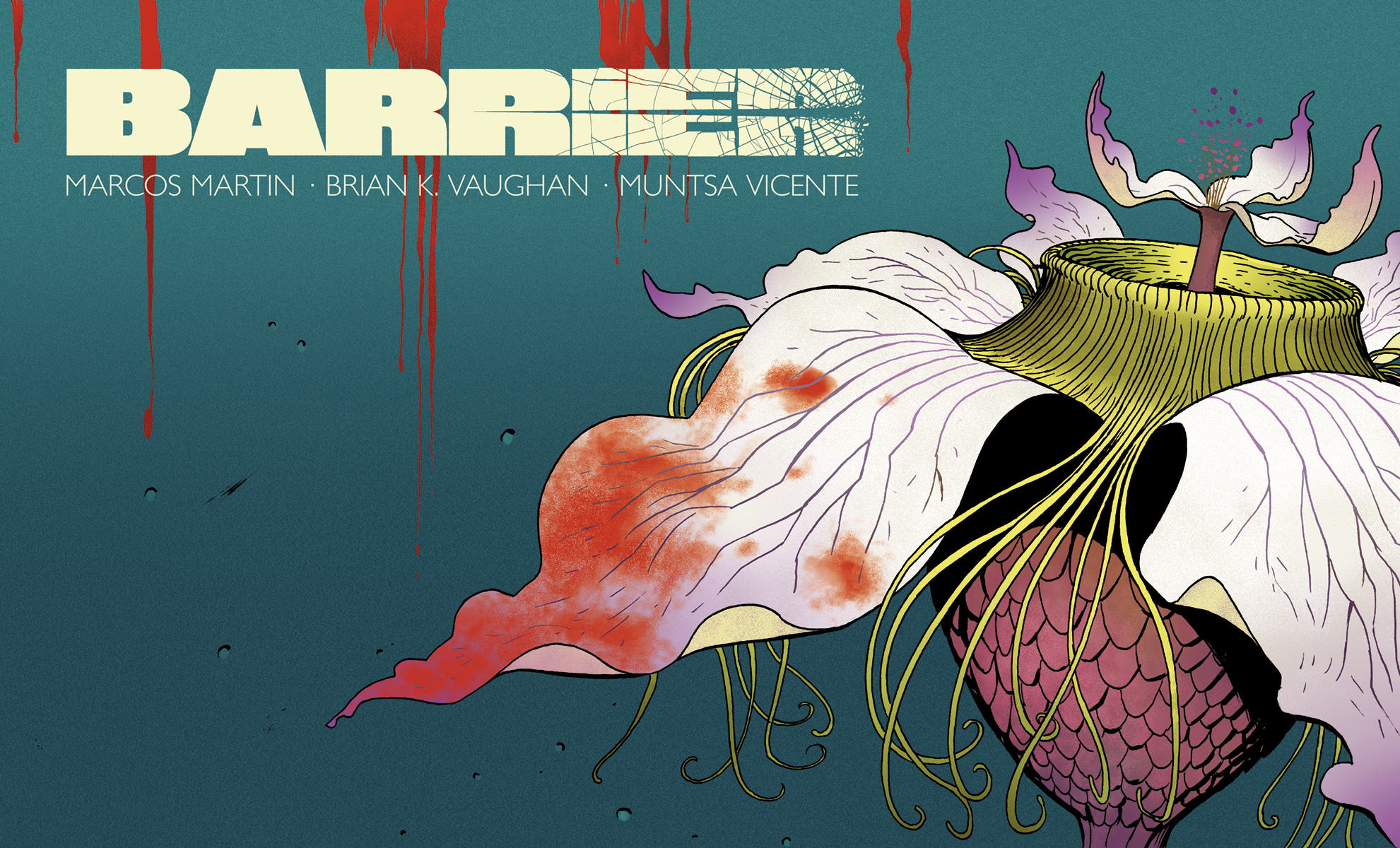 Barrier #5 by Marcos Martin
And here’s Barrier, throwing off my carefully lined up images with a landscape oriented cover. Blood and flowers contrast great against each other, and the empty space to the left also contrasts well with the extreme close-up. It almost reminds me of an open gatefold LP cover.


The Wild Storm logo (red square with smaller black square centered) is the maritime storm warning flag: http://www.nws.noaa.gov/om/marine/cwd.htm
Nice! Thanks for that.
Comments are closed.