

This is the third season in a column that judges a book by its cover. Catch up on the current season, or view the complete archive.
I hope you’re not tired of me talking about textless covers yet, because I’ve still got so much to say! This week: the textless wraparound cover.
Maybe the two most iconic textless wraparound covers of the ’70s were albums by Led Zeppelin and Pink Floyd. Both were gatefold covers, which meant you could open them up like a book.
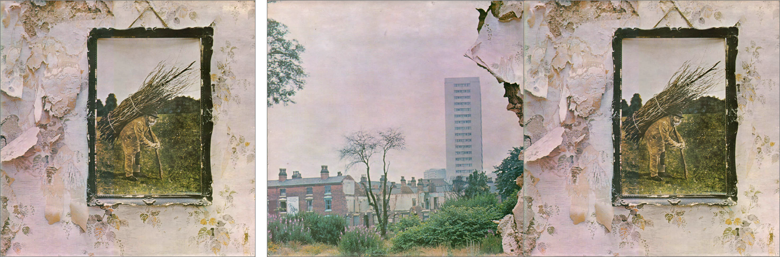
The front cover of Led Zeppelin’s untitled fourth album (commonly called Led Zeppelin IV) was a framed image of an old man, hung artistically off-center on an aging country wall. When opened up, the wall crumbles apart and reveals a city. It’s a wonderful conceptual idea — though how much more surreal would it be if the horizon line in the framed image lined up with the horizon of the city, as if you were looking at a window into the past?
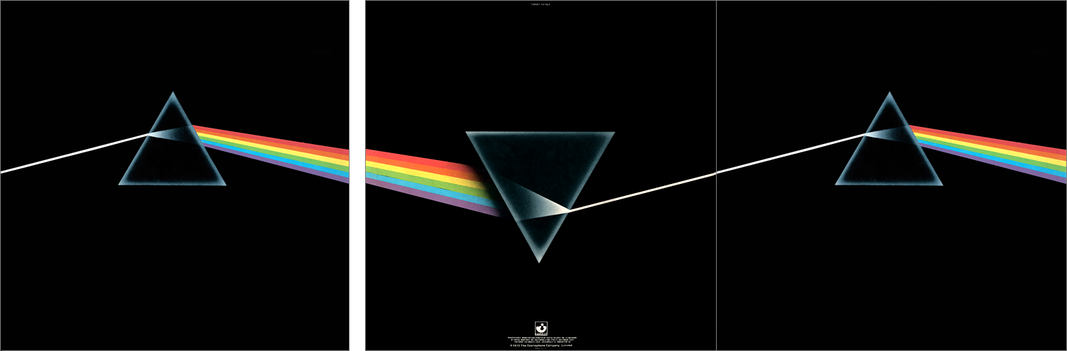
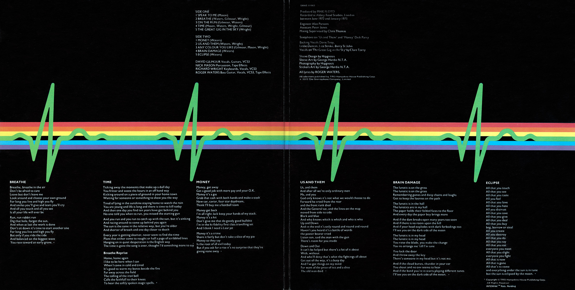
The front cover of Pink Floyd’s Dark Side Of The Moon is an ultra-minimal image of a prism. When opened up, a magical anti-prism turns the rainbow back into a ray of light and shoots it at the original prism. The image repeats endlessly, mirroring the song cycle inside the sleeve that begins and ends with the same heartbeat. Reportedly many record store owners lined up multiple backs and fronts to create an in-store display.
Even better, the inner gatefold continued the rainbow on the inside, so that the entire package is a repeating image. This album, to me, is the pinnacle of album design and will never be topped. It’s probably a little unfair to compare Image’s textless wraparounds to these, but I wanted to show an example of what a cover can do on a conceptual level.
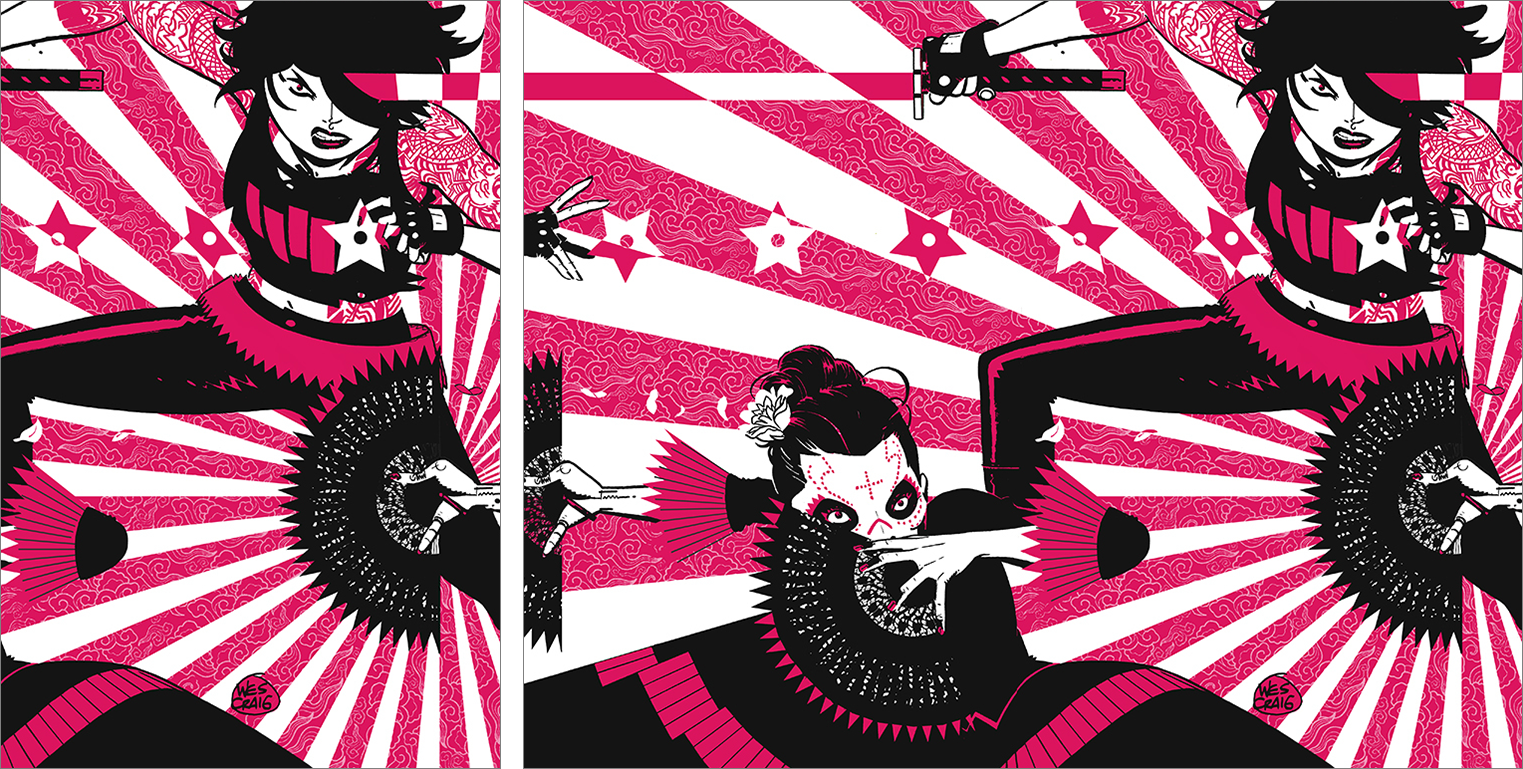
Deadly Class #32 by Wesley Craig
I almost didn’t notice, but this cover is actually very close to doing a Dark Side Of The Moon. Notice how the sword from the back continues on the front, and the fan on the back almost does the same but doesn’t really line up. If only this cover was taken one step further, lining up the fan and the background elements, and this could’ve been a really epic cover.
Witchblade #4 by Roberta Ingranata
We’re so used to reading left to right that we subconsciously read images that way too, starting in the upper right corner. When designing a wraparound, you want to design things right to left, to try and get the viewer to flip over the cover or to notice there’s more. But as artists, we also have a tendency to design images that move left to right, and it can be hard to reverse that flow.
As a result, the two most common problems with wraparound covers are: 1) the front was designed left-to-right, and the back looks like it was added after, or 2) the back looks like it was designed first and the front is less interesting. This one looks like the former to me.
It also has a lot of open space in the corners that look like text wants to go there. I would’ve suggested raising the horizon line, so that the figures were all more centered vertically and filled the space better.
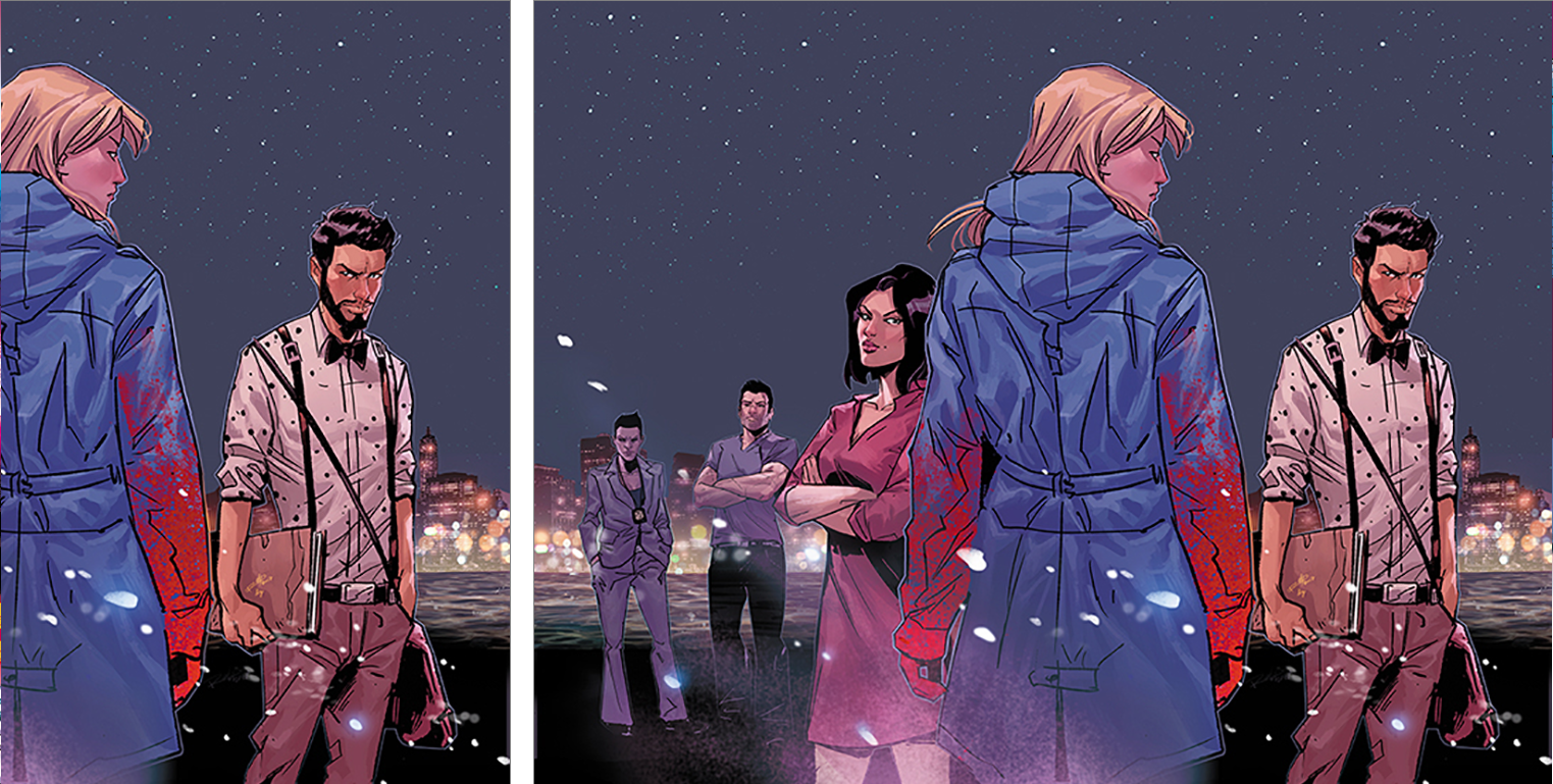
Kill Or Be Killed #17 by Sean Phillips
Disclosure: I’m a huge Sean Phillips fan, so it feels weird for me to criticize this piece by pointing out how empty the back cover is. It doesn’t just look like it wants a logo back there to balance it out, it looks like it wants a book summary to go with it. But that front cover by itself is so good.
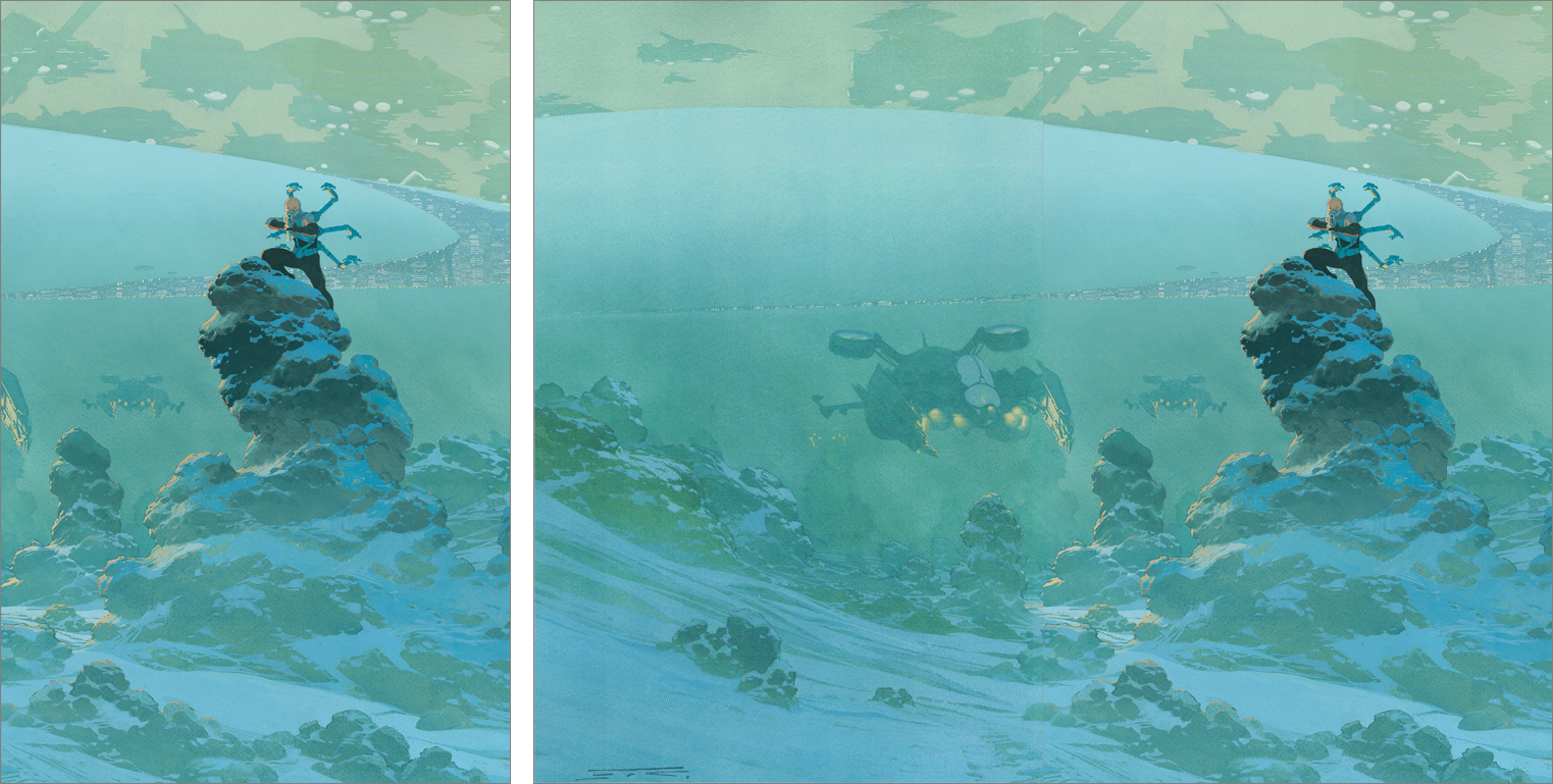
VS #2 by Esad Ribic
This reminds me of a dark sci-fi version of a Roger Dean cover, and I almost want to see a Roger Dean style logo laid on it. Or even just Tom Muller’s amazing logo for the series. This is a rare case where I feel like adding a logo would make an image more exciting. Or at the very least, if the image had been cropped in so that the flying ship dominated more of the back cover?
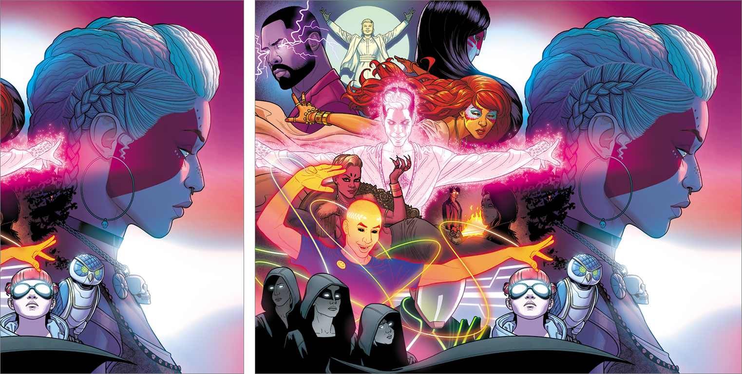
The Wicked + The Divine #34 by Jamie McKelvie
Disclaimer: I’m a huge fan of Jamie McKelvie, so it feels weird for me to criticize this piece by pointing out this feels like scenario #2, where the back cover feels like it should be the front cover. It feels like everyone on back is saying “hey, turn the book over and see the rest of the image!”
You could make an argument that the hands poking into the front cover encourage you to turn it over, but something about it feels…I dunno, not very elegant?
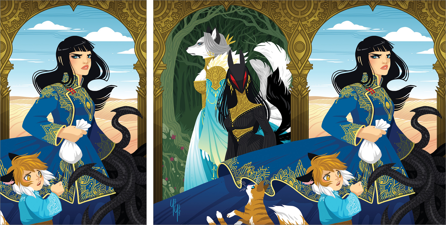
Monstress #15 by Yoshi Yoshitani
This cover does a better job of having something poke into the front cover by adding a sense of mystery and intrigue…except it’s coming in from the right, where there is no further image. I really want to “fold out” the right side and see what’s over there.
The front and back covers are wonderfully composed, filling the space and not feeling like there’s a logo missing, but the two covers also point away from each other rather than leading you to the other.
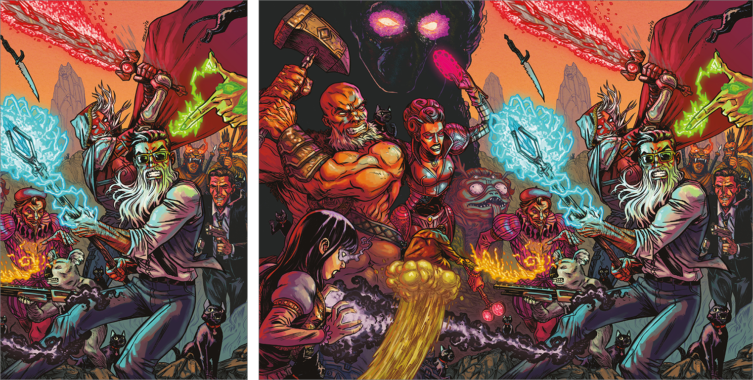
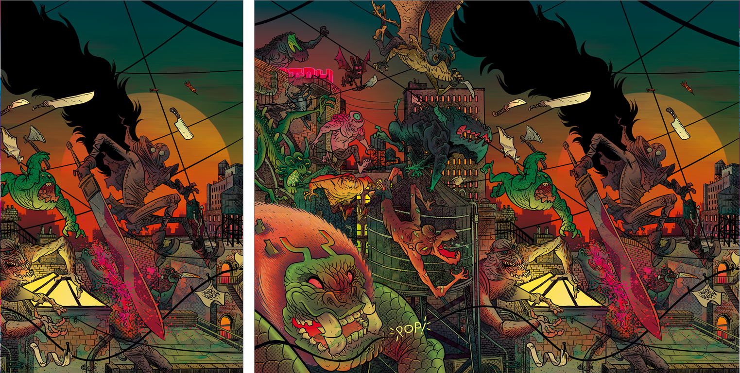
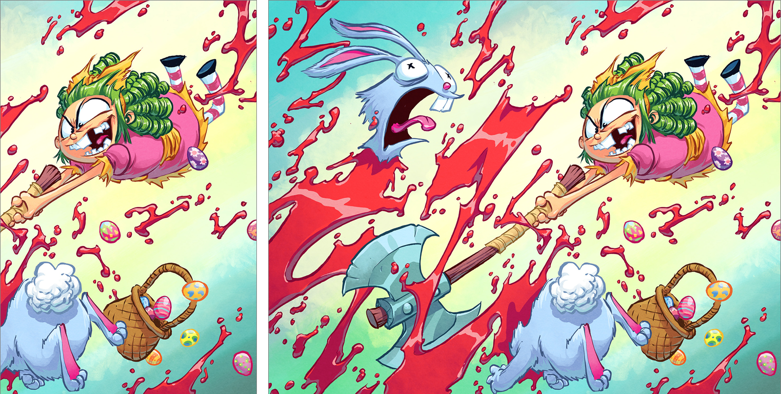
Curse Words #12 by Ryan Browne / Rumble #4 by David Rubin / I Hate Fairyland #17 by Skottie Young
These covers are all so busy and hard to “read,” partly due to a lack of flow, and partly due to colors that vibrate or fight each other instead of complimenting each other and creating depth. Wasn’t a fan of these, sorry.
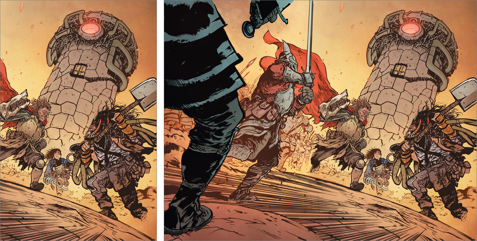
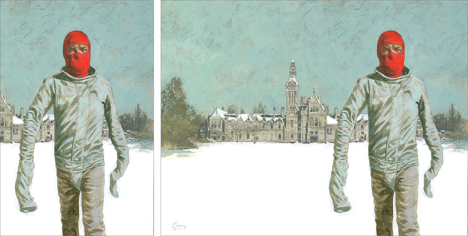
Extremity #12 by Daniel Warren Johnson
This is purely my personal taste, so you can completely disregard what I’m about to say, but I really can’t stand Dutch angles. Maybe if they’re being used to represent a character feeling disoriented, but other than that I think they make for weak compositions. I feel like the tower in the background, in particular, would have so much more power if it was centered on the front cover in a Kubrick-esque unsettling manner. But like I said, personal taste.
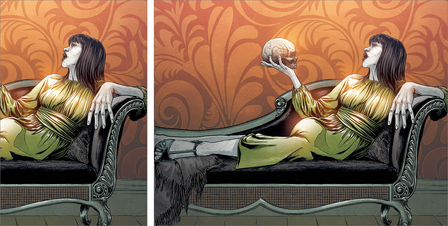
Beauty #20 by Jeremy Haun & Nick Filardi / East Of West #36 by Nick Dragotta
I grouped these together just to draw attention to the interest coincidence of two similarly reclining figures. But I feel like the Beauty cover would’ve benefited from zooming in, so that the skull dominated more of the back cover. The East Of West image, on the other hand, could’ve been zoomed out a little more, letting the white space dominate a little more like the surreal white room moments in The Matrix. But both are okay as-is.
This Week’s Covers
Every week I pick a handful of covers that I consider particularly well-designed, not just well-illustrated. My personal criteria for a well-designed cover is that the illustration and design elements compliment each other rather than fight each other, and that the resulting image stands out from the crowd.
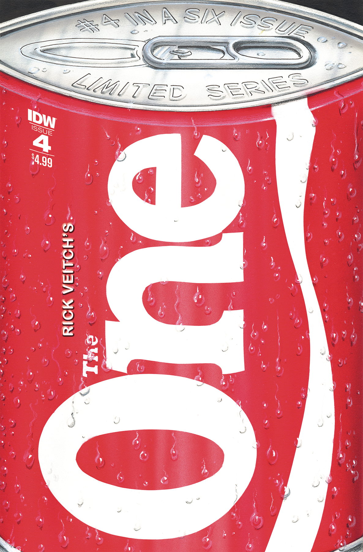 The One #4 by Rick Veitch
Rick Veitch wins my attention once again. I mean, how can you look away?
The only thing that really bothers me is the warped perspective of the top of the can. Was it intentional?
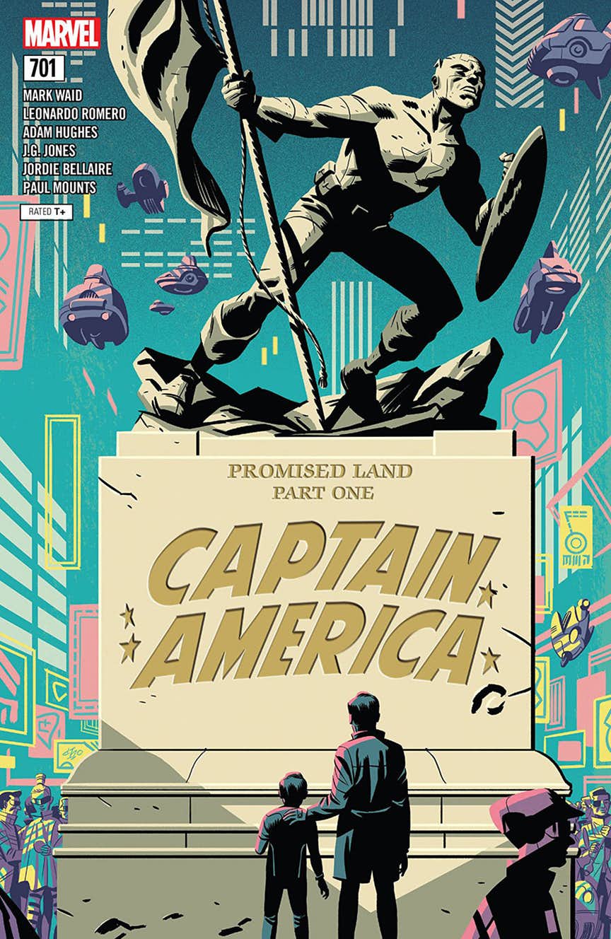 Captain America #701 by Michael Cho
I’m a big fan of logos becoming a physical part of the image, like the way the logo here is chiseled into that block.
I also like how the figure of cap acts at the top of the book logo. Wish those credits had been placed a little more elegantly, though.
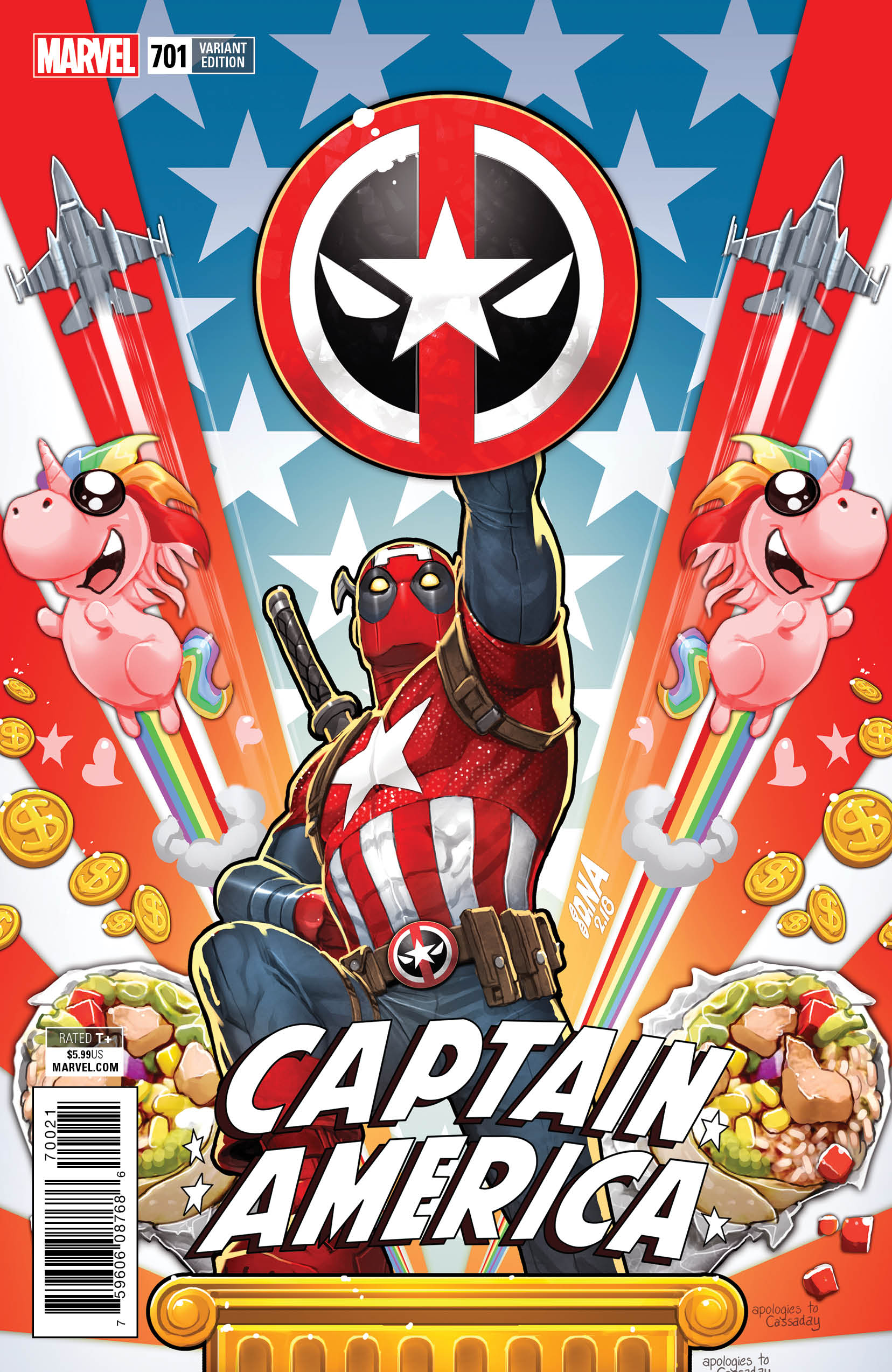 Captain America #701 by David Nakayama
Is this a parody of an existing image? Because this composition is so good, I could imagine it being a powerful Cap image just played straight. It’d be kind of fitting for a Deadpool to do a parody before the real image exists.
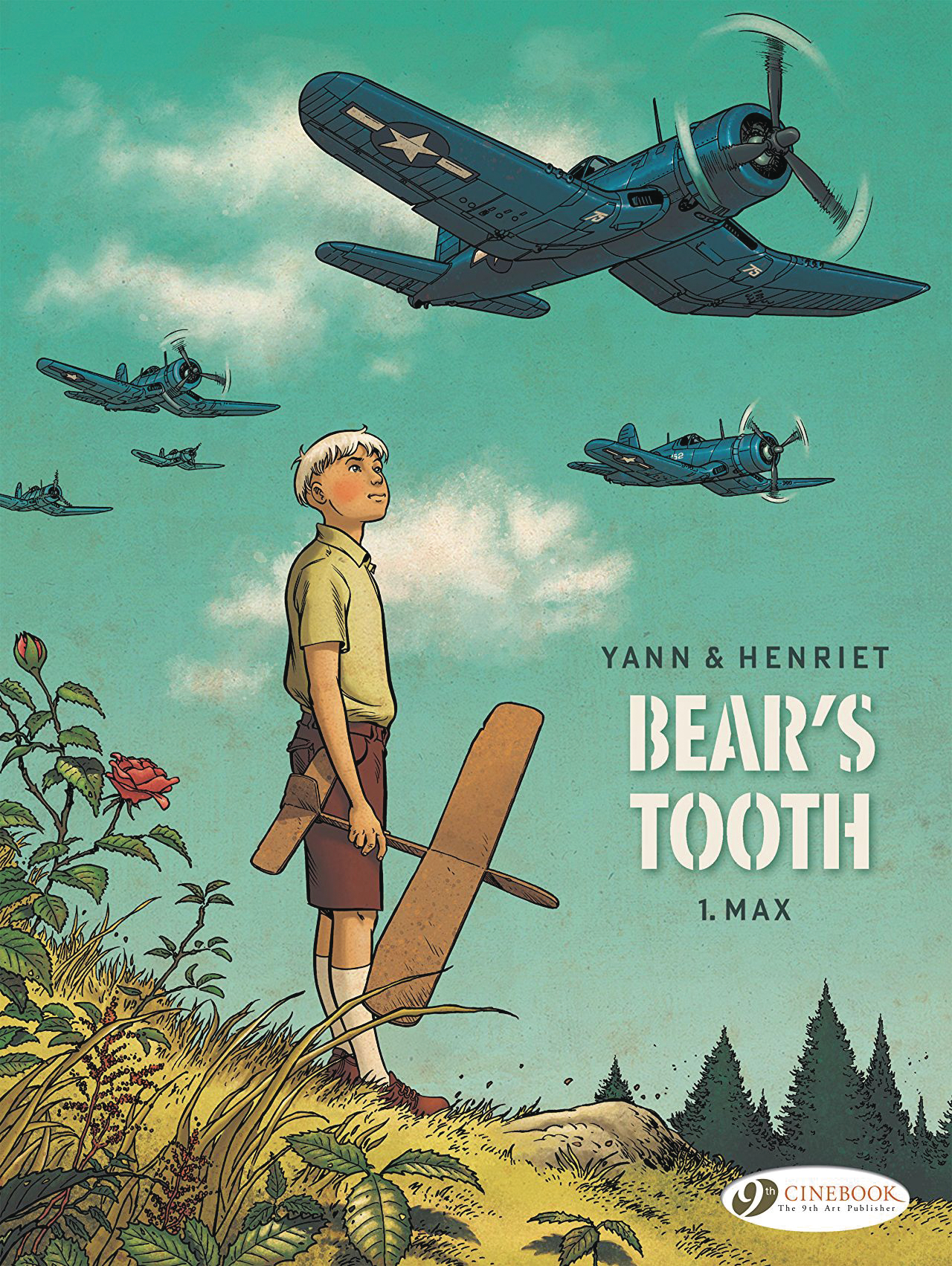 Bears Tooth by Yann & Henriet
The contrast between the innocence of a wooden toy plane and the actual war planes is so visually poetic, and the downplayed logo makes it look very movie poster. I love this.
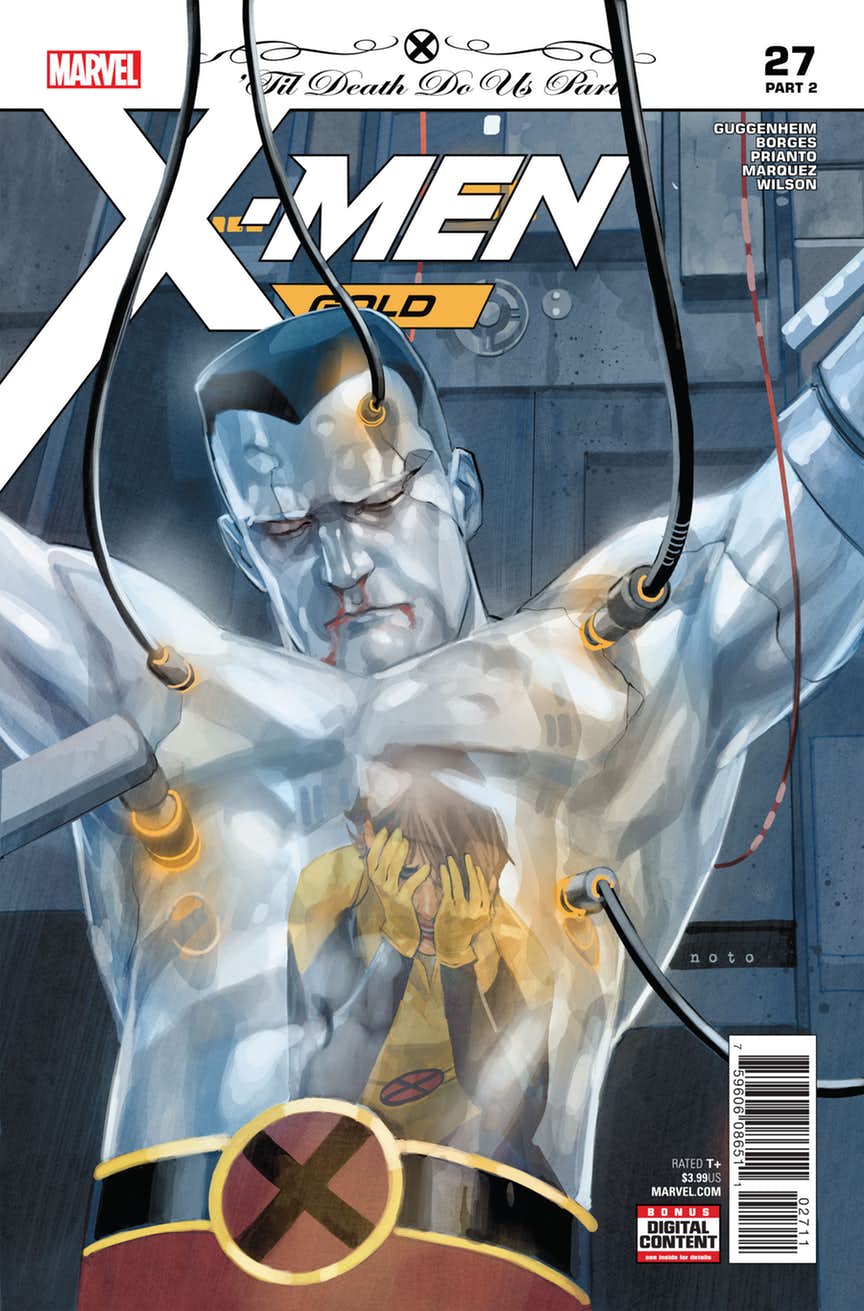 X-Men Gold #27 by Phil Noto
Reflecting an emotional moment in Colossus’ metal skin is nice, but my favorite part of this image is actually how the wires overlap all the text elements, creating depth. I think what particularly sticks out to me is that the wires are even overlapping the event header, which is usually always left clean. It’s kind of striking.
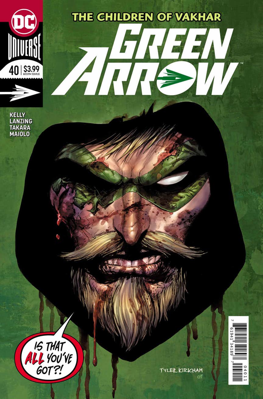 Green Arrow #40 by Tyler Kirkham
I’m unhappy with the logo being off-center with the centered image, but the image is so eye-catching I just had to include it. My favorite thing is the painterly treatment of the canvas around his head and the drips of red at the bottom, like the image is painted on a field of green. Or maybe it looks to you like he’s sticking his head out of a hole in a board? But for me it’s more the former. But that logo…
NEXT WEEK: A strong chance of more ramblings about textless covers.


Yes, that Deadpool cover is a parody of a John Cassaday “Captain America” cover from his short run on the title 15 years ago or so. It is zoomed in a bit, though. We’re much closer to Deadpool here than Cassaday was to Captain America.
Happy to see a Cinebook title make the list this week, too. That is a great cover on “Bear’s Tooth”!
Ah, I see the resemblance now that I’ve done a Google search. It’s zoomed in, but the composition itself is also very different. The vanishing point in the Deadpool one is set at the bottom instead of in the center. If it wasn’t for the pose being nearly identical, I might question whether this was actually a parody or merely a coincidence.
Comments are closed.