

This is the third season in a column that judges a book by its cover. Catch up on the current season, or view the complete archive. Spelling corrections are welcome.
Phil Noto’s painted cover for Daredevil #607 is a fun image. “Wait, is that Daredevil reflected in Matt Murdock’s glasses?” It’s actually his fake twin brother Mike Murdock who has suddenly been made real — it’s complicated — but that’s not what I’m here to talk about.
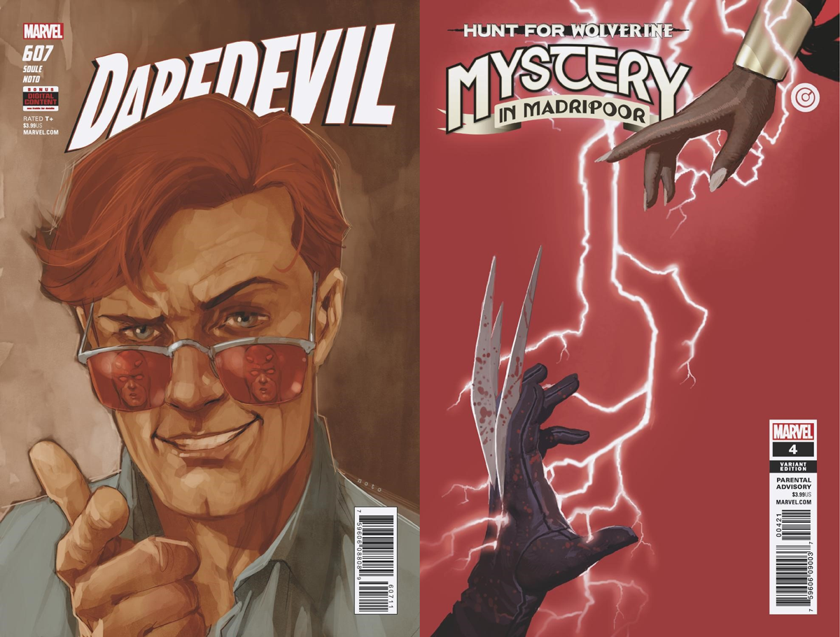
Daredevil #607 is an example of the type of cover that bothers me every week. It’s an illustration designed to be centered with a logo place slightly off-center. Most of us probably don’t notice it, because the slightly-off-center logo has been a fixture of superhero comics as long as we’ve all been reading. But if you’re sensitive to design rules, it looks bad. It’s bad design.
That’s not to say logos always have to be centered. The Mystery In Madripoor #4 cover by Chris Bachalo is an example of how to make a logo look off-center on purpose, rather than a careless design accident. It follow the rule of thirds, taking up 2/3 the width of the cover. Less would also be acceptable, just as long as it’s far enough from one edge to look intentional.
I’ve talked about this previously in two of my earliest columns, first explaining why this tradition started, and then a few suggestions for ways to comply with the Hibbs rule while still looking good.
Since then, I’ve observed the video game industry struggle with the same problem, thanks to last year’s release of the Nintendo Switch. Normally video game box art places the console’s logo in a bar across the top, but Nintendo decided to switch it up by placing it in the corner, just like a comic book.
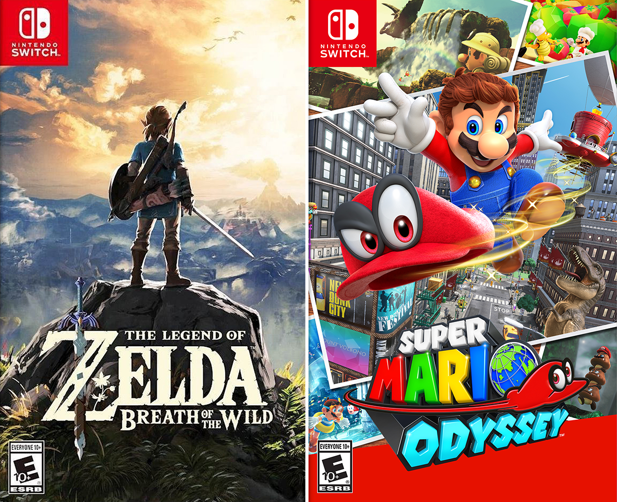
Most of the time they get around this problem by placing the game’s logo in the bottom half. This works for me, since I mostly read comics digitally, but doesn’t quite comply with the Hibbs Rule.
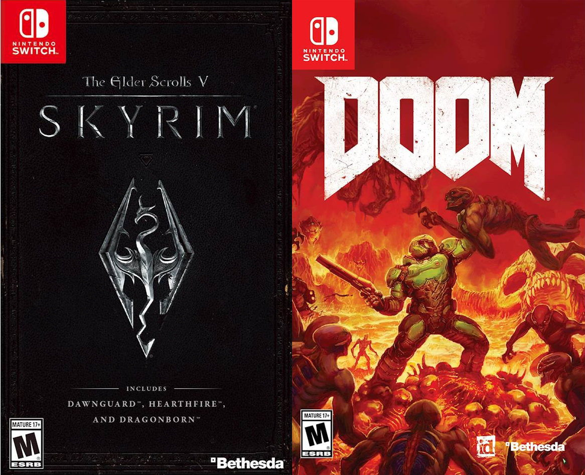
The other solution is to simply place the game’s logo below the Switch logo. This works particularly well for Skyrim‘s for minimal and striking cover, but admittedly looks a little empty at the top of Doom‘s cover. The latter could’ve been fixed simply by putting one of the flying demons above the logo near the upper right corner.
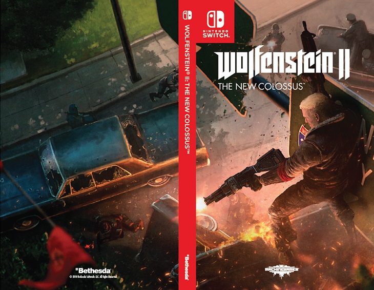
Wolfenstein II for Switch had a few alternate covers that were given out for free at Gamestop. This one looks particularly comic book-y, and shows how good a title logo can look sitting below a company logo. Marvel and DC’s company logos are much smaller than this, which means a series logo would be slightly higher even. It also leave plenty of room to place the issue number and creator names somewhere in that top area, preferably in a way that isn’t off-balance.
Before I move on, I just have to comment how much I absolutely love the Wolfenstein logo. Such a slick design.
This Week’s Covers
Every week I pick a handful of covers that I consider particularly well-designed, not just well-illustrated. My personal criteria for a well-designed cover is that the illustration and design elements complement each other rather than fight each other, and that the resulting image stands out from the crowd.
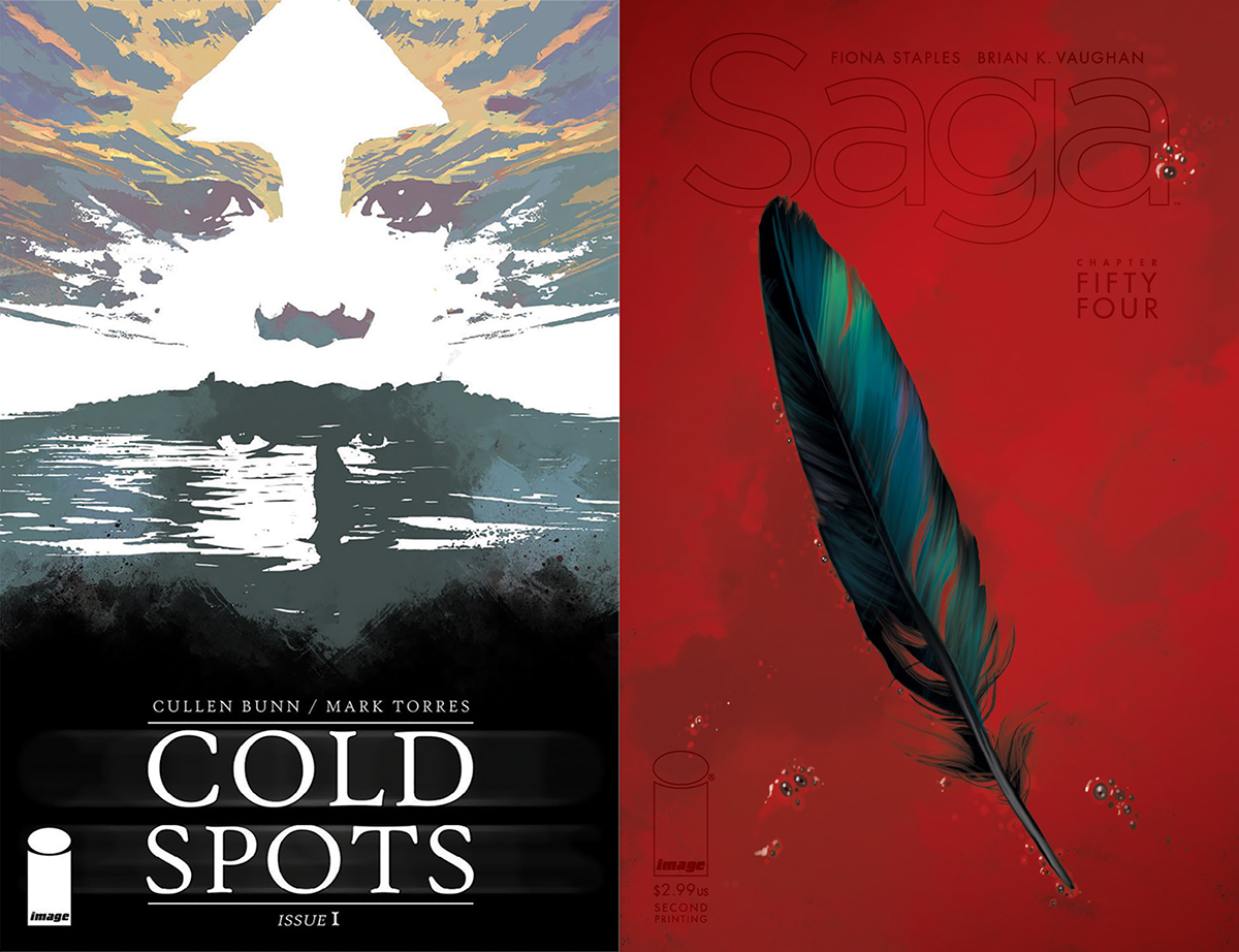
COLD SPOTS #1 by Mark Torres / SAGA #54 by Fiona Staples
These two covers remind me of the poster art of John Alvin, whose images are as recognizable as Drew Struzan‘s, but who leans towards simpler compositions that look instantly iconic. He tends to focus in on objects, or something in the sky. I love both of these.
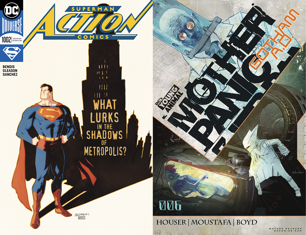
ACTION COMICS #1002 by Patrick Gleason / MOTHER PANIC: GOTHAM A.D. #6 by Tommy Lee Edwards
Gleason’s cover is a good use of white space to make an image stick out, but the other thing I like about it is how the caption text (is there another name for this? I’m blanking) has been integrated into the art. A lot of times this text feels placed on top randomly as an afterthought, but here it feels like it was always meant to be there.
I’ve enjoyed some of Edwards’ Mother Panic: Gotham A.D. covers while others have felt too busy and haven’t quite worked. I like this one because it does a great job of putting focus on that container. It’s the brightest object and surrounded by dark, the main character’s body language is pointing at it, and the title itself is pointing at it like an arrow. If I could tweak just one thing, it would be to rotate Mr. Freeze so he’s vertical, appearing to gaze down at the scene.
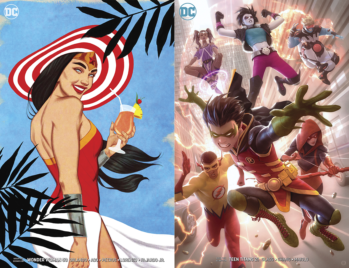
WONDER WOMAN #53 by Jenny Frison / TEEN TITANS #21 by Alex Garner
The bold colors in Frison’s illustration are great in an old-timey way, but what I particularly like is how the branches keep us in the composition. The top branch helps point focus at Wonder Woman’s face, and the bottom ones balance things out and frame her.
A lot of group shots on covers are busy and not fun to look at, but this one puts Robin way up front as a focal point to give us entry, and then we can take our time looking at the other characters around him, always coming back to the focus in the center.


