Via PR, Dynamite has announced that Kurt Busiek will be the writer of the Jack Kirby/Alex Ross project they’ve been teasing. Based on some of Kirby’s concepts, Busiek and Ross will co-plot with Busiek writing and Ross supplying some of the interior art.
Having already thrilled fans with the release of teaser images for the upcoming Kirby: Genesis comic book line, Dynamite Entertainment is now proud to announce that “the friend” who is joining Alex Ross will be none other than best-selling and multiple Eisner and Harvey award-winning writer Kurt Busiek! Writer Kurt Busiek will be re-teaming with Alex Ross for their first full collaboration since 1993’s Marvels. With Kirby: Genesis, Busiek and Ross are primed to expand on the vision of the legendary Jack Kirby with the same dynamic and unique perspective on superheroes that made Marvels such an original and successful story, allowing a new generation of comic book readers to become acquainted with the genius that is Jack Kirby!
About the chance to work with Alex Ross and the Kirby characters Kurt Busiek exclaimed, “If you look up ‘dream come true’ in the dictionary, it’s defined as ‘Working with Alex Ross on a big, epic project featuring dozens of Kirby characters.’ In my dictionary, at least. “Jack Kirby was the premier creative force in American comics history. And to have the chance to work with his creations in their purest form — some who’ve been seen before and some who haven’t, from the Ninth Men to Galaxy Green to Tiger 21 to Silver Star — and to build a new world and a grand story with them is the kind of opportunity and challenge I couldn’t possibly turn down. When we started talking about this, there was just so much stuff, so many great ideas, that I was confused as to where we could possibly start. But then Alex described one image — a single moment — and that was all it took to make me say, ‘Got it. I see the whole story now. Man, this is going to be fun.’ “And it is. Stand back. We’re gonna need the room.”
“One thing that Kurt and I have always shared is our love for Jack Kirby’s comics and legacy,” adds Alex Ross. “The Kirby: Genesis project is a way to repay the impact this one man’s creativity has had in shaping our lives. I’m excited to be plotting this adventure with Kurt as well as to be contributing to some of the interior art. This epic will be an ambitious assembly of every Kirby design we can lay our hands on.”


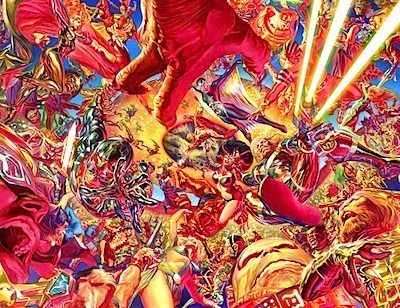



That’s an amazing piece of art, but MAN! is it cluttered! It’s hard to read.
Perhaps it’s the details, or the predominant use of red, yellow, and orange hues, or maybe the lack of a plain background to offer contrast. Maybe I’m spoiled by the Byrne/Rubenstein Marvel Universe poster, or George Perez’s two-page spreads.
Project Superpowers did not interest me, but I’ll give this a try. Hopefully, Dynamite will add lots of back matter to each issue, showcasing Kirby’s designs.
I wonder if any of the characters from Kirby’s “Phantom Force” that was published by Image will be used.
Kurt Busiek has worked with Topps on the KirbyVerse project from many moons ago, so he ought to know his way around! If my memory’s correct, he’d worked on SilverStar and TeenAgents, both of which were a lot of fun. With Busiek on board, I’ll be much more interested!
“Don’t ask, just buy it!” should be the slogan!
Looking forward to it on iApp!! :)
How much of the interior art are we talking?
Captain Victory! And it looks as if a few of the Topps Kirbyverse characters are in there as well. And I THINK that’s Silver Star…
Gotta agree with Torsten. This is a very confusing layout. Atypical for Ross.
All I want out of this project is a Captain Victory TPB. Please?
“Focal point? Of course this has a focal point! Hell, it has dozens of focal points!”
How much of the interior art? 10% I’d guess.
Methinks Mr. Ross was trying to emulate the day-glo colors Kirby used to color his initial sketches for the New Gods.
Way too many reds, oranges, and yellows. And it could have expanded so there’s a little room between characters. But that’s a little thing. I’m thoroughly looking forward to this.
Lance Roger Axt
The AudioComics Company
I hope that panel is four times bigger than that image because I can’t make out a single thing happening in there. There are some faces and a claw – that’s about it.
Anyone remember the two-part “Worst Comics Ever Awards” thing? It listed two Captain Victory comics and gave Kirby an award for worst dialogue. They said he didn’t so much write dialogue as compose word Jazz. The examples they pulled out of CV were pretty awesome.
If Ross had done more/some interior art on Project Super Powers it may have helped boost sales, same with Torch and other projects he was involved with in the past 2 years. Now he is acting like McFarlane at IMAGE, a few covers, a few plots and suggestions… So if he plans to do the same thing with the Kirby project I will not waste my money on it.
So is this a prelude to news on the Astro City movie?
I agree with Torsten, this artwork is very hard to look at.
It’s the red and yellow colours everywhere, yes, but also that the figures remain as sharp and clear in the distance as they are right in front of us. So it’s just a jumble.
In “real life” (.. which seems to be appropriate, since this is likely painted from figure reference, in a realistic representation) atmospheric haze would help us to make sense of foreground and background. Faraway objects are more “faded” than foreground objects.
If Ross had painted this with this in mind, he would have made this painting truly amazing, even with his maddening mix of yellows and reds.
An awful lot of negativity thrown at one image. It’s just an ad people. And what’s wrong with Word Jazz? I loved the dialogue in Captain Victory. Didn’t understand a word of it, but so what?
It’s supposed to be a jumble….it’s Kirby! I think the piece does a great job of evoking the frenetic, kinetic. Day-Glo madness of Kirby’s imagination.
Gotta agree with Kid Kyoto. Captain Victory is long overdue for a collection. Outside of the DC New Gods/SuperPowers stuff, that was his last continuing series and its absolute Kirby madness. I know Two Morrows did a mini collection of the first issues several years ago, but I’d love a color volume collecting the later issues.
You guys know that’s a THUMBNAIL, right? Click to enbiggen.
I think Alex Ross’s art style is well enough established by now that we can assume that he used this style deliberately.
Alex Ross’ painting is fairly lackluster. It’s his drawing skills that seal the deal.
I’m having fun embiggening the image and trying to ID the characters without referring to any Internet sites. Love the way Ross uses the primary superhero palette of red, yellow and blue to tie the picture together…!
Let’s see… there’s Lightning Lady, Captain Victory, Silver Star, Darius Drumm… and if you look closely, Kirby Krackle in the distance!
My retinas are burned! Is that a good composition…really? Ugh, oh well it’s Alex Ross, and he must have made it ugly intentionally. Wow, I guess love IS blind!
Yes, I know it’s a thumbnail. Yes, I’ve looked at it larger. It was just as garish, and just as jumbled. Its lack of negative space hurt just as much to look at. As a “Where’s Waldo in the Kirbyverse” stunt it’s well executed. But it’s not an example of good color choice or composition. I can’t define fanporn, but I know it when I see it; this is fanporn.
“But it’s not an example of good color choice or composition. ”
and of what merits do you make this demonstrative statement? has the internet killed “subjective” and turned everything into absolutes when i wasn’t looking? I know we lost nuance, but really…
I wasn’t put off by the coloring — though more complementary colors would have been nice — as much as I was by the number of characters. I hope that the intention isn’t to throw a platoon of heroes at the reader immediately, or there won’t be enough space to make the heroes interesting as individuals. I’d guess that one reason that DC’s LEGION OF SUPERHEROES has repeatedly foundered is that the editors think that having a large number of heroes and heroines ensures that the reader will be interested enough in several of them to buy the series to follow them. But if he isn’t interested in most of the heroes, and the ones he likes only get a few panels or less per issue, he’ll drop the series.
SRS
It is nice to see Ross teaming up with Busiek again. I think Marvels was the best project Ross ever worked on.
Though, for those saying that the colors and composition in this piece are merely a tribute to Kirby, I have to say that is not accurate. This piece is actually quite indicative of Ross’s recent body of work. Off the top of my head, I can think of pieces of his, all from with the past few years. And all exhibiting similar composition and color palettes.
To see a couple of examples for yourselves, look up the Ross covers for Justice Society of America #19 and for Batman #682.
I like a lot of Ross’ stuff but I do not like this. There are so many characters jumbled together and such similar colors are used that I can barely tell what’s going on. It pretty much hurts to look at and makes me disinterested at any potential project. I’ll wait to see more before I get excited.
I guess this means Ross will give even less attention to Project Superpowers, when it seems to me that needs more of his attention.
‘“But it’s not an example of good color choice or composition. ”
and of what merits do you make this demonstrative statement? ‘
I make this statement based on the fact that I made it through my first year of art school with good grades. (I actually went farther, but that’s when I took Color Theory and learned the basic principles of composition.) If another student had presented something like this in class, I would’ve said the same thing: it’s a hard-to-read mess.
Now, Ross knows those principles too, as a look at most of his other work shows. Painting this dayglo trainwreck the way he did was apparently a conscious choice to ignore those principles in favor of… fitting Forgotten Kirby Character #134 in somewhere. The oversaturation and overuse of magenta and yellow was presumably a choice to make it more “intense”. Whether that was a good choice or not is subjective, I suppose. But I was never one to buy the idea that all creative choices are equally valid.
I love Captain Victory and Silver Star, there was some real humor in those books that’s rarely seen these days. I would have liked to read more than one issue of Busiek’s Silver Star mini series in the 90s, maybe he can use the plot he never got to finish there.