
This will be the final installment of By Its Cover for 2015.
Don’t be alarmed, it’ll probably return in 2016. Having a day job at a major online Halloween costume retailer means the second half of my year is always busier than the first, which makes it a little harder to keep up.
While each column might seem fairly short, the majority of the work happens in the research stage. Every week there are roughly 200 comics and graphic novels are released in the Direct Market, which adds up to about 800 per month. When we include variant covers, that might take us past 1,000 comic covers per month.
And I try my best to look at every single one.
Most of them don’t make it past the first round. As Sturgeon’s Law states, 90% of everything is crap. However, what Sturgeon’s Law doesn’t tell you is that 90% of that remaining 10% is average or mediocre. The good stuff is only in the remaining 1%, and out of that I choose the 10 or so covers out of 1,000 that appeal to me most.
Here’s a graph to illustrate:

Each column you’re only seeing 0.1% of the total covers that were released.
I should be said that creating a cover that really stands out isn’t as easy as sitting down and saying “today I’m going to design something Great.” Even the By Its Cover logo at the top of this article is something I’d probably rate as “Mediocre.” Greatness is that perfect combination of clever idea and solid execution. Sometimes you have an idea, and it all comes together in a few hours. Other times you spend days on it, and it just isn’t working.
Below are the five artists who were mentioned the most in the 2015 edition of By Its Cover:
- Tom Muller
- Rafael Albuquerque
- Kris Anka
- Phil Noto
- Mike Del Mundo
Congratulations, you are the winners of the 2015 award for Comic Cover Artist With Most Mentions In Kate Willaert’s By Its Cover On Heidi MacDonald’s The Beat. There is no physical trophy, but you are more than welcome to mention this prestigious award on the cover of your next collection…if you can find away to include it that doesn’t clutter up your design.
In a previous column, I made a statement to the effect that keeping a series logo in the same exact for longer than a single storyline can start to get boring. I cited a few examples where a nice logo design took up a large portion of the book, but the illustrations on each issue weren’t memorable enough or significantly different enough to defeat “did I already by this one?” syndrome.
No one felt strongly enough to disagree with me (or to agree with me, for that matter), so I’m going to provide my own counter-argument. Recently I was reminded of John Berg’s run of album designs for Chicago. His intent was to keep the logo the exact same size and in the same place on each album, creating consistency and a sense of familiarity.
However, he also dramatically altered the look and feel of each one — changing not just the color scheme, but the style and even the medium — so that nobody would ever confuse one for another.
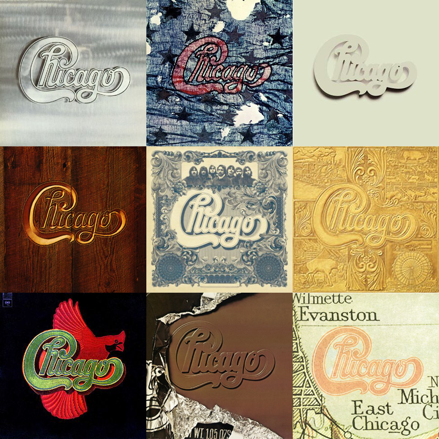
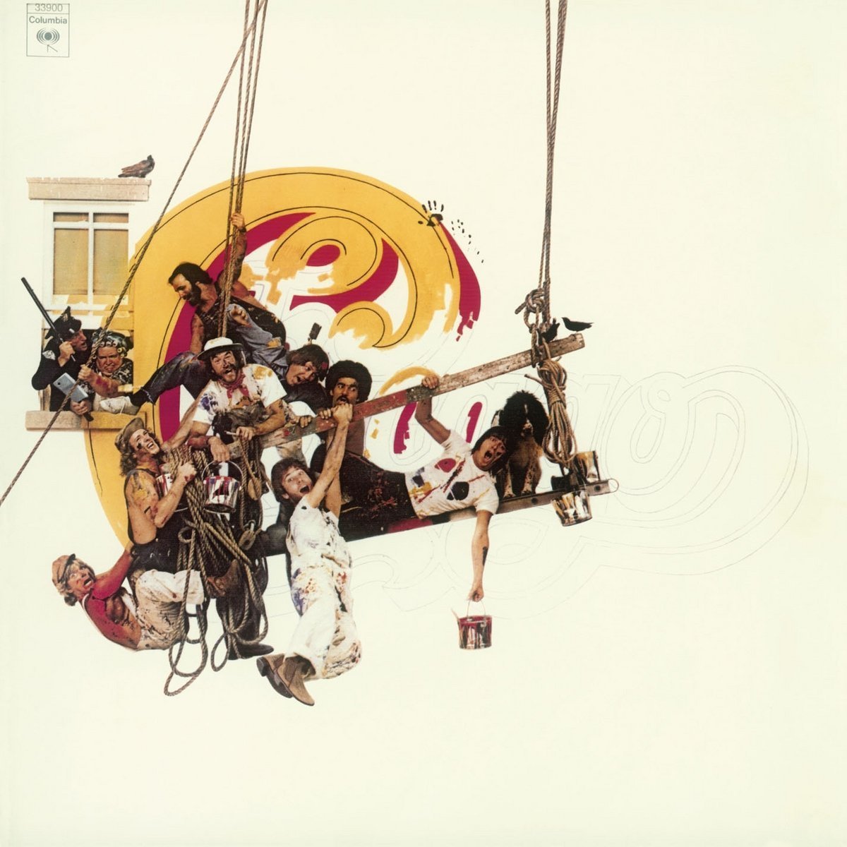
Chicago made of metal, cloth, plaster, wood, and chocolate. Chicago as an engraving, a map label, and a Rockwell-style painting. If you want to keep the design elements static over a series, you have to push that much harder to make the rest of it unique and memorable.
Out of all the comic covers I’ve seen, I think Watchmen maybe came the closest to achieving this. Akira might be the second-closest (both the collections and the Epic serialized covers), though some of them were kind of forgettable. It’s a challenging thing to attempt.
When By Its Cover returns, it might once again take on a new format. I’m contemplating focusing on the body of work of a single designer per column.
Would that interest you? If so, who are some cover artists/designers you’d want to see covered? My short list might include Dave Sim w/ Gerhard, Neal Adams, and Jim Sterkano, , but I’m also open to more recent artists as well. Who has an impressive body of comic covers?
Kate Willaert is a graphic designer, a UI/UX designer, an illustrator, a writer, a critic, and possibly a bunch of other things she isn’t even aware of yet. You can find her her art on Tumblr and her thoughts @KateWillaert. Notice any spelling errors? Leave a comment below.


I’d like an overview of Alex Ross covers. He works with lighting, deep perspective, and live models. Could be interesting.
Comments are closed.