
The column that judges a book by its cover, focusing on the month’s best-designed comic covers. For the month’s best-illustrated comic covers, see Best Comic Covers Ever (This Month).
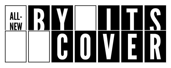
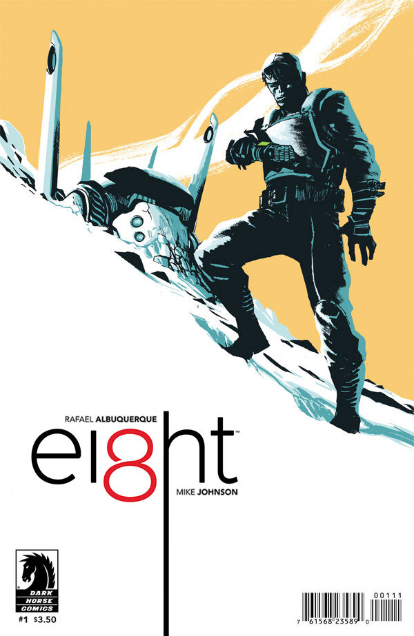
Ei8ht #1 by Rafael Albuquerque
This is such a fantastic cover. The diagonal angle is dynamic, and the limited color palette is striking. The only things that break from the color palette are the numeral “8” and the face of the character’s watch. Personally, I might’ve tried to make those two items the same color to unify them (and draw more attention to the watch), but it still works.
The only thing that really bothers me is the way the title logo leans awkwardly on the Dark Horse logo. If we’re committed to keeping the DH logo and barcode where they are, I might’ve tried playing with the logo placement and size to do some more dramatic and poster-esque, along the lines of this.
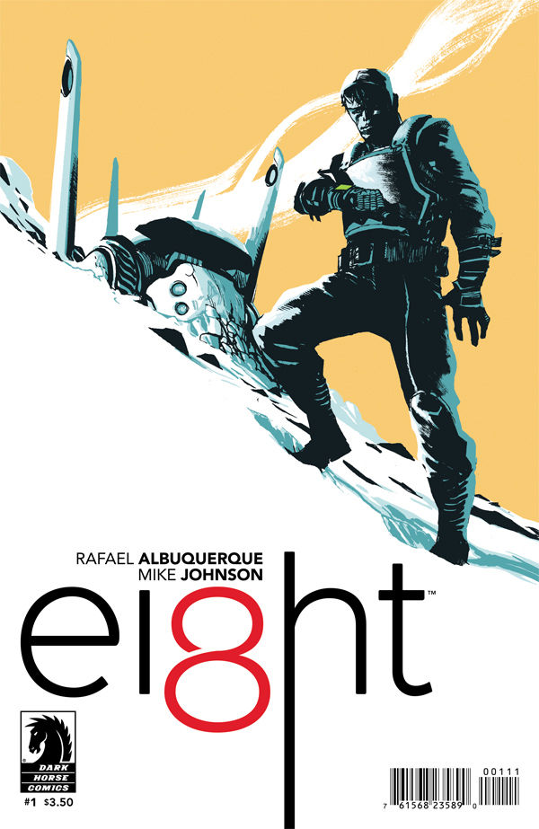
Ivar, Timewalker #2 by Raul Allen
This is a brilliant concept, using the language of comics (panels and gutters) to represent a person literally walking through time. The muted colors and heavy use of black are so sharp, it took me a moment to realize how similar the cover concept is to the old Sega Genesis game Comix Zone, because this looks so much nicer.
I’m not sure who designed the logo (another Tom Muller creation?), but I like how ultra-modern and traditional fonts have been mixed to suggest two different time periods.
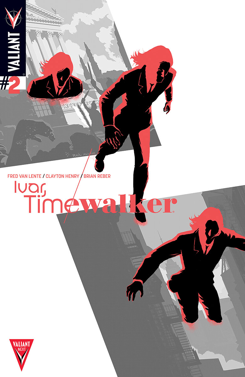
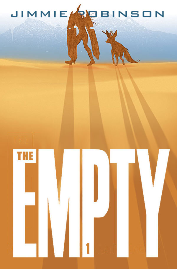
The Empty #1 by Jimmie Robinson
This image does a great job of suggesting a long journey. The warm-and-cool color palette used here and on Ei8ht is one of the most effective color palettes, but that also leads to it going through periods of being overused. Right now I think it’s okay because magenta is currently the most overused color palette for covers that are trying to stick out.
The one thing that kind of bugs me is how the creator’s name is off center, while the logo itself appears centered enough that it doesn’t look like it’s intentionally flush-left. I have a feeling it was because of that difficult uppercase “Y”, where it might look odd for the name to be sticking out past the bottom. Personally, I might’ve tried playing with something along these lines instead.
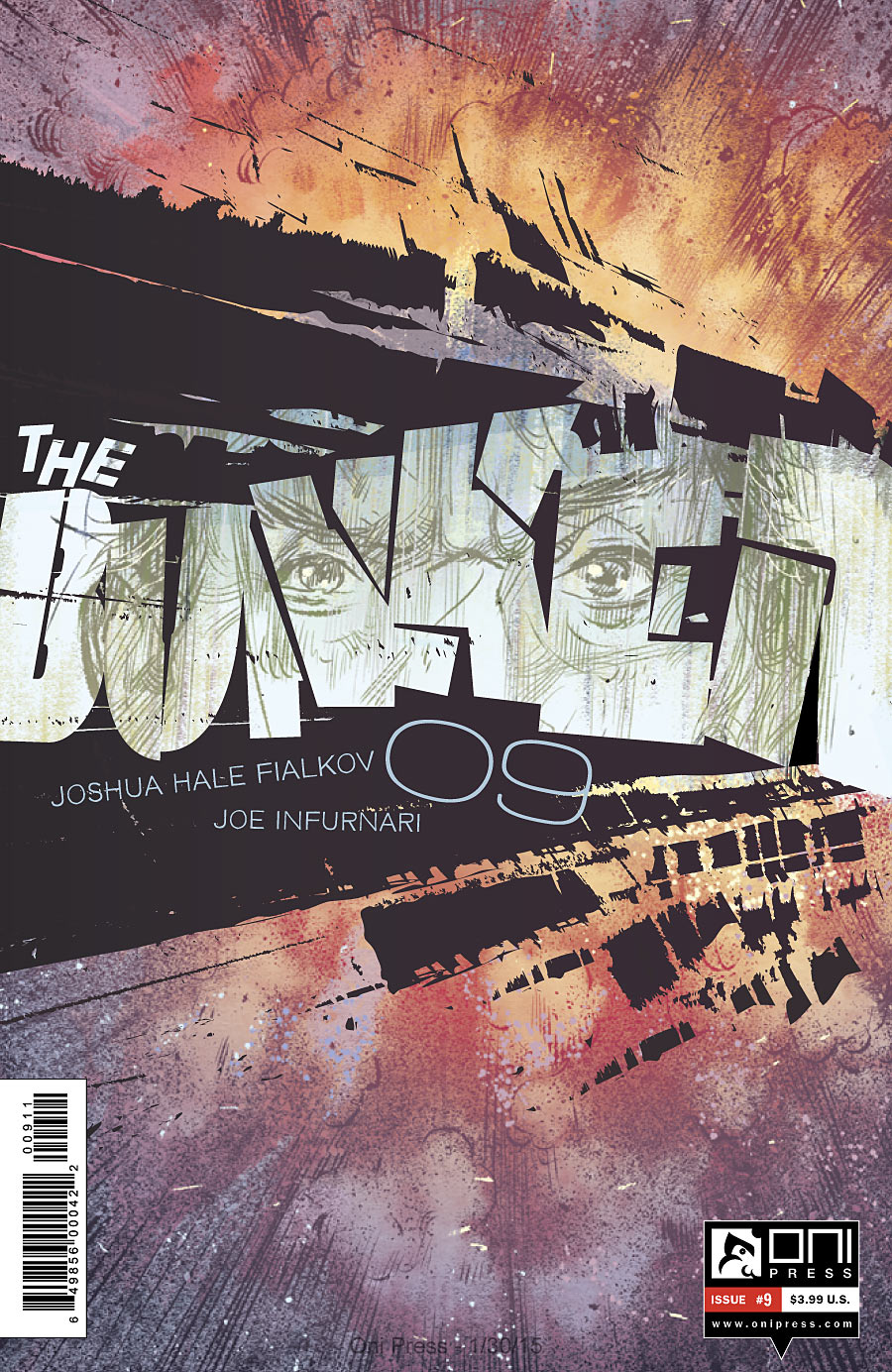
Bunker #9 by Joe Infurnari
I love the energy of this cover. It might not communicate anything to me in terms of story (other than the story being explosive?), but I have a soft-spot for covers that involve destroying the logo. One thing to note: a friend I showed the cover to felt it looked like the logo said “The Bunken.”
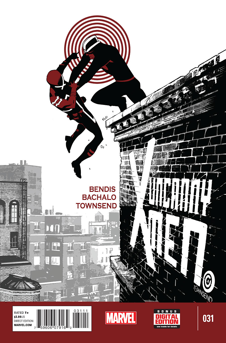
Uncanny X-Men #31 by Chris Bachalo
One of my favorite things about Bachalo X-Men covers is how often he draw the logo in himself, in order to make it a more organic part of the illustration. It’s also a great way to make the logo is exactly where you want it if someone further down the line is going to be adding it in.
I’m not sure about the placement of the credits. Personally, I would’ve put them in one of the upper corners…and yet, there’s something that works about Cyclops nearly getting tossed into them. They could maybe be nudged upward just a bit, though. Right now they’re awkwardly touching the tip of one of the background buildings, and I’d kind of want the three lines to match up with the “U” in “Uncanny,” since the three lines together are roughly the same height as that word.
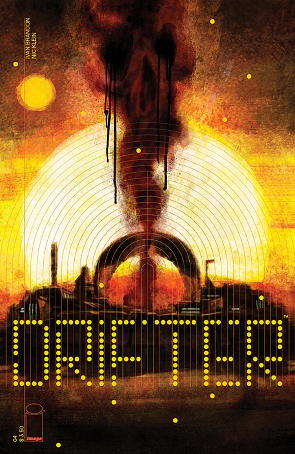
Drifter #4 by Nic Klein & Tom Muller
I’m enjoying all the covers for Drifter, but I’m running out of things to say about them. What is it that I like so much, exactly? Is it because I love circles and grids, and every cover has grids and circles and circular grids?
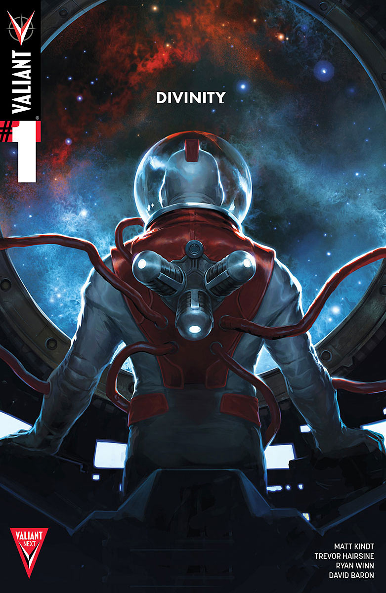
Divinity #1 by Jalena Kevic-Djurdjevic
I’m a big fan of minimalist logos, so this is right up my alley. The only problem is, the other design elements don’t fit into the minimalist theme. If I knew nothing about comics, I would assume this was called Valiant #1, and “Divinity” is maybe the name of the storyline, or an oddly placed subtitle (Valiant: Divinity #1).
What if we got rid of that whole blog in the upper-left, and had a version of the “Valiant Next” patch that was just a “1” above a “V,” and centered that shape horizontally at the bottom of the cover? I’m not sure where the creator credits would go, but maybe they could be spread out along the top. But I think “Divinity,” at it’s current size, should be the largest text on the cover.
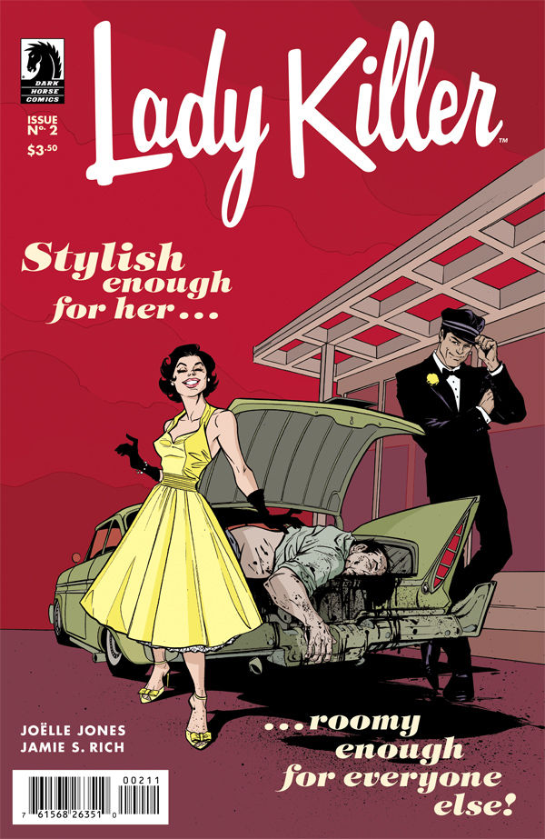
Lady Killer #2 by Joelle Jones
I have a very dark sense of humor, so this appeals to me greatly, yet it’s not quite working for me. If this was colored like a vintage car ad, the focus would be on the trunk being the out of place element. Instead, the sky is colored a scary red, which makes the smiling woman in the bright yellow dress the out of place element, which isn’t as funny.
The cover of the first issue used a slightly more pastel color palette, but it still doesn’t quite work because the black lines are so overpowering. Both of these covers would work a lot better if they’d been painted in the same style as vintage ’50s advertisements, or at the very least had the linework colorized. Bodies #1 did a good job of creating contrast between vintage ’50s and blood, even if their design went more for horror than dark comedy.
Agree? Disagree?
Kate Willaert is a graphic designer for Shirts.com. You can find her her art on Tumblr and her thoughts @KateWillaert. Notice any spelling errors? Leave a comment below.


I have always liked this column.
But seeing my cover for The Empty on this month’s list makes this all the more special. THANK YOU!
And y’know… I agree with your redesign. If I had not already finished and solicited 5 out of the 6 covers already I would’ve heavily considered your format. Perhaps I can use it for the trade paperback. Thanks again, Kate. You’ve made my day!
Great covers. I’m also loving the Hellboy and BPRD covers. The recent I human cover was perfect and my favorite of the month.
SO happy to see the return of this column, Kate!! Awesome work, as always. Super illuminating. I am especially struck by your attention to logo placement which does seem to be seemingly random or thoughtless on many of these cover
And by the way, this is a little late, but I wholeheartedly agree with you on the Tom Muller Valiant variants from the previous column; they are a rare misstep from the guy who is my favorite designer in comics today; you were right on with your critique of them… They did look more like a printing error than anything else.
Hey Kate — I didn’t design the Timewalker logo. I did design the Divinity logo though (along with all the Divinity B variant covers).
Comments are closed.