
The column that judges a book by its cover, focusing on the month’s best-designed comic covers. For the month’s best-illustrated comic covers, see Best Comic Covers Ever (This Month).
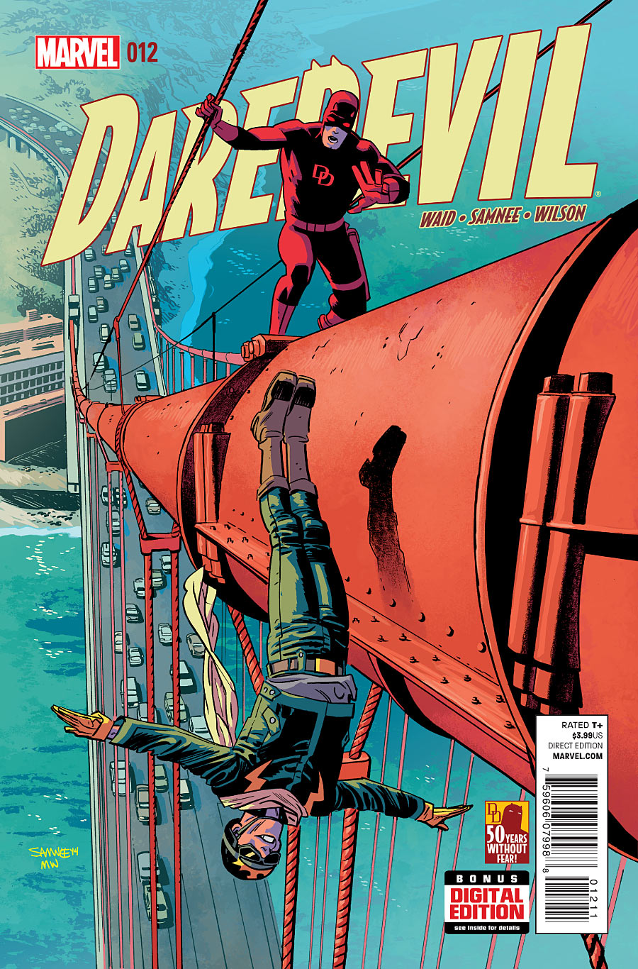
Daredevil #12 by Chris Samnee
When Daredevil looks shocked that someone is flying through the air, you know this is serious. But what really gets me about this cover is the dynamic foreshortening of that bridge cable. My eye just keeps going forward and back, forward and back…I’m lost in this cover, I can’t escape.
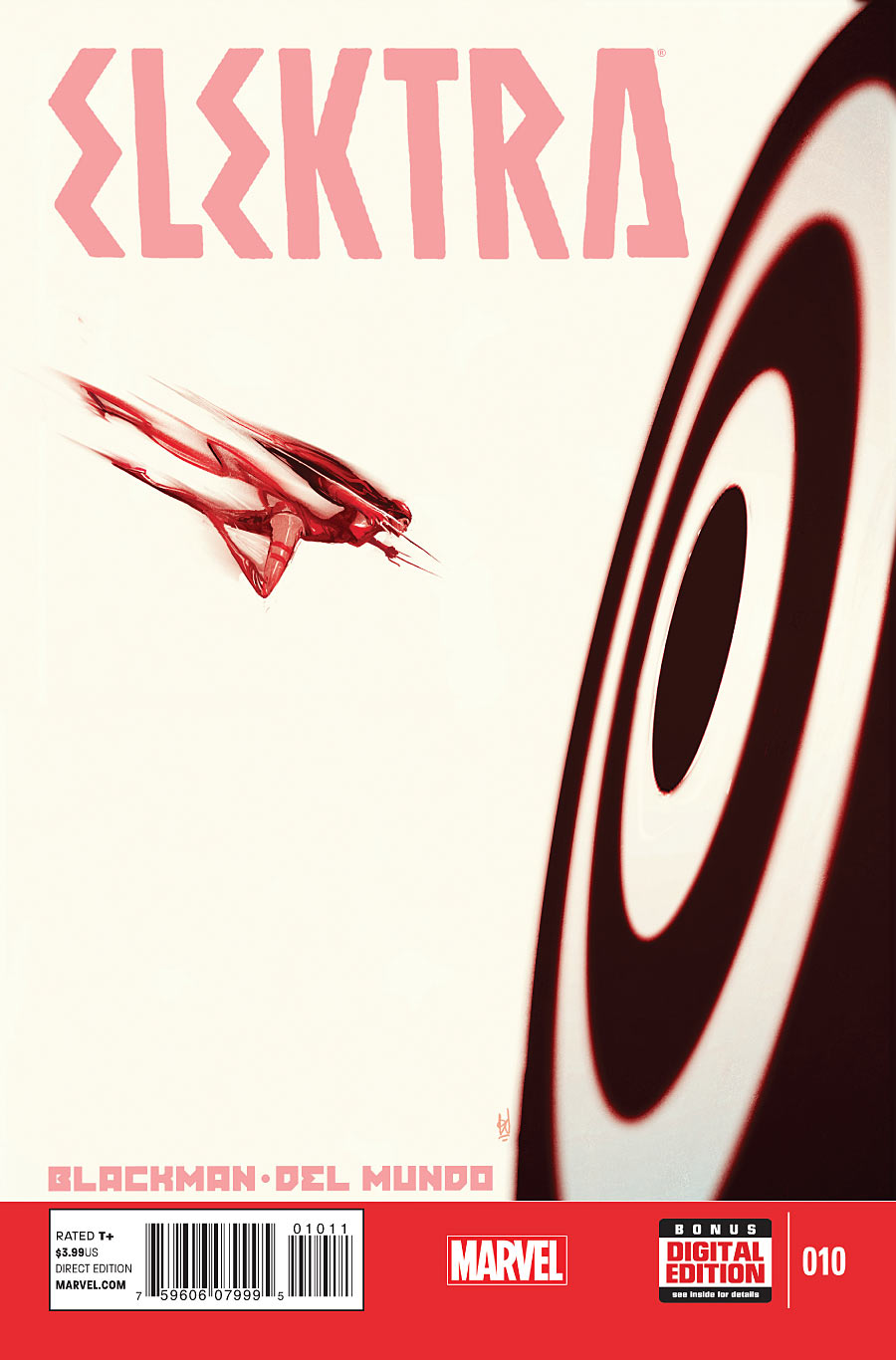
Elektra #10 by Mike Del Mundo
You’re going to notice that people flying through the air is a recurring theme this month. I like the idea of Bullseye being represented by a target, but I think the symbolism would’ve been much more powerful if it had been a sai flying towards the bullseye (whereas the tiny Elektra flying towards a wall looks a little too Wile E. Coyote to me). What do you think?
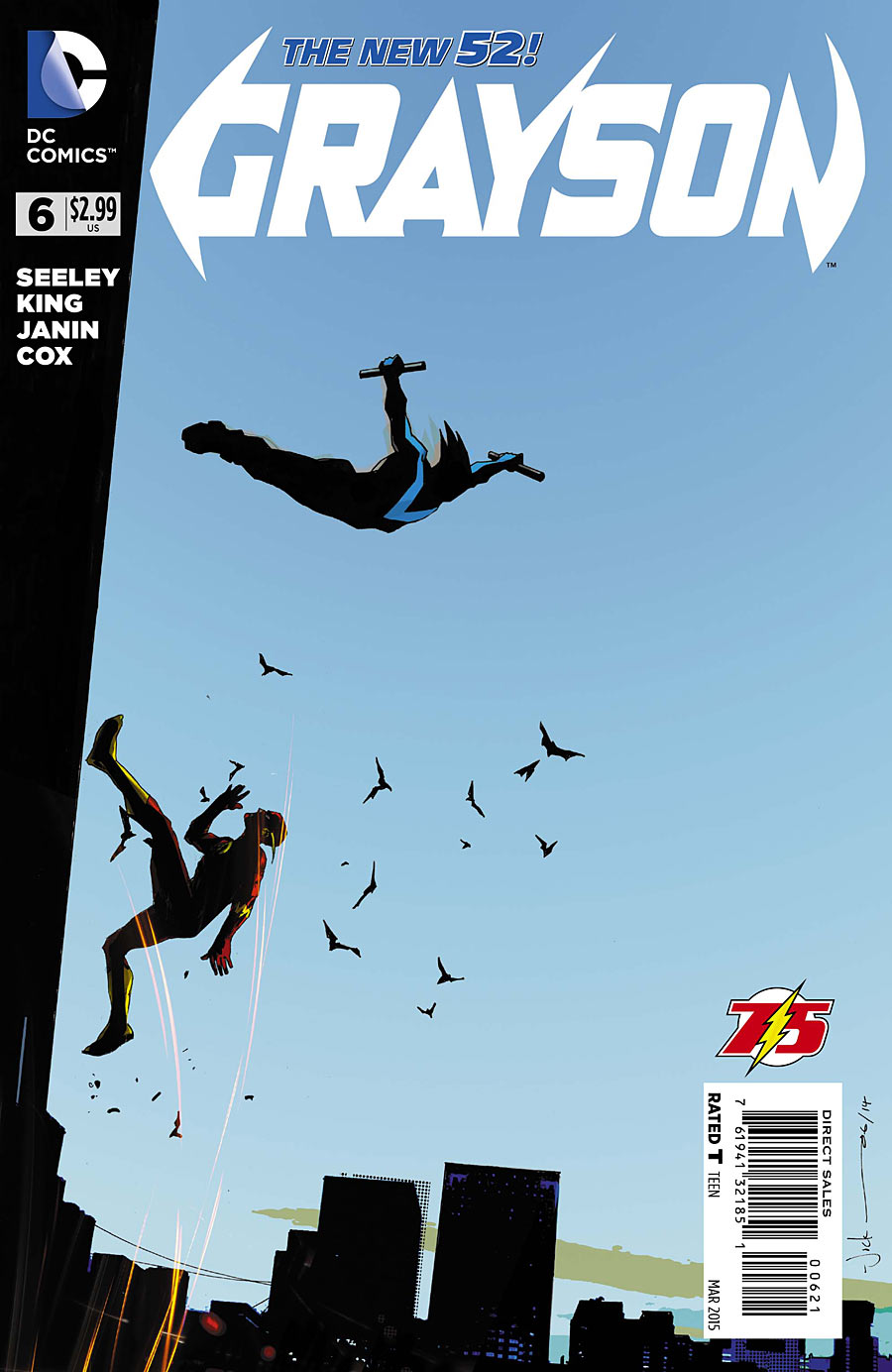
Grayson #6 by Jock
Jock demonstrates a clever way to make the title appear centered when stuck with the standard DC trade dress. I’m a little confused whether Flash and Nightwing are interacting or just happen to be crossing paths on separate adventures, but the high contrast of the sky against silhouettes looks very nice.
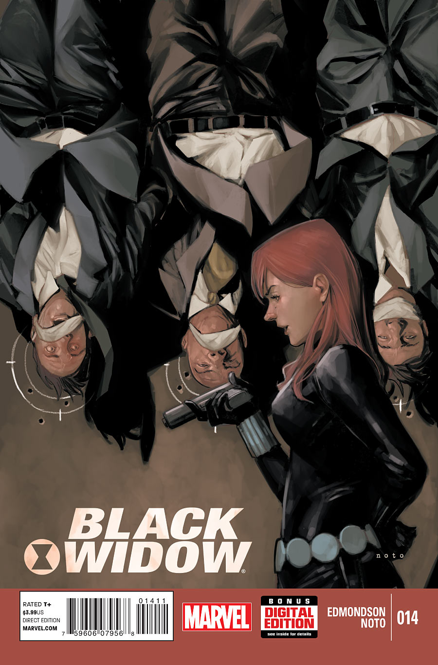
Black Widow #14 by Phil Noto
The body language in this one is great. You can clearly tell that Black Widow is lecturing them, despite the absence of dialogue. My main complaint is that the logo placement seems like such an afterthought. Am I the only one who feels like the top portion of the cover seems really “empty,” like there should be a logo across the top instead?
The more I look at the cover, the more I start asking other little questions like “why did she tie their gags so loosely?” and “wouldn’t it make more sense to draw targets right below their head, and hit the bullseye on each to show how in control she is?” But that’s me.
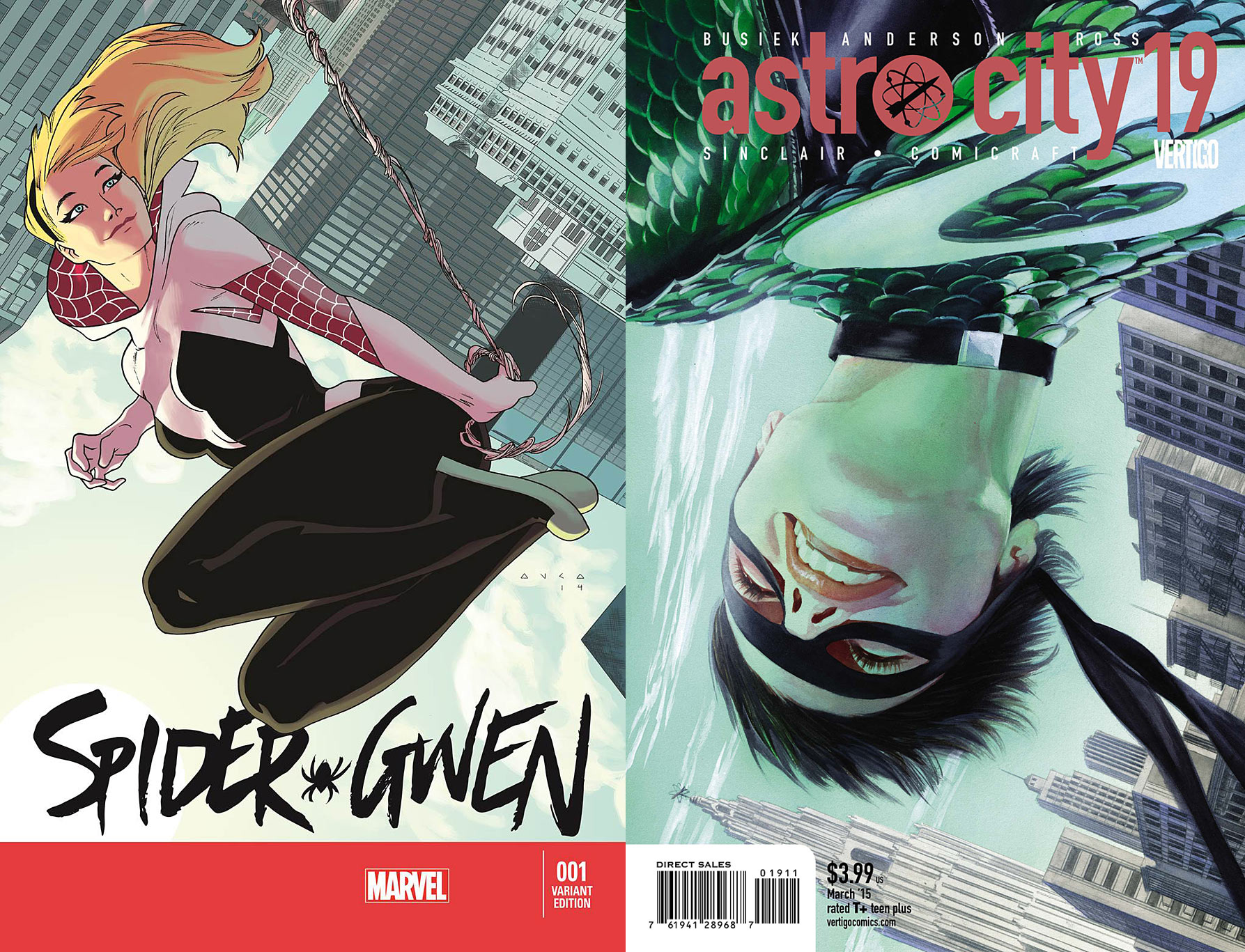
Spider-Gwen #1 by Kris Anka / Astro City #19 by Alex Ross
Two artists this month played with skewed horizon lines. Marcos Martin’s Amazing Spider-Man cover is still my favorite, in part because of the way it integrated the logo, but these are fun too. Zooming in on the character’s face as in Ross’ painting puts the focus on the sense of bliss the character is feeling, while going full figure like Anka’s cover gives you a better sense of how high up she is.
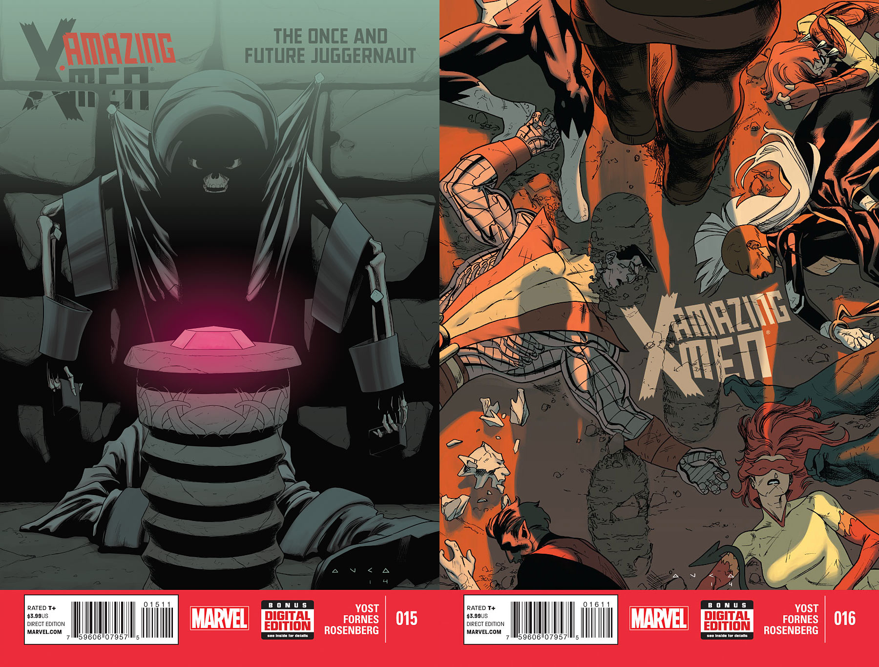
Uncanny X-Men #15 & 16 by Kris Anka
Speaking of Anka, I really enjoyed these two covers he did. Maybe it’s a sense of nostalgia for when covers would show moments that don’t actually happen in the book, but that exaggerate the stakes that are present in the story.
My only complaint is that the logo placement in both isn’t quite working for me. On the first cover, the logo has been split in two by a shadow that is lighter in shade than the logo. If the logo is painted on the wall, it should be the same shade of gray. If the logo is floating in front of the image, it shouldn’t be split in two by the shadow. It’s one of those little things that distracts me.
In the second cover, I like the idea of Juggernaut stepping on the logo…except that it distracts from the best part of the illustration, which is the footprint over Colossus’ head. Plus, the placement of the logo feels almost like it was crammed in there just because it’s the only place where it wouldn’t overlap any characters. Though honestly, if there was ever a cover illustration begging to be logoless, it’s this one. Maybe the logo even could’ve been fit somewhere down below in the Red Bar Of Design Elements We Don’t Know What To Do With.
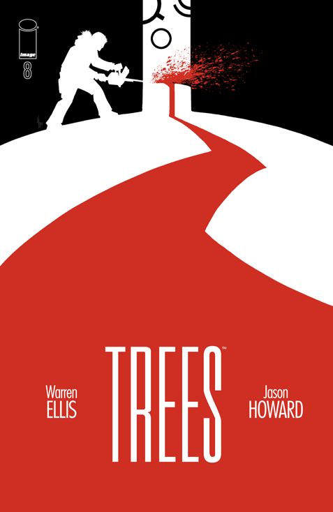
Trees #8 by Jason Howard
I love the high contrast and how balanced everything is. If I saw the top third of this cover poking out behind another comic, I’d definitely be like “what is going on here?”
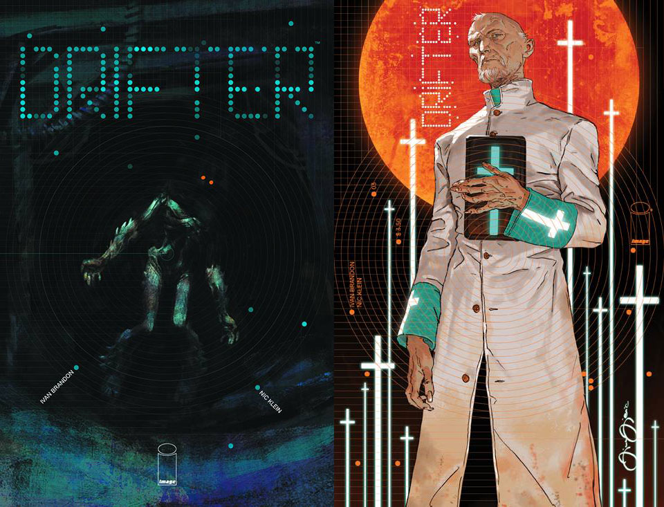
Drifter #3 by Nic Klein & Tom Muller / Marko Djurdjević & Tom Muller
It’s a little hard to see at this size, but the clever thing about the first image is that the creature’s eyes line up on one of the circles that radiate out of the center of the cover:
Not having read the issue yet myself, my question is: should I be afraid of this creature? Because unfortunately I feel like the scary glowing eyes and shadows are sort of neutralized by the creature’s body language. The tilted head and open arms that seem to say “I want to give you a hug,” while the unsteady legs that look a little like the creature is taking its first steps.
The second cover seems much stronger to me, because there’s so much contrast. White robe against black background, warm planet against cool teal details. I also like the movement of the crosses, which send me back to the top after I look down from his face to his hands. The low angle is also incredibly dramatic. I know some people cringe a little when they hear the word “pops” in reference to design, but this cover really pops.
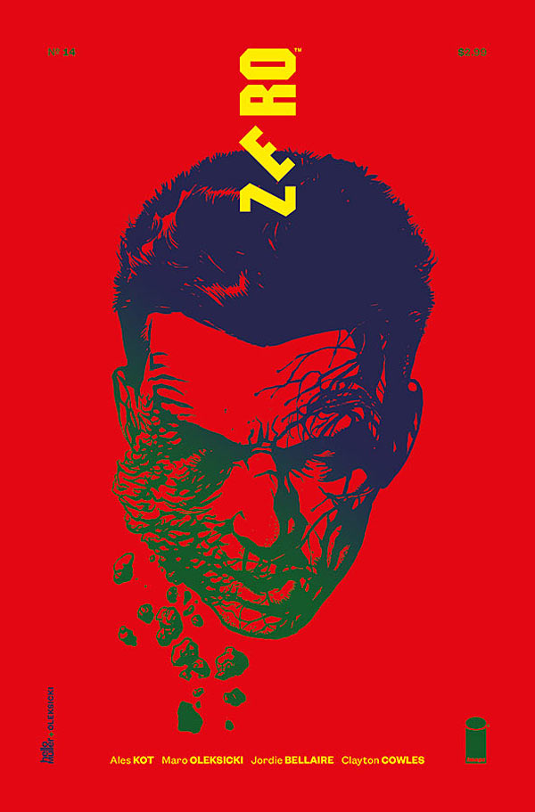
Zero #14 by Marek Oleksicki & Tom Muller
The thing that sticks out to me the most here is how the logo appears to be falling apart in a way that mirror’s the face crumbling, yet at the same time seems very solid and controlled. The bright colors really stand out, but would immediately be less effective if a similarly vibrant cover appeared nearby. In fact, for that reason I did not include the variant cover, which uses the exact same color scheme. When placed side by side, both immediately lose their power.
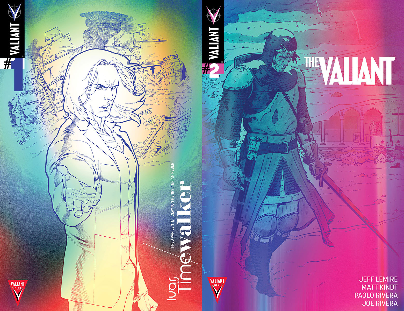
Valiant Next Variants by Tom Muller w/ Clayton Henry, Paolo Rivera, Trevor Hairsine, and Mico Suayan
I’m going to be honest with you: I don’t like these. I realize not everyone feels this way, so I’ll try to explain my thoughts.
Designers can have some major philosophical differences on what “good design” means. (For a good example, I highly recommend the documentary Helvetica.) In particular, there are different schools of thought on whether design should exist to serve the message, or whether design is the message.
I lean towards the former. And just as I feel that design should serve the message, I think comic art should serve the story, and comic coloring should serve the art.
Muller’s coloring on these covers doesn’t serve the art, it upstages the art, sometimes nearly obscuring it completely. The Valiant cover has a cool damaged film look to it, but the rest don’t have the same visual impact (especially when they all appear together).
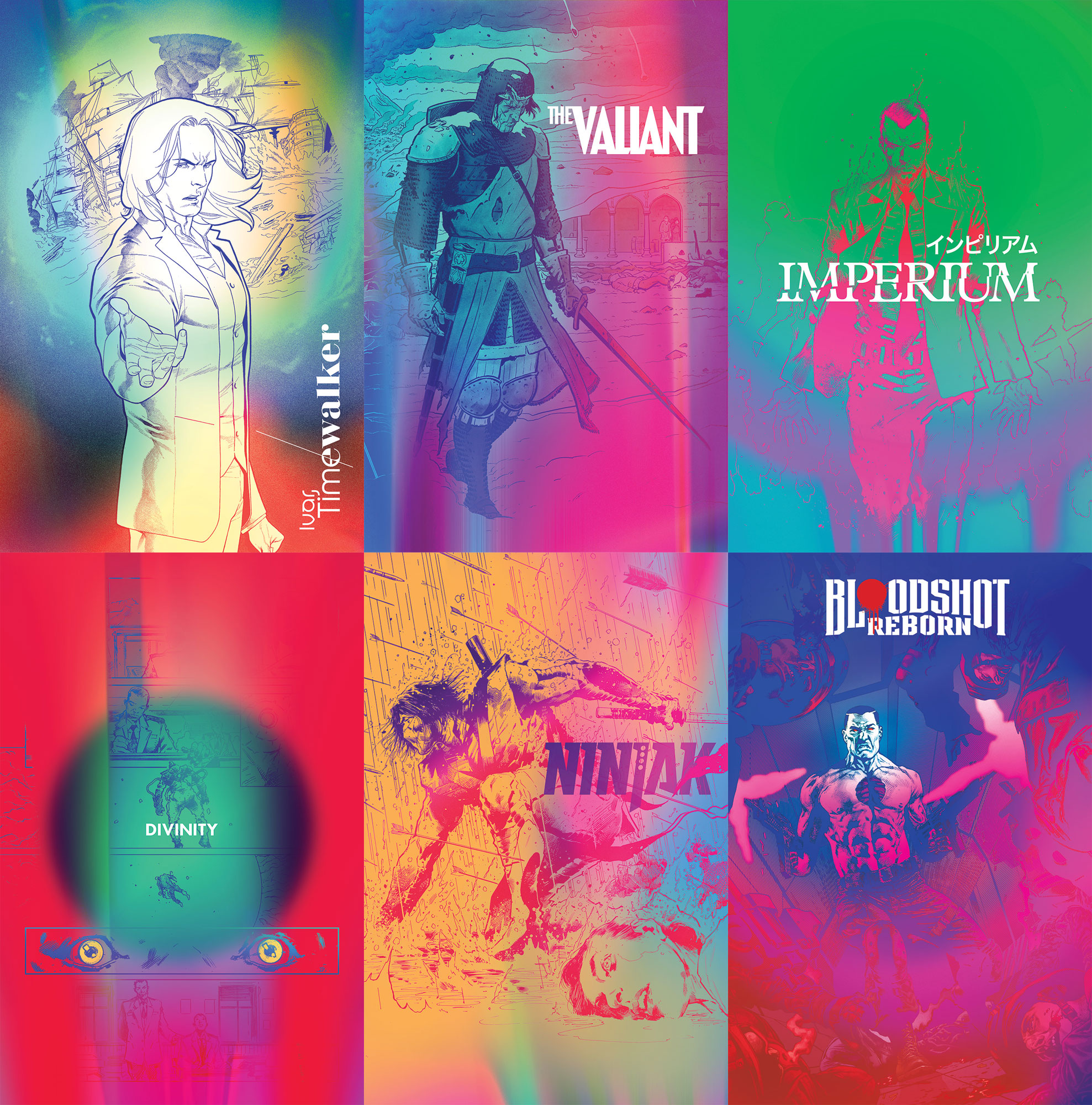
My favorite thing about Muller’s work is the creative placement of design elements, so it’s doubly sad to me that the covers are pretty traditional in that regard, aside from title placement. The vibrant clashing colors work on Zero because the logo and text elements fit with that same sort of punk aesthetic. When combined with fairly traditional logos and trade dress, the warped colors no longer look intentional as much as they look like a printing error.
What are your thoughts? Do you like or dislike them?
Kate Willaert is a graphic designer for Shirts.com. You can find her her art on Tumblr and her thoughts @KateWillaert. Notice any spelling errors? Leave a comment below.


How did the Lady Killer #2 cover not make the list?! That Black Widow cover is great, though, definitely agree :)
I really really like Spider-Gwen #1 by Kris Anka. It captures the intent of the other ‘people flying through the air’ covers you mention, but the figure is larger, which to me works better.
As far as the Valiant Next Variants, they are fine. They are interesting, dynamic and eye catching. More fun than one of the cover clichés we are seeing a lot of these days: Unhappy Hero grimacing in darkness, backlit by: (pick one) 1. lightning 2. explosion 3. supernova/planetary event 4. enemy blast
I agree about not enjoying the design for those valiant variants, especially the Divinity one.
DD#12 was my favorite of the month, as well. Tells the entire story.
Katy: The concept of the Lady Killer #2 cover definitely appeals to my dark sense of humor, but I think the execution could’ve been a little better.
If the sky had been a sunny blue sky to match the smiling figures and campy lettering, the dead body would’ve looked more “wait, that’s not supposed to be there.” When given a blood red sky that matches the tone of the dead body, it’s instead the smiling figures and the lettering that seems like they’re out of place. Know what I mean?
Comments are closed.