
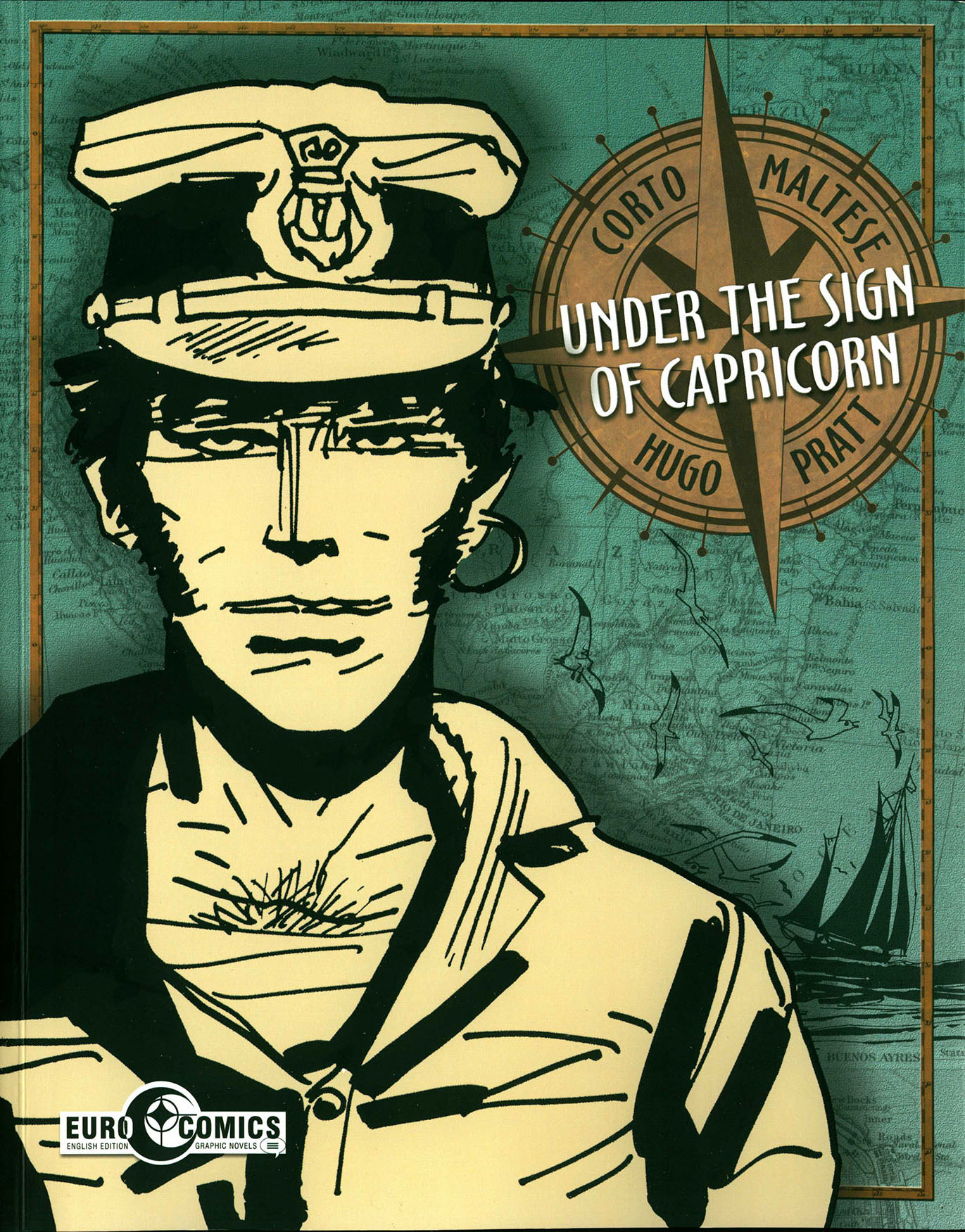
Under the Sign of Capricorn by Hugo Pratt IDW/Eurocomics, $29.99 _________________________________________________
As the year turns, IDW’s EuroComics imprint debuts with the first of twelve projected volumes of Hugo Pratt’s beloved Corto Maltese. For these elegantly produced trade paperbacks, Pratt’s literate, witty, exceedingly well-researched and beautifully drawn stories are translated by Simone Castaldi of Hofstra University and Dean Mullaney, producer/co-editor of IDW’s essential Milton Caniff collections and their Eisner award-winning Alex Toth biographical trilogy. Pratt’s Corto Maltese is among the most highly regarded series in European fiction, but American publications done by NBM in the 1980s and by Rizzoli in 2012 had production problems and they found lukewarm receptions. Finally, Mullaney and IDW do Pratt justice with this new series.
Hugo Pratt was born in 1927, of Italian, English, Jewish and Turkish heritage. In 1936 his father, a Mussolini supporter, moved his family to Africa, where at the age of 14 young Hugo was conscripted into the colonial police. The now-multilingual youth became entranced by Caniff’s comic strip Terry and the Pirates and writers like Joseph Conrad, Jack London and Robert Louis Stevenson. After his father’s death in a British POW camp in East Africa in 1942, Pratt and his mother returned to Venice, where he studied at the military college Città di Castello and interpreted for the allied army. In 1949 he moved to South America where he collaborated with the late writer Héctor Oesterheld on El Sergeanto Kirk, Ernie Pike and Ticoderoga and he created Fort Wheeling, Anna della Jungla and other well-known titles.
His most famous creation Corto Maltese was first seen in “The Ballad of the Salty Sea” in the Sgt. Kirk title, then after he returned to Italy in the early 1960s, the series debuted in earnest in the French magazine Pif in 1970 and made Pratt famous; it has been translated into more than fifteen languages and is still a best-seller in Europe. Concurrent with Corto, Pratt also created many other series, such as Scorpions of the Desert and Morgan. He wrote Indian Summer (1983) and Gaucho (1991) for artist Milo Manara and he also wrote prose novels such as Jesuit Joe (1980). Pratt is the recipient of many honors worldwide including a French knighthood; in America he was inducted into the Eisner Hall of Fame in 2005. Pratt died of cancer in Switzerland in 1995.
I interviewed Dean Mullaney and Simone Castaldi by email in December 2014. _______________________________________________________
James: It is hard to overemphasize how significant I believe this project to be; Hugo Pratt is simply one of the greatest cartoonists to ever walk the Earth.
Dean: We’re all in agreement here! I first tried getting the rights in 1982, hoping to serialize the short stories in Eclipse! You live long enough…dreams sometimes do come true.
James: Pratt and Corto Maltese have been huge in Europe for many years, but are unknown here. How will IDW promote such an important series?
Dean: Introducing Hugo Pratt to an American audience presents its challenges but we are wholly dedicated to making it a success. I personally consider this one of the most important projects I’ve ever edited. Corto Maltese is the lead feature in IDW’s winter catalogue. The promotional budget for the series is easily the highest of any of our previous books. In the U.S. Hugo Pratt and Corto Maltese are primarily known by professional comics writers and artists, who have eagerly “enlisted” in spreading the word to their fans. With Patrizia Zanotti, Pratt’s longtime assistant, we are putting together a Pratt presentation at the Society of Illustrators in cooperation with the French Embassy. And Corto benefits as the premiere title in our new EuroComics imprint.
James: “Under the Sign of Capricorn” contains all of the stories that were in NBM’s The Brazilian Eagle and two of the pieces are from Banana Conga. Will forthcoming volumes include a lot of material never published in English before?
Dean: Although Pratt’s 20-page Corto stories have been published in several formats and in seemingly arbitrary configurations such as “Banana Conga,” he envisioned them as belonging to four distinct cycles. We are publishing these stories in four collections according to Pratt’s overall design and will complete the entire series in twelve volumes.
James: Your initial offering is actually the third book in the series. Will there be hardcover editions forthcoming at some point?
Dean: We’re beginning with the third book because the poorly-received Rizzoli edition of “The Ballad of the Salt [sic] Sea” (chronologically the second book in the series) is still in print. We’ll cycle through the rest of the books, and then double-back to present “The Early Years” and “The Ballad of the Salty Sea.” “Under the Sign of Capricorn” is a good place to start because it’s with these inter-related short stories from the early 1970s that Pratt established most of his primary themes and characters. We will also issue six oversized (close to the dimensions of Pratt’s original artwork), limited edition hardcovers, each containing the contents of two trade paperbacks. For example, the first hardcover will collect, for the first time anywhere, the entire “Caribbean Suite” (the first eleven short stories) in a single volume—something Pratt had always wanted to see. These hardcovers will include many “extras” — essays, artwork, and photographs that provide background on the stories and Pratt’s intensive historical research. The covers of the hardcovers will feature Pratt’s watercolors.
James: Yours is a beautiful packaging, done at a much more appropriate, larger scale than the NBM versions from the 1980s and the small color book done by Rizzoli a few years ago. To be fair, the earlier US editions were well-intended, I think. NBM’s efforts were the first and they are long out-of-print. The worst aspect of them was their very lackluster covers. Rizzoli’s book was actually done with the cooperation of Patrizia Zanotti, who did the color with Pratt’s blessing; the main detriments were the scale, the odd font lettering and some pixelation of the art. Now, IDW’s excellent reproduction is a clear improvement. Did you have access to stats, or scans of the original art?
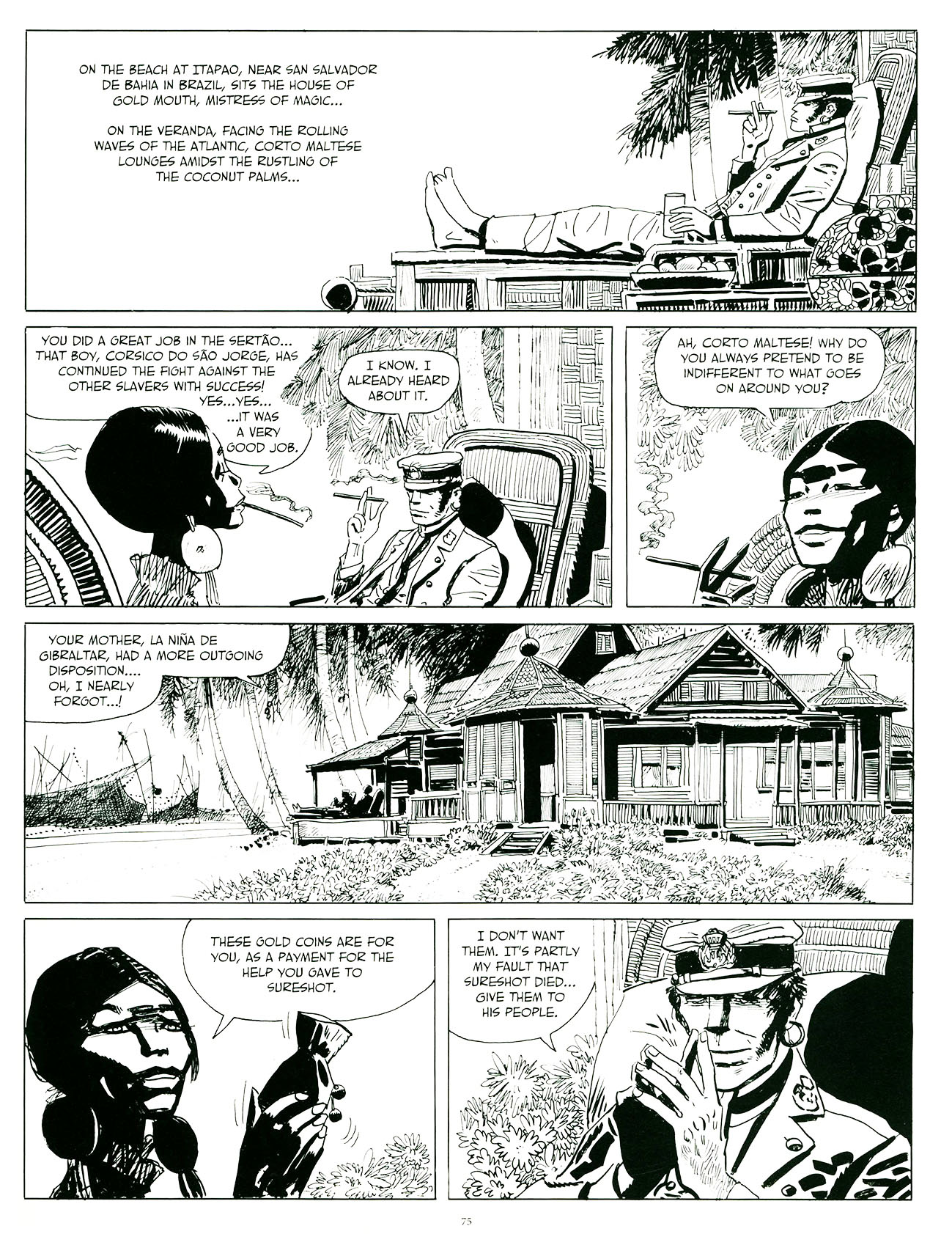
Dean: Because Corto has been published around the world in various formats and sizes, both B&W and color, the digital files are of varying quality. I rejected the first set we received from Europe. Some of the artwork was blown-out, details were missing, etc.. They were a disservice to the cartoonist. Oddly, these were the identical files used by NBM in the 1980s. I’ve been wanting to edit a definitive edition of Corto Maltese for too many years to settle for sub-par reproduction. The Italian files we have for translation were made from pristine sources and we requested nothing less. All stories will be published in B&W. I specifically chose a heavyweight matte stock with a slight sheen that would give the book substance and hold the ink well, providing crisp, sharp blacks, which is essential to doing justice to Pratt’s art. Like Milton Caniff and Alex Toth, Pratt was a master at spotting blacks. It’s one of the factors that, I believe, makes his art seem better in B&W.
What’s also fascinating about Pratt is that unlike most cartoonists who develop a style early in their careers and run with for decades in often-deteriorating exactness, he (again like Toth) improved with age. Pratt stripped his storytelling down to the minimum elements necessary to tell his story effectively and with impact. There are certain panels that make you just shake your head, wondering how he decided to place his characters that specific way within the frame. An example comes to mind in “So Much for Gentlemen of Fortune,” in which he focuses a slight downshot on Corto and Ambiguity as they step on the gangway to Rasputin’s ship. I don’t think I’ve ever seen that angle in any other comic. And then there are memorable panels like the straight-on close-up of Sureshot peering through a window in “Sureshot Samba.” As both writer and artist Pratt creates images that stay with us forever.
James: Will any of the future books be in color?
Dean: Will we eventually publish them in color? Perhaps, but at first, it’s essential that we present Pratt’s artwork the way he originally intended.
James: [Update, Feb. 2015: I generally prefer Pratt in black and white, but an exception can be seen in a book I just got in Paris, Casterman’s 2015 facsimile of the original Italian 1977 Milano Libri edition of Corto Maltese en Siberie. This book boasts some gorgeous color done by Pratt’s partner of the time, Anne Frognier, which is printed in the ben-day dots of American Sunday newspaper strips and comic books. The dots are described in a booklet that is included with the volume as the “ancestor of the pixel”; this look is explicitly referenced in the story as Corto reads a newspaper with a Geo. Herriman “Krazy Kat” strip and one must also think that Caniff was homaging his greatest influence, Caniff.] I have not read the originals, but can you tell me what is involved in translating a work with such specificity of international and historical significance?
Simone: I do a first basic, literal translation indicating all idiomatic instances and uses that are proper to the Italian language and suggest possible ways to adapt them into English. This way Dean has a good starting point to smooth everything out in a coherent and uniform style. Then Dean and I compare solutions and make sure that the literal meaning and stylistic flavor is preserved. The challenge we face is that of rendering the peculiarities of Pratt’s style and the laconic “hard boiled” dialogue in Pratt’s stories. Corto is part a Stevensonian and part a Chandlerian character. However, his sarcasm and elliptical rhetoric have both literary and specific regional roots. As a Venetian, Pratt has absorbed the traditional quick and stinging humor of the Venetian people. Corto, although he doesn’t speak the dialect of Pratt’s hometown, is inherently Venetian.
Dean: It’s not our place to show the reader how clever we can be. My job is to make you believe that you are reading Hugo Pratt’s dialogue in English. If I can capture the cadence and rhythm of Pratt’s narrative, then our translation is a success. It was imperative that we went back to Pratt’s original Italian scripts. Previous English editions were translated second-hand from French. It’s like the old game of telephone — the original message changes with each retelling until eventually the meaning completely veers off course. That Pratt was an inveterate researcher adds an additional layer of complexity to the translation; we need to embrace the breadth of his research in order to interpret it into English. Further, Pratt makes liberal use of literary allusions. I spent a half hour on a single panel that made no sense in the literal Italian or translated French, until I realized that he was making an oblique reference to Malraux’s “The Voices of Silence.” Patrizia has been helpful in some of these instances because she recalls discussions with Hugo Pratt about his influences.
James: I usually dislike digital lettering, but the font used here, derived from Caniff’s illuminator Frank Engli, seems to be the best possible choice in that regard.
Dean: I created a digital font of Frank Engli’s lettering because reading “Terry and the Pirates” was what made Pratt want to become a cartoonist in the first place. Patrizia Zanotti agreed that Pratt would have been thrilled to have Frank Engli letter his work! 
James: Pratt’s collaborations with the late writer Héctor Oesterheld are among the most significant European comics to never reach our shores. Do you plan to translate them?
Dean: I would love to eventually edit a larger library of Hugo Pratt’s work, but first things first — we need to make Corto a success on this side of the Atlantic.
James: Can you speak a little about the uniqueness of Pratt’s content in comics, for instance his critique of capitalism/imperialism? He certainly retains a powerful sense of adventure and romanticism, but at the same time deglamorizes how the western world subjugates various cultures.
Simone: Pratt’s early works like “Asso di Picche” appeared in the immediate post-war years in Italy. The Corto Maltese stories hit the Italian, and European, scene in the late sixties—after Pratt’s return from Argentina—and become very popular with the ’68 generation of student protesters and left-wing activists. This happened almost by chance as Pratt clearly belongs to an older generation, that of the pre-economic boom Italy of the ’50s. Nonetheless, incidentally, Corto reflected some of the stances of the ’68 youth and it even predated the anti-ideological movements of ’77. Although Pratt’s personal political positions became a bit more conservative later in his life, Corto’s individualism, his refusal of country, family, even personal gain, made him an ideal hero for the times. Moreover, not only can his Caribbean saga be read as the first post-colonialist stance in the comic medium, but Pratt’s demystification of WWI (especially Italy’s role in it) and the dismantling of the patriotic rhetoric tied to it are of great significance in the largely conservative Italy of the times.
Dean: I think it’s also instructive to place Pratt’s Corto stories in context of what was happening in mainstream American comics at the time. For example, in 1967 when Pratt started “The Ballad of the Salty Sea,” even the best of Stan Lee, Jack Kirby, Steve Ditko, et al was aimed at a juvenile audience. Pratt, on the other hand, was an adult writing about mature themes in a nuanced manner for a sophisticated audience. We didn’t see anything in American comics approaching Pratt’s take on colonialism and the plight of indigenous people, for example, until Don McGregor “Panther’s Rage” in 1973, and even that remained an anomaly, whereas Pratt continued to develop his themes in Corto.
It must be remembered that Hugo Pratt’s comics reflect his own peripatetic experiences. He came by a humanist outlook honestly — from his youth in Ethiopia to his many years in Argentina. That his stories resonated with a late ’60s and early ’70s audience — and still resonate with us today — is because he writes of the universal struggle for human dignity, and did so in the context of a classic adventure narrative. 
James: What’s next for the EuroComics imprint?
Dean: For our next series we will turn to the Iberian peninsula and what many consider the most important graphic memoir comics to have ever been published in Europe—“Paracuellos,” Carlos Giménez’s poignant stories of being forced to grow up, along with thousands of other “children of the defeated,” in church-run “orphanages” in Franco’s fascist Spain. Will Eisner says, “Carlos Giménez speaks with humor and sensitivity to the human condition. His work is international.”
________________________________________________
(A heavily edited excerpt of this interview ran in Publishers Weekly Comics World)
James Romberger is the artist behind the critically acclaimed graphic memoir The Late Child and Other Animals (with Marguerite Van Cook); the Eisner-nominated Post York; and 7 Miles a Second (w/ D. Wojnarowicz and Van Cook).


This sounds brilliant. IDW has been knocking these editions out of the park.
This is very cool, can’t wait to get hands on a copy, I love it when people take risks like this. Great long form piece by the way.
I read and loved IDW’s Corto Maltese. I’ll be getting all of them. There’s a particularly great moment when the orphan English boy meets his half sister.
I too read and loved IDW’s Corto Maltese. I was able to borrow a copy from the local library and mine is on order and in the mail as I write this note. I will read it again when it comes. Simply marvelous storytelling.
I too read IDW’s Corto Maltese. I was able to borrow a copy from the local library and mine is on order and in the mail as I write this note. I will read it again when it comes. Simply marvelous storytelling.
I’m almost jealous of you guys, you are in for a fantastic experience!
I love Corto Maltese. Fantastic quality from IDW, I would say the best ever print of Corto I have seen. I prefer this format instead of landscape used for Terry and many classic reprints from IDW as they are harder to store and read/handle. But, that’s another subject.
I’m mostly a fan of black/white art (with occasionally beautiful watercolored comic) and would love to see Martin Mystery comic from Italy be reprinted by IDW (Dark Horse did 6 issues few years back); there are many of them (maybe around 350-400 issues) and I think those by artist Alessandrini are the best story wise and art wise.
Forgot to add that this is the best ever softcover book; no need for heavy hardcovers when produced this way. For some comics can probably even use a slightly cheaper paper quality.
Comments are closed.