, quality = 90")
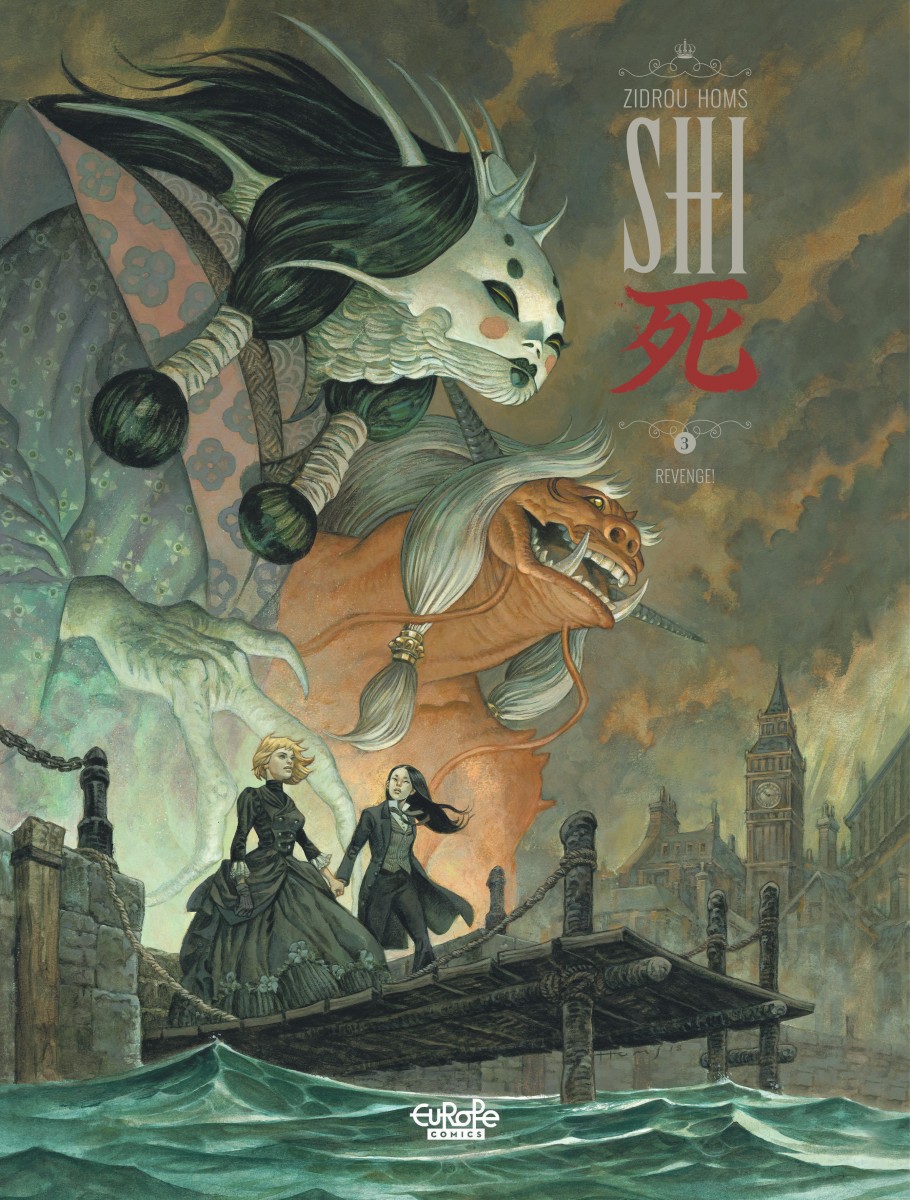
§ Nice Art: Glom this cover by José Homs for Sh1 Volume 3 Revenge!, (no not the US Shi) released by Europe Comics, the digital euro-comics publisher. The story is by Zidrou.
In the third book of the series, the Glorious Eries develop their plan to win England back its colonies and they find themselves collaborating with a powerful and surprising ally. Jennifer Winterfield and Kita let the world believe they are dead so that they can begin plotting their revenge with the help of Kita’s sensei, a Japanese tattoo artist with mystical powers who lives in a houseboat on the Thames. Meanwhile, Pickles the street urchin gets her hopes up that Jennifer might adopt her, but destiny has other plans.
§ I figured out a new RSS reader for my workflow on this, so the kibbles may become more robust. We’ll see.
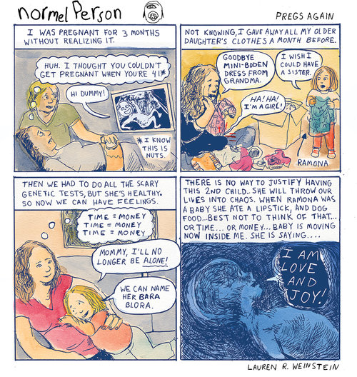
§ Cartoonist Lauren Weinstein – whose had a bang up couple of years – is interviewed in The Believer by Tahneer Oksman
LW: My idea was always to make absurdist commentary on whatever was going on in the Zeitgeist, and then, every once in a while, throw in an autobiographical strip to contextualize things. I didn’t think I would be a political cartoonist; I’m not really a political cartoonist. But when I started to do the strip, I felt like I had to respond to the crazy news cycle, even though it also felt kind of pointless. Also, I realized going into it that the most productive part of my entire career was when I had my weekly strip, “Inside Vineyland,” for The Stranger in Seattle [from 1998-2001]. That’s when I was really learning how to be a cartoonist. I was in my early twenties, I was on the same page as Chris Ware, and every week I’d get completely schooled. When I got the job at the Voice, I thought, I’m going to do the same thing now; I’ll throw caution to the wind and see if I can just make something every week.
§ Marvel Executive Editor Tom Brevoort has begun as exhaustive look at how Stan Lee and Jack Kirby collaborated on the Fantastic Four.
That said, there are a number of odd things concerning the first three issues of FANTASTIC FOUR that bear looking at a little bit more closely. From what I can tell, based on my analysis, Lee and Kirby worked more closely together on these three comic books than perhaps anything else they did together. I’ll lay some of that case out to you all in the days to come. It’s also worth mentioning that, from what I can see, the Lee & Kirby collaboration went through at least three, possibly four, separate stages of development in which the manner these two giants interacted with one another and collaborated changed and evolved. In short, what we learn about these earliest issues of FANTASTIC FOUR doesn’t necessarily apply to other stories that they did later.
In the first part, Brevoort digs in, with a page by page analysis of what Stan or Jack might have done – and mentions that the art for FF #s 1 and 2 is lost, an idea I find very sad, but also that Stan doodled on the back of the art.
The original artwork to FANTASTIC FOUR #1 and #2 has not surfaced, and it would tell us a lot more in terms of what was done here. The earliest FF art that still exists in the public eye is a number of pages from FANTASTIC FOUR #3. And on the backs of a number of them are crude sketches by Stan Lee showing how he’d like to break a certain sequence of panels down, or how he wanted to display a bit of staging. My guess is that these were made at Lee and Kirby’s regular weekly/biweekly office meetings, where Kirby would bring in the pages he’d drawn in the interim and go over them with Stan, describing the story that he’d put down. Stan would typically jot notes in the margin to himself during this process, to remind himself of plot points when he went to script the pages. But in these instances, it seems as though, either before Kirby had penciled the pages or after, Lee had comments that altered or affected what the final pages turned out to be. Taking the FF #3 methodology as my basis, I’m making the assumption that the same process was used on the preceding two issues as well.
The idea that a busy fellow like Brevoort spends his spare time pouring over every panel of FF #1 is remarkable – you’d think he’d like to do something different from his day job, like play Red Dead Redemption.
§ BTW I know I’m repeating myself but the original coloring by Stan Goldberg is so much more effective than the newer versions. As Brevoort notes, he was very fond of knockouts – filling in areas with a solid color – probably because color separations were made by hand and tedious, but do yuo actually need more then the SIX colors he used in the above page?
§ Claire Napier funnels her resentment of Watchman into an examination of other nine panel grid comics:
What bothers me about the nine-panel grid is the sense of “being told to.” Someone is telling me this is happening, specifically, like this. I am being asked to sit still, with my hands in my lap, while the teacher talks, and I feel there is no facility for imagination. But this is muddied by the primary source of admiration for the grid. Morrison mentions it obliquely in the most recent spurt of Moore-based criticism: Watchmen, the evergreen paragon of nine-panel, feels like “you can’t turn the page without him saying ‘Look at me, look at me, look at me.’” There are aspects of the book which Morrison may be speaking to other than the grid, but this is how Watchmen’s layouts register to me. As a grind. The author (gestalt; Moore-Gibbons-Higgins, though bless bless Higgins, as he tried hard to save me with that glorious palette) is present, beside me, turning the page (which I’m not allowed to touch) when he feels inclined to, giving out details like Mary Poppins doles out growth. Reading Watchmen in trade is a drag because the rhythm of it is so regular, for whole issues; for twelve whole issues. Repeat your nine times tables, again, please, Claire. Noooo. I’m bored, sir!
As I suggested on Twitter, some kind of Napier/Santoro cage match – or GRID match – might be quite entertaining.
§ But speaking of Twitter, are you alarmed and exhausted by Twitter? So is media pundit Douglas Rushkoff, who suggests we pump the brakes on that retweet button:
That’s why we can’t respond intelligently or compassionately to photos on a news feed. We can only react — impulsively and usually prejudicially. This is raw footage. We were not there. It may be compelling to look at — particularly if it triggers our knowledge of real racism, oppression, and violence. But this is also why we have real journalists, on the ground, skilled at investigating a story and determining what happened — so we don’t have to rush to judgment. So what if I don’t find out about what happened until an hour later? Tweeting one’s outrage is not real activism, anyway. It’s really just a form of social signaling. Doing so without even knowing anything about the scene we’re commenting on is just adding noise. Worse, it becomes good evidence that whatever side you’re on is just as guilty of disinformation and rushing to judgment as the trolls.
This is something I’m guilty of as well. It’s hard not to join in on the power rush of hitting that retweet button – but it’s something I’m trying to be more thoughtful about. Trying. These are trying time.
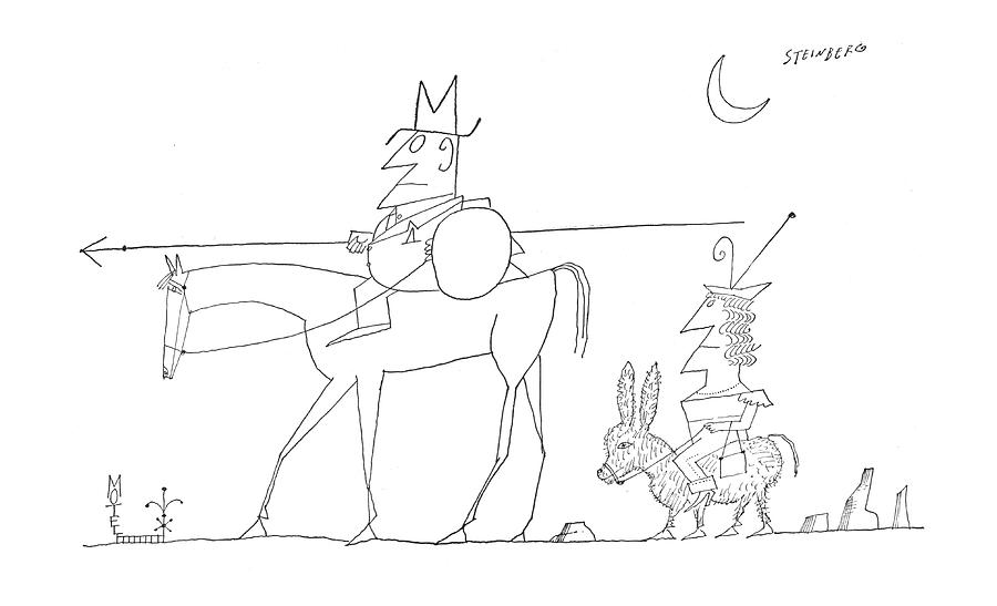
§ Apollo Magaazine looks at Saul Steinberg – NY Review Graphic Novels recently reprinted one of his best works and his entire body of work is still marvelous.
For while Steinberg may have contributed to the creation of a specifically New York brand of refined, achingly cool modernist civilisation – you’ll recognise the Mad Men aesthetic of sleek cocktail shakers, leftists in lofts, streamlining, tiny paper napkins on a table in a darkened room – the entitled parochialism is its least interesting aspect. Far more compelling is the way that it was underpinned by a mash-up of Balkan orientalism, flight, fear and murderous political madness. For decades, Steinberg was lauded for his contribution to this aesthetic, often by the kind of European modernist he had been forced to leave behind. Le Corbusier told him ‘You draw like a king’; he was praised by Ernst Gombrich, Italo Calvino, Eugène Ionesco and Roland Barthes, attaining a cultural superstardom rare for cartoonists. Even more than Ronald Searle and Ralph Steadman, Steinberg closed the gap between what ‘cartooning’ is often assumed to be – cheaply reproduced, silly scribbles knocked out to make you laugh – and ‘art’, which is supposedly so much nobler.
§ Rob Salkowitz looks at how the high end comic market is going bonkers thanks to all that extra cash zillionaires have sitting around.
In yet another sign that there is an awful lot of cash sloshing around the upper echelons of the global economy, auction house Heritage Auctions reported record sales of $58,544,323 in its comic and comic art category in 2018. That’s a 32% increase over the department’s previous record, set in 2017.
Most of the biggest movers were in the comic art category, including the original drawings and paintings that artists created for reproduction as covers or interior pages. Once disdained by the fine art world as “commercial art” and “illustration,” comic art is increasingly seen as culturally and aesthetically significant, with more work now exhibited in galleries and museums worldwide. It’s also attracting the attention of well-heeled collectors and investors, who are sending prices skyrocketing.
§ Nominations for the Third annual Gary Reed Independent Creator of the Year award are now open.
§ Nerdlebrity corner. It seems that Mads Mikkelsen is another celeb who claims to love comics, and encouraged him to star in the Netflix film POLAR, which to be honest, I forgot was a graphic novel.
The 53-year-old actor stars in the new action film – which is based on the comics series of the same name by Victor Santos – and Mads admitted that his fondness of graphic novels attracted him to the project.
He explained: “I am actually a huge graphic novel collector. But I kind of stopped 20 years ago when it was just becoming too much. There was too much to read.”
§ This piece on The 25 Most Influential Movie Scenes of the Last 25 Years from Vanity Fair is not comics, but it correctly identifies Sméagol as a Stoor and is presented in a lovely digital format.
§ Supposedly someone jumped off of the classic Disneyland ride Space Mountain this week but here’s a sensible, fact based report that explains he just got off on the first lift hill:
No, no one fell out of the roller coaster cars on Disneyland’s Space Mountain on Tuesday, contrary to wild rumors that have been flying around social media this week. But someone did manage to get off the ride on a lift hill, prompting Disney and California state officials to close the ride for inspections. Brady MacDonald at the Orange County Register got to the bottom of the story — which happens to be something that occurs more often than you might think at Disney and other major theme parks. An unidentified man climbed out his rocket on Space Mountain as the coaster car was climbing its first lift hill, just after the loading station. (The lift hill has a staircase located immediately to its side, for use in evacuations.) Ride operators saw the man, immediately shut down the ride, then escorted him to first aid to be checked. The man, who happens to have a cognitive disability, according to the Register reports, was not injured.
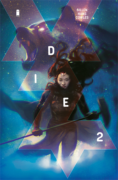
§ BONUS NICE ART because we made it to Friday, a Die #2 variant by Jana Schirmer, as reported by Pastee’s The Best Comic Book Covers of January 2019


The “Shi” series has beautiful art. I wish the first book told more of a story, but the art will get me to read the second book eventually, someday. Maybe when 3 comes out, it’ll be a good time to read them all and see if things come together.
Comments are closed.