
In June 2016, DC Comics kicked off the start of its Rebirth initiative. After a wave of criticism surrounding the way they have treated their characters’ rich histories since 2011’s New 52 relaunch, DC has decided to rebrand. They hope that by restoring their characters’ pasts, they will restore readers’ faith in them as well. Do they succeed? That’s what the Comics Beat managing editor Alex Lu and entertainment editor Kyle Pinion are here to discuss. Book by book. Panel by panel.
UPDATE: With a new year comes change. Going forward in 2017, Alex and Kyle will be alternating articles weekly in order to give each other a breather after 7 straight months of going tandem. A little break is always good! This week, Kyle takes the helm.
Note: the reviews below contain **spoilers**. If you want a quick, spoiler-free buy/pass recommendation on the comics in question, check out the bottom of the article for our final verdict.
 Wonder Woman #17
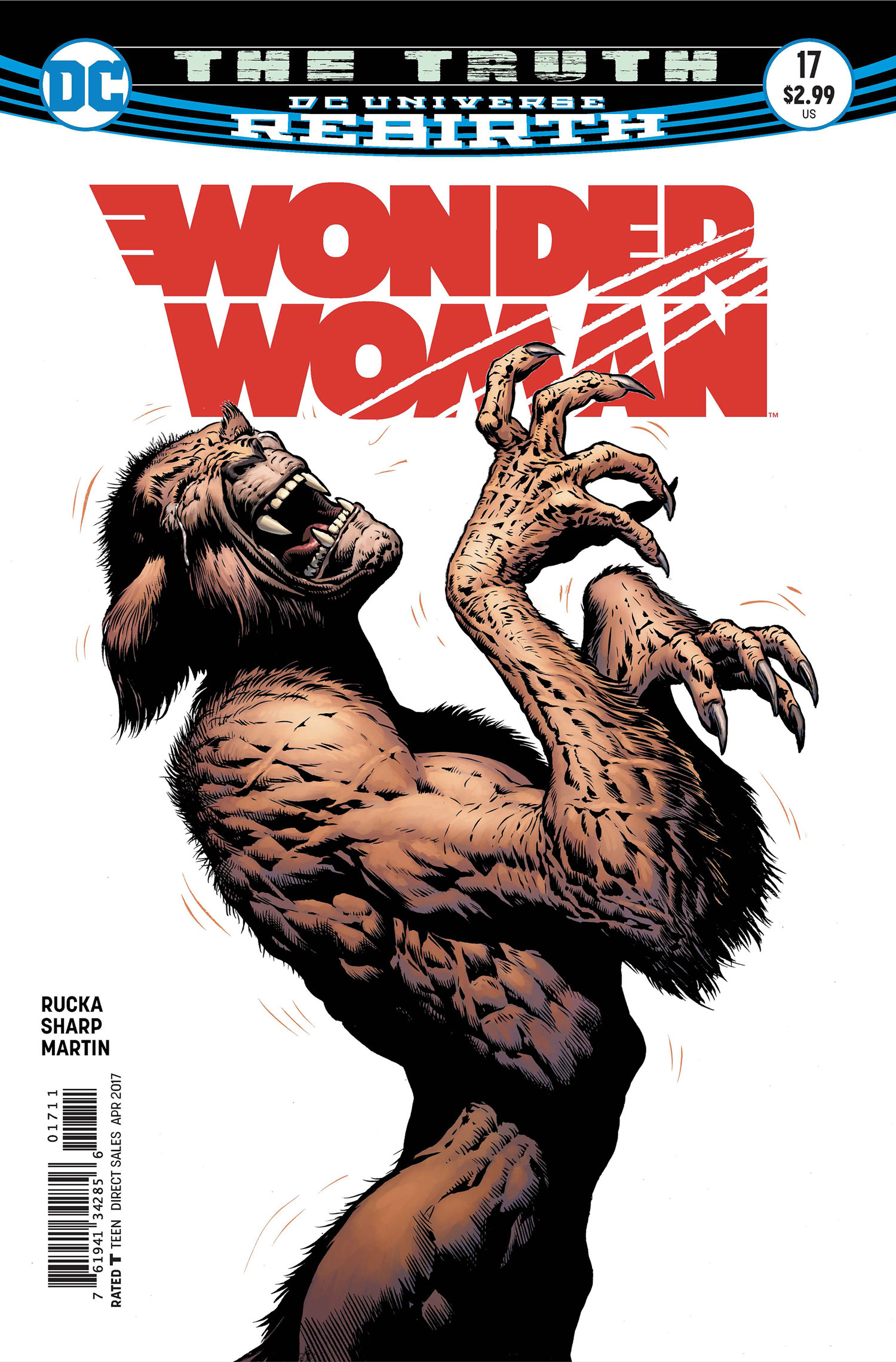 Wonder Woman #17
Writers: Greg Rucka
Artist: Liam Sharp
Colorist: Laura Martin
Letterer: Jodi Wynne
I think Greg Rucka’s run on Wonder Woman is one of these titles where I’m just going to forever break from critical consensus or at least some approximation of that based on the comics critics whom I discuss such things with. That’s not to say I’m looking to be the contrarian who tries to tell you that this current volume of Wonder Woman isn’t living up to expectations…I’d say for the most part, it is. But I find that in my various places of comics chatter, most readers tend to prefer the even-numbered issues of the run, which initially showcased Nicola Scott on art duties and parlayed a new “Year One” tale for the character, and have now shifted over to further flashbacks, set just a little thereafter, as Rucka has partnered with Bilquis Evely.
I think these are enjoyable stories that dovetail very well with the present day journey that Diana is undertaking. I just happen to be far more in-tune with the odd numbered installments that feature the work of Liam Sharp, whose 2000AD infused chops provide a unique perspective into Wonder Woman’s environs for the reader, while also standing out visually from the fray. No DC comic looks like these Sharp-drawn arcs, and that kind of Frazetta inspired approach stands in stark contrast to the very story that Rucka is telling regarding this reinvention of the character, and that dichotomy is really exciting to behold. It’s funny to consider that Rucka and Sharp set together as oddly as Azzarello and Chiang did in the previous volume, but there’s a nice bit of circularity there as well: the somewhat pop-Chiang translating grittier/darker material vs. the above-mentioned work of Sharp’s translation of a more caring Themyscira and Diana. I know there are quite a few fans out there that are upset that Rucka and Sharp have twisted the New 52 origin and cast whole-cloth to serve the needs of the Rebirth take, but I appreciate how the team has used that past without just throwing it out. It may all be a scheme by Ares (my running theory for almost a year now), but it still counts and it’s a clever bit of retroactive continuity that I can appreciate that I think can serve fans of both takes on the character.
At least they didn’t just kill her and replace her with a different version, right? I’m sorry, that was a joke, I like the Superman comics…I really do!
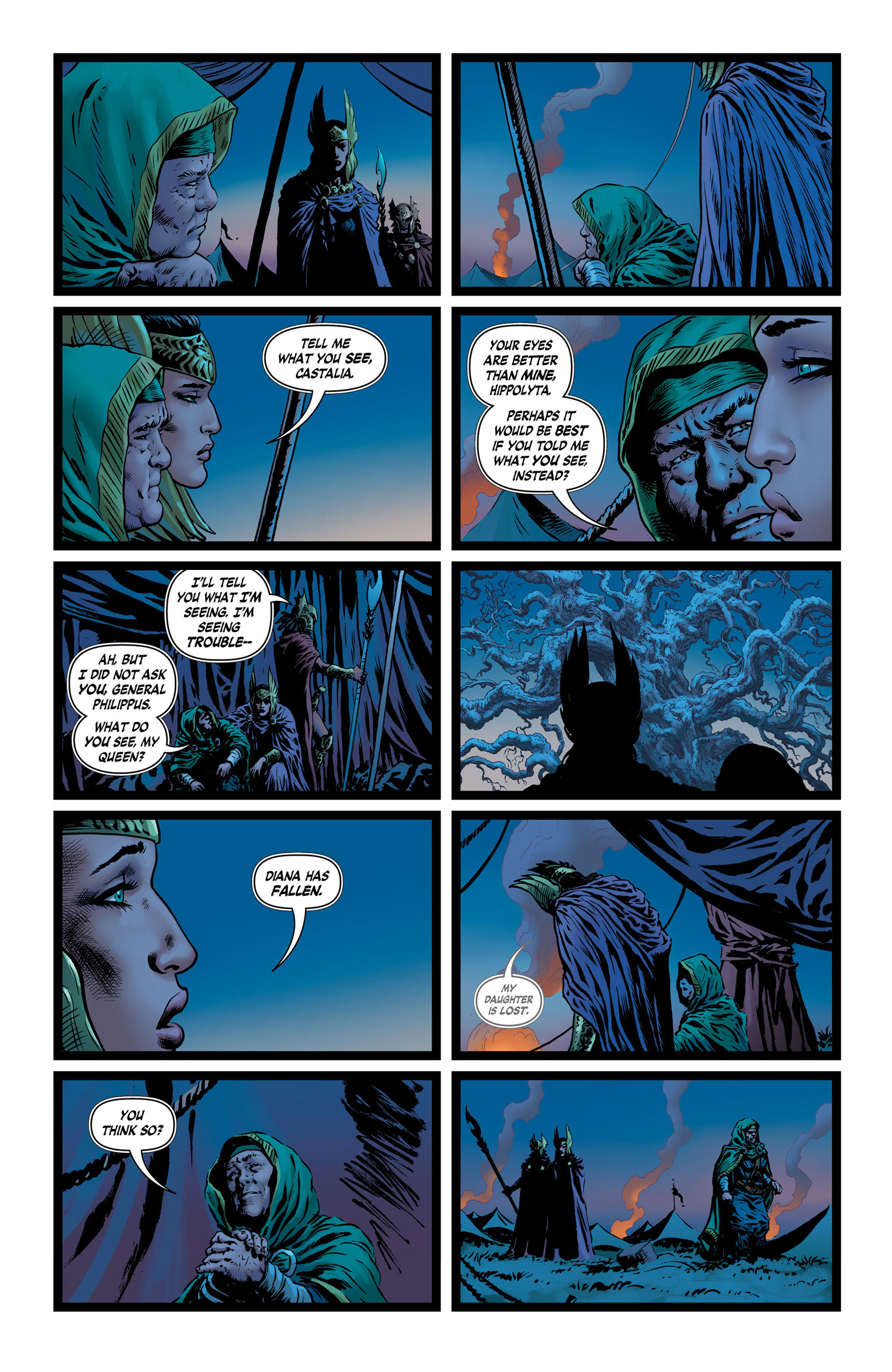
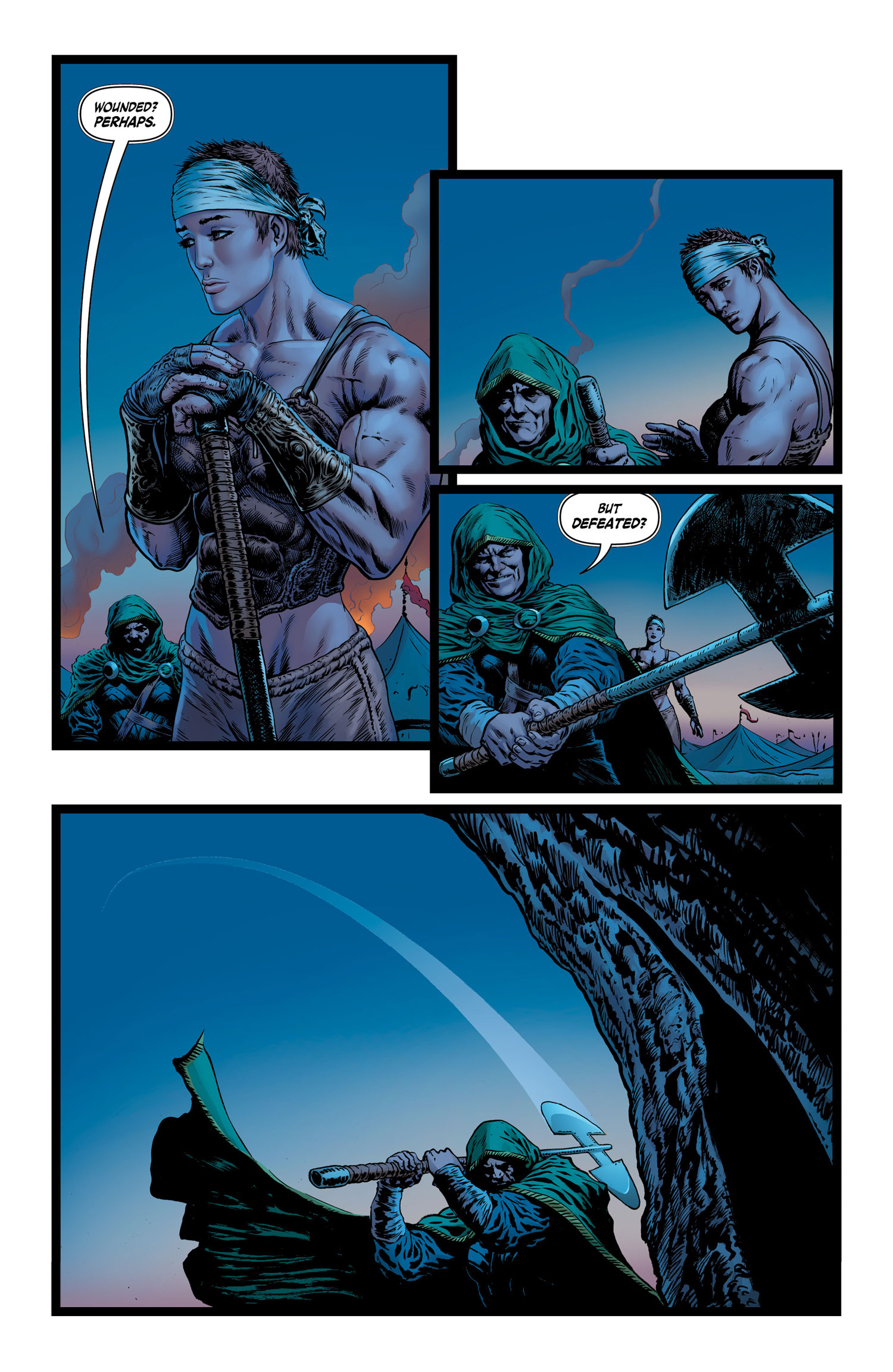
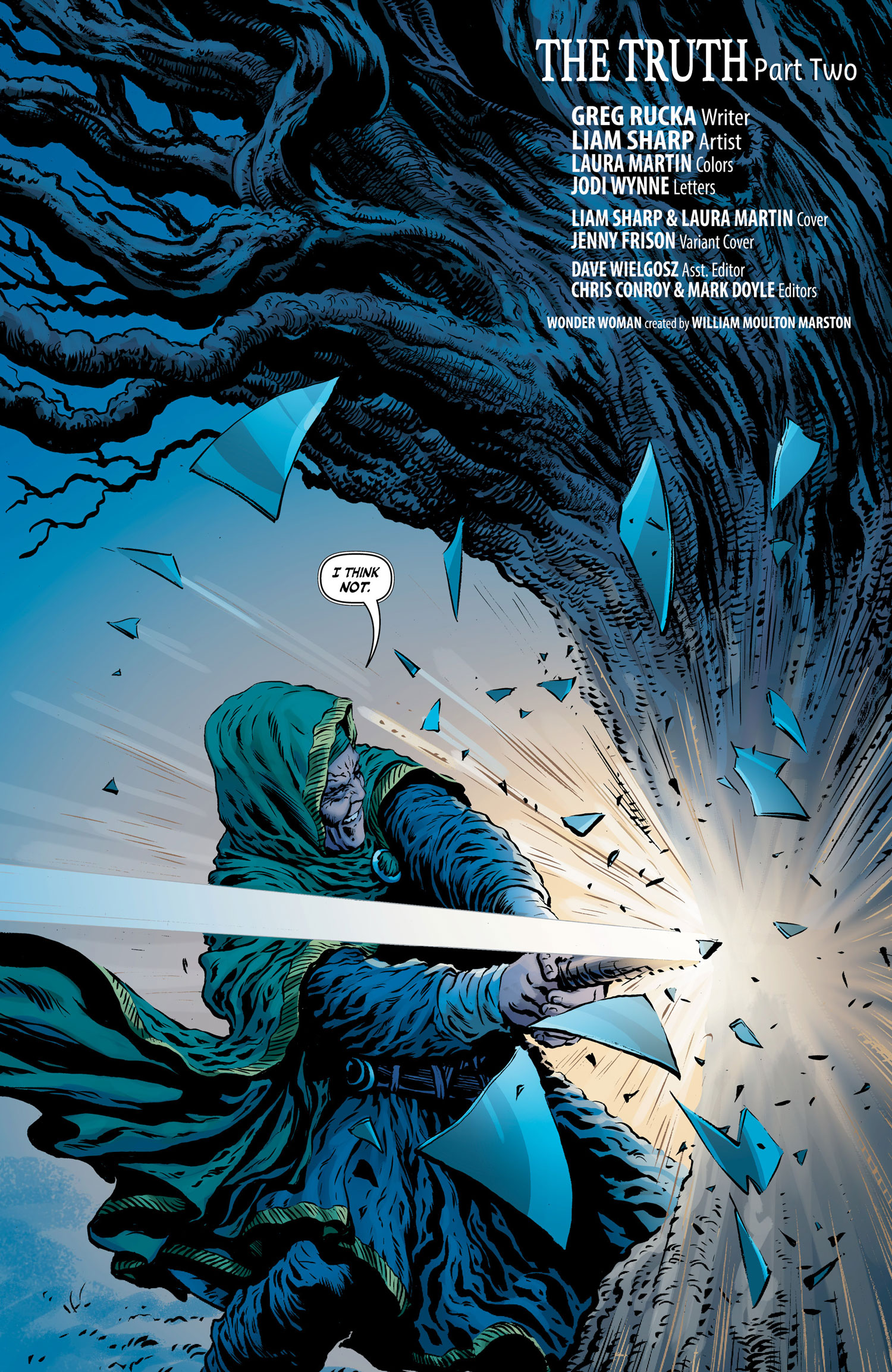
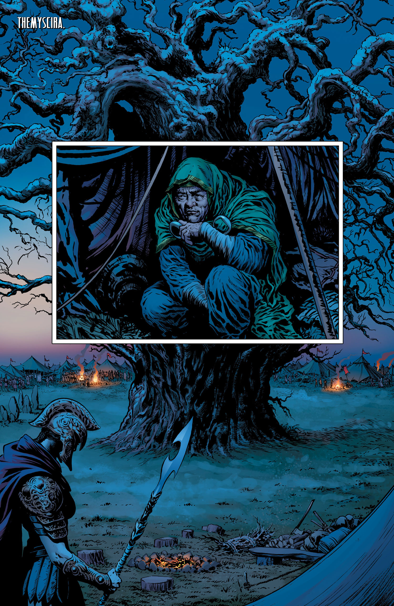 This issue speaks specifically to the strengths of its artist and colorist Laura Martin. The first half of the issue is lighter on dialogue than I think we tend to get with a Rucka comic. He’s a master wordsmith, but all good writers know when to pull back and allow the artist to take the reins. The lovely sequence with Castalia and Hippolyta discussing the “fall of Diana” and Castalia’s attempt to strike down the tree (an image that has permeated throughout these 17 issues) works thanks to the mood evoked by the synthesis of Sharp’s fully expressible body language and Martin’s mix of blue, pinks and browns. Sharp’s page economy comes into play as well, shifting from 2 panels to 10 panels to 4 panels effortlessly. The 10 panel sequence on the second page gives off so much information about the two central figures, the weight carried by both and their shared histories in relation to the daughter that’s not even seen on screen. In short, it’s a very lovely bit of storytelling done in micro, the words are almost not even necessary.
 But that’s just a warm-up to the even more vivid pages to come, as we check back in with Diana where we last left her in the Psychiatric hospital. This turn of events wasn’t exactly my favorite from the previous issue, as I tend to dislike comics tackling mental health without some really nuanced thought behind it and that perhaps Diana could have dealt with this new revelation regarding her past without being put into a padded room. Then again, this sense of isolation that the setting provides gives Sharp and Martin another really lovely palette to play off of, as the white walls give way to the lively splash of color that’s introduced via the re-appearance of the snake who emerges from her old wound (attained during the Year One arc). That then builds to a gorgeously rendered piece that reflects imagery of who Diana is, was, and who she might become. By the end of the scene, the snake recedes back, Diana still unable to quite make the connection to her true nature and Sharp and Martin pull together a beautiful background that sits behind those final five panels – a sort of Aurora Borealis version of the ongoing foliage imagery.
 The second half of the issue is a well-paced look at the supporting cast and their branching missions. Etta, Steve and the returning minotaur Ferdinand have to avoid an attack by Maru/Dr. Poison and her crew at the behest of Veronica Cale, in order to reach Diana at the hospital – the hope being that Ferdinand may finally be the one to snap Diana back into her true nature. At the same time, Cale and her associates are utilizing that attack as leverage against Barbara Ann in order to restore her Cheetah-form, as Cale sees that as the only way to reach Themyscira. While there’s a really lovely bit of comparison between the restorations of both Diana and Barbara Ann by issues end, in a way that evokes some of the work Rucka and Scott did on the second issue (with alternating panels of Diana and Steve’s history), I was perhaps more taken with the color choices of Martin here yet again. Martin pitches all of the Steve-Etta-Ferdinand panels in muddier, earthy tones, whereas every instance of Dr. Cale’s office and lab are swathed in cooler, more sterile, blues. This seems to speak particularly to the connection between our heroes and the natural world and how their enemies utilize the tools of science in order to encumber upon their sacred realm. These little choices can be easily scanned over quickly without much thought, but if you take the time to really zero in on just how much energy Rucka, Sharp and Martin place into the themes and visual timbre of this title, it’s all the more impressive.
Final Verdict: Buy
 Future Quest #10
 Future Quest #10
Writer: Jeff Parker
Artist: Ron Randall
Colorist: Veronica Gandini
Letterer: ALW’s Dave Lanphear
Above, I chose to focus on art, at least as much as my untrained eye has the ability to do so…with Future Quest, I want to speak more to potential, though art has a lot to do with it too if I’m being honest.
The DC/Hanna-Barbera experiment has been an interesting one. Sort of the imprint that’s not really an imprint in the same way that Young Animal and The Wild Storm present themselves, where there’s one (visible) creative voice overseeing the entire line, these Hanna-Barbera comics still have a fairly uniform mission of reinvention. This is the line that turned Wacky Races into the Mad Mad inspired Wacky Raceland, and melded Scooby Doo together with a sort of Walking Dead-like scenario. The Flintstones, easily the strongest title in the line, is this wonderfully subversive look at modern life and cultural tidings through the lens of people who push cars with their feet and vacuum their floors with animals. And based on press from the publisher, there’s more to come, gay southern playwright Snagglepuss and all.
But Future Quest sort of thumbs its nose at that revisionism. Of all the takes within editor Marie Javins’ purview, this is the one that is the most true to form. When it was first announced, it was a dream come true scenario for my 11 year old self that loved Jonny Quest re-runs, and was an even bigger fan of Space Ghost and the Herculoids, and having grown up with Adult Swim’s play on these concepts (Space Ghost Coast to Coast, Harvey Birdman: Attorney at Law, The Venture Bros.), I was more than primed for a serious take on Hanna-Barbera’s action heroes all coming together to face a larger than life threat. The idea that Flash Gordon‘s Jeff Parker and Evan Shaner would take the reins, who keen-eyed Beat readers know I’m a *huge* fan of, was the perfect icing on the cake.
So why haven’t I come to love this book as much as I want to?
 It all started well enough, with Parker and Shaner pulling together a really fun and vibrant first issue that started off with a bang, providing some background on Space Ghost’s unseen past dealing with Omnikron, the ever present world-shattering threat. From there, other major players like Birdman and the Quest family were rolled out and it seemed like smooth sailing was ahead. But it was not quite so easy.
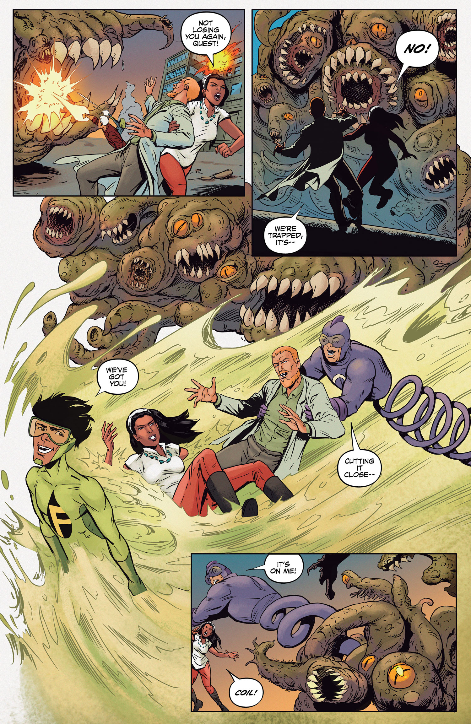
It’s not my place to guess why fill-ins are needed, or the difficulty of the monthly workload on the artist, but as the series wound on, Shaner (one of THE major draws for this reader) continued to recede further and further into the background. Some of that necessitated regular fill-in work by Ron Randall, as well as a few others. The art remained strong and worth looking at no matter who the artist was, but that need to fill-in sometimes impeded upon the story, with obvious visual shifts from page to page. This was also likely a contributing factor to why Future Quest had so many backup stories to avoid that very problem, though that in turn created a different quagmire in that it stalled the momentum of the overall arc. Every time you were just about to get excited about the new Mightor or whatever Drs. Quest and Zin might be up to, it’s interrupted by a less than engaging short story about The Impossibles. Over the course of its first 9 issues, Future Quest really only ever moved by inches.
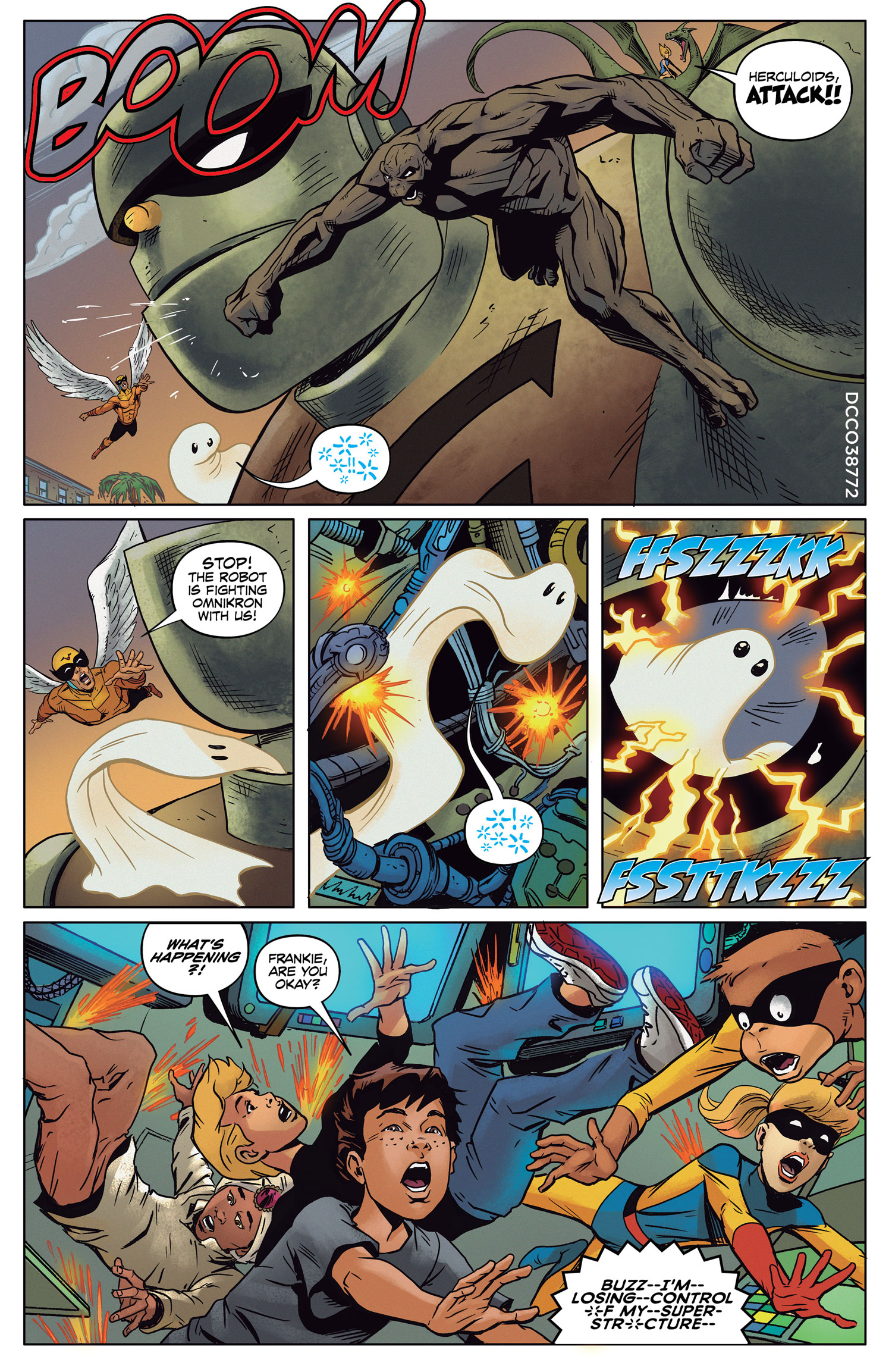
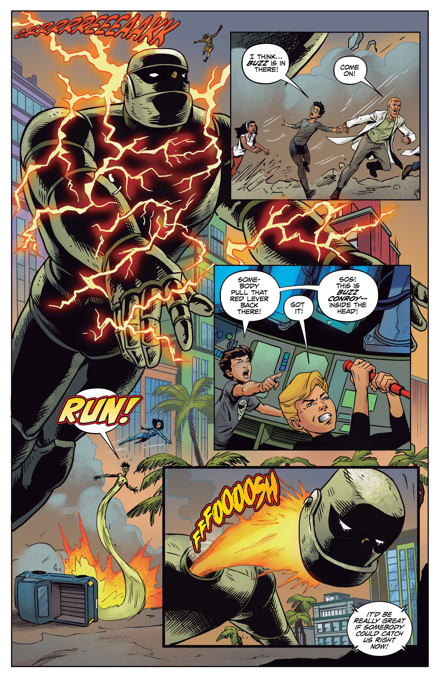 With Issue 10, again with art by Randall, the team has finally come together by issue’s end but it takes a little bit of doing to get there. This chapter and the last have felt a bit more consistent throughout as Randall has settled in taking on the entire issue on his own, and while his linework is a bit less Toth-inspired in the way that Shaner’s pencils were such a natural fit for the material, these are the two issues where he’s able to make these characters more his own and it improves the reading experience immensely. As for the story, it kind of runs the typical “misunderstanding among allies leads to the team finally coming together” trope, though there’s a really nice bit in the middle where the new Mightor meets the original one and some mythos building is laid down in regard to Mightor’s role on Earth and his importance in the grand scheme of things.
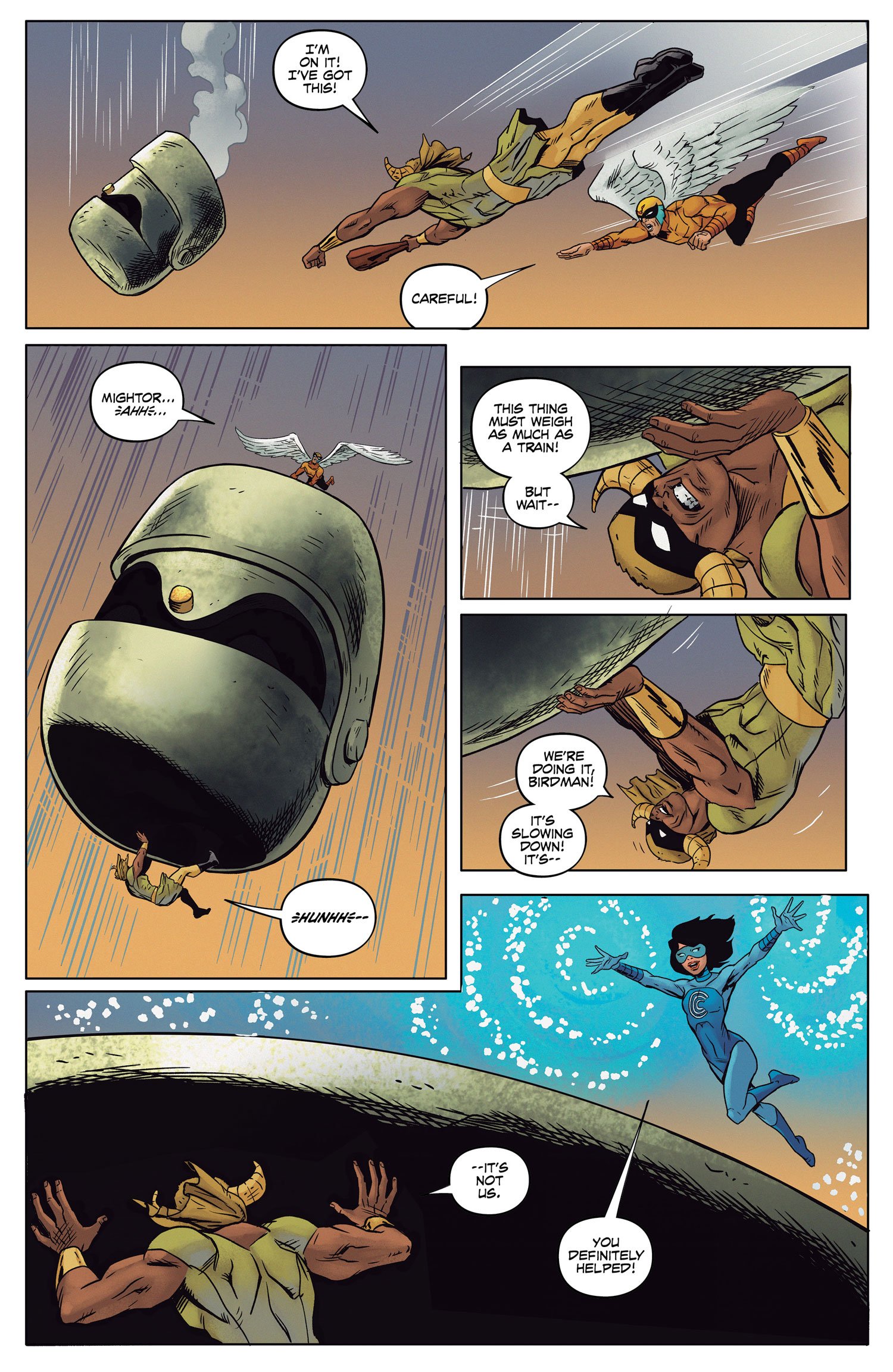 After that, we get to the set-up for the finale, where the team builds one by one. And I enjoyed how Parker cleverly set up the abilities of each member in how they’ll play some role in the final defeat of Omnikron. There’s a bit of a sense of rushing to get to this point, which is funny, because before that we had 9 issues full of set-up, but that just speaks to some of the trouble I think this title has had. So much set-up to justify these teams coming together (I’m not fully convinced the Frankenstein Jr. crew adds much here, except maybe to give Jonny and Hadji someone to talk to), and now that we’re at Issue 10, it’s almost all over as the title is coming to a close at #12.
I think this issue on its own makes for a satisfying enough read, it’s just that you had to fight through some of the more sloggy middle offerings to get here and fully appreciate where this series is going. BUT, on the bright side, Parker and Shaner stand reunited for these final two issues, barring any unannounced changes that I can tell, so perhaps these readjustments will all prove worthwhile with the whiz bang finale that I, and lots of other kids at heart, have been waiting for. I just kinda wish this title had lived up to its massive potential more often, rather than just in fits and spurts.
Final Verdict: Browse
Round-Up
 Round-Up
- Kamandi Challenge #2 hits shelves this week and with it comes a story by Peter Tomasi and art by Neal Adams. Let me just say, the resolution to the cliffhanger is fun (though my review copy did not include the write-up in the back, so I’m not sure how it compares to Dan Abnett’s solution), and I think there’s always something to be gained from Adams’ panel to panel work. There are a few pages that are a bit more rough-hewed than I’m used to, but it’s Neal Adams, one of the legendary artists that I’m so glad is still pumping out work as regularly as he does. Tomasi’s script doesn’t quite take flight until the back-half, but when it does, it becomes a blast, especially once another piece of Kirby mythology is introduced. By the time a most unexpected set of guests appear, I’m hooked all over again. Jimmy Palmiotti and Amanda Conner are up next, I can’t wait to see what they bring to the table in this milieu.
- Supergirl: Being Super #2 is the next chapter in the very stirring stand-alone origin of Kara Zor-El and her life in Midvale. This one is all about grief and how someone deals with it at a particularly young age. Coping is something that adults struggle to master, so when it occurs to teens, especially one with as many questions regarding her own sense of self and identity as Kara’s, you can imagine the internal strife that’s built up. This one continues to strike me hard, all credit due to the powerhouse team of Mariko Tamaki and Joelle Jones. This is such an introspective and lovely comic, and along with the equally powerful Deadman: Dark Mansion Of Forbidden Love, it makes a powerful case for why DC should continue to produce these limited, stand-alone, idiosyncratic takes on their iconic characters.
- See? As promised I went a whole week without talking about Batman! Though, Justice League of America #1 sure is swell, as has some nice dovetailing with DC’s multiverse with the team squaring off against Lord Havok and the Extremists, basically Doctor Doom and a bunch of other Marvel pastiches (I assume, my knowledge of that other side of the fence is real limited). I highly recommend getting on board with this series now and read what’s shaping up to be one of the best team-up comics on the stands.
Miss any of our earlier reviews? Check out our full archive!


“That’s not to say I’m looking to be the contrarian who tries to tell you that this current volume of Wonder Woman isn’t living up to expectations…”
I’ll say that. I realised when reading it last night that there have been 18(!) issues of this comic now and it’s just not gelling or getting going. I’d put it in the bottom 25% or so of the Rebirth titles for quality. I’ve got no attachments to any previous versions of Diana so have zero problems with what has or hasn’t been done there, but it’s just not telling a compelling story. It’s certainly one of the titles I had the most hope for as I’m normally a fan of Rucka’s writing and it’s probably the biggest Rebirth disappointment for me because of that.
Comments are closed.