
By Victor Van Scoit
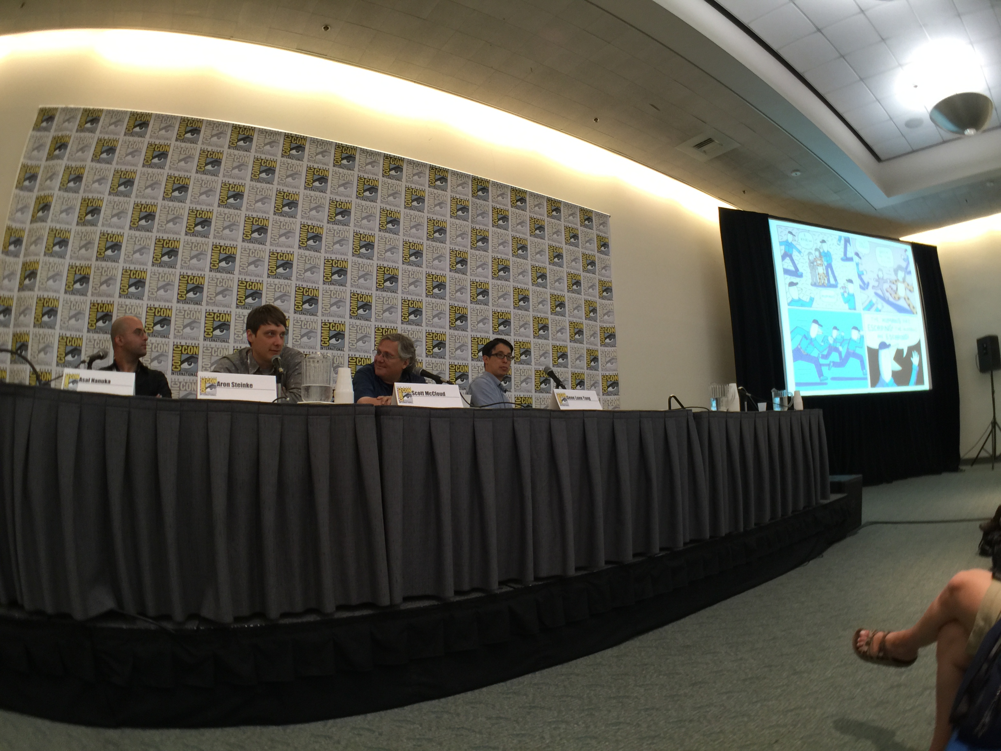
A great comic book let’s your brain relax and enjoy as you take in each page of the story. You’re not trying to figure out which panel to read next, or be taken out of the story unexpectedly. Instead the creator has made choices in storytelling that take you smoothly through the story and subconsciously informing your mind with all the metaphors, themes, and subtext required. First Second’s What’s in a Page panel aimed to give the audience some insight into those choices from four of their creators: Asuf Hanuka (The Divine) Aron Nels Steinke (The Zoo Box), Scott McCloud (The Sculptor), Gene Luen Yang (The Shadow Hero).
The panel limited each of the creators to just one page from their graphic novels to walk the audience through. Calista Brill of First Second moderated the panel and asked each of the authors for additional insight.
It was mentioned to Steinke that when constructing a page of comics for a western audience it’s expected they will read from left to right and from top to bottom, as is true with text. Being a teacher was that something he thought about when putting together comics for kids and using ways of reinforcing easy reading?
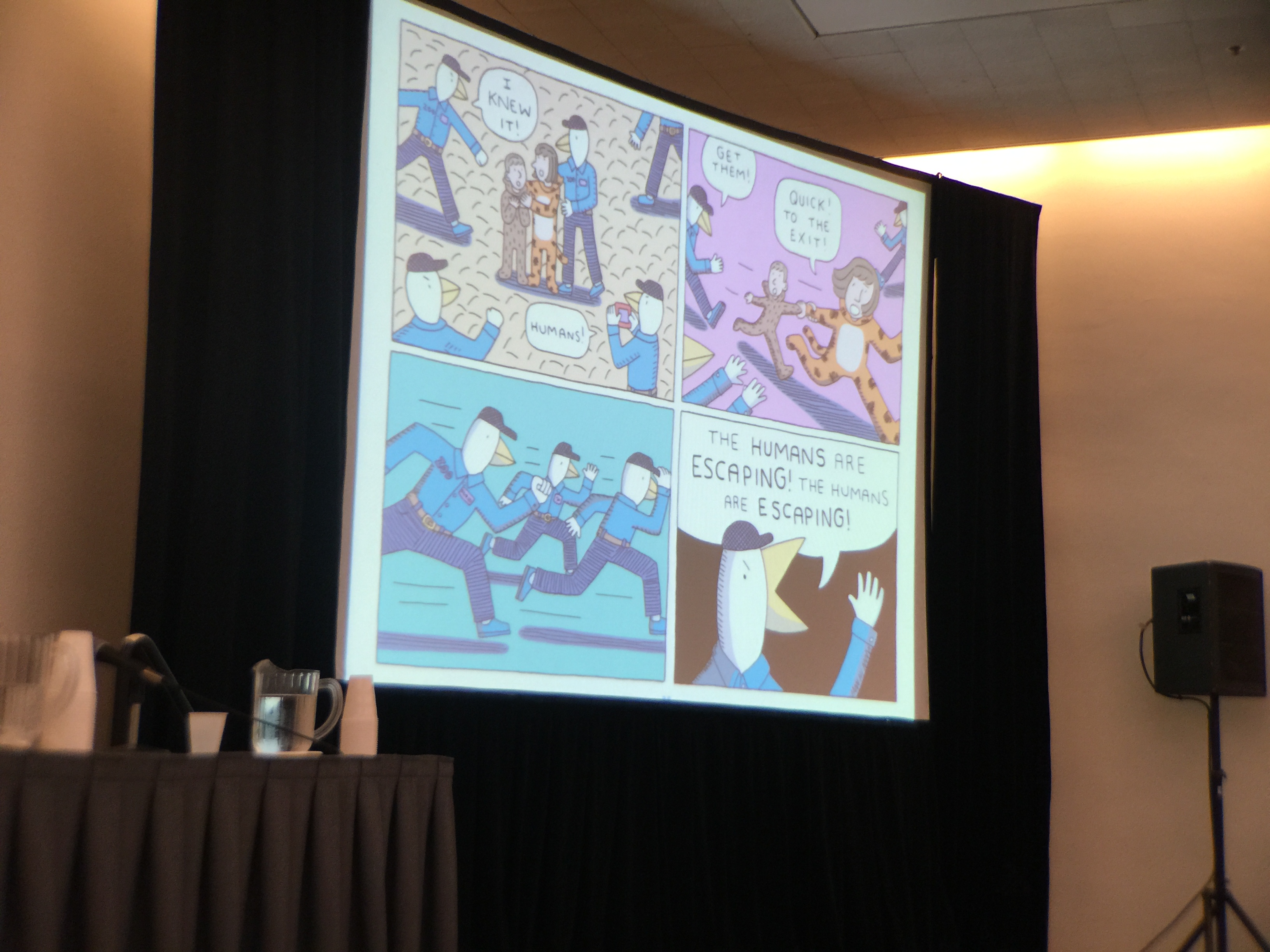
Aron Nels Steinke: “I definitely think about that. Most of my students I’ve worked from 1st-3rd grade. It’s very rare when a student doesn’t understand how to go left to right. But there are times where they do but they kind of get it after a while. If you make it so there really only is one way, then they’ll understand that really this is the next sequence.”
Hanuka had chosen a very vivid page and it was noted how the lead character is handsome, and nice and symmetrical. You’re not afraid to get really grotesque. What drove that choice?

Asuf Hanuka: “It’s really hard to do something beautiful without showing something ugly. I guess it’s just a way of creating contrast. We did have red lines for stuff we didn’t want to do.”
The notion of a red line, or line the creators wouldn’t cross, was a bit humorous considering the amount of violence in in the book where people have brains and spines ripped from their bodies. So it was surprising to hear there were lines the creators wouldn’t cross. The crowd laughed at McCloud’s quip regarding how that violence was portrayed.
Scott McCloud: “But tastefully”
For McCloud’s page he kind of cheated having chosen a two-page spread. This spread in particular from The Sculptor was chosen to show how he was experimenting with auditory experience of the main character.
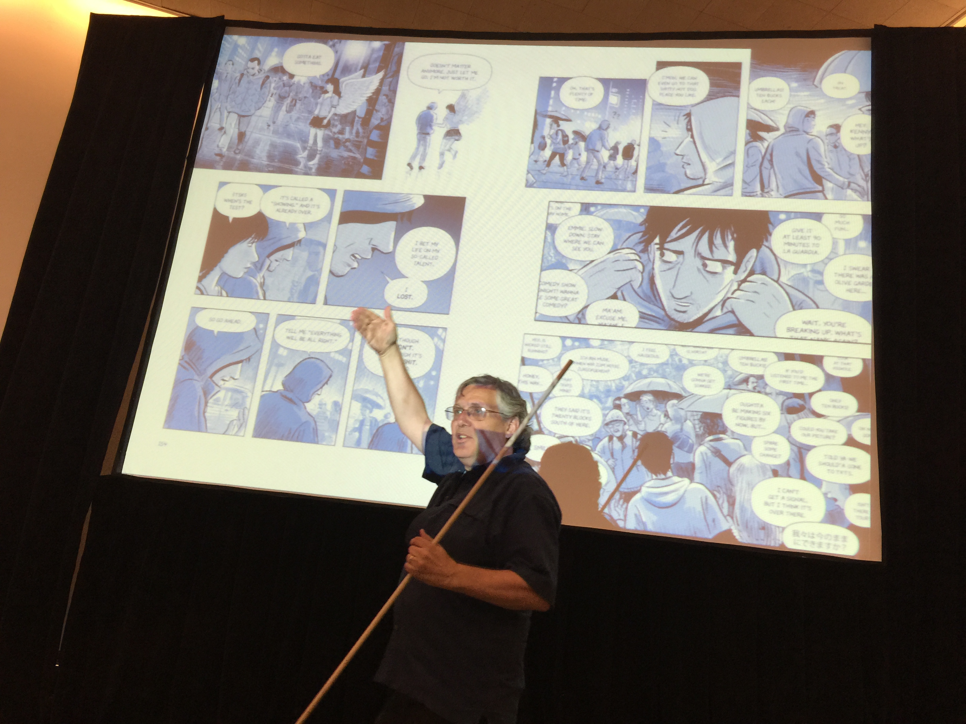
Scott McCloud: “The reason I like this spread is because it was an opportunity when I’m doing everything visually to see if I could do something auditory. Where it’s all about somebody trying to find a real person in a crowd. And so I just have voices, and voices, and voices and this is what Times Square is. I wanted you to have a sense of what it is to be like inside of his head.”
Gene began with two pages from separate the separate books of his two volume series Boxers & Saints. He joked that he immediately regretted the choice as they’re probably not comics in the McCloud definition. He picked them so he could talk about the duality of the two scenes based on the themes in the graphic novels
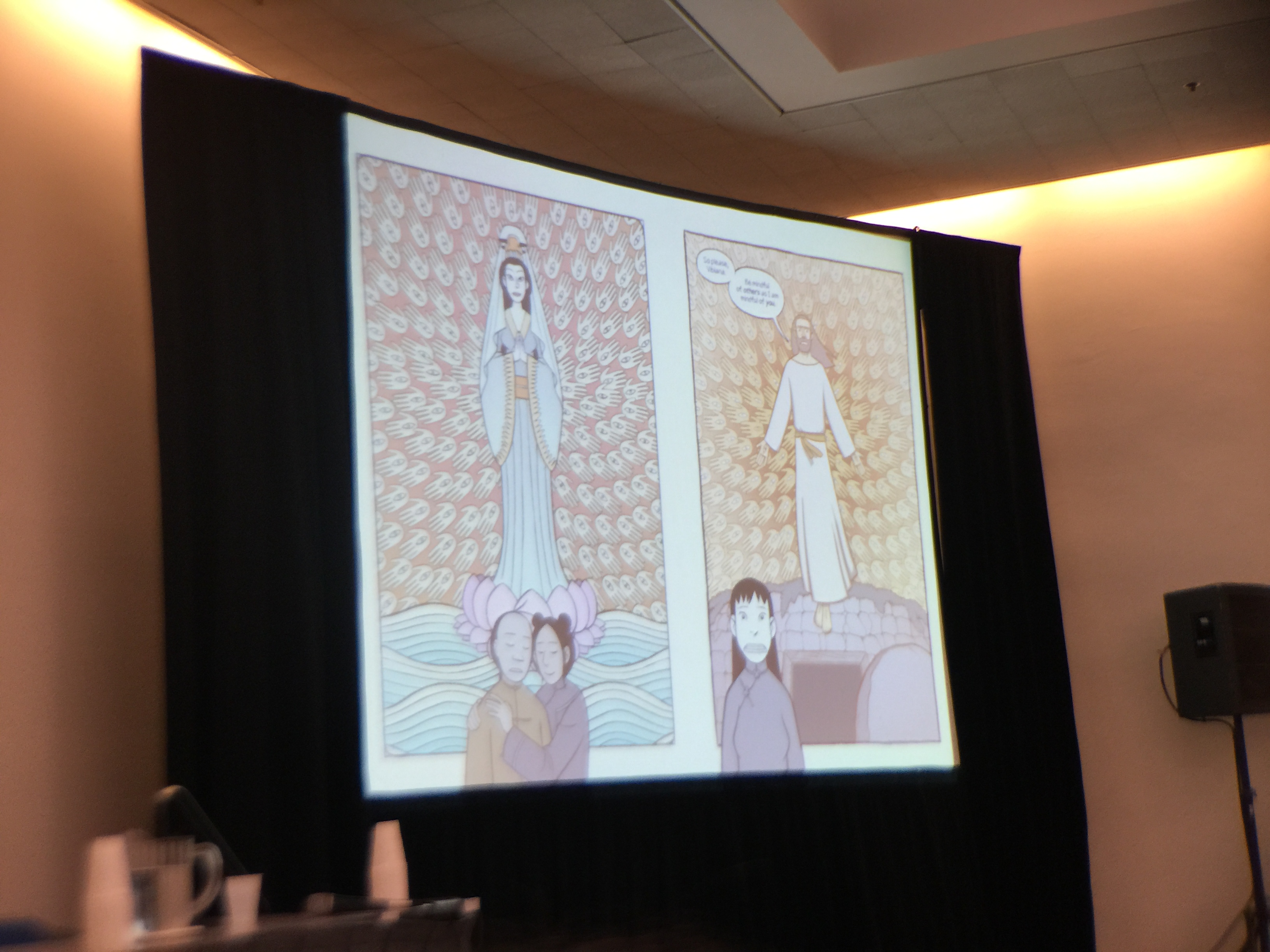
Gene Yang: “The reason I did two volumes [Boxers and Saints] was because I couldn’t decide who I sided with. I couldn’t decide who the protagonists are. So the protagonists in one book are the antagonists in the other. So that’s what these two panels are all about. I just wanted to visually represent that resonance between the two cultures.”
After having gone through each creators selected pages the floor was opened up to questions. The first one allowed for some interesting insight from the creators. It was asked “What informs your choices when choosing the panel layout and which panels or pages will be contained vs a full bleed?”
Yang’s response came from a narrative point of reference—
Gene Yang: “I actually had a debate in my head about whether or not to make these [the two pages selected] bleed. I think visually it would’ve been more striking. But narratively each of the larger images represents something that is happening in the heads of the characters that are at the bottom. So by containing it in something kind of a panel it’s sort of a visual representation of that.”
while Steinke’s was born from humorous practicality.
Aron Nels Steinkie: “First my answer involves the laziness on my part. When you do a bleed you’re drawing art work that won’t actually get printed. It’ll get printed and it’ll get chopped, by the chopper. Because it bleeds and goes off to the edge of the page. One of my favorite cartoonists is the cartoonist Joe Socko and he does a lot of bleeds. And I think about all the inches of artwork that we don’t get to see because it’s been chopped from the paper cutter. That’s one reason and another is I try to use it for emotional impact. So whenever I do go to the effort to make that extra effort it’s got to be for a reason.”
Hanuka’s response was more rooted in the experience of comics and it’s physical medium—
Asuf Hanuka: “I think it’s a question of taste. For me I prefer to never go to a bleed because I believe the magic of the comics language is that you’re seeing a universe through a window. And so you need the window. And if it goes all the way to the end of the page, then you’ve seen the end of the page—and it’s paper and something about the illusion disappears. But I think that in some cases you can do it. But for me it has to be really—like—if the Earth explodes. Yeah, let’s go to the edge. Save it for the important moments.”
and as to be expected McCloud’s response blended metaphor, theory, and art.
Scott McCloud: “I do use bleeds a lot. I think the most important thing for me about bleeds is that they are well named. It’s a really good name—bleed. If you think of any panel as a kind of container it’s like an organ that contains fluids. And it contains time. If you have three panels in a row—boom, boom, boom—then it has this nice staccato rhythm. It’s telling you “Here’s an instant. Here’s an instant. Here’s an instant.” Or maybe a span of time. But it’s a container. It contains your sense of the duration of the panel. That this thing is—holding, time, in— and so it has a nice feeling of containment. When you lose that edge something happens in our perception”…
“What happens when you have a panel bleed is it really almost literally bleeds time. As it goes to the edge of the page there’s a sense the duration just flows outward. If you have a bleed at the beginning of a spread for example, that instant will seem to become a lingering moment. It has an echo. It has a reverberation. And it tends to bleed throughout that spread. You can sort of feel it sinking in. That’s why they’re so good for establishing shots. You have a nice bleeding establishing shot and then that sense of place in that one little box becomes a sense of place for the whole spread. If the whole scene takes place in that place, then you have that sense of place throughout. It escapes time. Time—bleeds—out. It’s well named.”
Another audience question brought up how audiences are also reading digitally now, and how that’s increasing with, “I’m curious about what kind of impact digital is having as far as laying out the page?” At this McCloud had to leave so he could make it to the other side of the convention center to participate in another panel. It was another humorous moment for the audience considering McCloud’s many thoughts on the topic, hence his own jab at himself leaving on the digital topic.
Scott McCloud: “And also, I’ll never stop talking.”
The rest of the panel seemed to still be working that question out for themselves as they work, realizing it’s two worlds still very much sharing space from a creative endeavor.
Asuf Hanuka: “Personally I don’t read any digital comics. I only read on paper. But everything I do and create is digital. It’s on computer. Even the penciling—it’s called penciling, but it’s really a Cintiq pen on a screen. The thing I like about digital is that I know the color will look exactly like it looked on the screen. And the printing quality will be always [sic] perfect for everyone and that’s amazing. But I don’t have any specific changes that I will make in the layout design, or the storytelling, or the drawing style because it’s going to be on the screen and not on paper. For me it’s the same thing.”
Aron Nels Steinke: “My published work I’m generally thinking about turning a page in a book. That’s how I enjoy reading comics the most.” …
“I would like to see digital versions of my books or any other books done panel by panel. I really like the way my friend Zac Soto—who has a group called Study Group—a lot of times when they put their work online it’s an infinite canvas going vertically. Because that’s how you’re scrolling if it’s online.”
At this the moderator mentioned “Design for devices and print should be designed for that medium. But usually not both.”
Gene Yang: “When I am writing my own comics, and making my own comics, I almost always am just thinking about the print version. Mostly because like Aron—I love that page turn. I can’t imagine doing without it. It seems to me that most comics, even if they’re presented digitally, are still formatted for print. There’s still the concept of the page which is purely a print thing.”
In finishing his thought Yang helped the moderator sign off the panel on another laugh.
Gene Yang: I know Scott—it’s too bad he left!
Moderator: If he had stayed this would be a whole other panel.


Una boda en la que los novios solo deben pensar en ellos, en la que los invitados
se sorprenden y divierten como jamás, en la que hasta la tía abuela
se lanza a bailar….; una boda única que se recuerda durante
un buen tiempo, en la que todos y cada uno de los instantes irrepetibles se han captado por siempre, en la que cada cosa está a tiempo y en su lugar…; una boda más feliz es una
boda perfecta…, y en Diamonds deseamos que sea la vuestra.
Y tienes de nuevo razon en una cosa, no hay nada pero peligroso aterrador que alguien que no
duda, se te ve como un excelente ejemplo, crees firmemente en tus tonterias y eres un riesgo para la salud de quien caiga en tus manos, puesto que
eres incapaz de dudar de los cuentos magicos que dices que son medicina.
Consultando las estadística en Analytics desde Enero de 2013 hasta Octubre de dos mil quince (mes todavía en curso, con lo que
muestra datos parciales) lo que podemos observar es que desde principios de dos mil quince hay un descenso constante de visitas al blog y lo cierto es que
no sé muy bien a qué es debido.
Comments are closed.