
This week’s lead review for Wednesday Comics is w0rldtr33 #1, the newest horror epic from James Tynion IV and his collaborators. Plus, the Wednesday Comics Team has its usual rundown of the new #1s, finales and other notable issues from non-Big 2 publishers, all of which you can find below … enjoy!
 w0rldtr33 #1
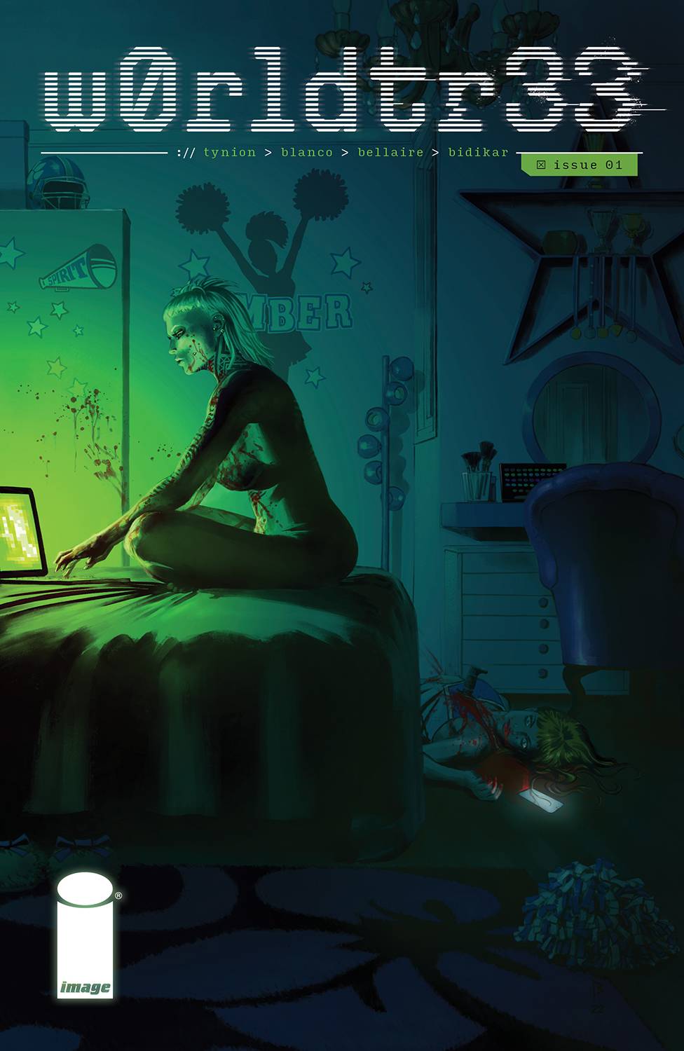
Words by James Tynion IV
Art by Fernando Blanco
Colors by Jordie Bellaire
Letters by Aditya Bidikar
Edits by Steve Foxe
Design by Dylan Todd
Published by Image Comics – Tiny Onion
There was a brief prelude to this series in the recent Image Anthology, but it did not sufficiently prepare me for what I was about to read.
The opening sequence to James Tynion IV’s latest horror epic is devastating in how familiar it feels. A teenager commits a massacre, being pushed to kill dozens of his neighbors by a virus haunting the internet…but the implication makes it feel like it’s almost the internet itself which pushes this kid to kill.
Now, I just finished reading The Stand, and there’s a panel in this that made me have horrific flashbacks to the foreshadowing of the Captain Trips at the beginning of that book. Except, instead of a biological virus killing everyone, Tynion and co. seem to imply that this will cause everyone to kill each other… a far more frightening premise that sets up a potentially devastating series. The cliffhanger for this issue only adds to this impending sense of doom, with a stunning display of violence that I’m sure will seem tame when we look back at this series someday.
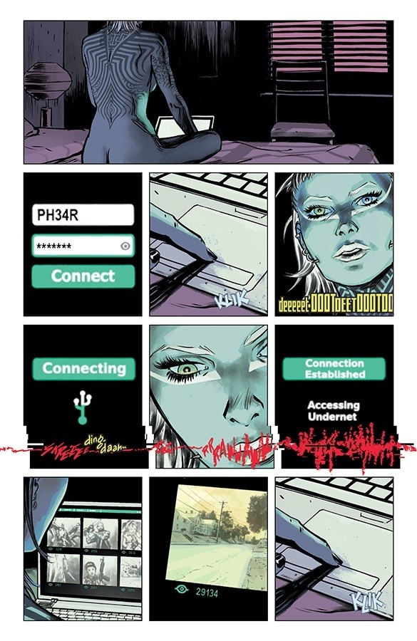
The characters are vivid throughout this issue, with bold personalities that keep them distinct as we’re slowly introduced to them. Dialogue makes these relationships feel fleshed out, even when some of the main characters involved in the w0rldtr33 make cryptic references to past events. A brief flashback establishing who some of our players are isn’t confusing, but drops slight seeds as to who we’ll eventually find out they are.
Fernando Blanco and Jordie Bellaire are a match made in heaven. Not only do the colors bounce and pop, but when we’re pulled into a flashback or a murder spree, the palette explodes into these surreal oranges and greens. There are a few pages scattered through the issue where Blanco paints the characters or background, and the details are rendered to the extent that the panels become miniature works of art on their own, nearly photographic in their level of precision.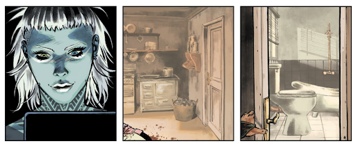
Aditya Bidikar’s lettering only adds to the dread that seeps into your skin while reading this issue. Speech balloons have this imperfect quality to them; they’re intentionally janky and lopsided, unconsciously unsettling without until you stop and look closely at them.
If there’s anything to be frustrated about with this issue, it’s the pacing and vagueness of some of these ideas. There are a few questions that are left up in the air that I was surprised to see open-ended for now. Obviously this is just a first issue (and those questions will undoubtedly be answered in time), but this almost feels like it’s missing a few pieces that could make this perfect from the get-go.
I’m not gonna lie and say this was an easy read. It’s brutal and disturbing in a number of ways, but this team has created something so alluring, it’ll be hard for me not to read the next issue. I wouldn’t recommend this for the squeamish or those who prefer their dreams nightmare-free, but if you’re willing to be comfortable, this is the comic to read.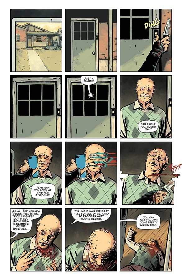
Verdict: BUY
Wednesday Comics Reviews
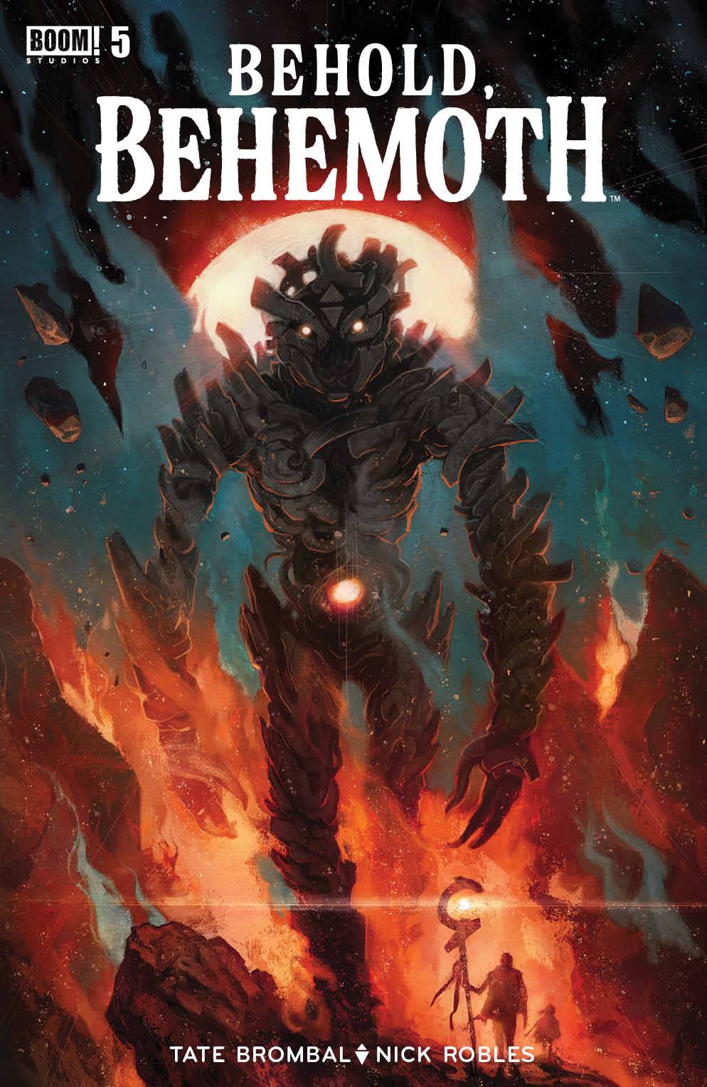
- Behold Behemoth #5 (BOOM! Studios): The finale of Behold Behemoth sees the story run its parallel narratives in a way that provides an excellent mirror both visually and thematically as writer Tate Brombal threads continued subtext about systems and institutions while exploring the very nature of the Behemoths as an extension of an institution. Tate’s writing is realized through art by Nick Robles whose dynamic character work, paneling, and mastery of compositions and spreads work so well to provide a sense of scale to the moments, environments, and characters. Andworld Design’s lettering is weaved through the pages and feels like a natural extension of Robles’ artwork as the dialogue and sound effects flow throughout the compositions, heightening the sense of movement across the pages. The colors are gorgeous and really inform the mood of the events taking place, the art and the story are a feat as characters are given fitting conclusions while also being sympathetic within the page space, juggling the future and present of this cast of characters while answering many of the questions posed at the start of the series and leaving room for further exploration. –Khalid Johnson
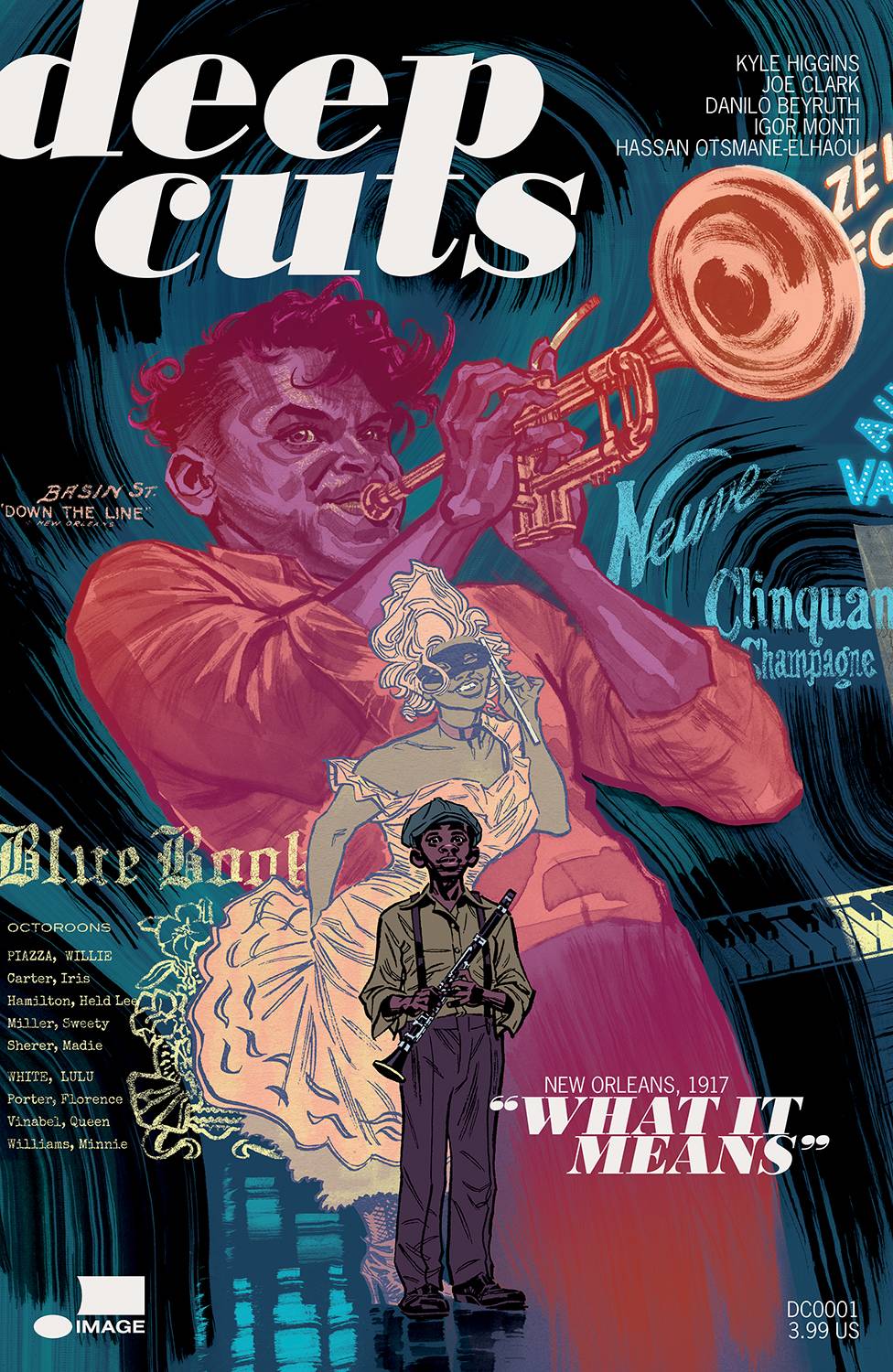
- Deep Cuts #1 (Image Comics): This book by Kyle Higgins, Joe Clark, Danilo Beyruth, Igor Monti and Hassan Otsmane-Elhaou covers a subject that is not easy to do in a printed medium — music. But if you think about it, putting together a good comic is sort of like putting together a good band. Both are collaborative and require each participant to work off each other. Deep Cuts, an immersive and beautiful story about jazz set in 1917, does just that. It plunges us into turn of the century New Orleans, where there’s plenty of conflict (like main character Charles’ grandmother disapproving of the musician lifestyle). By keeping the plot simple and relatable, as a reader you experience what Charles does. You get the sense of wonder of being brought into a world you always wanted to be a part of. It’s classic storytelling. When you toss in the beautiful art and impeccable lettering, it all starts to flow like a beautifully composed piece of music. I also want to highlight the lettering, because there’s a musical quality to the fonts and illustrated notes that’s vital to the reading experience. Hassan Otsmane-Elhaou is one of the best letters in the biz, andwhat he does here with notes coming out of instruments is magical. —Manny Gomez
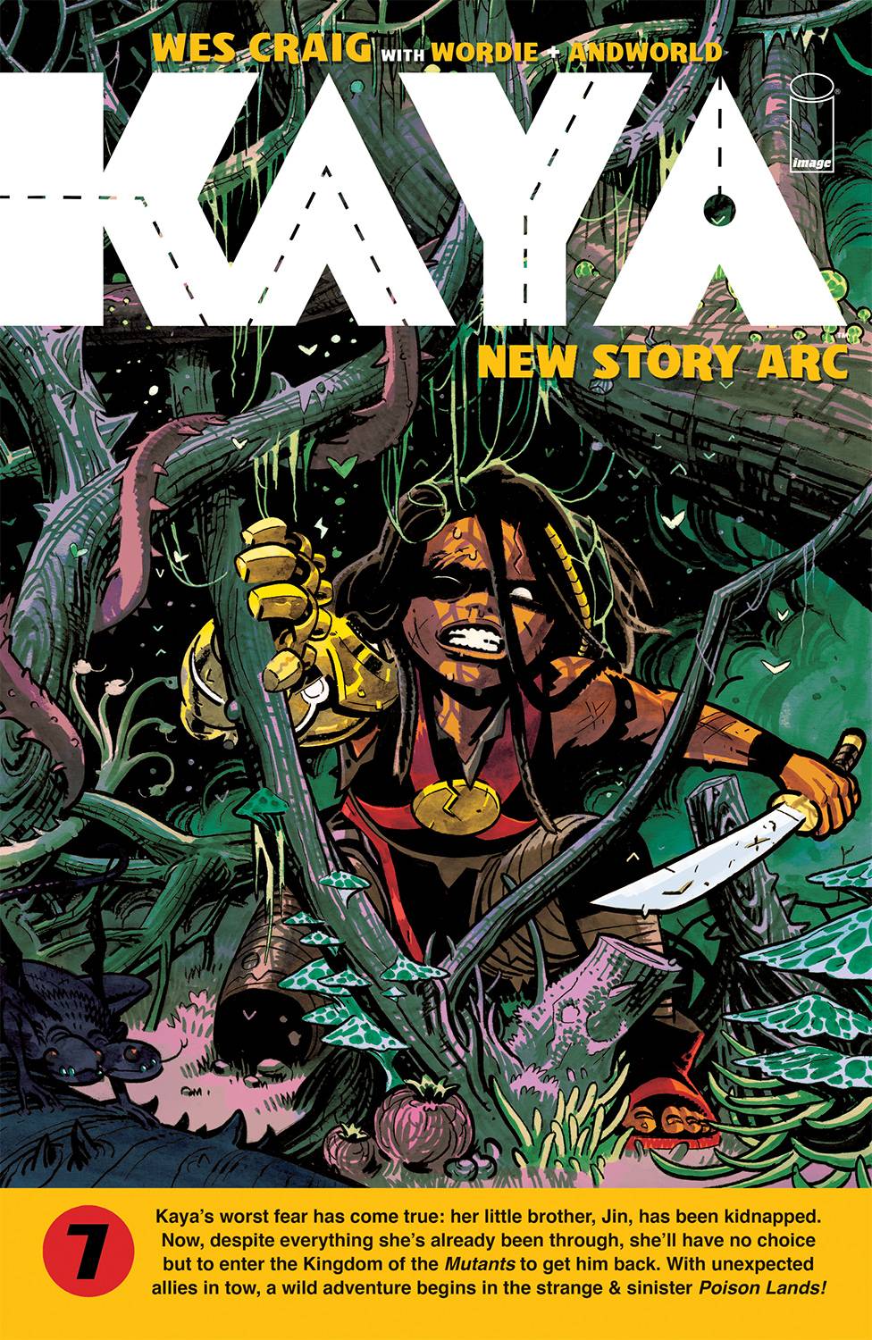
- Kaya #7 (Image Comics): Spoilers for the end of my Kaya: Book One review (coming soon), but I mentioned that lead character Kaya only punched with her gold Kirby arm four times and never once made contact in-panel. Four pages into the new Poison Lands arc, Kaya punches a boulder, and we see her make contact. But it doesn’t mean anything to us. It’s not a big moment or meaningful in any way. Kaya punching a boulder is a solution to a problem, but more importantly, and more so about the entire book, it must mean so much more to triple threat creator Wes Craig that Kaya is breaking through. Craig admits in the lovely monthly-reader-only backmatter, that “It’s the most fun [he’s] had in [his] career…” With that level of career fulfilling endorsement, we can take much of Kaya’s Poison Lands adventure as this is a book for Craig by Craig, and we’re allowed on the journey. Craig has an admirable ability to add weight and drama through layout and character performance, through hatching and ink wash, and through an intense sense of movement. While colorist Jason Wordie lends a continued lushness to the craggy and teeming Poison Lands albeit in comic-book villain purple and green hues, the watercolor undershadow stands huge against the grain of Craig’s inks. Tom Napolitano, Kaya’s letterer, administers cut-in captions, Kaya’s desperate grunts, and disconnected balloon tails to great effect, but none more so than adapting font size to volume level! Whether what Team Kaya is bringing does anything for you, every statement made by the production team is abound with well-purposed stream-of-conscious creativity. Enjoy! —Beau Q.
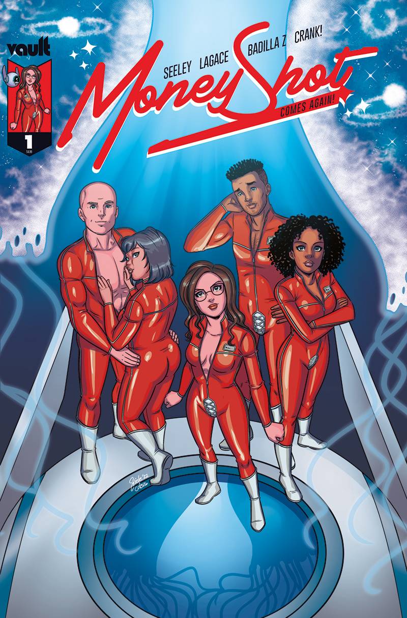
 Money Shot Comes Again #1 (Vault Comics): With a new subtitle that would make Howard Stern proud, Vault Comics’ sci-fi sex romp Money Shot is back this month. If you liked the first run of Money Shot, you’ll surely pick right up where you left off. The artist has changed and half the writing team has departed, but the book still feels like itself. Tim Seeley does a great job reminding of us of the concept and characters with this script. New series artist Gisele Lagace (colored here by Carlos Badilla Z) is a natural fit for the ahem unique imagery this sort of book calls for. So, that’s all great. It’s nice to remind readers what they like about an idea before going into the next phase or new territory. And this book certainly does that. The big thing in this first issue back is the incorporation of Cherry Popstar, an inspired addition to this story and a fun nod to classic erotic comics. Moreover, it’s a bold move that feels unpredictable, in the sense that there are now many different and new directions Money Shot Comes Again can go, and I have no idea which it will choose. But it will be fun to find out. This book is lettered by Crank! —Zack Quaintance
Read more entries in the Wednesday Comics reviews series!
Wednesday Comics is edited by Zack Quaintance.


