This week’s main review is Unnatural Order #1, a giant swing of a new series from Vault Comics. Plus, the Wednesday Comics Team has its usual rundown of the new #1s, finales and other notable issues from non-Big 2 publishers, all of which you can find below … enjoy!
 Unnatural Order #1
Writer: Christopher Yost
Artist: Val Rodrigues
Colorist: Dearbhla Kelly
Letterer: Andworld Design
Publisher: Vault Comics
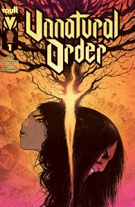
Vault Comics is taking a big swing with Unnatural Order #1 — in more ways than one. The publisher (one of the most interesting in the indie comics space) is so confident in this new series, that the first issue is being offered to retailers free. This has led to orders for more than 140,000 copies of the book, which would be a banner week for Batman, let alone an original fantasy comic.
This is a savvy move, one that will likely take advantage of how comics are sold, leading to more orders for second and third issues, which are always tough to maintain. This ambitious sales move, of course, doesn’t mean much if the comic isn’t good. But that’s the thing, Unnatural Order #1 is also a big swing of a comic, one that takes aim at bold engaging storytelling and connects, hitting it out of the park.
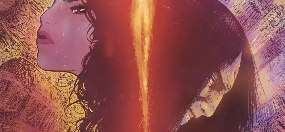
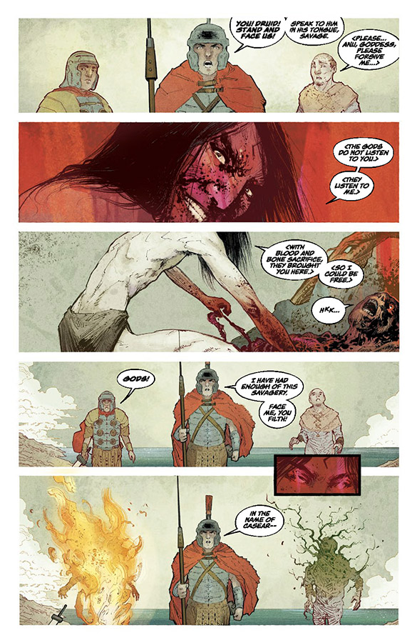
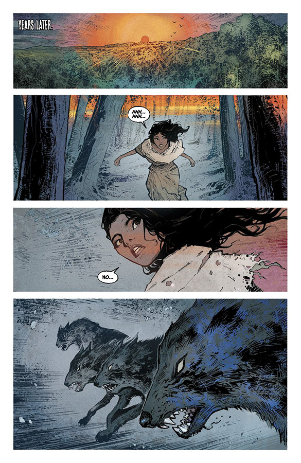
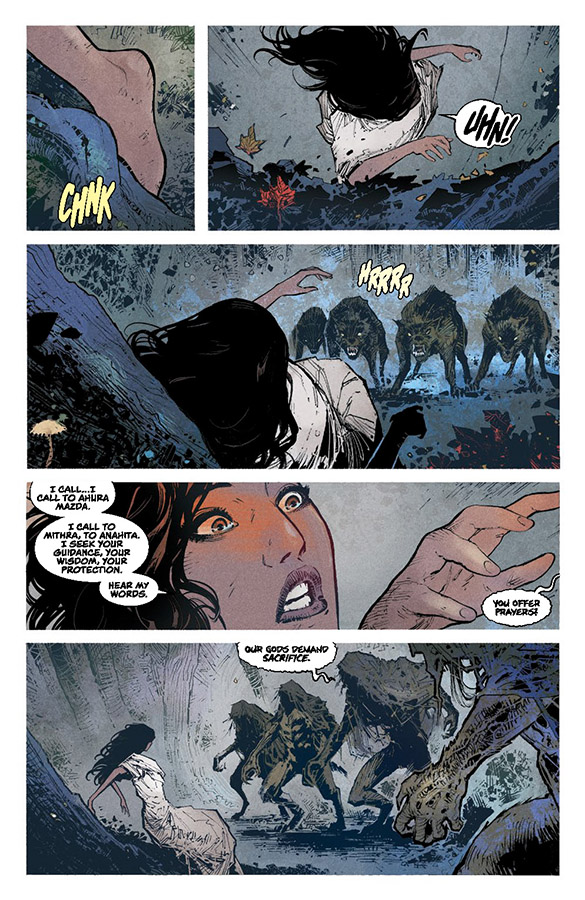
I have to be careful how I talk about this book, because I’ve also read the second issue, which might be even better than the first. But I will say that first and foremost, this comic is absolutely gorgeous. The line art is from Val Rodrigues, who has previously worked with Vault on one of my personal favorites from the publisher, the Dan Watters-penned Deep Roots. Rodrigues levels up here, delivering grandiose splash pages that punctuate the clear and well-paced visual storytelling throughout.
And a major part of that leveling up is colorist Dearbhla Kelly. Kelly is absolutely fantastic in this book. Indeed, a lot of the heft of Unnatural Order #1 comes through the color flourishes that bring the fantasy imagery to life, be it through mystic flames or casting of actual magic. A grounded sort of magic is central to this first issue, powered by the mysterious Druid, and so the color ends up being crucial to establishing when that magic is being used, with circles of light enveloping characters, or backlighting ominous trees, or emanating from giant wooded kaiju. It’s just such a good-looking comic, where the excellent visuals serve the action on the page so well.
It’s also very well written, penned as it is by Christopher Yost, the original creator of X-23 who is returning to comics here after in recent years writing mostly for movies and TV, and for marquee projects like Thor: Ragnarok and The Mandalorian. It might seem odd to describe Yost’s writing here as understated (again, there are wooded mystical kaiju), but it does feel that way. Yost grounds a lot of this first issue in the coming together of a cast of characters, trying to save their lands from the Druid.
It’s a relatively sparsely scripted comic, and yet the characters are clear and interesting, with unique personalities and objectives. We can also easily see how they all blend together, even in this early moment in our story. This is all leading up though to the book’s major reveal on its last page, which is what really elevates Unnatural Order #1.
Overall, what we get in this book is a landmark new series, a remarkable must-read comic that I can’t recommend enough.
Verdict: BUY
Wednesday Comics Reviews
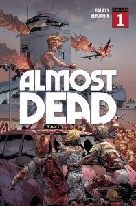
Almost Dead #1 (Ablaze): As if travelling via airplane to see estranged family wasn’t bad enough, the premiere issue of Almost Dead presents an entirely new fear to associate with the airport: waking up to the unexpected beginning of a zombie apocalypse. With story written by Galaxy, readers will assume they’ve seen this all before with other zombie stories, but the clues and breadcrumbs left for things to come is more than enough to keep them hooked. Art and inks from Ryan Benjamin and John Livesay respectively showcase an incredibly detailed world not lacking for stellar set pieces among well-laid out panels. Colors from Sivakami M At NS Studios bring the art together to add the grossness needed in telling zombie stories and all their horror. With lettering done by Saida Temofonte, the internal monologue of main characters contrasts well the unsettling grumbles of hungry zombies hunting her! —Bryan Reheil
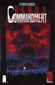
Blood Commandment #1 (Image Comics): Admittedly, I’m not the biggest fan of werewolf horror — I consider myself a laidback Dracula aficionado even, so while my experience with werewolf fic might feel tainted, I’m sure Blood Commandment #1 is up someone’s alley. Packed to the brim with repeated shots, claustrophobic layouts, and a particularly wordy dialogue scene, Szymon Kudrański is clearly intending all these design decisions. Repeated shots and repetitive actions to build expectation. Dense layouts suffocating pages with tiny panels and minute details, so you feel like you just visited a stuffy gallery of extreme close-ups. These are all fairly common creative decisions in horror that when executed well feel like a no-brainer, but when executed poorly feel like tacked on clichés. Kudrański marries his house style hatching and love of hyperrealism to a dark, gaussian palette heavy on using cold browns and blurs to hone focal points and eyelines. Largely quiet between big moments, Kudrański mimics rural life well, though the core relationship of hunter dad and hunter son isn’t for me; doesn’t help either that the 14-year old son looks a hyperrealistic 9-year old. This is further compounded by a scene that wants to be that long Tarantinoesque dialogue scene between our main characters, but is paced in-comic like a one-page infodump. Worse still is letterer Marshall Dillon’s decision to wrap these densely packed word balloons around each other in a visually displeasing manner that feels like a hammer beating the point in again and again. Hopefully with three more issues in Blood Commandment’s run, the father-son werewolf revenge frontier can find a home to trick and treat. For me, I’m going somewhere else this Halloween. —Beau Q.
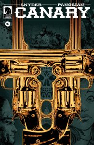
Canary #1 (Dark Horse Comics): Oooh boy. Canary by Scott Snyder and Dan Panosia, with lettering by Richard Starkings, is going to be a beautiful book in print. Starting as a Comixology Original series, Canary is a hard-pressed western fable whose vibes land for me somewhere between Bone Tomahawk and True Detective. There’s something weird lurking and you can tell right away. The artwork is so stark and the horizons are so vast that the pages begin to feel menacing. It’s the kind of pure wild humanity that only this story could be. In the first chapter of Canary we are introduced to Marshal Holt as he tracks through what is quickly becoming a series of odd killings. It’s labeled “first form.” And we spiral out from there. I don’t want to describe too much. Go to your local shop, pick it up, and flip through a couple pages. You’ll see. —Michael Kurt
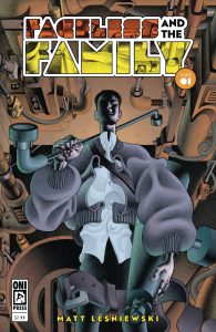
Faceless and the Family #1 (Oni Press): Matt Lesniewski does EVERYTHING here, and I don’t feel as though I have the words to describe much of what I’m looking at in this issue. My immediate instinct is to compare this to something I already know, like the work of Paul Chadwick or Tradd Moore, but it doesn’t seem right to compare this to anything. Shapes twist and bend into each other nonsensically, with mass having unique properties that makes everything feel kind of bulbous to touch. Lesniewski, who letters the issue as well, keeps balloons small and neat, allowing for the art to take center-stage – though sfx are ginormous, and are organically worked into the linework. Speaking of, avoiding color lets the lines shine, with these wonderfully varied brushstrokes that give so much weight and depth to everything on the page. The plot feels a bit thin here, but the issue more than makes up for that with this overarching feeling of loneliness that permeates everything. There’s this palpable cloud of sadness hovering over the main cast, and that only ever-so-slightly lifts at the end once the core group assembles into a bit of a family. This is such an interesting comic and I’m excited to keep checking it out. —Cy Beltran
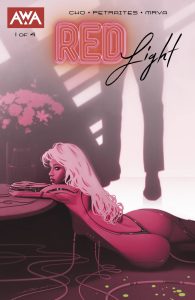
Red Light #1 (AWA Studios): Red Light #1 is an erotic thriller comic that features as its protagonist and AI sex worker who is slowly becoming more aware of not only the world, but of some tragic circumstances around her. If it sounds like this will be something you enjoy reading, I can confidently assure you that it is. This book is a stylish vision of paid companionship in the future, one that draws from technologies real tendency to be lead by erotica and spins a very human tale out of it. The art is fantastic, the writing very sharp, and the substance of the book singular among other comics offerings. The creative team here is writer Sarah H. Cho, artist Priscilla Petraites, colorist Miroslav Mrva, and letterer Sal Cipriano. —Zack Quaintance
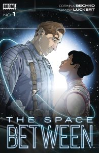
Space Between #1 (BOOM! Studios): Created by writer Corinna Bechko and illustrator Danny Luckert and lettered by Jim Campbell, The Space Between #1 explores class relationships and a romance budding in spite of them. Our protagonists Les and Revla come from different backgrounds and have different experiences, each pining for something that the other has had access to, and pining for each other after their chance encounter. Bechko creates a strong sense of who these characters are, allowing us to connect to them that much easier and to root for them once their romantic connection is established. When paired with Luckert’s art, everything feels fully realized; the characters feel real and expressive. The environments have a geometric feel, until we’re taken below the starline and see organic shapes in the greenery that sustains life for everyone. The way Luckert renders space is beautiful; it feels so expansive and works as a wonderful backdrop for a great character moment about halfway through this first issue. The end of the issue sees a big time jump which was a bit jarring but also leaves room for the story to go in virtually any direction. —Khalid Johnson
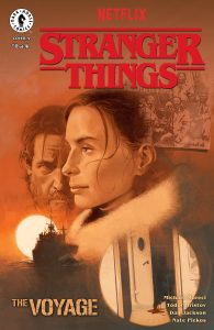
Stranger Things – The Voyage #1 (Dark Horse Comics): As Stranger Things continues to expand into different splintering stories, we join Captain Jacoby and his crew aboard The Persephone. Written by Michael Moreci, Stranger Things: The Voyage is a four part miniseries from Dark Horse that pits the nearly out of work crew against some big and rather gruff Russian soldiers (and inevitably their cargo). With art by Todor Hvistov and color by Francesco Segala, this comic looks fantastic. The darks are properly dark, and the characterizations remind me of the original Alien film in the way they present people in tight spaces. Nate Piekos, who lettered the comic, manages to wrangle some of the lengthier dialogue segments very naturally, careful to leave plenty of room for the action. I do find it generally overwritten, but think that has more to do with the Stranger Things tone and presentation of characters than how the story may unfold. If you like Stranger Things, you’ll like this. —Michael Kurt
The Prog Report
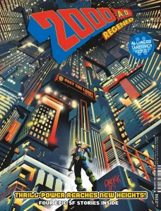
2000AD Prog 2356 (Rebellion Publishing): This week is one of the all-ages takeover issues, giving us a break from the ongoing stories. But that doesn’t mean the art is any less excellent than in the main stories. A pair of the stories in this issue are especially spot-on for my tastes in comics art. The first is Lowborn High: Fire & Frost by writer David Barnett, artist Mike Walters, colorist Pippa Bowland, and letterer Jim Campbell. When done right, there’s no better comics landscape than snow, and Walters and Bowland nail it here, with an absolutely fantastic splash page featuring a polar bear. The other story I found really striking was Future Shocks: Content Provider by writer Karl Stock, artist Joe Currie, and letterer Rob Steen. Currie’s sci-fi cartooning is just so interesting to me, with shades of Mœbius throughout. Both those stories — and, indeed, the entire issue — are overall quite a bit of fun. As always, you can nab a copy of this week’s Prog here. —Zack Quaintance
Read more entries in the Wednesday Comics reviews series!
