

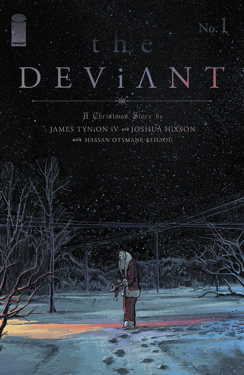
This week’s main review is The Deviant #1, a stunning Christmastime horror tale from James Tynion IV and Joshua Hixson. Plus, the Wednesday Comics Team has its usual rundown of the new #1s, finales and other notable issues from non-Big 2 publishers, all of which you can find below … enjoy!
 The Deviant #1
Writer: James Tynion IV
Artist: Joshua Hixson
Letterer: Hassan Otsmane-Elhaou
Publisher: Image Comics – Tiny Onion Studio
Review by Cy Beltran
I’m not sure what’s scarier here: the carnage left by the titular deviant or James Tynion IV’s ability to scare the shit out of me.
The Deviant is set around Christmas, and revolves around a comic book writer named Michael and his interest in an old murderer, a mall Santa from the 70s who murdered a pair of teens. As he investigates the crime, he starts to feel haunted by connections between the killer’s life and his own… all while a man wearing a bloody mall Santa outfit returns.
The pacing in this comic is so well thought out, and I think that speaks to both Tynion and
Joshua Hixson’s ability to construct an issue. The comic knows when to slow down and give us quiet beats, with these wide panels that veer from the impersonal to the intimate. It feels somewhat hard to explain, but in those moments of pure horror, it feels like we’re sitting in it, engulfed in the terror of it all.
I also can’t get over how vivid Hixson’s colors are, especially in the opening sequence. I’d say it’s Chicago bias, but even in scenes that have darker lighting, the colors leap off the page. It doesn’t hurt that some of the pages are these nasty, gorey images of mutilation by way of the murderer. Hixson makes the bloodiest images stand out, both with those colors and the grotesque attention to detail.
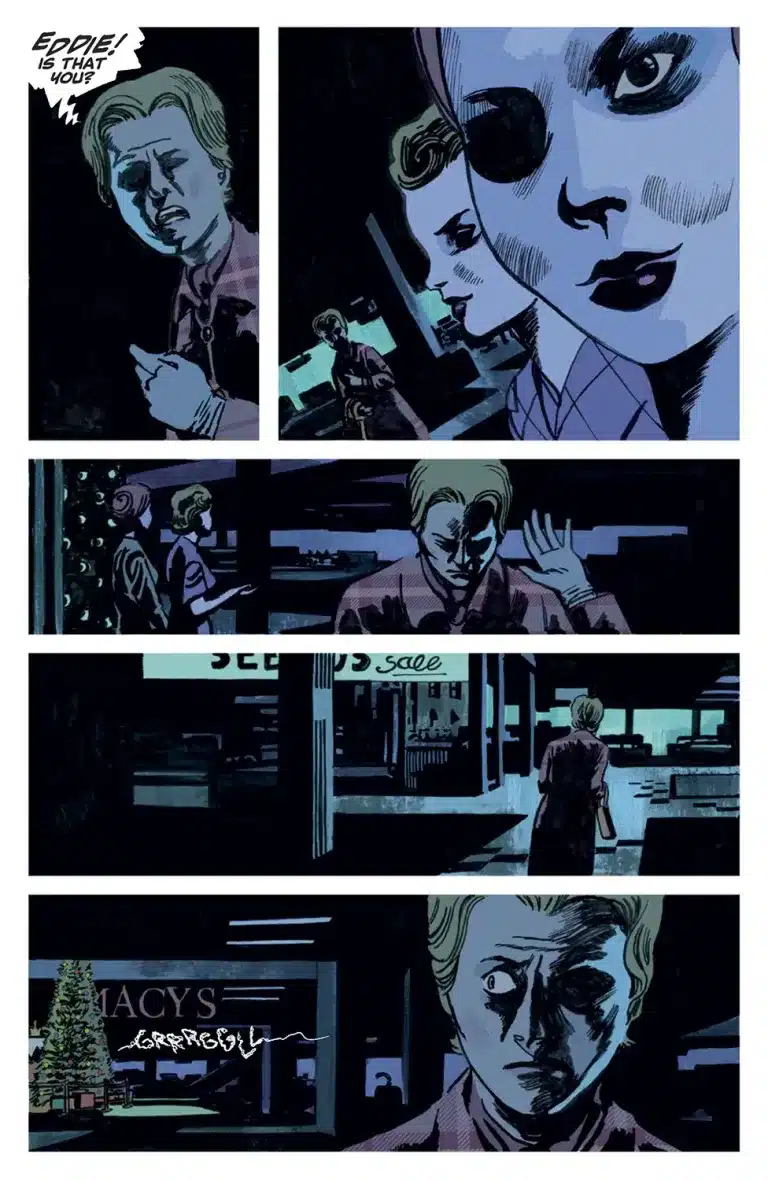
Hassan Otsmane-Elhaou kills it on letters, particularly with these horrible choking noises that appear whenever the killer shows up. I never get over the way he experiments with balloons either, with these off-kilter jagged edges and warbled tails whenever someone is exasperated.
Tynion has cemented himself as one the most versatile horror creators out there, but this might be the series I’m the most interested in checking out from him. As far as I’ve been able to tell from newsletters he’s written, there are no supernatural or sci-fi elements to be expected here; it’s a slasher through and through, and this might be the first time outside of Blue Book that he’s writing in this mode.
There’s something so interesting about seeing him work in this stripped back world of killers, especially knowing the amount of research that had to have gone into this. There are some mighty demons being battled here, and it can be a tough read, but that makes it that much harder to put down.
Verdict: BUY. This has the makings of yet another perennial horror book from Tynion and co.
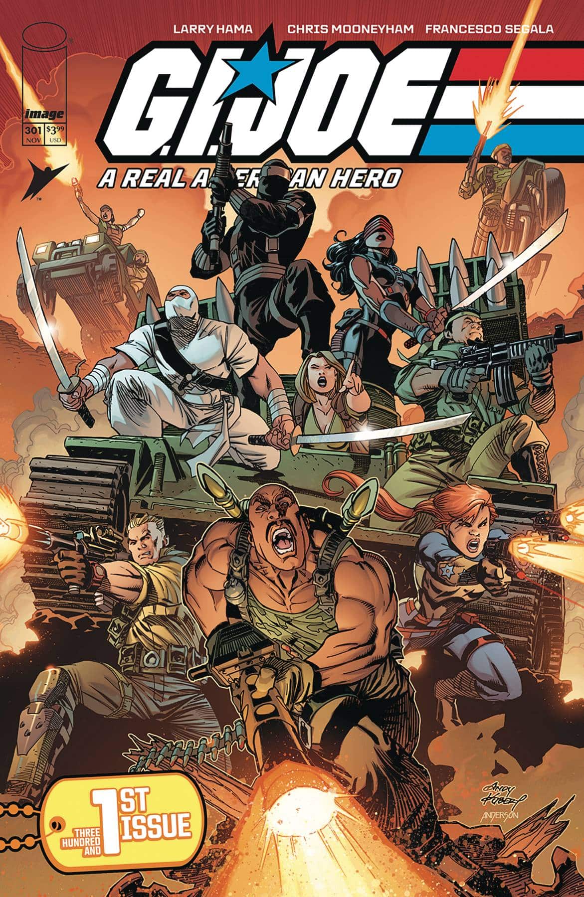
G.I. Joe: Real American Hero #301
Wednesday Comics Reviews
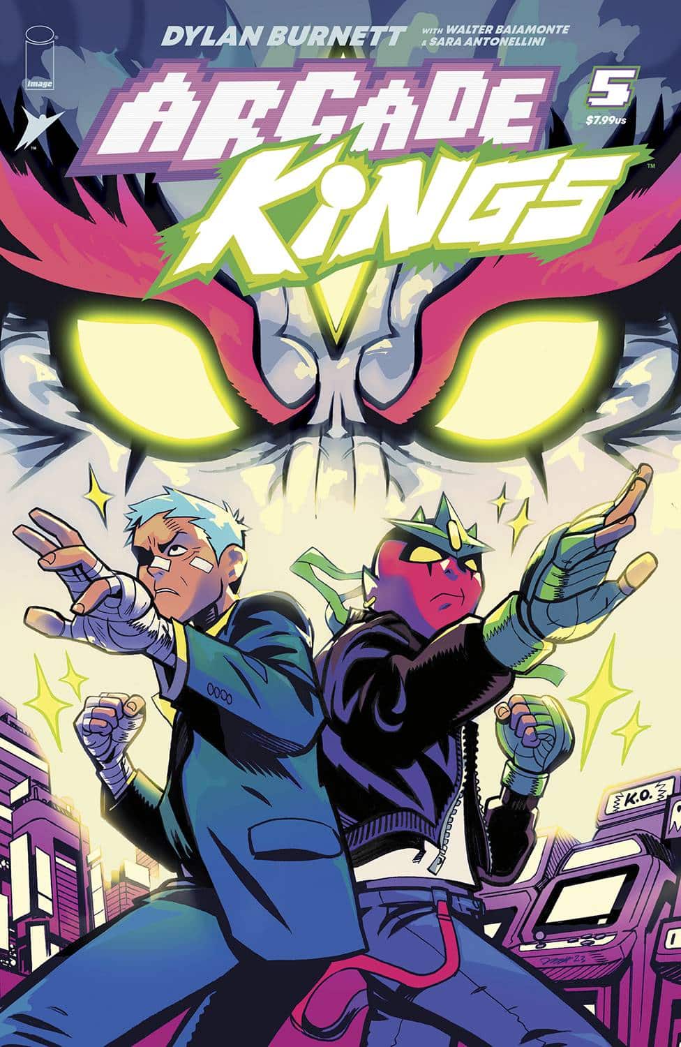
- Arcade Kings #5 (Image Comics): Never the perfect jumping-on point, but ever the consummate conclusion to our shonen rival protagonists’ emotional arcs, does Arcade Kings #5 stick the landing? Well, triple threat creator-writer-artist Dylan Burnett spends ample time subverting expectations by ramping into the climax rather than getting right into the action. Following the previous issue’s stage setting cliffhanger, Burnett and co seem to have written themselves into a corner where the character we’ve spent the most time with is incapacitated, so a protag we’ve spent less time with has to be our connecting bridge to the final battle. This wouldn’t be so obvious or worrisome in a penultimate issue, but sharing a fourth of the page count getting back to the climax will read differently in succession with previous issues. This is only further compounded by the final fight lasting about one actual page. There is a case to be made about the brother bonds being stronger than this parent villain, so the victory is swift, but it feels like a copout from an action standpoint. However, if you’ve been here since day one for the dovetailing of emotional arcs, Burnett and co have you covered. Of special note is the four artist color team of Walter Baiamonte, Sara Antonellini, and assistants Simona Iurato and Sharon Marino. Honestly, you never see colorists credited by fans in the letters column, but given the wide array of stylized techniques on display, it’s hard not to. With color moods that keep the emotion afloat, the overall book saturated, and enough backlit glows to provide that big fight feel, the Arcade Kings colorist team should get some serious award nominations in the near future. Not to be left out, this book wouldn’t scream the way it does without Andworld Design matching pace and energy with freehanded word balloons and bombastic sfx that are ever-present, but never feel as if they’re stealing the spotlight until it’s their time to do so; definitely a lot of cross-pollination from the colorist team here in the sfx to keep compositional flow breezy and impactful. Besides the slow for some, fast for others plot padding, Arcade Kings is more than the 90s videogame referencing throwback you might take it for — it’s a cathartic end to an appealing action series…and maybe the beginning of another… —Beau Q.
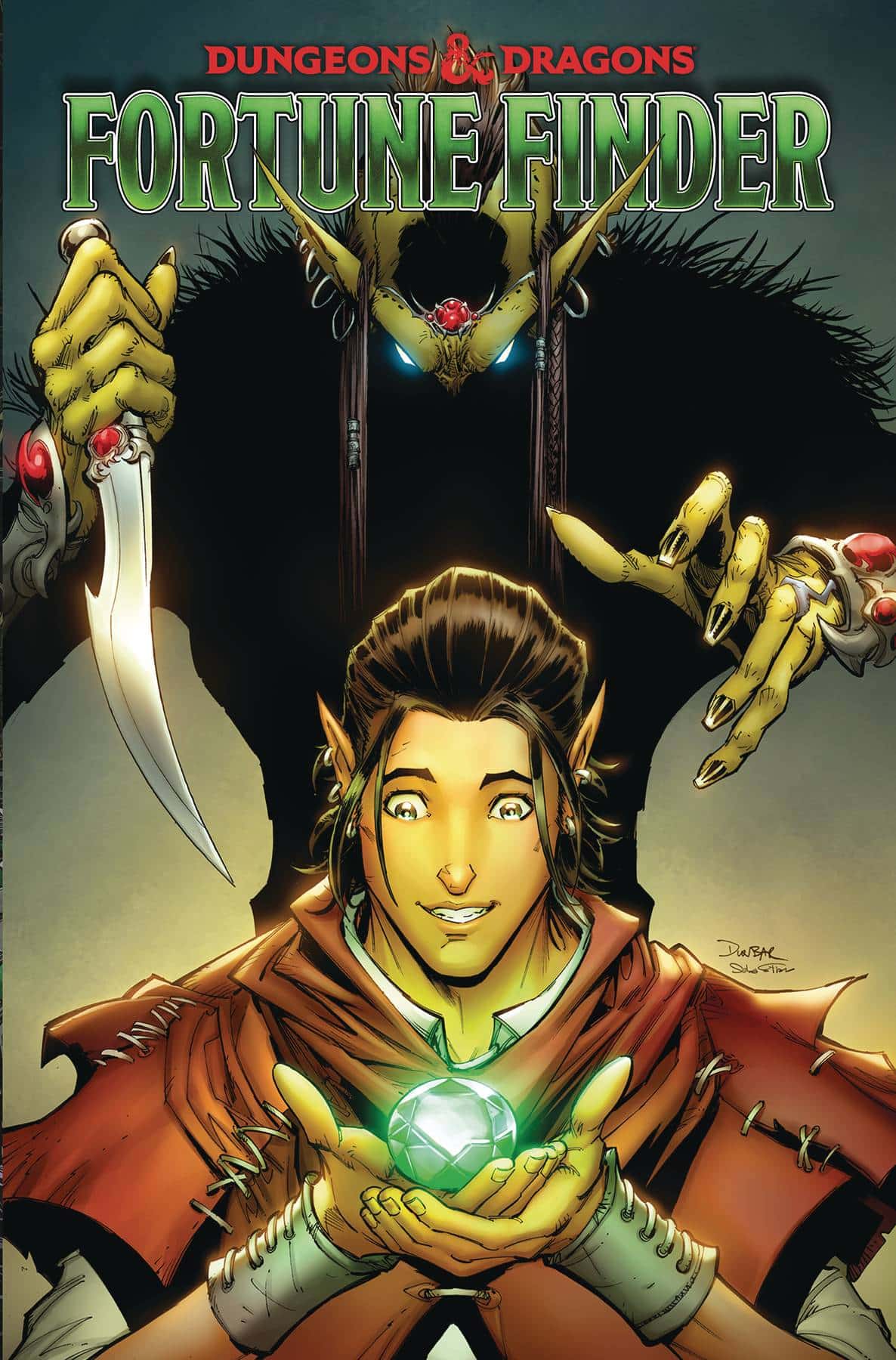
 Dungeons & Dragons – Fortune Finder #1 (IDW Publishing): The world of Dungeons & Dragons expands further with Fortune Finder #1, a series inspired by the recent multiversal game expansion allowing players to go further in their adventures than ever before. A hypothetical that writer Jim Zub takes full advantage of by introducing readers to a charming amnesiac main character just looking for answers in a world of near-limitless possibilities. Zub’s penchant for sword and sorcery tales really shines in the structure of the DND world where the only limits that exist for storytelling lay in the players and dungeon master’s ability to think on their feet, something Zub illustrates effectively in his writing, coming off like a campaign come to life! With art by Jose Jaro and colors by Adam Guzowski, the multidimensional plane looks like a cross between the vast imagination of every DND player and sourcebooks with the various species and classes interacting throughout. Those familiar with the game might find it hard to resist trying to classify each background and main character that appears each panel. Lettering, Production and Design by Amauri Osorio brings the book together with exciting sound effects, clever balloon design for spells cast, and the quill and ink-feeling internal monologue captions from the main character. —Bryan Reheil
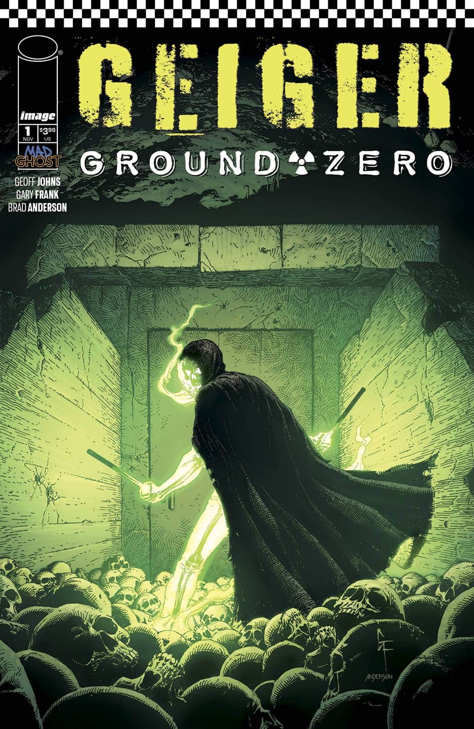
- Geiger – Ground Zero #1 (Image Comics – Mad Ghost): Creative team Geoff Johns, Gary Frank, Brad Anderson, and Rob Leigh visit Tariq/Geiger’s past, juxtaposing it with Molotov’s own story and motivations as they tell the story of how the two met. In a story that is situated in Americana, Johns takes the space to allude to the tensions of the red scare and the Islamophobia that permeates our culture, flashing back and forth between a freshly irradiated Tariq and his memories of his life before and the family that he lost. There’s more space given to those relationships, building up more compassion and understanding of Tariq’s family and the sickness he was struggling with. Gary Frank is on top of his game as usual; the art is gorgeous with some explosive (pun-intended) moments that are testaments to Frank’s superhero work and the sense of scope that existed in those big-two stories. Frank’s work is complemented by the colors of Brad Anderson, who really works to make the greens of Tariq’s new form pop and at the same time, feel haunting. Everything is tied together with the lettering of Rob Leigh whose sound effect work especially sings. Even without reading the original Geiger series first, this could still be an accessible on-ramp to the character and the growing line of stories set in this world. —Khalid Johnson
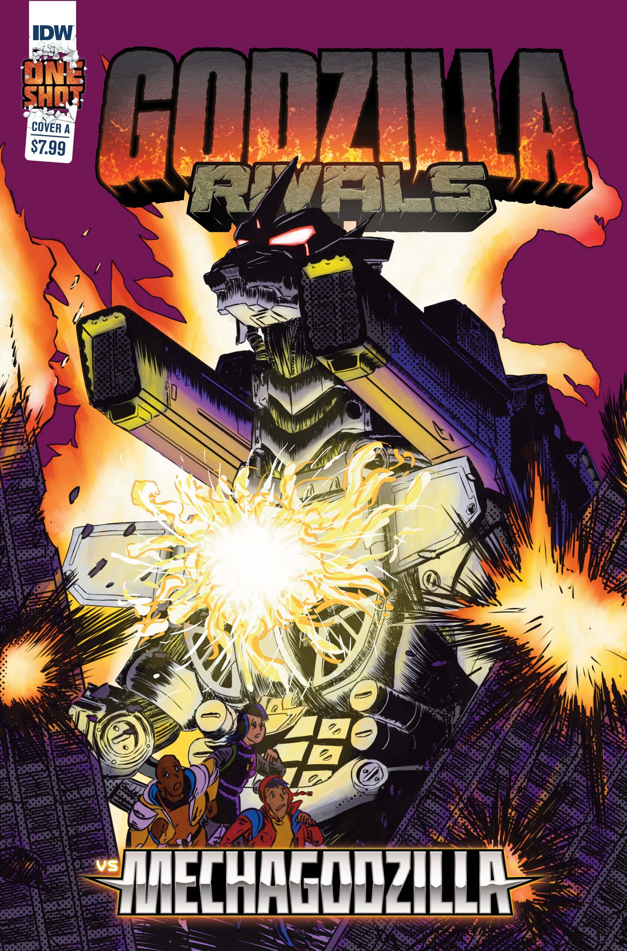
- Godzilla Rivals vs. Mechagodzilla #1 (IDW Publishing): Godzilla Rivals: VS MechaGodzilla is the newest entry into the Rivals series of one-shots. Rivals is much like Godzilla’s Millennium era in that each story is largely self-contained. Yet, much like the Millenium Era, the Rivals stories can be uneven and leave the fans cold. VS MechaGodzilla is unfortunately one of the latter. The story by Mark Martinez is decent and fits in with the larger Godzilla story tradition of corporations being the true evil and not the monsters. Additionally, much like most Godzilla stories, the focus of VS MechaGodzilla is on the human characters and their overall plot while the giant monsters serve as story device for the overall message. The pacing was brisk, and the action was intense. However, the human scenes would be enjoyable if it was not hampered by mediocre art.The art team of Kara Huset and Alex Sanchez leaves a lot to be desired. The human scenes are poorly rendered and lack any real sense of energy or emotion, which is a shame given they are the primary plot of the book. The Godzilla scenes are fine if not claustrophobic at times. There isn’t much in terms of scale presented here which robs the scene of impact. While the coloring by John Paul Bove and Ed Pierre does well to meld the two art styles into something more uniform, it cannot overcome the uninspired figure work and composition. I must wonder if there was a deadline at play here given the rushed nature of it all. Either way, the quality of the product was unbecoming of a mainstream Godzilla comic.
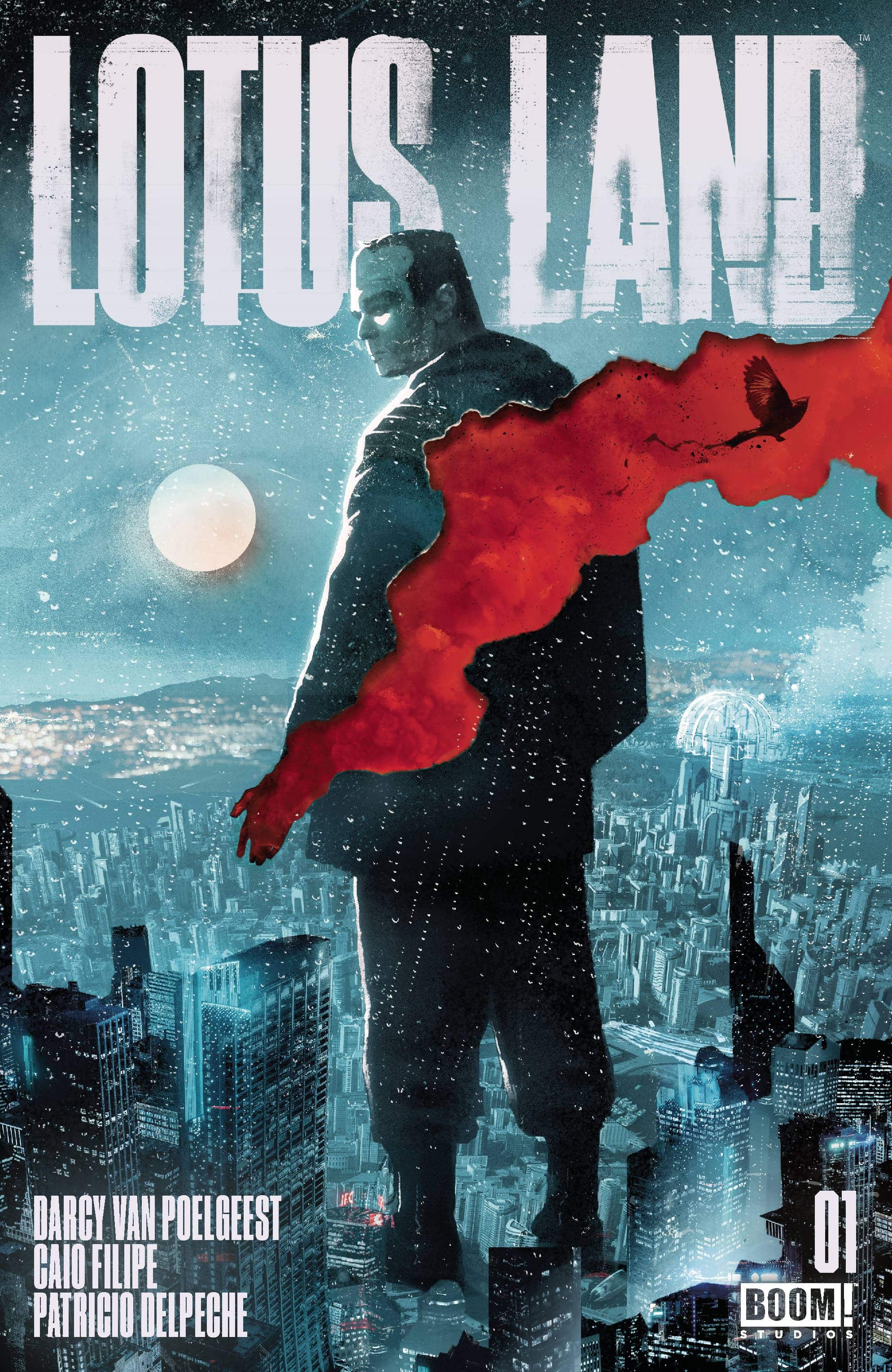
While the Kaiju clash is fun and the story fits the tone of Godzilla tales, Godzilla Rivals: VS MechaGodzilla is a disappointment. I cannot recommend this comic to even the most ardent Godzilla fan. —Jordan Jennings - Lotus Land #1 (BOOM! Studios): In sci fi, there are stories so dominant that to play anywhere near their sandbox is to invite immediate comparison. Lotus Land #1 wears its debt to Ridley Scott’s Blade Runner on its sleeve, from the moment a flying car lands in the front yard of retired Detective Bennie Strikman to recruit him for one last case. It’s noir with high concept science fiction thrown in, but with a limited number of pages, the first issue struggles to flesh out the world or the characters, despite feeling fairly dense with information. The hook here in the early goings is Caio Filipe’s warm, wide-screen art, which evokes the work of Gabriel Ba and Jeff Lemire. While it doesn’t grab the reader from jump the way Darcy van Poelgeest’s Little Bird did, Lotus Land lays down compelling groundwork, a fresh coat of paint on a well-worn classic theme. Colors are by Patricio Delpeche and letters by Nate Piekos. —Bob Proehl
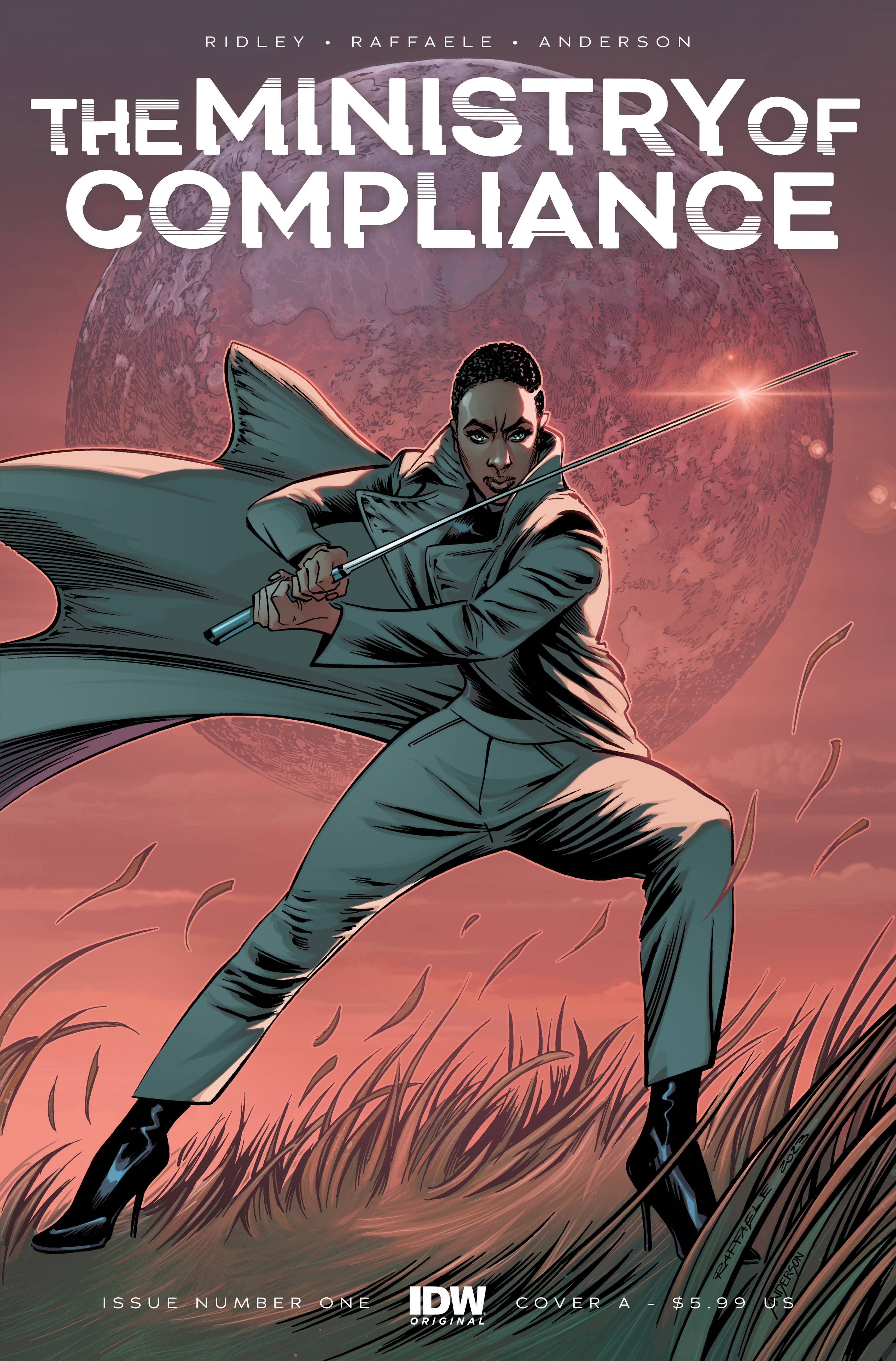
- Ministry of Compliance #1 (IDW Publishing): There’s a disquieting nature to the first three pages of the book that fails to be replicated by the rest of the comic. The languid pace of these first three pages seems to evoke a sense of deliberateness to the pacing of the book. The small details are going to be focused on. Add to that the use of narration acting as a contrast to what’s occurring in the pages, and you have the makings of a rather uncomfortable book detached from the form in unexpected ways.
However, once those three pages end, the sense of deliberateness evaporates and things take a turn for the tedium. The Ministry of Compliance takes on a more traditional comics form that results in a book that feels rather meandering rather than deliberate. Pacing wise, the book drags out scenes without letting the reader take in anything that is happening for even a moment. This is not helped by the art, which comes across as more functional than deliberate. None of the visuals are going to stick with you when reading this. As a result, the book is a chore to read, especially at its ostentatious 56 pages. While one gets the sense of what The Ministry of Compliance is going to be overall, there lacks a sense of forward progression and implication to the book that makes one want to see how we get to that conclusion. Written by John Ridley, with art by Stefano Raffaele, colors by Brad Anderson, and letters by Ariana Maher.
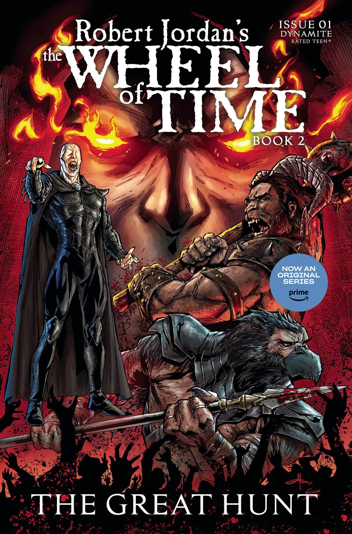
- Robert Jordan’s Wheel of Time Book 2 – The Great Hunt #1 (Dynamite): In my younger days, I was an enormous fan of the Wheel of Time novels by writer Robert Jordan. That interest was sparked again recently with the Amazon big budget live action series, which has been an interesting remix of the books. This first issue of the second novel’s comic book adaptation, by writer Rik Hoskin and artist Marcia Abreu, is not the same kind of ambitious reinvention. It’s not Hoskin’s fault, the script is a compelling and more personal take on the Great Hunt’s prologue, with a more intimate narration than the novel’s third person style permits. It gives a tragic and pathetic look into the minions of the series’ villains. But Abreu’s art doesn’t match the gothic and foreboding tone of Hoskin’s words or Robert Jordan’s original description of this clandestine gathering. What is meant to be a shocking insight into the extent of the evil’s influence on the world looks like a tiny and cramped office meeting. The ornate and meticulously described architecture and design is absent in the minimal backgrounds and Vinicius Andrade’s colors are strangely bright for a shadowy cult. I did like Jeff Eckleberry’s letters, which added some flavor to the magical characters. It’s a shame that the visuals are not up to the task, because without a visionary artist this fantasy realm just doesn’t have any life. Give it a PASS and read the original books. —Tim Rooney
The Prog Report
 Judge Dredd Megazine #462 (Rebellion Publishing): I know, I know…this space is called the Prog Report, and yet, here I am this week featuring another Rebellion publication, the Judge Dredd Megazine #462. The thing is, I made up this weekly feature like a month ago in the first place, so I can change it as I see fit. Anyway! The lead, complete Judge Dredd story in this one is by writer Ian Edginton, artist Mike Collins, colorist Jim Boswell, and letterer Jim Campbell. This story opens strongly, with a page turn and the phrase “ALIENS STOLE MY BRAIN!”, and progresses from there. And that’s just the opener. There’s also a great jumping on point to a new story in this one, with neo-noir Demarco, P.I.: A Picture Paints Part One by writer Laura Bailey, artist Rob Richardson, and letterer Simon Bowland. I enjoyed this opener quite a bit, with its perfect blend of sci-fi and twists on detective tropes. Finally, this one also features the continuing Spector story by John Wagner, Dan Cornwell, Dylan Teague, and Campbell; an excerpt from an interesting new book by Karl Stock; and more. You can nab a copy of this week’s Megazine, as well as the new Prog, here. —Zack Quaintance
Read more entries in the Wednesday Comics reviews series!


