
In this week’s Wednesday Comics column, we get four strong new #1 issues Hidden Springs, Destination Kill, Innards and Showdown. Also, Godzilla stomps on Texas…and much more! Plus, FOC Watch and The Prog Report!
 Hidden Springs #1
 Hidden Springs #1
Writer: Rob Williams
Artist: Nil Vendrell
Colorist: Berta Sastre
Letterer: Simon Bowland
Publisher: Dark Horse Comics
Due Out: May 13, 2026
Review by Zack Quaintance
Talking about generations is just so tiresome. Arguing about which was better, and whose era is responsible for what. Etc. And don’t even get me started on those terrible reels that show the different generations at the office. It’s all bad. But you know what’s not tiresome? Kaiju comics built around generational differences, it turns out.
Or at least, that was one thought I had while reading Hidden Springs #1 from writer Rob Williams, artist Nil Vendrell, colorist Berta Sastre, and letterer Simon Bowland. The book’s principal cast is a group of retirees who live in a home for high-profile and artsy guests. They are, essentially, retired celebrities (the Ozzie Osbourne analog is a highlight, you’ll see when you read this). It starts with them on a hike, separated from their stereotypically Gen Z minders, and off we go.
Vendrell and Sastre’s art and designs are great, giving each of the characters a distinctive look drawn from their characterization. And Williams does a fantastic job making these inflated people individual, charming, and also fun to spend the length of a comic book with. There’s just such a sense of everything here is done right to Hidden Springs, making it a really great example of a fun high concept, wherein the creative team also puts in the hard work of realizing the concept’s potential.
Hidden Springs is my favorite sort of comic. It’s born out of a silly-as-hell idea: what if old celebrities took on kaijus? But the book takes this wonderful comics nonsense seriously. Add to that clever writing and art, and you’ve got a fantastic first issue that gets me entirely on board for the full story.
Simply put, this is a book I would recommend to anyone.
Showdown #1
 Showdown #1
Writer: Dave Wielgosz
Art: Tadd Galusha
Colors: Tríona Farrell
Letters: Clayton Cowles
Publisher: Ignition Press
Review by Clyde Hall
Sometimes a review begins by framing the comic book in question with a fusion concept using films or books as relatable references. Things like, “Sharknado meets The Catcher in the Rye” or “A blender full of The Prisoner, Pluribus, and Monty Python’s Flying Circus set to Liquify”. Promo copy from publishers use the same tact, hoping to snare readers who likes one or all of the mashup elements they list. Creators even ‘what if…?’ their storylines that way at times for intertwining elements of pop culture knowns to make a new, all-different unknown.
Showdown #1 doesn’t need that. It’s a most compelling modern era crime comic that delivers on its own terms and in refreshingly honest style.
This 5-issue limited series begins with truth-in-advertising, a showdown happening now complete with arson and antipathy between Trish Sullivan and Harvey Harlowe. It’s the emotional end result of an incident years earlier in which Trish’s younger brother, Michael, died at a high school party. She holds Harvey responsible and facing off against one another for a showdown in which only one of them survives is the only way she can imagine getting on with her life.
Scripter Dave Wielgosz then turns the clock back 48 hours previous for a look at how Trish’s challenge was delivered and with insights into what Michael’s death has cost both herself and Harvey in the years since that party.
Trish’s been successful despite the loss and despite her feelings that she let Michael down as the older sister with a duty to protect him. The tragedy haunts her, but it didn’t stop her from finishing college, finding a vocation, and falling in love.
Michael’s death and the blame for it has haunted Harvey. His hometown turned on him, a promising college football career ended before it ever began due to injury, and he’s just lost his father when our story commences. Harvey is all alone, greatly disliked, and working at a dive bar because it’s the only job he can get.
And here is where that uncompromising honesty comes in. Through confrontational dialogue and actions of Trish, Harvey, and those around them, we see both sides of the tragedy’s aftermath. It’s a stark, unblinking gaze into different yet equally dark abysses.
Both tried getting busy living. Trish made progress, but the desire for revenge won’t let her enjoy it. Harvey became karma’s hacky sack, guilt and loss tracking him through the wreckage his life’s become. In their own ways, both have now embraced busying themselves with dying.
The character autopsy Wielgosz gives us regarding both characters is unflinching. Trish and Harvey recognize that they are each likely abnormal in divergent ways, perhaps making this collision course inevitable. Trish initiates the exchange between them, where regret and the need for closure is acknowledged. It eventually brings Harvey around, and in it all, forgiveness has no place on the table.
As for the art of Tadd Galusha, it’s a rare illustrator who can do the heavy lifting of emotional turmoil and seething animosity so well that only after the final panel do we notice the dearth of action sequencing. And given what’s delivered visually, do not miss it at all. Galusha’s exactly that sort of talent. He works the facial expressions to great effect, sure. But his imbuing the tense confinement of a passenger train interior with nervous energy, tilting the exterior angles of a drive home, and impactfully applying God’s-eye-view panels in selected places are even more impressive.
Likewise, Tríona Farrell’s color art enriches the narrative. The icy outdoor setting matches the cold determination of Trish and contrasts the eventual mercurial burn of Harvey’s anger. The palette Farrell uses, especially in the pages featuring a snowy churchyard, are a perfect delivery system for the dead of winter vibe via flurries and stone-cold grave markers.
Yet again, Ignition Press has set a high bar and cleared it with the premiere of Showdown. One comparison I saw regarding this limited series likened it to the crime comics work of Ed Brubaker and Sean Phillips. Such comparisons shouldn’t be made lightly. They’re masters. But in this case, it’s apt for Showdown as a modern, hard-boiled revenge tale.
Godzilla Vs. America: Godzilla Vs. Texas #1
 Godzilla Vs. America: Godzilla Vs. Texas #1
Stories/Art: Matt Frank, Devin Kraft, Joe Eisma, John Lucas
Colorists: Matt Frank, Heather Breckel (with flats by Tommy Shelton), and KJ Diaz
Letterer: Steve Wands
Publisher: IDW Publishing
Review by Jordan Jennings
The next stop on Godzilla’s tour of the United States brings him to the great state of Texas. Much like other one-shots in the Godzilla vs America series, this issue is an anthology of 4 short stories set in the Lone Star state. For the sake of clarity, I am going to review each of the short stories on their own.
Deep in the Podcast of Texas by Matt Frank, with colors by Heather Breckel and Tommy Shelton, is a satirical take on the Conspiracy Texan Podcaster ala Alex Jones and Joe Rogan. Frank frames Godzilla’s weeklong march through Texas through the lens of a Godzilla denier who seemingly doesn’t believe what he is shilling as he is constantly fleeing the path of destruction. While this story may be low-hanging fruit, it truly does feel like the sign of the times we are enduring. Constantly having to see/hear people denying the horrors of the world around us to grift a couple bucks is frustrating and there definitely would be Godzilla deniers if Godzilla was real. The art by Frank is pretty great. The talking head bits of the podcast are carried by Frank’s command of emotional expression. You can see the unease on the face of the grifters as they lie through their teeth. The action sequences with Godzilla are equally dynamic and a lot of fun. I’ve written countless times that I find the best Godzilla stories are really human stories and this one is about a lousy human but in the end he gets his competence and that’s all I want to see.
Crude by Devin Kraft is a simple story about some reprehensible Texas oil tycoons talking about how they accumulated their wealth at the expense of the planet. Meanwhile we see that the oil tycoons have essentially been building up the pollution based alien-kaiju Hedorah. Kraft’s use of narration work well for this short story as we hear the internal thoughts of the younger tycoon who is clearly oblivious to the destruction they have wrought on the world. Kraft’s art is the real star here as he beautifully illustrates Hedorah and creates a sense of scale that is breathtaking. The combat between Hedorah and Godzilla is deeply satisfying and just like the prior short, this may be a story about the worst people in the world, they do get their just desserts in the end.
Godzilla vs Tex-Mech by Joe Eisma with colors by Heather Breckel is a more lighthearted story that focuses less on the evils of man. Instead it dares to ask what if legally-distinct Big Tex fought Godzilla. The design of Tex-Mech is brilliant. It is a cowboy themed mech complete with mustache, poncho, and hat. He speaks like he’s from a John Wayne movie and he fights Godzilla. Joe Eisma nails it across the board here. Fantastic design, art, and overall premise. This may have been my favorite story in the collection.
A Texas-based comic would be incomplete without a comic about the Austin music scene and the hipsters who always espouse their era. Luckily, You Missed it! By John Lucas fits the bill. This is a beautifully illustrated comic about how good music can soothe the savage beast but also how gentrification and urbanization can ruin the vibe. Lucas does a lot of showing the passage of time and despite the abundance of narration, doesn’t really belabour itself in telling the reader what is actually happening. It is very much in a “show don’t tell” comic and I appreciate that one a lot. The art in this short may be the best in the collection.
Overall, Godzilla Vs America: Godzilla Vs. Texas #1 is a fun artistic showcase full of fun stories about Godzilla messing with Texas. Each story showcases different aspects of the state without being too cute. I definitely enjoyed this one and highly encourage checking it out.
Innards #1
 Innards #1
Writer: Rob Guillory
Art: Sam Lofti
Colors: Jean-Fancois Beaulieu
Letters: Andrew Thomas
Publisher: Ignition Press
Review by Gianni Palumbo
After his 26-issue masterpiece Farmhand ending back in October 2025, writer Rob Guillory is back, this time reuniting with his Mosely (BOOM! Studios) collaborator Sam Lofti for a new sci-fi dystopian thriller, Innards from Ignition Press.
Taking place decades after a world-shifting nuclear attack, this first issue follows our protagonist Roy Wilder on his first day on the most dangerous job in the world, a “diver” for the ONIS corporation. The job? To mine “Lucifium”, humanity’s last viable energy source, buried miles deep into the Earth’s surface. Meeting the rest of the ragtag team of divers and their veteran boss, Jax Ridley, we quickly learn just how dangerous the job is. If you’re not dying on the job, the cancer will get you. It’s a false promise because although they’re promised a better future for themselves and their loved ones, they are basically used as cannon fodder. There’s a lot to say about the state of corporations, late stage capitalism and how it abuses workers to meet quotas. This and an ending that sets up an interesting mystery makes the reading experience all the more thrilling.
My favorite thing about this first issue is the atmosphere. While underground, it’s pitch black and claustrophobic. The divers really have no idea what’s down there. Anything can pop out from around the corner and I really dug how Sam Lofti and Jean-Fancois Beaulieu portray it in the art. It gave me an extra sense of dread as someone who’s terrified of being in closed off mysterious spaces like this. It reminded me of playing games like Lethal Company or exploring the deep, dark depths of caves in Minecraft, and I got that exact same feeling of excitement of finding diamonds when the divers discover a massive wall of “Lucifium”.
Innards is the perfect comic for anyone looking for that same sense of dread.
Touched By a Demon #4
 Touched By a Demon #4
Cartoonist: Kristen Gudsnuk
Publisher: Dark Horse Comics
Review by Khalid Johnson
The road to hell is paved with good intentions in Touched by a Demon #4 and Bifrons (Frons) and Zuzu have paved their way to a promotion from Lucifer himself. T
his last issue really draws out the efforts Frons is making to be better, to make a change and what trying in spite of failure looks like and means. Frons is presented a choice, where his unintended failures are working in favor of the path that he is working to leave behind, against all odds and conventional understanding, in pursuit of heaven’s grace. The art of writer and artist Kristen Gudsnuk has been charming throughout, feeling like something from Adult Swim.
The page where they make good on fulfilling a bucket list is a real highlight here right after some bigger moments of emotions that feel perfectly paced and perfectly dramatic for the charm and hellish whimsy that never stop shining through these pages. The care and humanity in the midst of the sacrilegious humor as the cast of characters encourage and support each other has been a sticking point since this adventure started.
The environmental details are something that Gudsnuk really builds in to set a scene and create humor and character, always punching up a moment, giving the eye something else to land on and playing really well off of the dynamic characters moving around in them. This is a truly charming premise, brilliantly executed by Gudsnuk leaning into these humorous sensibilities while also bringing a real earnestness to these characters and it sings because of it, and I would definitely recommend it.
Joe Palmer’s Destination Kill #1
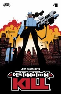 Joe Palmer’s Destination Kill #1
Cartoonist: Joe Palmer
Color Assists: Folasade Olaseni
Publisher: Oni Press
Review by Zack Quaintance
Joe Palmer’s Destination Kill is one of those comics that reeled me in with its name, cover art, and general aesthetic. I’m lightly familiar with Palmer’s work, and I enjoy following him on Instagram. So, that helped too. But this is all to say that I had my mind so made up about this book, that I didn’t even read the preview text before I cracked it — and I’m glad I didn’t.
I found Destination Kill to be an immersive and bonkers trip to a near-future London that was vaguely recognizable, skewed through the lens of Palmer’s idiosyncratic art and a narrative choice to pump every last idea in this comic to the extreme. At its core, Destination Kill is perhaps a comic about systems — about how things are built, how labor is treated, how tension in society is policed, and about how controls all of it.
That all sounds far more intellectualized than the actual experience of reading Destination Kill, though. Make no mistake, there’s definitely hyper-relevant acerbic commentary baked into the very DNA of this book. But it’s also a book that makes room for quips, word play, hilarious bonks on the head.
And that’s what I liked most about this extra-long first issue of Destination Kill. With this book, Palmer has perfectly straddled the line between the serious societal ills that ought to be discussed and the inherent joy of playing them out by drawing funny people having little adventures where things blow up. This balance is to me something comics does better than any other medium, and I’m thrilled to see Palmer’s newest project absolutely nailing it.
FOC Watch
The following titles are currently available for pre-order at your local comic shop!
 A Mischief of Magpies #1
 A Mischief of Magpies #1
Writer: Simon Spurrier
Artist: Matias Bergara
Colorist: KJ Diaz
Letterer: Hassan Otsmane-Elhaou
Publisher: DSTLRY
Due Out: July 15, 2026
Review by Zack Quaintance
This is the first new DSTLRY comic I’ve read since the publisher took a brief pause, and it’s a good re-introduction to their extra-long, over-sized format, because it is, perhaps, the book that makes the best use of that format yet. Indeed, for this book’s opening, A Mischief of Magpies is not really paneled out like a traditional comic. Instead, it’s more of a “found footage” collage, compiling fictional letters, diary entries, school assignments, and childhood drawings from its cast of characters to introduce us to its rich, poetic story and world.
This is how it starts, before segueing into the haunting dreamscape artwork of Matias Bergara, who is colored to perfection here by KJ Diaz. In this way, A Mischief of Magpies #1 quickly creates a fascinating tension between the hyper-realistic and the ethereal, one that serves as an engine to propel the reader forward through its narrative and world. I’m not sure this would work nearly as well (or even at all) in the space of a normal-sized, 22-page comic book issue.
But this bigger format gives it so much space to breath. There are pages with single digit words on them, and they are airy and mysterious and perfect. And they are also necessary, serving as they do as pacing between other pages with full, text-heavy blog entries.
In generally, I’m not a fan of dense prose page in comics. I love reading prose, that’s not the issue, but it always feels a bit like having breakfast for dinner to me, in that I’m not in the mood for it when I sit down. I need my eggs in the morning and graphic sequential stories without giant blocks of text. But this book is an exception for me (just like having chicken and waffles is from time to time after dark).
It’s just so smartly done, and moreover, the way its done feels equal parts experimental and significant to its story. Key to the plot of this comic is that the protagonist is a bit backwards facing (at least in this opening) while also suddenly falling in and out of the world. The way that Si Spurrier scripts the haunting dreamlike art sequences between the real world documentation captures and conveys that perfectly.
Overall, I found A Mischief of Magpies to be an absolutely fascinating first issue of a comic, one that is bravely-told and also in confident possession of so much narrative depth. If you’re game to try something new and grandiose in your comics, circle the date this one comes out (July 15) on your calendar.
The Prog Report
- The Prog Report is taking a break! The issue that is out this week in the UK — 2000AD 2481 — will be the first released in the U.S., come May 20, and so we’re going to put a pin in this section until that day arrives (next week!), thereby synching it up with the new stateside release dates. Cheers!
Column edited by Zack Quaintance.
Read past entries in the weekly Wednesday Comics reviews series or check-out our other reviews here!


