
This week’s main review is Dutch #1. Plus, the Wednesday Comics Team has its usual rundown of the new #1s, finales and other notable issues from non-Big 2 publishers, all of which you can find below … enjoy!
 Dutch #1
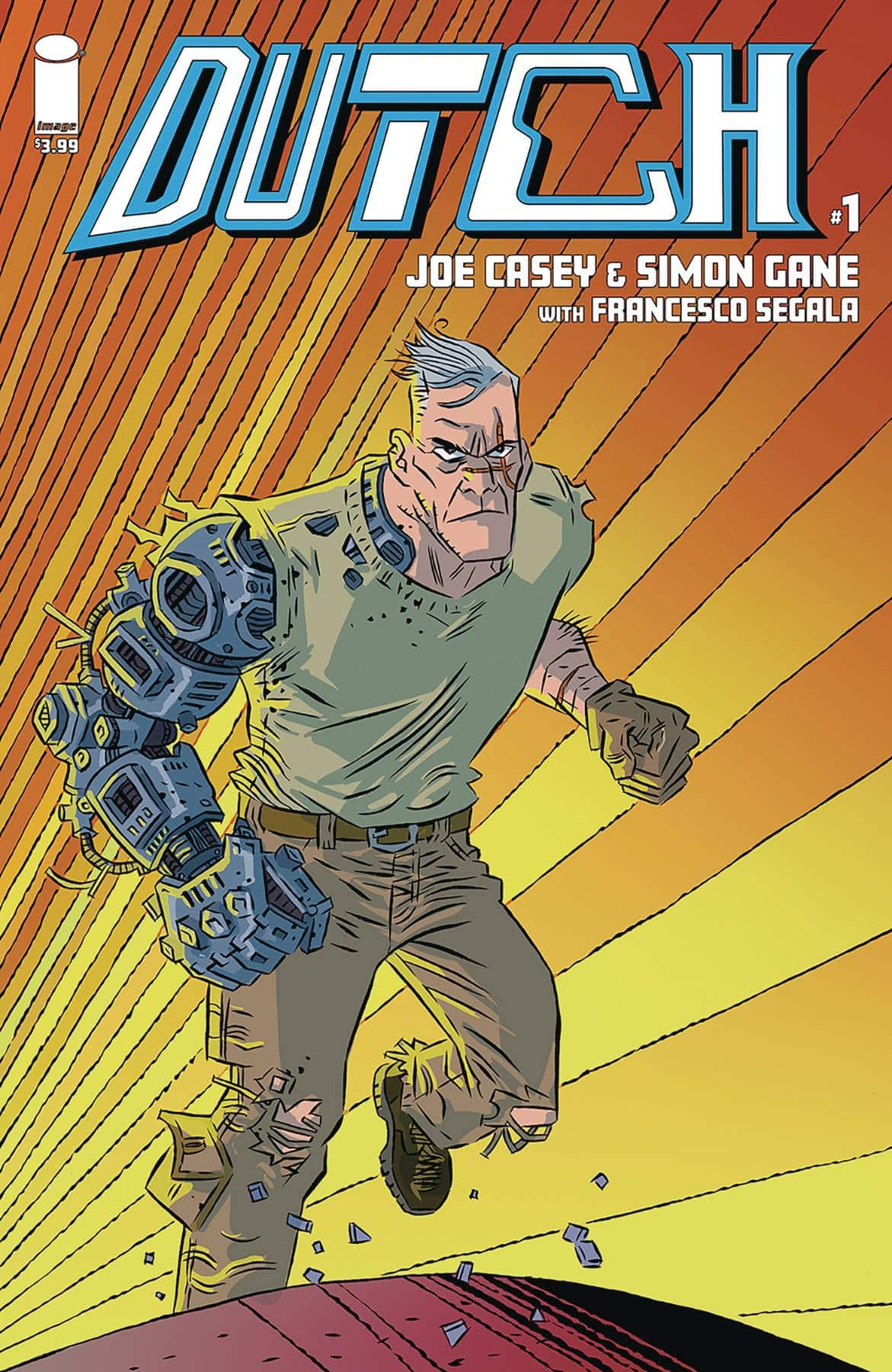
Writer: Joe Casey
Artist: Simon Gane
Colorist: Francesco Segala
Color Assists: Gloria Martinelli
Letterer: Rus Wooton
Publisher: Image Comics
Review by Jordan Jennings
Some background for this comic. Dutch was originally on Team Youngblood. Unlike a lot of the Youngblood characters, Dutch was created and owned by Chad Yaep. Meaning, he is not tied up in nasty rights issues. So, it is interesting to see a Youngblood character back in Image Comics. With that said, I found Dutch #1 to be an interesting comic in that it manages to bring back a ’90s Image character and doesn’t really take the nostalgia bait. Joe Casey, who is no stranger to Youngblood, decides to take Dutch and age the character in real time. Dutch isn’t some 20-something solider turned superhero chasing fame and endorsement deals. He is a grizzled vet who is over it but manages to get pulled back into the world he was so desperate to leave behind.
Casey’s portrayal of Dutch is more along the lines of Old Man Logan. It really fits the character and makes him stand out from prior attempts to revive Extreme Studios characters. Honestly, Dutch #1 reminds me a lot of the recent Local Man series from Tony Fleecs and Tim Seeley. They both play in the similar playground of being retrospective of Image’s past, but not mocking it. They both take the initial Extreme Studios pitch of Superheroes in the real world and look at what that actually means for a character 30 years later. While the narrative is similar to other stories about retired soldiers getting forced back for one more job, it is refreshing in its execution when framed in the context of Image’s long and choppy history.
The contrast between the world of Dutch circa 2024 and 1994 is really driven home by the art style. Simone Gane’s line work and the colors from Francesco Segula — with assists by Gloria Martinelli — craft a tonal shift. It is still dynamic and animated. There are exaggerations in character designs and fluidity in the page compositions, but the style is more grounded compared to the Extreme and Liefeldian inspired art of the 90’s.
Dutch looks and carries himself as someone who has put a lot of miles on their body doing some rather brutal work. It speaks volumes for the character’s age and mindset and matches what Casey is doing with the character in the dialog. Even other characters, such as former Youngblood member Infiniti has been aged up, a rare sight for female characters. Gane’s command of action and body language is solid and creates a strong action comic. The quieter and more talking moments are equally dynamic and well composed. The colors of Segula and Martinelli create a world that is much more muted and really hammers the differences between now and the neon colors of the ’90s.
Dutch #1 is a good comic but admittedly it is not for everyone. The story is compelling and well executed but the full impact of it all may be lost on those that are not as familiar with B-tier Youngblood characters from the ’90s. I am a big fan of those comics, though. I found this comic to be an interesting read and brings something to the table that few other attempts at reviving other Extreme Studios related characters. Definitely worth checking out if you are fan of Local Man or those classic ’90s comics.
Wednesday Comics Reviews
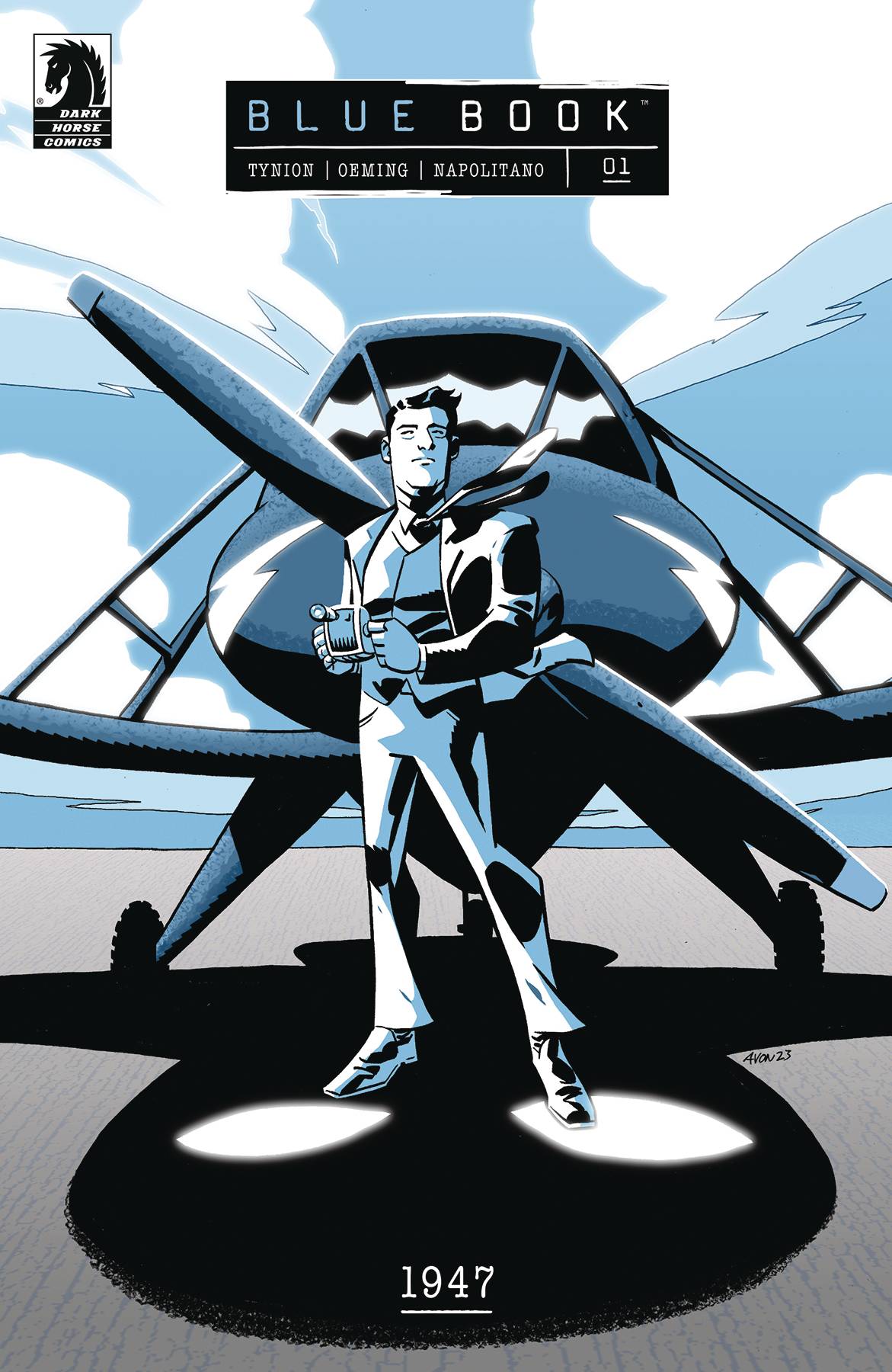
- Blue Book 1947 #1 (Dark Horse Comics): I absolutely loved the first set of Blue Book comics, which were a non-fiction look at one couple’s run-in with a UFO. Now writer James Tynion IV and artist Michael Avon Oeming with letterer Tom Napolitano are back to cover another historic UFO event via comics. And this first issue was great. It maintains the fantastic, monochromatic artwork with removed, dosier-esque captioning from the first series, which worked great then and continues to work well now. Through one issue, it does feel like the scope of the UFO event in this new series is a bit broader than it was in the first series, which is an interesting way to sort of evolve the book. It definitely worked for me. Add to that a great back-up story by Zac Thompson, Gavin Fullerton, and Aditya Bidikar — and it all adds up to a comic I highly recommend. —Zack Quaintance
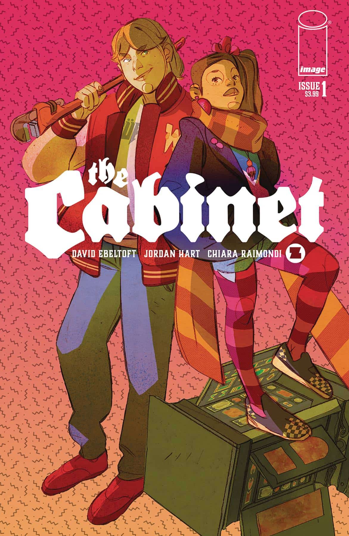
- The Cabinet #1 (Image Comics – Syzygy Publishing): There are a lot of interesting elements being thrown together in The Cabinet #1. There’s a borderline-fluorescent teen adventure aesthetic, courtesy of artist Chiara Raimondi. There’s a start date in the 1980s. A pair of mismatched teens. And, of course, powerful magic. This creates a comic that’s a bit hard to put in a box, at least genre-wise, and that’s an interesting point for this story to start. From there, The Cabinet remains surprising, both in the story it wants to tell and the visual ways it finds to tell it. There’s a 12-panel silent page, a full splash that looks like a sideways tattered post card, and more. It feels like every creative choice here was very carefully considered, and the book is better for it. I definitely enjoyed this first issue, and I think if the concept and singularity sound interesting to you, you will enjoy it as well. —Zack Quaintance
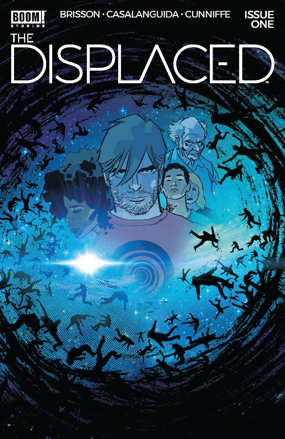
- The Displaced #1 (BOOM! Studios): Like so many “entire population goes missing” mystery dramas, the driving force is usually how they get back to where they came from [Lost] or how the people left behind are feeling [The Leftovers], but in comics, we have limited space, so writer Ed Brisson and illustrator Luca Casalanguida have married the ideas to ramp the tension: the folks left behind have to find the missing people or else! The efficient storytelling doesn’t stop there as the everyday convos between our cast and the displaced immediately cue us into the title’s core themes and the mystery’s larger clues. While the page layouts feature no fancy flourishes, Casalanguida’s eyelines and negative spacing smooth a bumpy ride into a quick pace with no time to dilly dally, but enough life in it to be approachable and humane. As often is the case with sci-fi/supernatural mysteries, cold blues and enigmatic purple hues dominate colorist Dee Cunniffe’s palette, but leave enough warmth in this non-winter Canadian night, so the overall tone isn’t bleak and sullen. I mentioned Casalanguida doing the best to chew up as little real estate as possible, but this could possibly be to let letterer Hassan Otsmane-Elhaou cook as loudly and bombastically as possible. Beyond sfx that tear the page in half without breaking the immersion, Otsmane-Elhaou makes active use of word balloon shape to communicate tone in a silent medium that helps keep dialogue as diegetic as possible. While the story itself is clearly setting up and the characters are more a means to an end than interesting on their own, The Displaced is a book showcasing what comics can be at the peak of its medium. —Beau Q.
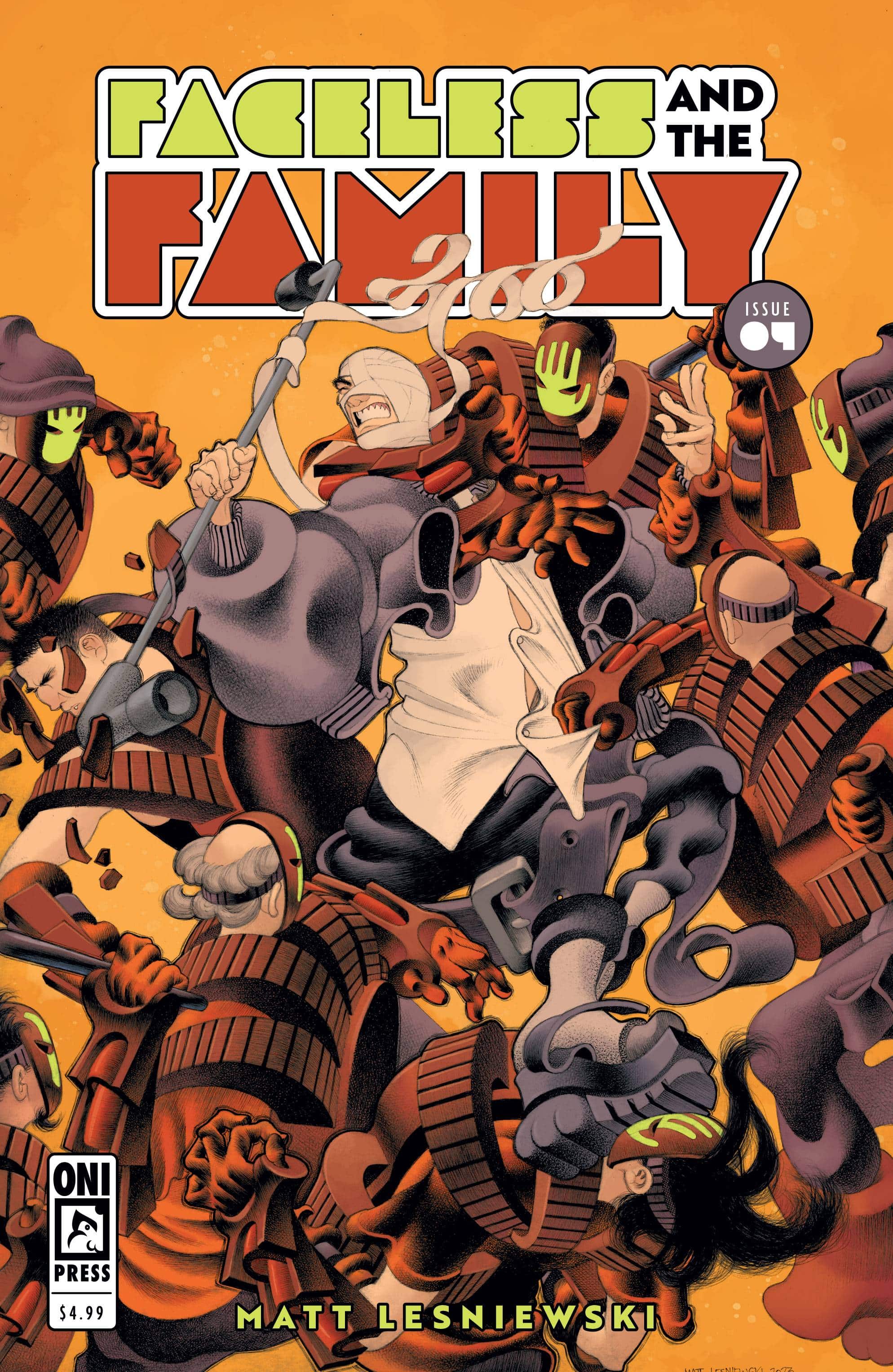
- Faceless and the Family #4 (Oni Press): This story about a found/chosen family comes to a conclusion with the fourth issue (during its original publication, this would have been the fifth issue.) Matt Lesniewski has done it all and by hand which is even more impressive. Across these four issues, Lesniewski’s work has been nothing short of jaw dropping and that continues here as the group make their way back to The Palm. This fourth issue brings action, and a sense of dynamism as Faceless must confront his past alongside his new family. By this issue, everyone has had an arc, either big or small and by the end we have a new status quo and the potential for new adventure. Each page, each panel, a visual feast, with the surrealistic feeling carried across characters and environments. The texture work, the hand lettering and sound effects really call for attention as they bend with the characters and bring texture and perspective with them, elevating the sense of motion and dynamic action. And again, BY HAND. —Khalid Johnson
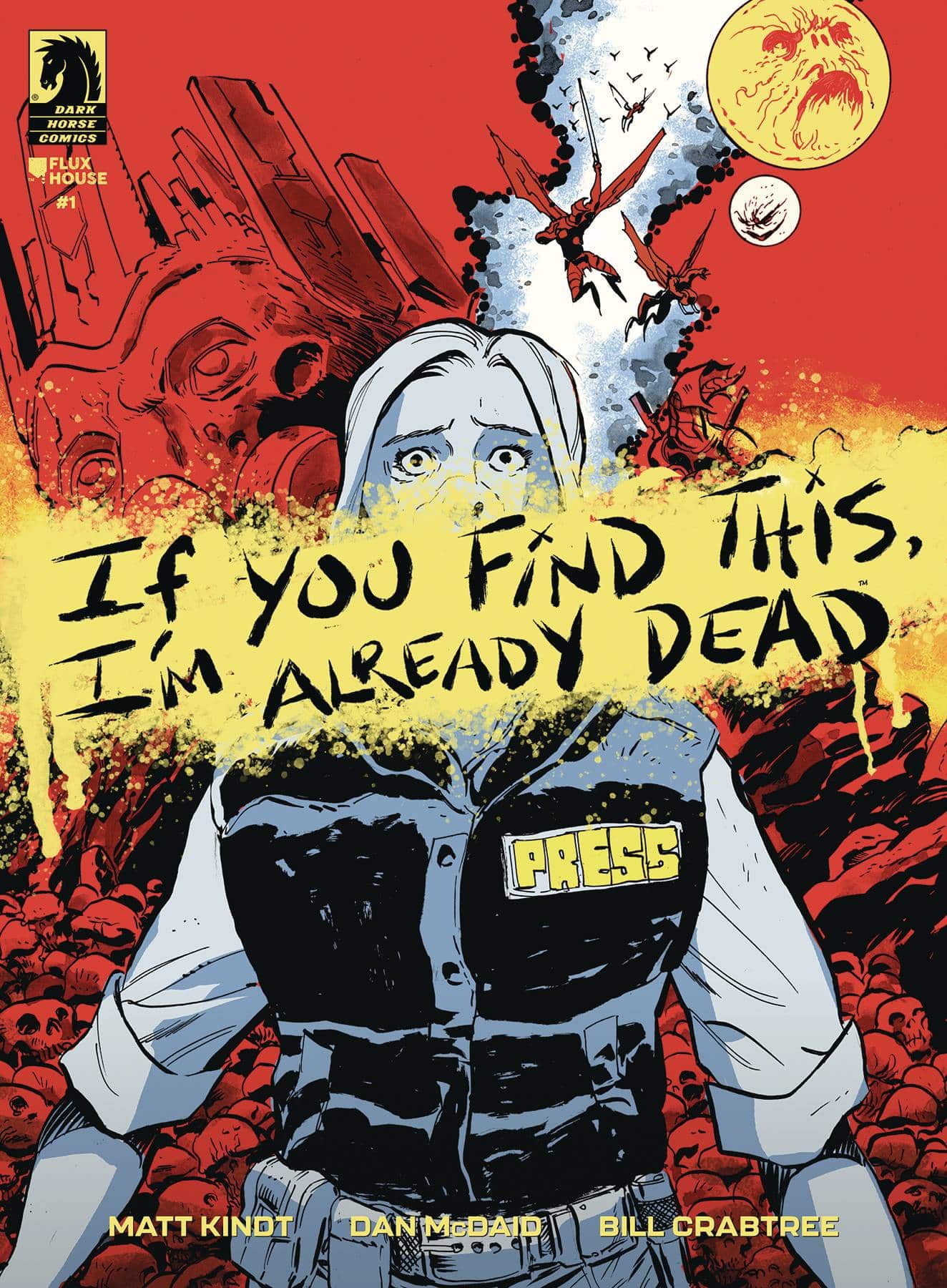
 If You Find This I’m Already Dead #1 (Dark Horse Comics): Writer Matt Kindt takes the reader and our main character, reporter Robin Reid to Terminus, a distant planet accessed through an anomaly in space. Through a military expedition we see things get out of hand and the beginnings of the idea “Exploitation looks the same no matter where you are.” It’s a great entry point for Robin with great art from Dan McDaid. From cold military machinery to the architecture of an alien society, McDaid really creates immersive environments that work with the page layouts to keep a sense of tightness where the characters don’t have room to breathe or feel safe. These spaces are then filled with carnage that McDaid captures so grippingly with the color work of Bill Crabtree where together each distinct environment is also given its own mood through color. Robin is fun to read, given a voice through an internal narration, a journal, by the letters of Jim Campbell along with what feel like hand drawn sound effects and an alien language. This first issue is compelling and hopefully Robin makes it out alive. —Khalid Johnson
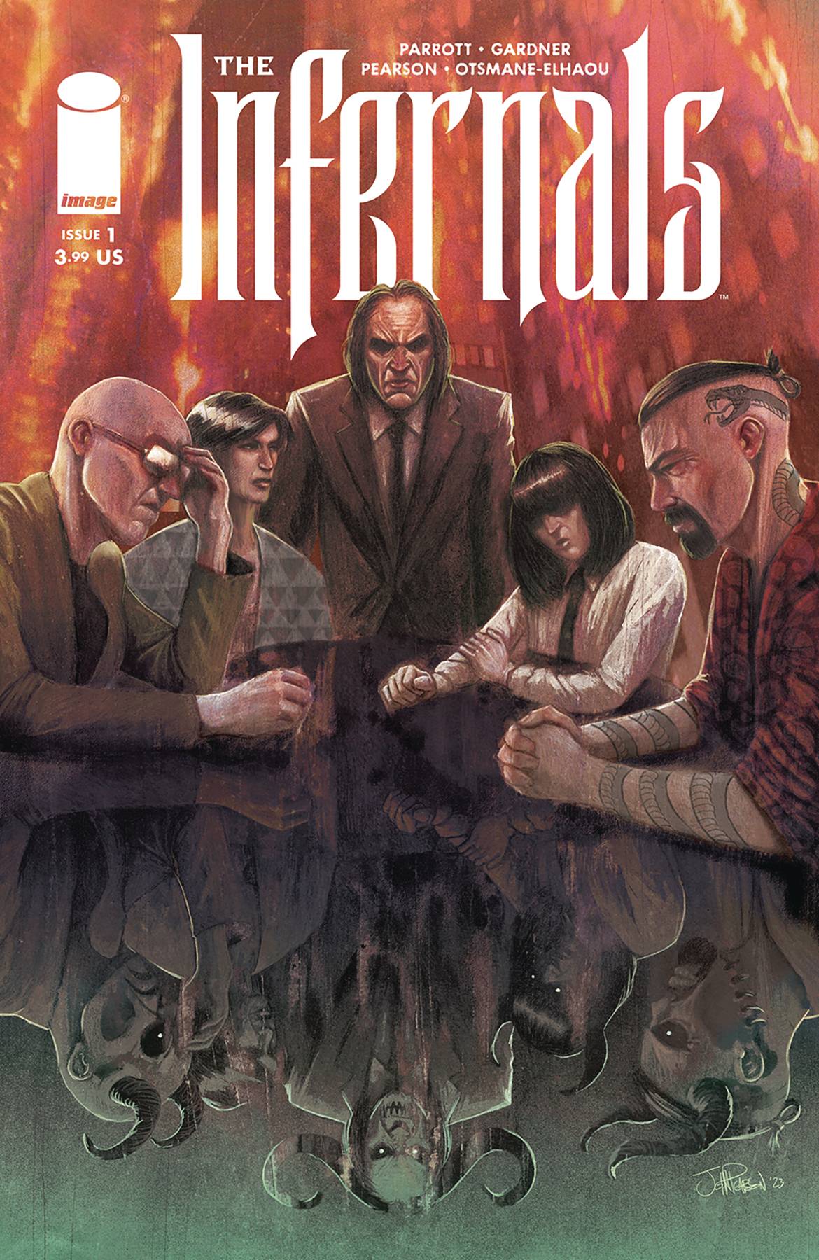
- The Infernals #1 (Image Comics): The apocalypse is the family business and the prospects for who takes over when dad kicks the bucket doesn’t look very promising for the regular folks not blood-related to the Devil. Writing team Noah Gardner and Ryan Parrot exceed in crafting a world teetering on destruction and a hellish family drama capable of rivaling Succession. Art from John J. Pearson and Lola Bonato invoke horror psychedelic vibe with excellent character design as scenes shift and characters interact. Letters by Hassan Otsmane-Elhaou elevate the story that much more as they interact with Pearson and Bonato’s art, blending seamlessly in to give a memorable voice to each speaker on the page. —Bryan Reheil
The Prog Report
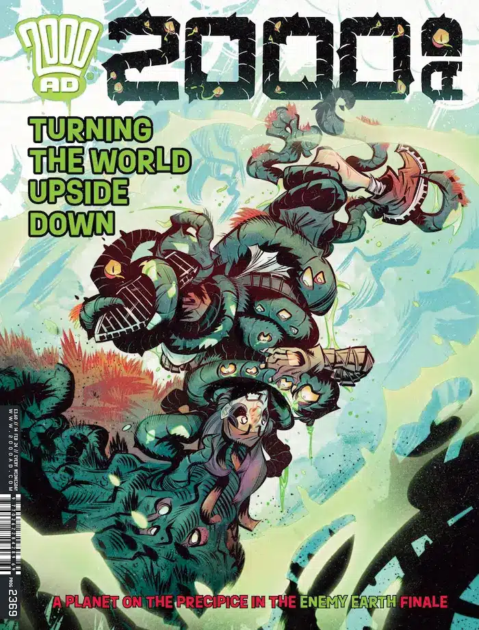
 2000AD Prog 2369 (Rebellion Publishing): A pair of stories wrap up (for now) in this week’s Prog, and while I’m sad to see them go, I’m also happy to report that I found the endings to each quite satisfying. The first was the three-part The English Astronaut by writer Paul Cornell, artist Laura Helsby, colorist Matt Soffe, and letterer Jim Campbell. A madcap romp of a story, this one doesn’t let up with the pace for even a moment, opening its final chapter with reality-bending hijinx wherein a housecat is absolutely bonking the hell out of Big Ben. I found this story to be an excellent pallette cleanser the past three weeks, coming after the rather intense and ambitious Judge Dredd: A Better World story. Meanwhile, Enemy Earth Book Three — by writer Cavan Scott, artist Luke Horsman, and letterer Simon Bowland — also comes to a conclusion this week. I was happy to see this one end with a satisfying character moment, after really coming to feel for the protagonist of this kinetic adventure story. As always, you can nab a digital copy of this week’s Prog here. —Zack Quaintance
Read more entries in the Wednesday Comics reviews series!


Your link to the 2000 AD Progs is out of date, the correct one is:
https://shop.2000ad.com/catalogue/2000-ad/2024
Comments are closed.