

This week’s lead review for Wednesday Comics is a look at Blue Book #1, which is jumping from Substack into print. In addition, the Wednesday Comics Team has its usual rundown of the new #1s, finales and other notable issues from non-Big 2 publishers, all of which you can find below … enjoy!
 Blue Book #1
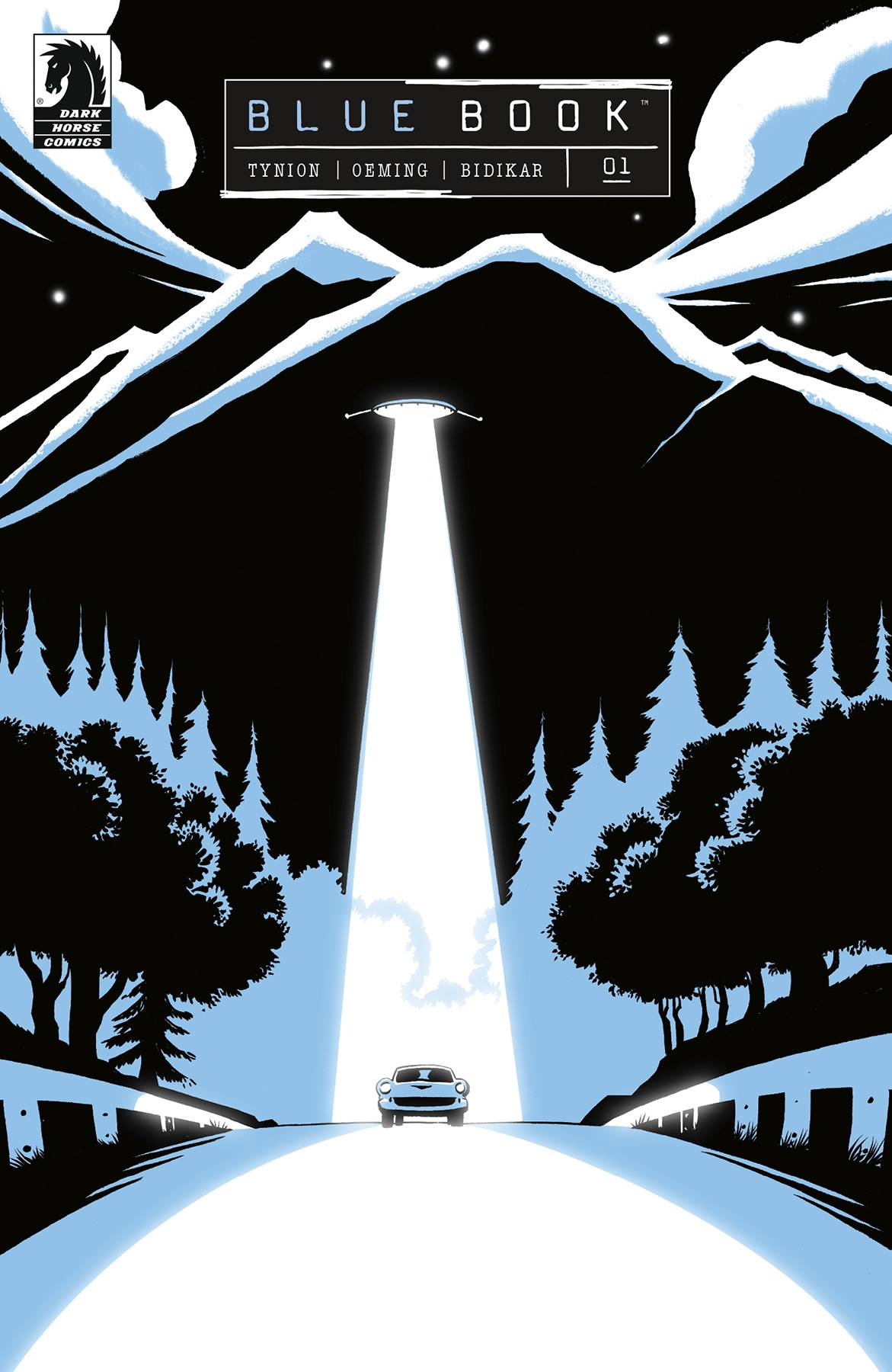
Script: James Tynion IV
Art: Michael Avon Oeming
Letters: Aditya Bidikar
True Weird – “Coney Island”
Script: James Tynion IV
Art: Klaus Janson
Letters: Aditya Bidikar
Publisher: Dark Horse Comics
I’ve been eagerly following along with James Tynion IV’s The Empire of the Tiny Onion newsletter well before it became a Substack juggernaut, and it’s safe to say that Blue Book has been one of his digital-first projects I’ve been the most excited about (and not just because of the recent UFO sightings across the US). Its premise is simple: the goal is to retell ‘true accounts of UFO encounters and adapt them to the comic form, without sensationalizing or altering the course of events.’ That’s a compelling hook in-and-of itself, but adding the art of Michael Avon Oeming and letters of Aditya Bidikar to the team make this an all-star project in the making.
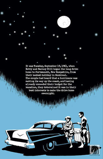
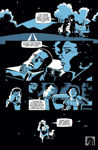
The story of this first issue is fairly straightforward. We follow Betty and Barney Hill on the night of September 19th, 1961, as they drive home to New Hampshire after a brief trip to Montreal. Along the way, they realize they’re being followed by an unidentified flying object, and pull over their car to inspect it further. The issue goes from there, but that’s generally it. It’s nothing groundbreaking, but that’s the point – it sticks to its premise and tells a well known story. And yet, this first issue is compelling enough to make me want to read more.
It doesn’t hurt that this is also a perfect story to be told through comics. While there are plenty of documentaries and podcasts about the Hills, Tynion and Oeming bring a palpable sense of dread and confusion that could only be found on the page. Oeming in particular does a phenomenal job controlling the pace of the story, stretching stressful seconds into moments of unending horror for our protagonists, as they come face to face with the unknown.
Similarly to Tynion’s Department of Truth, a few of the pages contain expository text. Similarly to DOT, that text never feels overwhelming; rather, Tynion is able to deliver necessary information to the reader in a compelling fashion, with a script that feels pulled from a novel as opposed to a dense skim through Wikipedia. This enjoyment also comes from the lettering, and Bidikar complements the text by choosing a clear font reminiscent of a typewritten letter, almost as if we’re reading the brief from a classified document.
Of course, throughout the issue, there may be a little bit of embellishment here and there for the sake of the comic (necessary when retelling a true story without exactly dialogue), but overall this is a gorgeous, honest attempt to tell the story of Betty and Barney Hill in this mode.
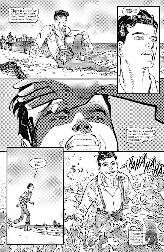
The backup of this issue is a similarly well executed piece, with Tynion and Bidikar joined by Klaus Janson for an exploration of a few oddities of Coney Island at the tail end of the 19th century. Once again, Tynion takes a couple of pages to establish the weirdness of the situation, then lets the characters and weirdness take center stage. Janson, of course, shines here, giving animated depictions of a strange flying man with leathery wings and an electrifying elephant, all while utilizing letratone-esque dots that evoke printing techniques of old. It’s a fantastic little piece.
This, and the previous story, are a sight to behold, and I think it goes without saying that we’re in for a treat with this whole series. I can’t wait to pick up a complete collection of this story, and to hopefully see more stories told in this same fashion from the Empire of the Tiny Onion.
Verdict: BUY
Ice Cream Man #34
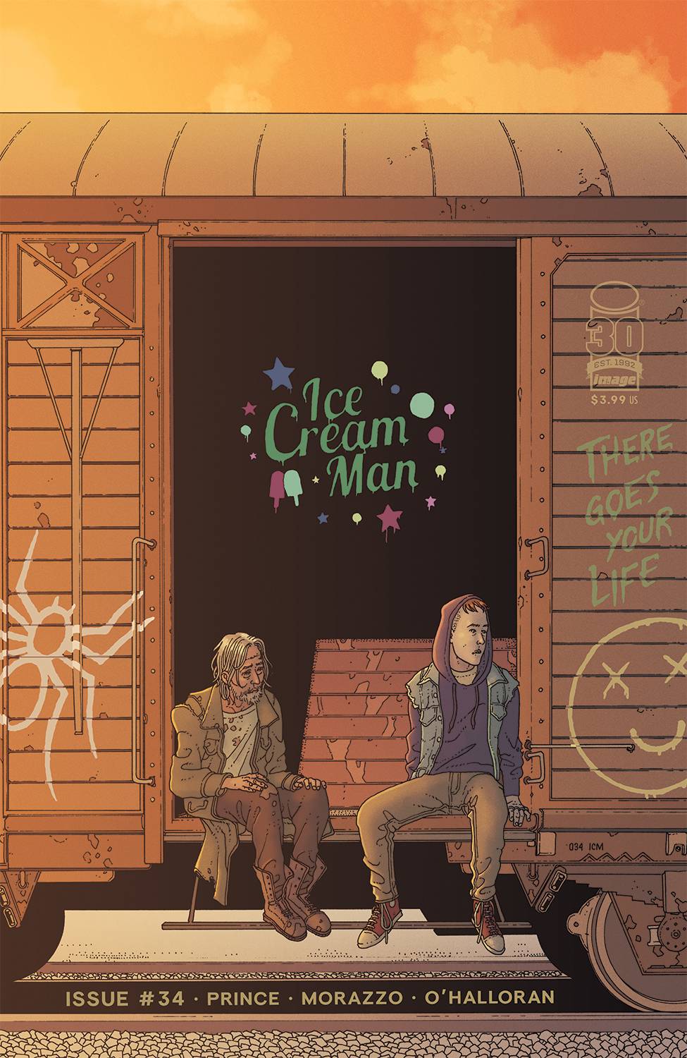
Writer: W. Maxwell Prince
Artist: Martín Morazzo
Colorist: Chris O’Halloran
Letterer: Good Old Leon
Publisher: Image Comics
Wednesday Comics Reviews Quick Hits
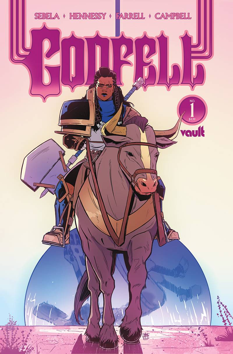
 Godfell #1 (Vault Comics): Play enough ttrpg campaigns, read enough elven/dwarven fantasy, maybe watch your share of sword and sandal epics– you’ll start to see the well worn tropes of high fantasy take shape to be able to parse out the zealots from the daytrippers. Alas, Godfell #1 starts us on a wargrooved day trip. In a first issue drafted by the hands of Christopher Sebela (writer) and Ben Hennessy (artist), we meet a berserker who knows only violence and survival suddenly done with war, set on returning to a home she seems ambivalent to which is 180° in the opposite direction. Zanzi, our human cleaver lacks depth beyond her stoicism, which itself could be compelling if her Odyssey through a god’s body (itself filled with gold rush excavation) felt important rather than accompanying the capitalism-heavy political intrigue Zanzi has run from. Beset by Hennessy’s blase approach to scene framing — choosing wide, flat shots to establish more often than to narratively reinforce — the world of Kerethim falls short of captivating, instead relying on fairly eurocentric designs with a black female lead dropped right in. Enter Triona Farrell (colorist) whose creative touch injects much of the mood the narration asks for…though commits the coloring sin of painting black palms the same as their skin color! For me, the only creative arm sin-free in Godfell is letterer Jim Campbell whose font choice and line splitting deftly follow the brilliant eyepaths Hennessy laid out panel to panel, allowing us to quickly, unobtrusively consume Zanzi’s quest home; that’s a duo to watch out for going forward! Would that Godfell were more than the sum of its parts, but high fantasy falls on deaf ears when it begins an adventure daytripping. –Beau Q.
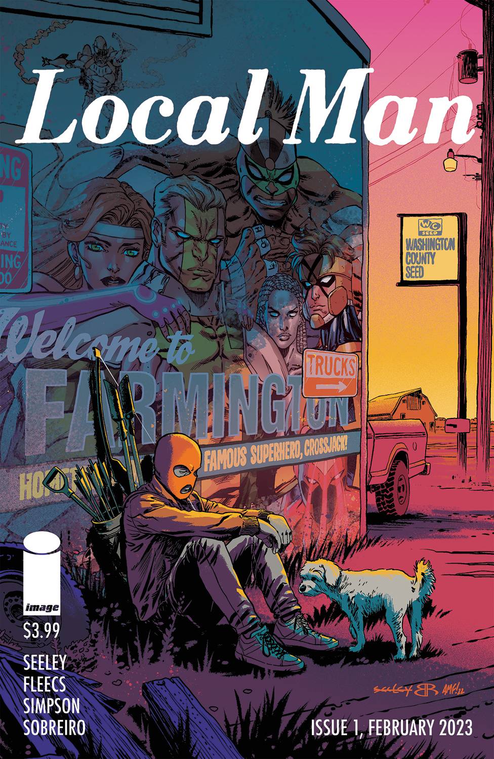
- Local Man #1 (Image Comics): Disgraced superhero CrossJack returns home to his small town of Farmington. After he finds out his family is not too pleased to welcome him back, he sets out to a local bar and is confronted by a super villain from his past. Assuming the villain is back for revenge, he swiftly knocks him down and then is removed from the bar. Throughout Local Man #1, there are flashes of memory. Outside the bar, after being ejected, his old team comes down from their supership and serves Crossjack papers. He violated his termination agreement by holding up a trash can lid as a shield. He sees his superhero crush again. What’s great about Local Man is that there are many layers of personhood and history throughout the first issue. At once there are these magical, splashy, superhero moments — drawn by Tim Seeley and colored by Felipe Sobreiro. But then there is reality, and small town grayness, and someone he dated in highschool before his rise to superhero fame, which are drawn by Tony Fleecs and colored by Brad Simpson. In the corners of the comic, and at the end of sections, there are questions about whether being a superhero is good or not, or if they even know why they do what they do. Lettered by Comicraft, the two halves of Crossjack’s life are distinct — Farmington, the small town human life, has a hand-drawn quality, whereas the “third gen” superhero sections have crisp and sometimes colored gradient bubbles. A really nice lettering touch happens when the third gen superhero team arrives in Farmington to serve Crossjack the papers. Their bubbles are in the Farmington style, because they’re in his small town world. This is subtle, but it goes a long way later when we get s seven page flashback of Crossjack as part of the Third Gen team, fighting supervillains and “faceless hordes.” Local Man excels in its ability to balance the feeling of returning home, a little ashamed of what you were, against a flashy commentary on the lives and actions of superheroes. –Michael Kurt
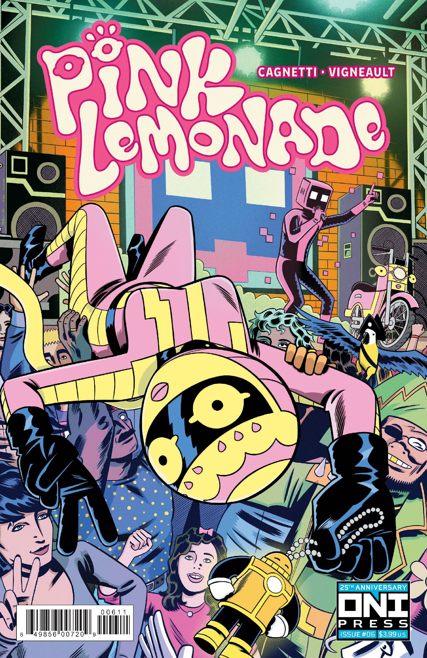
- Pink Lemonade #6 (Oni Press): Nick Cagnetti’s Pink Lemonade at Oni Press comes to an end, and like each Pink Lemonade issue, it ends full of heart and with a positive message for the reader. The plot involves Pink and her crew of misfit fans (including my favorite Ron Radical, a playful and loving jab at ’90s extreme characters) putting on a show to celebrate the release of a Pink Lemonade documentary the friends all made together. But the evil media magnate Zavi Xarad has a PL film of his own, and he will stop at nothing to make sure his premier overshadows theirs. The slimy dude first tried to steal away world famous DJ Bithead (a nice nod to Daft Punk) who had promised to perform at Pink’s premier. What ensues is a clever, fun battle where the friends come together to defeat the robot. Everything about the story is fun and fast, with clever bits of dialog that skew everything from movie starts to NFT culture. But it’s not bogged down by that and still tells a sweet story that makes you smile. And it all ends with a message of embracing things and yourself as best you can, while acknowledging that growth and change also take work. The art of course is fantastic. Full of great, crisp line work, page-popping colors and an almost musical visual narrative pace. It reminds me of Mike Allred’s Madman comics in the best way. And with elements like Ron Radical and a ton of robots, Cagnetti is also pulling influence from ’90s comics and Jack Kirby-style tech designs. He’s a creator who seems to believe comics are a fun medium at heart. I hope Cagnetti has more Pink Lemonade stories to tell, because it’s a character and concept that definitely quenches your thirst for fun comics. A must buy! –Manny Gomez
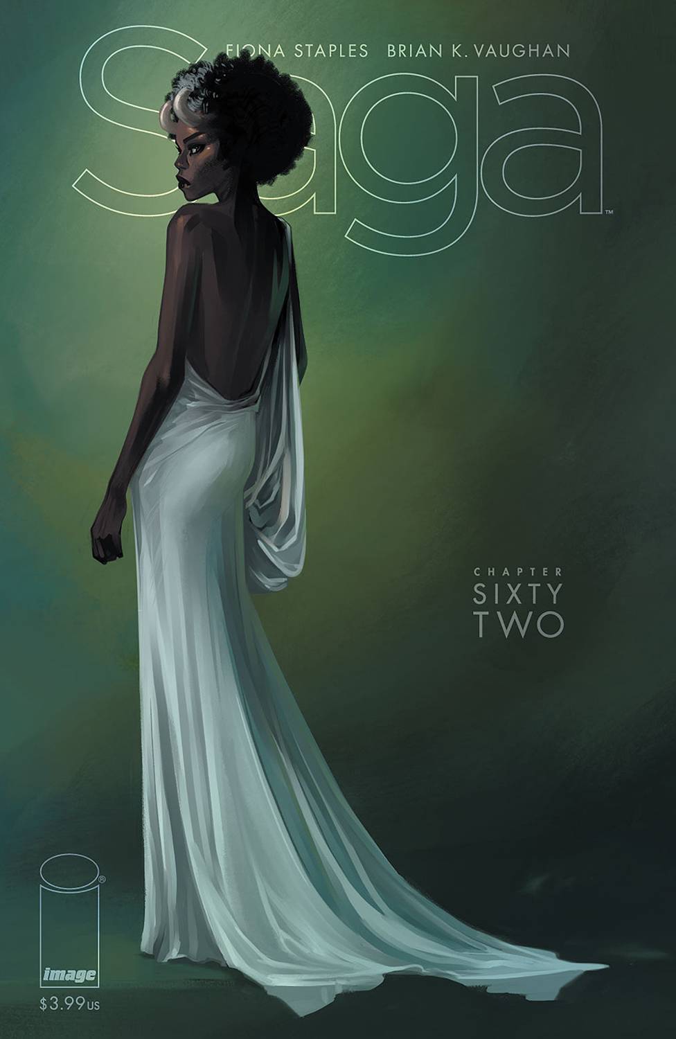
- Saga #62 (Image Comics): Saga’s new arc rolled on this week with an issue that features essentially three different (arguably four) sets of characters that seem likely to be on a collision course with each other. As always, this issue unifies its evolving plot threads with shared themes of cathartic vengeance, taking a clear-eyed look at it that doesn’t want to offer answers, but instead raise interesting questions. I wrote about this last month, but this second arc back from the long Saga hiatus really feels freer to me than the preceding arc, which had a lot of mourning to do/show. If I have a qualm about this current arc, it’s needs more Bombazine. But in Saga — as we see this week — no character goes unseen or unmentioned for too long. Saga as always is written by Brian K. Vaughan, illustrated by Fiona Staples, and lettered by Fonografiks. –Zack Quaintance.
-
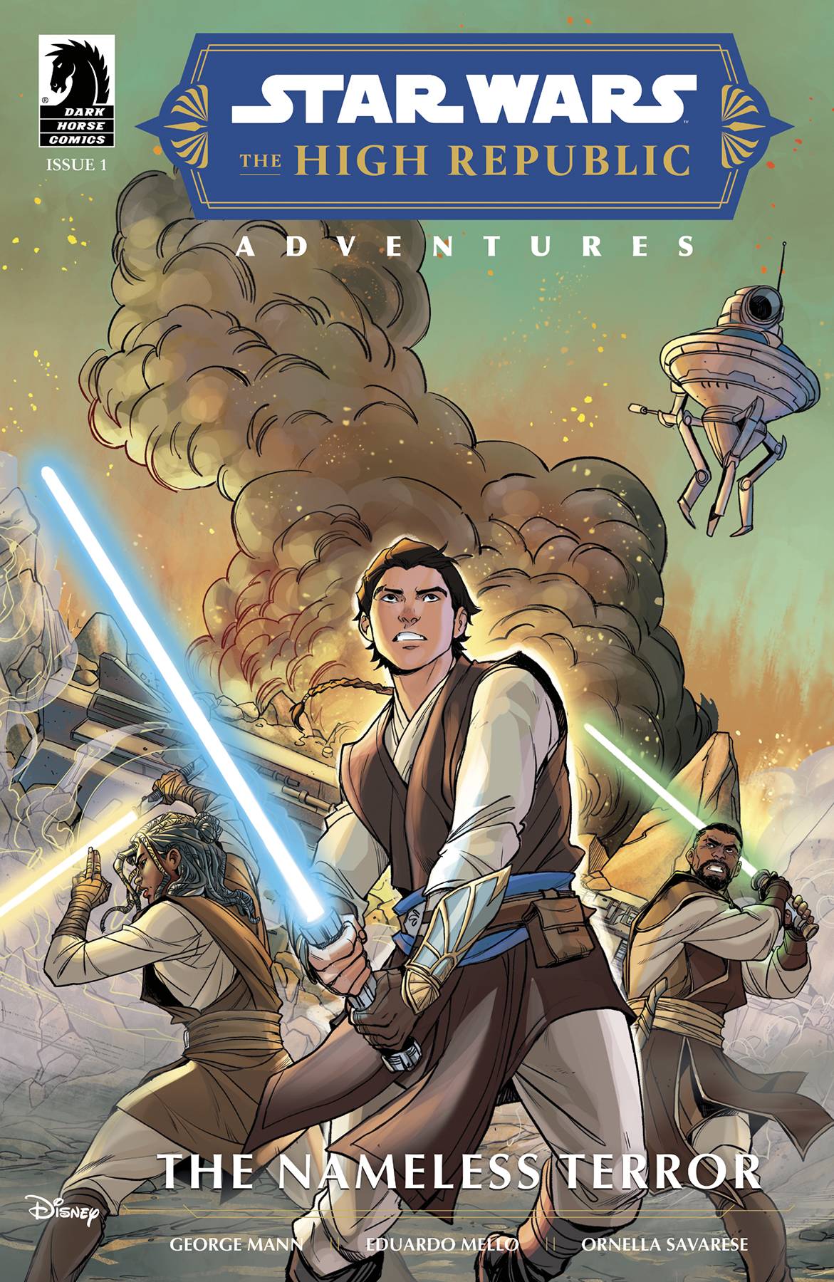
Star Wars The High Republic Adventures: The Nameless Terror #1 (Dark Horse Comics): The mystery of monstrous Nameless used by the Nihil, the Path of Open Hand’s plot, and the danger the Jedi faced 150 years prior to the Great Disaster continues to unravel in Phase II of the High Republic’s latest addition, The Nameless Terror, written by George Mann. A Phase II story told from the perspective of a popular Phase I character, The Nameless Terror gives readers a taste of Star Wars horror not often seen and gives it to them through the perspective those often thought fearless in the Star Wars universe: the Jedi. Art and colors from Eduardo Mello and Ornella Savarese set the mood while letters from Studio Ram provide the atmosphere that something dangerous stalks the stranded Jedi. The Nameless Terror #1reveals more secrets long thought lost to the galaxy that hopefully can help stop the threat of the Nihil and restore peace to the Republic, making it an enjoyable adventure for casual Star Wars fans, but also essential reading if you want to know what happens next! –Bryan Reheil
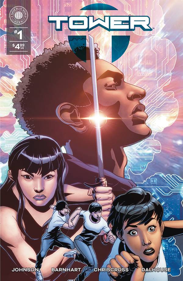
- Tower #1 (A Wave Blue World): Tower is a “portal fantasy” (or isekai) story written by Batwoman’s Carmus Johnson and Kelsey Barnhart, that in its first issue drops the reader into the world along with the protagonist Cassandra, presenting the basic premise “fight to survive or you will die” without too much exposition otherwise. Cassandra and the cast are expressive and dynamic as artist Chriscross draws them in intense action sequences, utilizing dramatic camera angles to heighten the sense of danger, though early there is a bit of male gaze employed in the visuals. Chriscross’ art is complimented by the colors of Andrew Dalhouse and the letters of Deron Bennett. This is the first issue of a five-issue miniseries. –Khalid Johnson
Read more entries in the Wednesday Comics reviews series!
Wednesday Comics is edited by Zack Quaintance.


