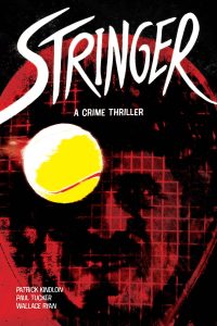
 Stringer
Writer: Patrick Kindlon
Artwork: Paul Tucker
Hand-lettered: Wallace Ryan
Publisher: Image Comics
Racket, string, net, court, serve — these terms hold completely different definitions in crime and tennis, but the stalwart hands of writer Patrick Kindlon and artist Paul Tucker have found the narrative threads to tie the two realms of thought together in their new eurotrip thriller.
Almost.
I say almost, because just like our coked-out penny-ante drug dealing protag, Tim, the world of Stringer looks tightly wound upon first glance, but completely unravels when you take a second longer to look, and is barely held together, figuratively, by its collective parts — albeit, by design and not necessarily for the better (unless coke frenzied 80s thrills that lack real bite are your cuppa).
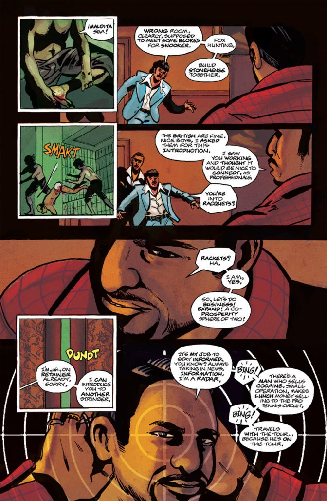
Tim is secretly tasked by a nondescript South American coke lord to traipse through an European tennis tour with a million dollar coke duffle en route to Vegas, but is summarily preyed upon by cartel hitmen, an inconvenienced Greek assassin, French pimps, and his own boss, a tennis star moonlighting as a small-time kingpin. After every leap in logic, every coincidence, every comeuppance, Tim follows his poor responses with a) a coke bender and b) worse decision making. With the curvature of Tim’s downfall seeming swift and one-directional, one could see the Uncut Gems comparisons, and settle in for a thrilling, nerve-wracking conclusion, but Kindlon seems little interested in character development and more interested in verisimilitude to 1983 Euro tennis culture.
Don’t get me wrong, Kindlon’s research pays off at the conceptual level here. Tim rocks a perm/mullet combo, some era-appropriate Ellesse sportswear, the MacGuffin is a Dunlop duffle, etc. That’s dope as hell! Hell, several of the international cast speak in their native language, though at the cost of pacing and/or ostracizing their predominantly English-reading audience from largely impactful narrative turns. So much of Kindlon’s dedication here feels angled at being credible even if they had to sacrifice coherence. Just like its premise, the stream-of-consciousness plot unravels seemingly as it was created, so instead of a fireworks factory ending we’d hope for, it ends with a whimpering lack of focus. All too often new characters are introduced instead of solving any problems, so by book end, you’d expect a mighty downfall for Tim et al, but everything wraps up a little too nicely for Stringer’s morally reprehensible cast; an unmerited bow instead of an unraveled tangled web.
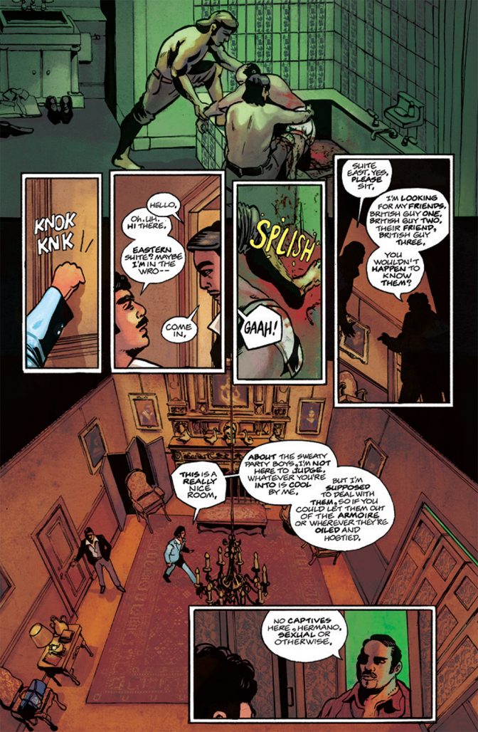
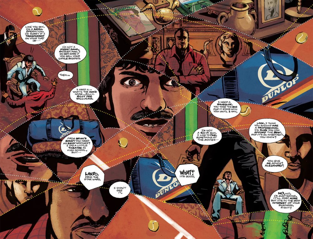
Much like Kindlon and Tim’s flawed decision making skills, Tucker sacrificed narrative comprehension for challenging page layouts heavy with visual metaphor. Don’t get me wrong– fans of Marco Rudy and J.H. Williams III will purchase Stringer for the way Tucker approaches a double page splash, but like them will find the read lacking immersion, and replaced with symbological puzzles. At a cost of compelling action and emotionally impactful scenes, Tucker renders Stringer’s Europe through the semiotics of tennis: clay courts, fault lines, racquet strings, etc. It’s beautiful, but mostly amounts to one of two deeper meanings: a) the plan is coming loose and/or b) they’re at a tennis match.
I want to specifically highlight how Tucker opens chapters with a cocaine-white tennis string curled into a chapter number juxtaposed a 9-panel grid breaking the same shot up into three consecutive moments. Following this chapter start is always a double-page spread that establishes location and a chapter title (though the chapter titles offer little to nothing to the plot/metaphor). This formalist approach sets a nice rhythm later in the book when chapters are shorter and Team Stringer has gotten into their production comfort zones. Tucker doesn’t use this approach elsewhere, which is a damn shame, because it plays with expectancy in a way that effectively communicates the ebb and flow of Tim’s smuggling op albeit for only four pages every chapter. Another theme Tucker seems invested in for Stringer’s success is using his panel borders to confine Tim et al to their rooms/situations, which helps facilitate the stir crazy coke benders Tim resorts to in his time(s) of need.
For someone who’s only experienced cocaine through criminal depictions, Tim’s rapidfire coke-induced paranoia only comes across so thoroughly thanks to Wallace Ryan’s hand-lettering. After 30 pages of working the Stringer style, Ryan clearly irons out the kinks that complicate Part One, like using lowercase to emphasize and crowding the frame with dialogue split into beats. What Ryan falls back on– polygonal balloons, sharp tails, bold emphasis, and interchangeable diamond and hamburger stacking– makes Stringer sing in its few moments of shine. While the sfx lack creative consistency, the effort Ryan puts in to make WOOPK and WUDT and SLAPK and KRAT native is commendable. Only drawback is a consistent drifting just left of center justification for the first word in every balloon that became blaring after I noticed it. Aside from that, and especially in the frenzied caption spirals, Ryan’s hand-lettering future is one to watch.
I really wish I loved all the alleys Stringer volleyed, but for me it was a swing-miss. However, if you’re game for a compositionally experimental, respectfully hand-lettered, thematically successful, but narratively disappointing Uncut Gems set in 1980s tennis culture, the ball is in your court.
–Beau Q.
Read a new entry in the Trade Rating series every Thursday at The Beat.
