Share this:
- Share on Facebook (Opens in new window) Facebook
- Share on X (Opens in new window) X
- Share on Mastodon (Opens in new window) Mastodon
- Share on LinkedIn (Opens in new window) LinkedIn
- Share on Tumblr (Opens in new window) Tumblr
- Share on Reddit (Opens in new window) Reddit
- Print (Opens in new window) Print
- Email a link to a friend (Opens in new window) Email


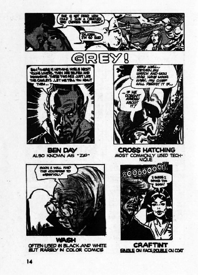
I believe another “trick” is to use a red overlay, which, when photographed in black-and-white, produces a gray tone. MAD Magazine used this technique on their movie and TV satires, when they needed to de-emphasize a background.
This comic was published in 1973. Might Dark Horse reprint it, given their relationship with the Charlton Media Group?
The various sections on using SWIPES is interesting.
@Torsten
When a red overlay or rubylith/amberlith is shot in black and white it becomes black. I think the techniques you are describing in MAD magazine were either ink washes or Zip-a-tone overlays. I got in on the tail end of the use of cameras in art production. Back in those days we used to hand crank the camera and walk up hill both ways to work.
Definitely a red overlay. This was at the Sotheby’s auction in 1995. Don’t know if the catalog shows the overlay, but I remember seeing it on the Addam’s Family movie artwork.
Can the rubylinth art be shot with a filter to produce a gray tone?
Tom Richmond on the techniques MAD artists used to produce their wondrous artwork:
Richmond includes some production artwork in his explanation.
SRS
Man I miss the days when pre-press was done in the printshop. I did it for years. Torsen–the answer is yes… The “red overlay” you mention is ruby lith and it designates an area which (in the dotscreen’s case) would be a printable area shot through a dotscreen filter. The dot filter is a lens filter you put over the camera lens when shooting the film negative/postive–it enables the camera to “read” the red area as a dot pattern. There were all sorts of dotscreen filters (they looked like metal percolator coffee filters sort of)…they were also used to make an emulsion photograph print-friendly for newsprint (converts the greys of a color/B&W photo into a series of dots). We still use handcut ruby lith for screenprinting, to mask for airbrush or create a large color placement for print…it’s all a hell of a lot more fun then pressing “return” on a computer.
I preflight digital files for a prepress shop and the biggest problem next to missing fonts is the designer not knowing the difference between CMYK and RGB. “But it looks correct on my monitor, how come it didn’t print that way?”
100 designers at the bottom of the ocean is a good start. :•)
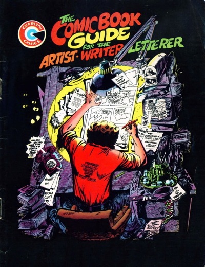
Wow, that brings back memories! I actually had a copy of that little booklet, given to me when I went on a tour of the Charlton office as a child.
I remember well the days of cut-and-paste, sizing-wheels, correction fluid, Zip-A-Tone, press-type, hand-lettering, ruling pens, rubber cement, and typing text columns using manual typewriters. But once I got my first taste of desktop publishing in 1992, I never looked back.
The rubylith method is also how the flat color comics negatives were made. A ruby was cut, by hand, for each of the three percentages of each color. The older newsprint comics used 25%, 50% and 100% of Yellow, Magenta and Cyan.
Each ruby would be shot with the appropriate screen percentage positives then the three films would be combined to make one negative with the three values in it for each of the three “primary” colors.
The nine layers of rubies would produce three films used to burn the printing plates that would produce 64 different colors plus the black plate which held all of the line art.
In the 80’s an extra percentage of 70% was added for each color (20%, 50% and 70%) The black plate also included the addition of 10% and 20% making the total number of rubies climb to fourteen. These were all still cut by hand! The outcome was 372 different colors which looked much better on the bright white paper that was being used by the Indy publishers.
Murphy Anderson’s Visual Concepts produced these films for us at Comico and the rest of the industry at the time and did an incredible job.
Comments are closed.