
Face front, True Believer! This week the House of Ideas unleashes one of the most anticipated titles of the year—War of the Realms #1! Will the event’s debut issue justify the huge focus Marvel has put on the title? Plus, Marvel brings back a classic title with some fresh talent as the Eve L. Ewing-written and Joey Vazquez-illustrated Marvel Team-Up series debuts this week! Finally, Rob Liefeld is back to add another new character to the X-Men universe. Is Major X the next Deadpool? We answer these questions and more in this week’s Marvel Rundown!
 War of the Realms #1
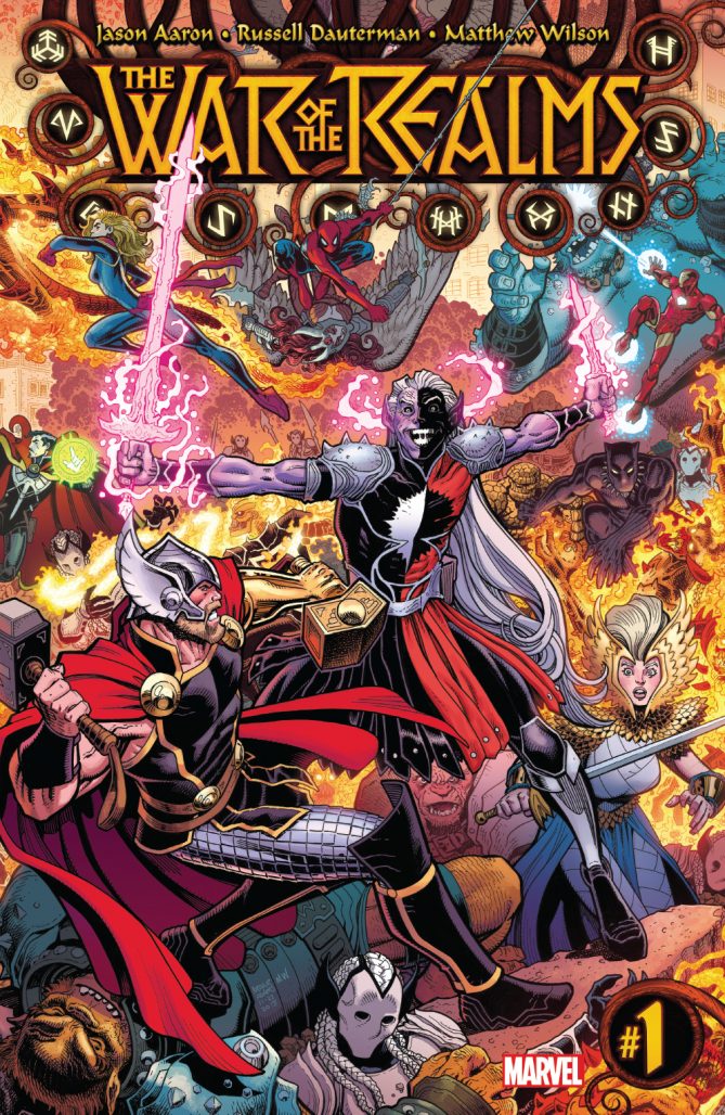 War of the Realms #1
Written by Jason Aaron
Illustrated by Russell Dauterman
Colored by Matthew Wilson
Lettered by VC’s Joe Sabino
Cover by Art Adams
Alexander Jones: AJ, Joe this is it! War of the Realms is finally here as Malekith’s forces have invaded Midgard. Is War of the Realms a worthy successor to Jason Aaron and Russell Dauterman’s beloved Thor run? Does it capture the grandiosity you would expect from a large-scale event mini-series?
Joe Grunenwald: To say that I’ve been skeptical of War of the Realms would be an understatement. I’ve been ready to more or less ignore this event basically since it was announced. Not because of anything against the creators; I’ve just never been super-interested in Thor and his associated mythology, so an entire event based around that didn’t exactly excite me. All of that said, this is a fantastic first issue. It really won me over.
AJ Frost: Alex, Joe, good to be back with you. Grandiosity is the word here, Alex. Everything about this issue was huge. The epic nature of Aaron’s writing really comes through in every facet. The narrative is huge, the art is bold and bombastic, and the great way that all the characters coalesce into this event is really something. And, like Joe, my skepticism was won over quite quickly.
Jones: I think it has been well-documented across this column that I have a deep, profound love for the Thor series from Jason Aaron and Russell Dauterman, but this issue does not carry the effortless charm oozing off of the page from Jane Foster’s time as the Goddess of Thunder. The fake-out deaths and vague plot beats between the villains are aspects that I wanted to see dialed down going into the event. Malekith’s forces feel like a threat worthy of the Avengers but not a large-scale event series that requires the full Marvel Universe. This issue also didn’t have any surprises or changes that feel like they would affect the Marvel U. I admit that I was expecting a lot here and had a bad feeling that I was going to be disappointed by this event. You guys know I’m no stranger to a dissenting opinion!
Grunenwald: Whereas I expected nothing and was pleasantly surprised. I’ll echo what AJ said: the scope of this story feels huge (which I actually did expect) but it wasn’t so unwieldy that I couldn’t follow what was going on. I was worried, since I haven’t been following Aaron’s Thor and I know he’s been building to this story for a long time, that I’d be completely lost reading this issue. Thankfully Aaron did a great job making the issue accessible for newbies, and even if he hadn’t Dauterman and Matt Wilson’s art would’ve been worth the price of admission on their own. This is an absolutely beautiful comic.
Frost: I haven’t been as keen on Aaron’s Thor writing, but everything about this issue was really well-executed. Using overarching mythology heavily steeped in Thor’s world really lent to the enormous scope and ambition that Aaron had in creating the story. The art also kept the visuals compelling by being turned up to its maximum potential. The layouts were quite insane, the lettering was bold, and everything felt fresh even though stories about ‘good and evil’ are quite tame.
Grunenwald: Yeah, this is not what I would call a complex story. Admittedly I don’t know all of the backstory behind the war, and it’s already been going on for a while when the issue opens (which, frankly, I loved), but it seems like a pretty straightforward ‘here are the good guys, here are the bad guys’ scenario. I wonder if that will get more complicated as the event progresses.
Jones: Aaron has been writing this character for years and Malekith has been conniving about this storyline for a long time with players like Dario Agger. I was really hoping that when the plot threads started to coalesce the story would feel epic and important, but I just can’t see that it happened here. Comics like ‘The Death of the Mighty Thor’ and Thor #700 feel like more important entries into the overall run for me. At the end of the day, War of the Realms comes off as a little cold for me. I love Dauterman’s pencils but don’t feel like this issue challenged him or stretched his capability in a significant manner. Matthew Wilson’s colors are also beautiful. I think if I had one main issue with the book, the cliffhanger just feels like a place holder.
Frost: Well, it’s the first part in a large arc. Maybe once the rest of the story is in gear, the cliffhanger will make a lot more sense and will be more satisfactory. I disagree with you on the art a little bit. I liked the use of onomatopoeia, used here almost as panels in and of themselves. This kind of bold departure from standard panel design made the issue feel special in a way that a lot of other Marvel events haven’t felt within the last half a decade or so.
Grunenwald: I also found the cliffhanger a little lackluster, though compared to the preceding thirty pages Thor fighting a bunch of frost giants just wasn’t that exciting. That feels like pretty standard Thor fare at this point. And I agree with you, AJ, on the interesting page layouts and integration of sound effects as panel borders. No two of Dauterman’s pages looked alike, and I really liked how the varied layouts kept the story moving.
Frost: It was quite a visual feast!
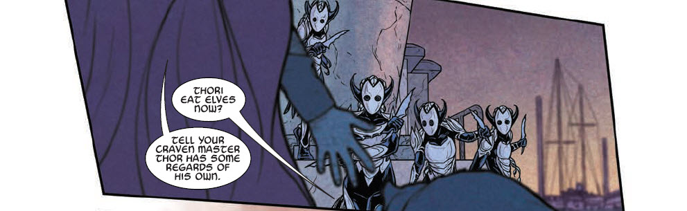
Jones: Joe, I agree. This isn’t the first time in the run where Thor and friends have teamed up to fight Malekith and some of his friends. I also think some of the deaths in this issue feel rushed. AJ, I agree with all of the bits you are mentioning in your praise of the artwork, but Dauterman has been drawing this series since 2015. Lots of these elements are aspects of the title we have seen from past works and comics like Thor #700. Past arcs of the series have carried wild layouts and page designs. That being said, this issue still packs in a few surprises and there are tons of awesome-looking creatures.
Grunenwald: I don’t for a second believe that either of the major characters who died in this issue are actually dead.
Frost: Also, I just have to say, that the Spider-Man model in this book was so on point. It’s been weird seeing all these kind of off-model Spider-Men all around but this one really just felt right and that also made me feel like this book was paying attention to all the details. And no one stays dead in the funny books long, Joe. It’s just a matter of physics.
Grunenwald: Please put Dauterman and Wilson on a Spider-Man book. I’d also accept a one-shot.
Jones: Yes to all of the above. I think what Joe and I are trying to get at though is that readers have to see something epic to believe these characters are dead. If you give us an average fake comic book death it just feels so effortless and almost like lazy writing.
Grunenwald: I mean, fool me once, Loki. (The best thing to come of that was the reaction from the Earth-bound heroes, though. That was pretty great.)
Jones: I’m not happy with this issue because it didn’t really make me feel anything, even though there were huge, epic deaths instrumental to the Thor Universe.
Frost: But if you were to read this book in isolation, would you say it would still pack a punch because of the way the art and epic scope of the piece goes well above regular comics for the most part?
Jones: From an art perspective, definitely. I think the script shows some potential and the next issue could definitely turn it around. I think at worst this is just an average debut. Do you think that is a fair assessment Joe or am I being too harsh?
Grunenwald: I think I have the opposite reaction: I liked this issue so much and thought it was so strong that I’m worried the ensuing issues of the series won’t be able to carry the momentum that Aaron, Dauterman, and co. have generated with the debut. Again, though, I think it’s a matter of how we’re coming into the series. You’re coming at it as someone who has been following this storyline for months already, so it makes sense that you would want more from the story than someone who’s coming in fresh and just getting up to speed like I am.
Jones: I think I have to give it some credit and mention that the issue sounds like it did a good job in bringing new readers up to speed. The artwork is fantastic as well. I think we really need Aaron to break some new ground in the script for next month to get me invested in the series. The stakes for the series are supposed to be high but I feel like this is still just an average day for the Odinson. Joe, AJ, do you care to award your final verdicts?
AJ: This is a BUY from me. Aaron nails the epic quality of the Marvel Universe. It’s a fun and rollicking event.
Grunenwald: I think it’s pretty obvious that I really enjoyed this book. Aaron’s script is accessible and compelling, and the art from Dauterman and Wilson is spectacular. I’m giving War of the Realms #1 a BUY as well.
Jones: War of the Realms #1 is a BORROW for me. This issue has spectacular art but I’m waiting for something of note to get me truly captivated by the script. This is not a bad debut by any means for a big event storyline.
Final Verdict: Joe and AJ say BUY, while Alexander says BORROW!
 Marvel Team-Up #1
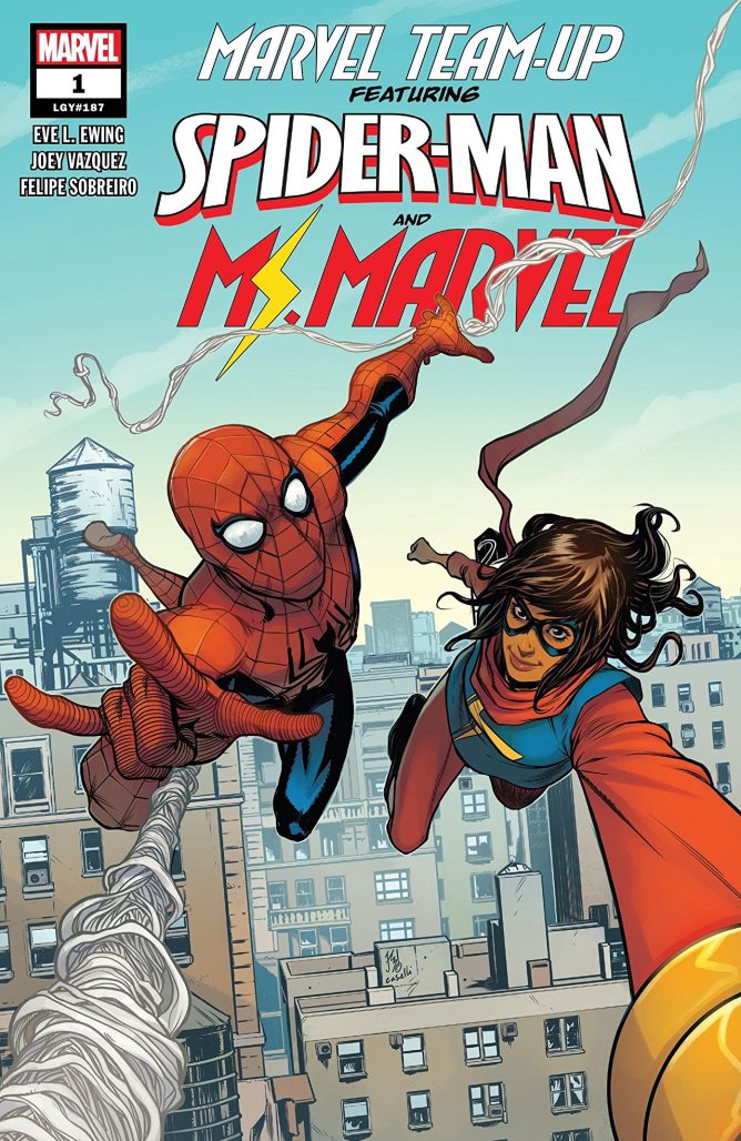 Marvel Team-Up #1
Writer Eve Ewing
Illustrated by Joey Vazquez
Colored by Felipe Sobreiro
Lettered by VC’s Clayton Cowles
Cover by Stefano Caselli & Tríona Farrell
Alexander Jones: Samantha, I’m really excited to see Eve L. Ewing back again at Marvel with a brand new book. This is the first time I have come across creator Joey Vazquez’s pencils and his contributions to Marvel Team-Up #1 did not disappoint. What are your initial impressions of the series debut?
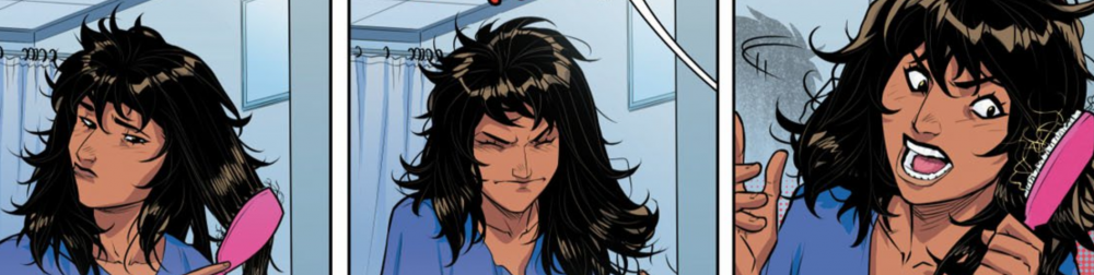
Samantha Puc: This debut issue is amazing! First of all, the formatting is so cool and I love how we get to see the lead-up to the last panel from both Kamala’s and Peter’s perspectives. Eve L. Ewing is a dynamite writer whose work on Ironheart is stellar, so it’s great to see her taking on other characters in the Marvel universe. As for Joey Vazquez’s pencils — dang. So much happens in this first issue and it’s all rendered so beautifully. I also really love Felipe Sobreiro’s coloring, and Clayton Cowles’s letters are always great.
Jones: I was cold on the Ironheart debut so seeing Ewing deliver a stronger script here has me more excited about her as a creator. Vazquez catches an intersection of art between dynamic and cool. His characters are really animated but they still have a level of polish. In certain moments, though, I found the models for faces and figures to lack some detail. The colors from Sobreiro get really out there towards the end of the book but in a good way. I think the true beauty of the comic is in the execution. Also, being the pessimist that I am, I can’t say this issue was a complete knock out of the park. I think it comes off as a little generic and predictable. The first few pages almost turned me away as the tone mirrored a script too closely to G. Willow Wilson for my liking. I still share your enthusiasm for the series, though.
Puc: Those are fair criticisms. I agree that parts of it were too predictable, though I did enjoy seeing Kamala get so flustered when Spider-Man swung in to save the day. I’m a sucker for good puns, too, which action scenes with Ms. Marvel always provide in spades. The foreshadowing of Kamala wanting to be older and Peter wanting to be younger and the subject of rent coming up in both those conversations made me chuckle. A body-swap felt kind of inevitable, but I still enjoyed getting to that point in the story. I’m also looking forward to what happens next… How did you feel about the dueling perspectives and the formatting of the book?
Jones: The dueling perspectives were incredibly well-executed. I really like how Peter Parker’s recent reputation in reference to recent comic continuity makes him come off a little like a sad-sack. The cliffhanger made me scratch my head. I would really like for this series to start exploring more about the medium and take on more of the mirror elements you mentioned, Sam. I hope Ewing will explore the characters from each hero’s cast and take even more chances with the structure of the issue. I also hope Vazquez will continue to develop his skills as a creator.
Puc: Agreed. I think there’s potential for the creative team to really play around and have fun with this series if they continue in the same vein as they did for issue #1. I found it refreshing to read a comic that not only held my attention once, but twice — alternate POVs are a cool trope when they don’t rehash all of the same scenes. I also agree re: Peter’s characterization. Maybe working with Kamala will help him get back on track.
Jones: The villain reveal made me scratch my head. I can’t see what this character can contribute to the series but hopefully, Ewing will make me a believer. Also, I think I would argue Kamala’s side is the weaker of the two narratives and want to see how Peter Parker’s mind could influence her friends.
Puc: Ewing is good at playing the long game, so I definitely have faith. I think I’m ready to give my final verdict. Are you?
Jones: Yes. I think the issue has potential and really like the form. I hope future issues of the series get even crazier with both script and artwork. I’m going to award Marvel Team-Up #1 a STRONG BROWSE.
Puc: Readers may invite some strange looks when they flip this issue upside down, but I think this is a STRONG BROWSE from me as well. It’s a fun, action-packed book but may honestly read better as a TPB.
Final Verdict: Samantha and Alexander agree on a STRONG BROWSE verdict for Marvel Team-Up #1!
 Major X #1
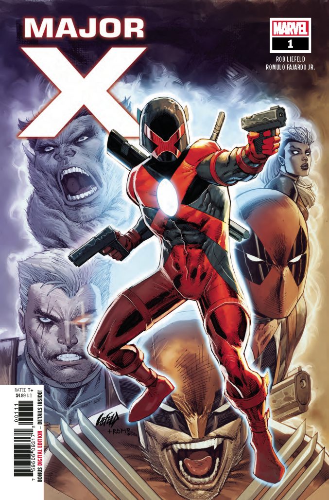 Major X #1
Written and Pencilled by Rob Liefeld
Inked by Rob Liefeld with Adelso Corona and Dan Fraga
Colored by Romulo Fajardo Jr.
Lettered by VC’s Joe Sabino
Cover by Rob Liefeld & Romulo Fajardo Jr.
Reviewed by Joe Grunenwald
There’s no denying the impact Rob Liefeld has had on X-Men history. Characters that he co-created—Cable, Domino, Shatterstar, and a certain mouthy merc, to name a few—have had true staying power, and the writer and artist has a loyal fanbase and an equally loyal group of detractors. Still, he sells books. His latest project for Marvel, Major X, debuts this week with a first issue that is already sold out at the distributor level, with a second printing on the way. Major X #1 is exactly what you would expect from a comic written and drawn by Liefeld, for better or worse.
The plot of Major X is pretty straightforward: the titular Major X has traveled back in time from an alternate future, called “The X-Istence,” in an attempt to stop a catastrophe that leads to the destruction of his world. This is well-worn territory for the X-Men, but Liefeld puts a spin on it by having the Major and his travelling companion, a future version of Beast called M’Koy, overshoot their target and land somewhere in the past of the Marvel timeline—what readers recognize as the early ‘90s, but that’s not specified in the issue thanks to the sliding scale timeline of comics. It’s a clever way to get around having to tie the story into any current continuity, and the past setting, combined with Liefeld’s own style, gives the whole issue a throwback feel that’s likely to please longtime X-fans.
Some of the details of the world Major X comes from, all of which are presented via lengthy expository captions in the middle of the issue, are still pretty fuzzy, and hopefully they’ll be made clearer in future issues; honestly, though, it feels like whatever the details will be are merely a pretense for the meat of this issue, an extended fight sequence between Major X and the original members of X-Force, plus Wolverine, Deadpool, and another new character (that I won’t spoil) thrown in for good measure. Every time the fighting stops, another character shows up with another snappy one-liner and it quickly resumes. There are inconsistencies in the script, things that don’t make sense after you finish reading the issue, but again the script is basically there to facilitate the fight scene. The issue is basically non-stop action and aggressive quips. The pace is brisk, and it has to be, because if you stop to think about the story for even a second it almost immediately falls apart.
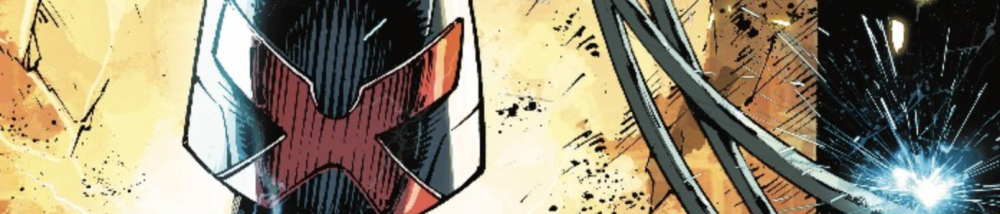
This brings us to the art. Rob Liefeld’s art is basically review-proof at this point. It hasn’t changed since 1991. You know what you’re going to get from a Liefeld-drawn book. It’s almost not even worth writing about. Everyone talks about how Liefeld can’t draw feet, but I could talk about how the way he draws hands holding things don’t look at all like actual hands holding actual things. I could mention the character who inexplicably appears on one of the final pages as if he’s been present since the beginning of the issue. I could talk about the lack of continuity between panels. How the design of Major X’s motorcycle changes from page to page. How the design of Major X’s costume changes from panel to panel on the same page. How the frequently-used reflected images in Major X’s helmet are never actually reflections. It doesn’t matter. That’s just Liefeld being Liefeld at this point. His figures, however rendered, are dynamic, though some of the page layouts are less than inspired if not outright awkward. Liefeld, assisted by inkers Adelso Corona and Dan Fraga, also frequently leaves a lot of blank space in the panels, which colorist Romulo Fajardo Jr. does an admirable job trying to fill. Fajardo Jr.’s colors go a long way towards the throwback feel mentioned earlier, which is a testament to the colorist’s adaptation to Liefeld’s style and the tone of the story.
As a complete package, Major X #1 isn’t a horrible comic. It’s not a particularly good comic, either. The writing is serviceable, and the art just is what it is. Liefeld’s not breaking any new ground here. It’s hard to say at this point whether the new elements he’s introduced will have any staying power, but it’s easy to see at least one or two of them sticking around in one form or another depending on how the rest of this series shakes out. Ultimately, though, if Liefeld’s goal was to create a comic that feels like it could have come out in 1991, then I’d say ‘Mission Accomplished.’
Final Verdict: BROWSE this comic if you’re an X-fan from way back. Otherwise, there are other, better books to consider spending your money on.
Next week the War of the Realms tie-ins begin with a Journey Into Mystery #1!


you guys sound like you’re trying to write what ‘mr comic book professional would say’ rather then having real, authentic opinions.
Comments are closed.