
This week, two Marvel #1’s shipped and they both have one thing in common: amazing cliffhangers that are the product of a long period of careful foreshadowing and preparation. I love it when good plans come together, and boy do they ever in Captain America #1 and Nighthawk #1.
We’re here to tell you more about these books and shower praise on some well-deserving titles on this week’s installment of The Marvel Rundown.
Captain America: Steve Rogers #1
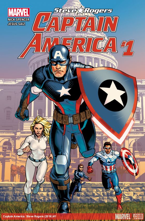
Writer: Nick Spencer Artist: Jesus Saiz Letters: VC’s Joe Caramagna
If Marvel was going to bring back Steve Rogers as Captain America, they needed to include a little something extra to pull lapsed readers towards it I would have loved to see a comic with old man Captain America, Steve Rogers–but if a recent press conference was to be believed, Captain America: Steve Rogers author Nick Spencer was the one who wanted to de-age Rogers in the first place for this upcoming series. Since there are now two Captain America titles, I have been watching this series closely, wondering and imagining just how this was going to set itself apart from the herd of solo Marvel books. However, a last minute twist that is cleverly executed in this comic really nicely shifts things up and keeps the proceedings interesting. This plot thread is seeded deep within the issue from the opening pages and plays off the paranoia and disintegration of the American dream that many Americans are feeling as they move through this this bizarre presidential cycle seems to holding on American citizens.
I’m more than happy that Spencer has a strong stance on contemporary American politics and is able to add tiny and pieces about his beliefs that should make readers care about the people that he is creating. Best of all, Spencer is accompanied by Jesus Saiz, an under-the-radar DC penciller who has been under-appreciated for far too long. Saiz’s art has been an elegant showcase for clean, slick pencil work that makes his work an excellent companion to that of Daniel Acuna’s on Sam Wilson: Captain America. These artists have a fine arts sensibility that sets their work above their competition and complements what is asked of them in their respective Captain America titles.
The bottom line is that this book is wonderfully crafted with some of the best, most heartfelt flashbacks to Steve’s childhood that I have ever read. Spencer has established some really interesting ground to move and shake around Rogers’ character and while I can’t wait to see what happens next, the author must proceed with caution and add plenty of new layers and aspects of this series to really flesh things out. I’m also hoping with crossed legs and fingers that Spencer really commits to this fun and new status quo change. This is a really fun comic that has massive potential to be something special.
Verdict: Captain America wins the fight for my attention, but will he win the war?
Nighthawk #1
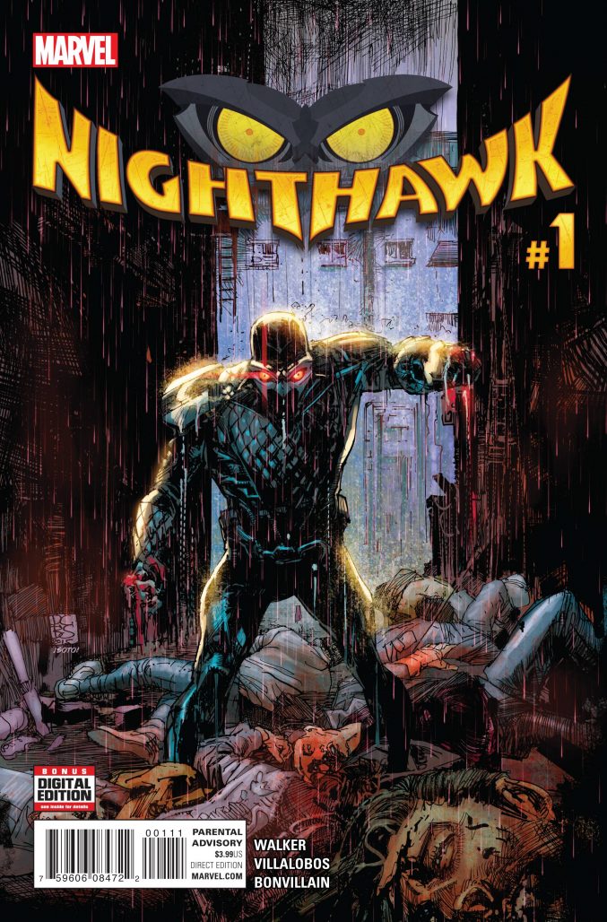
Writer: David Walker Artist: Ramon Villalobos
Colors: Tamra Bonvillain Letters: VC’s Joe Carmagna
So I was pretty sure that Nighthawk #1 was going to be a Batman ripoff, but I ultimately got something more than what I bargained for. For starters, this book simply defies expectations by using Ramon Villalobos’ art to tell a Batman-style narrative. However, in an interesting twist of events Nighthawk #1 actually ups the stakes above what you’d see in your average Batman book, as Nighthawk is forced to reckon with forces that impact his day-to-day life outside the costume. Writer David Walker treads the two stories carefully, but nicely ties the comic back together with a thrilling last page.
Figuring out where Nighthawk differs from Batman is something that Walker plays with quite well throughout the issue-finding the smallest of parallels to add depth to the character. The tone of the issue immediately comes off strongly for a Marvel series–some of the imagery here is disturbing and savage–depicted with carnal, pulsing pencils from Villalobos. In fact, this series looks like an independent series, due to some of the curvy lines on some the different street-level characters and the pink color palette applied to some of the action in the book. Nighthawk in-costume looks more precise, making him stand out from those around him quite nicely.
Everything in the story is a wonderful prelude to a disturbing last page–saying anymore would spoil an entirely fun chapter of this quirky and exciting book. This character has been considered a joke in certain circles of Marvel readers, but perhaps as fans move towards this issue, his frayed reputation will be altered.
Verdict: A strong debut outing for Nighthawk. Browse.


Wow, thanks again for reviewing two corporate-owned franchise factory superhero garbage books that will tank in sales and relaunch in six months.
Thanks for coming onto a “Marvel Rundown” post and complaining that the books are published by Marvel.
Nighthawk #1 didn’t read like a Batman ripoff, but like a Frank Castle ripoff. There is even a Frank Castle reference in the comics itself, and Nighthawk has his own Microchip. The main difference is the corporate part (that is more Batman than Punisher), but it depends how much this part plays out.
Comments are closed.