
Face front true believers, ResurreXion is upon us! After years of stagnation, Marvel has aligned the cards for yet another X-Men and Inhumans reboot. Will the publisher finally be able to find a solid groove for these characters, find out as we tell you if the debut of Royals and X-Men Gold are worth your hard-earned dollars. After all that action, we’re going to zip to the Star Wars Universe to recap the events of Rogue One: A Star Wars Story–this is The Marvel Rundown…I think.
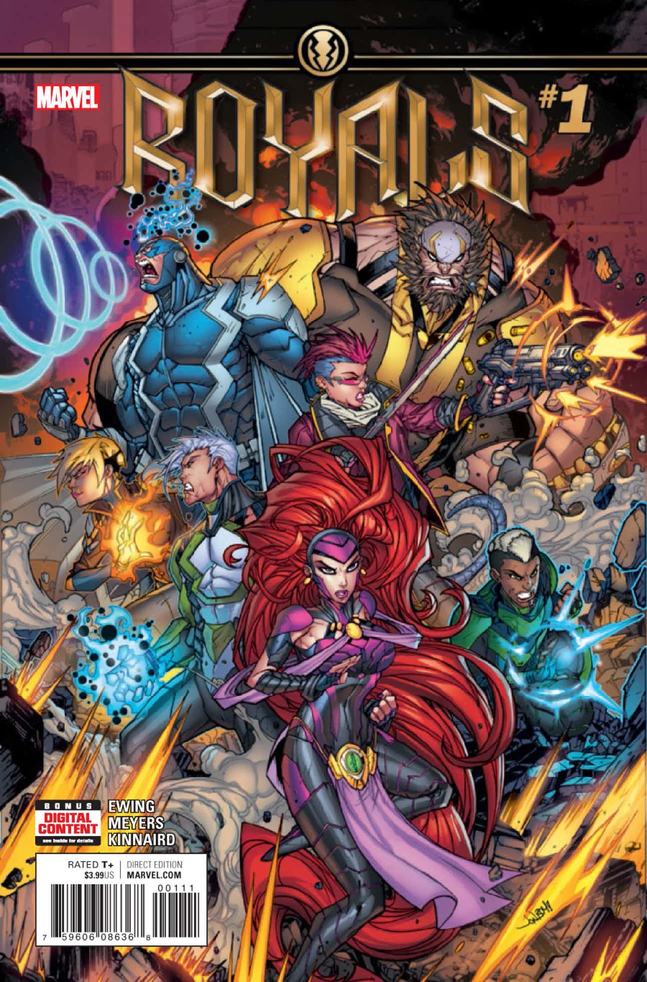
Royals #1
Writer: Al Ewing
Artist: Jonboy Meyers
Inker: Ryan Kinnaird
Letters: VC’s Clayton Cowles
Reviewed by Alexander Jones
This title got off on the wrong foot with me as the redesigned cover has incredibly strange proportions, dialing up some of artist Jonboy Meyers’ worst sensibilities. The interior work within the issue is much more refined, making the cover such an odd choice for this issue in every respect. The beginning of this issue also keeps readers at arm’s length. Unlike lots of other characters in the Marvel Universe, readers don’t understand the foundations of the Inhumans incredibly well and trying to shake the status quo of the series up without giving a solid introduction to each character alienates readers who already seem to be skeptical of this franchise.
This issue shakes up the narrative and instead of easing readers into the new status quo, writer Al Ewing makes the mistake of overwriting, having characters say too much of what they are thinking. Fortunately, when Ewing lays the cards on the table and shows the potential of the series, the narrative goes get more interesting. There are too many Inhumans and not enough hours in the day to invest in each and every one of them. The writer slices and dices the cast of this book and introduces the premise of this series with ease, but this issue fails to get readers to invest in these characters or shake-up the dynamic of the Inhumans enough.
Meyers is great at drawing some of the supernatural and robotic aspects of this series, but some of his proportions for the individual characters are wild and out of place. Gorgon in particular sticks out on each and every panel for the wrong reasons. His enlarged chest and body bring out some of the worst aspects of comics. Moments where the artist show restraint teases Meyers’ potential that he could potentially add to the series.
Royals pulls of a few card tricks to put aspects of this series into the right place, but at the end of the day this take on the franchise is missing the classic feel with too much wasted space and mind numbing exposition. The cliffhanger for this installment might possibly be the worst part about the comic, as there isn’t enough character development to make this wrinkle feel even a little bit important. There’s plenty of time for Royals to grow as a series, but at the moment, the title isn’t the unique shot in the arm that the franchise needs to stay fresh. However, there is some potential in this series slimming down the cast and heading for the stars.
Final Verdict: Browse. Royals isn’t the series to convert new Inhumans fans, but it could invigorate the franchise in future issues.
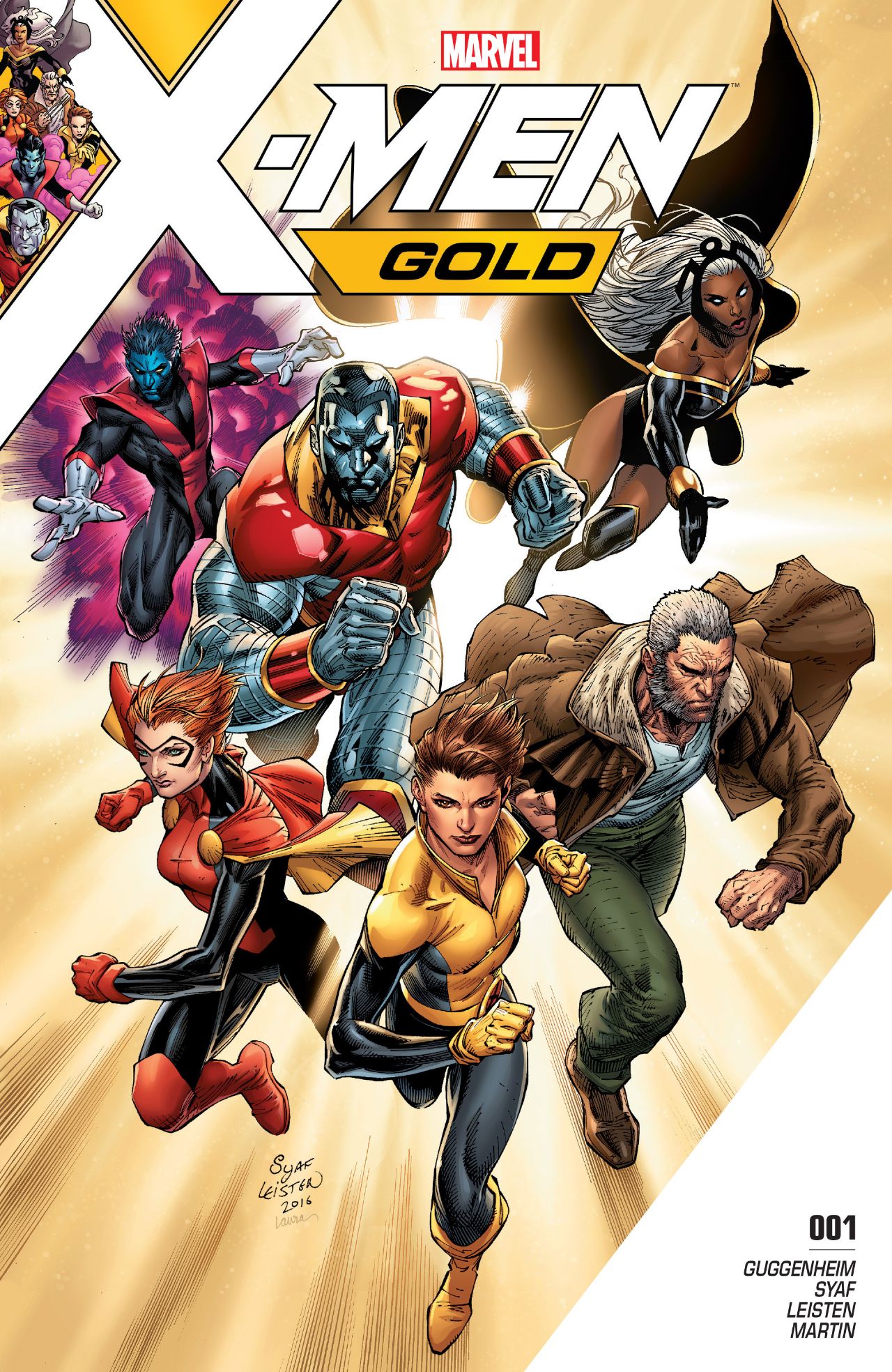 X-Men Gold #1
Writer: Marc Guggenheim
Artist: Ardian Syaf
Inker: Jay Leisten
Colors: Frank Martin
Letters: VC’s Cory Petit
Reviewed by Alexander Jones
Kitty Pryde is the leader of the X-Men now. After reading All-New X-Men and some of the material that has come before, this doesn’t feel like the massive shift it should. In the larger context of the X-Universe, there shouldn’t be a lot of weight narratively devoted to this status quo change because it doesn’t mean enough to this team. The X-Men have been so beaten and broken that like the Inhumans readers need a reason to invest in them again.
This isn’t likely going to be the issue that gets readers to that place as some of the same recycled X-Men tropes from past installments of the series are used again here. Stitching together a scene in a comic where the X-Men play baseball or get dinner is cute, but something that shouldn’t be used as a shorthand for character development. Much like the Inhumans, I think a lot of fans are having a sort of disconnect with this franchise that really needs to spend some time rekindling good will before writers can cash in on some of the those sweeter moments.
The new codename for Rachel, what might possibly be one of the biggest moments in this issue is thrown away in scene that only lasts a page. This scene in particular is impossible not to hold against this comic as that moment could have been a huge character beat in this issue. That’s not to say that this issue is all bad, a scene towards the end of the series touching on how Kitty has changed in the past few years is the most remarkable moment in this title and a way to dive into something new.
Ardian Syaf’s work on this series is technically proficient, but lacking in the bells and whistles deployed by some of his contemporaries. Backgrounds in this issue are very sparse, but the artist can be forgiven by devoting some strong work to a couple of really emotional scenes. Unfortunately, the inking and coloring are a part of what weighs this issue down. The color palette is a little too flat and yellow, giving this issue an understated vibe that it likely isn’t going for. The inking makes the comic look inconsistent, as the linework is more visible in some places than others. The work outside of superhero costumes starts getting particularly strange with faces looking off and bodies seeming to lenky.
More importantly, there are some X-Men tropes in this issue that are really weighing this title down. The scene introducing the series recaps past ideology and wastes precious time in this issue. A standard, uninspired superhero brawl kicking things off doesn’t introduce enough new dynamics to make this X-Men team feel fresh. The final page of the issue offers a cliffhanger that has no dramatic implications for the rest of the series, but only the next obstacle for this team to face.
Comics fans might say they want a back-to-basics approach with the X-Men, but this issue in particular doesn’t take enough risks. There’s not enough development in this issue pushing the franchise forward and showing what’s next for these characters. This team of X-Men so closely resembles the Claremont and Cockrum/Byrne X-Men team that readers might be tempted to dismiss X-Men Gold #1 as a cover band playing the hits. Guggenheim and Syaf need to convince fans that the X-Men are still Uncanny.
Final Verdict: Browse. These may not be the X-Men you are looking for.
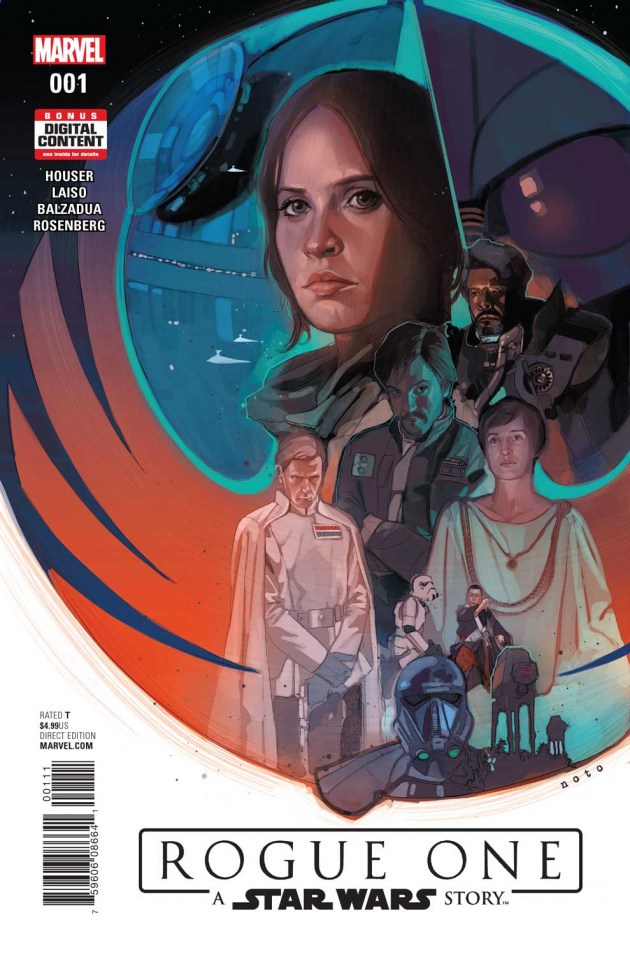
Rogue One: A Star Wars Story #1
Writer: Jody Houser
Artist: Emilio Laiso
Colors: Oscar Bazaldua
Reviewed by A.J. Frost
One of my most vivid childhood comic experiences is reading the graphic novel adaptation of Star Wars Episode One: The Phantom Menace. I obsessed over that comic, reading and re-reading, even though I had watched the film in theaters eight times that summer. There was something about the availability and immediate visual presence of that comic, like I was reading this movie that I absolutely loved (at that time, at least, especially when the availability of a bootleg online copy was nigh impossible for me to download.). It was with these warm memories in mind that read Marvel’s new serialized adaptation of Rogue One: A Star Wars Story, the first spin-off of the storied franchise that was released late last year. Having just come off a fresh rewatch of Rogue One, I was ready to delve into this highly anticipated graphic retelling of what is perhaps the darkest Star Wars film since The Empire Strikes Back, or at least, the bleakest.
My first impression of this first issue was that it did a solid job reinterpreting the film and placing it into the comic format. Writer Jody Houser translates Star Wars’ penchant for declarative expository sentences and gives them a little bit more wiggle room to breathe. The dialogue doesn’t veer off too much from the film, though there are minor tweaks here and there, which is to be expected. Indeed, from the outset, readers should note that this is not a 1:1 recapitulation of the film regurgitated back onto the page. Press materials leading up to today’s first issue have hyped the fact (and director Gareth Edwards’ afterward states) that this series of comics will include scenes not featured in the film.
With that being said, Houser and artists Emilio Laiso and Oscar Bazaldua do an admirable job of integrating these extended or completely repurposed scenes and making them stand distinct from the film. Like most Star Wars adaptations, the art is meant to reflect the contents of the film, so the design work is in-and-of-itself, nothing particularly innovative. That doesn’t make it horrible by any means. The characters are rendered pretty much as they were in the film, so that Felicity Jones’ ink and paper doppelgänger for Jyn Erso and all the other characters looks like they do on the screen with only the slightest hint of exaggerated cartooniness.
Where the art and words really meld best are the scenes that, arguably, deviate from the film and offer a more nuanced and more reflective approach to the film’s dialogue. For me, the passage that epitomized this the most was a scene after Jyn has been rescued by the Rebel Alliance and taken back to their base for questioning. There’s an exchange where Jyn, being pressured to reveal the whereabouts of anti-Imperial radical guerrilla Saw Gerrara, says something to the effect of: “I was a child. Saw Gerrera saved my life. He raised me. But I’ve no idea where he is. I haven’t seen him in years.” In the movie, this line is breathlessly said as if it were a single word. But here, every line is spaced out and given its own space to breathe and create a meaningful impact. I really appreciated this sort of deviation from the source material, though it was a more a byproduct of the different mediums acting in their own realm of conveyance. Nonetheless, it was effective.
The bottom line is, if you enjoyed Rogue One on the silver screen, you will find something to enjoy about this comic. On its own, it’s a dependable translation, and as part of the vast Star Wars comics pantheon, it will hold a prominent place by its nature as an official film in the canon. I think that even casual fans will enjoy it at face value because its still a really great story, though I’m not sure it would be something that would want to wait issue by issue for. But, as a huge fan, I was excited, and am excited for the upcoming issues, especially to see how a certain scene (we all know which one!) is interpreted in all its slashing glory.
VERDICT: If you’re a Star Wars fan, then this is a BUY. If you’re more of a casual follower of the franchise, this is a recommended BROWSE.


“A standard, uninspired superhero brawl kicking things off doesn’t introduce enough new dynamics to make this X-Men team feel fresh.”
One of my problems with a lot of superhero comics these days is that they have scenes like this that basically take the characters that the heroes are fighting and marginalize them. The fact that the heroes are able to dispatch the villains in about 3 or 4 panels does a disservice to those characters.
“This team of X-Men so closely resembles the Claremont and Cockrum/Byrne X-Men team that readers might be tempted to dismiss X-Men Gold #1 as a cover band playing the hits.”
Wow. I was trying to figure out why such a good comic didn’t completely win me over and you nailed with that statement.
Is Royals Marvel’s answer to Transformers – Lost Light ?
Also, nice transition from X-Men Gold to rogue one :)
Comments are closed.