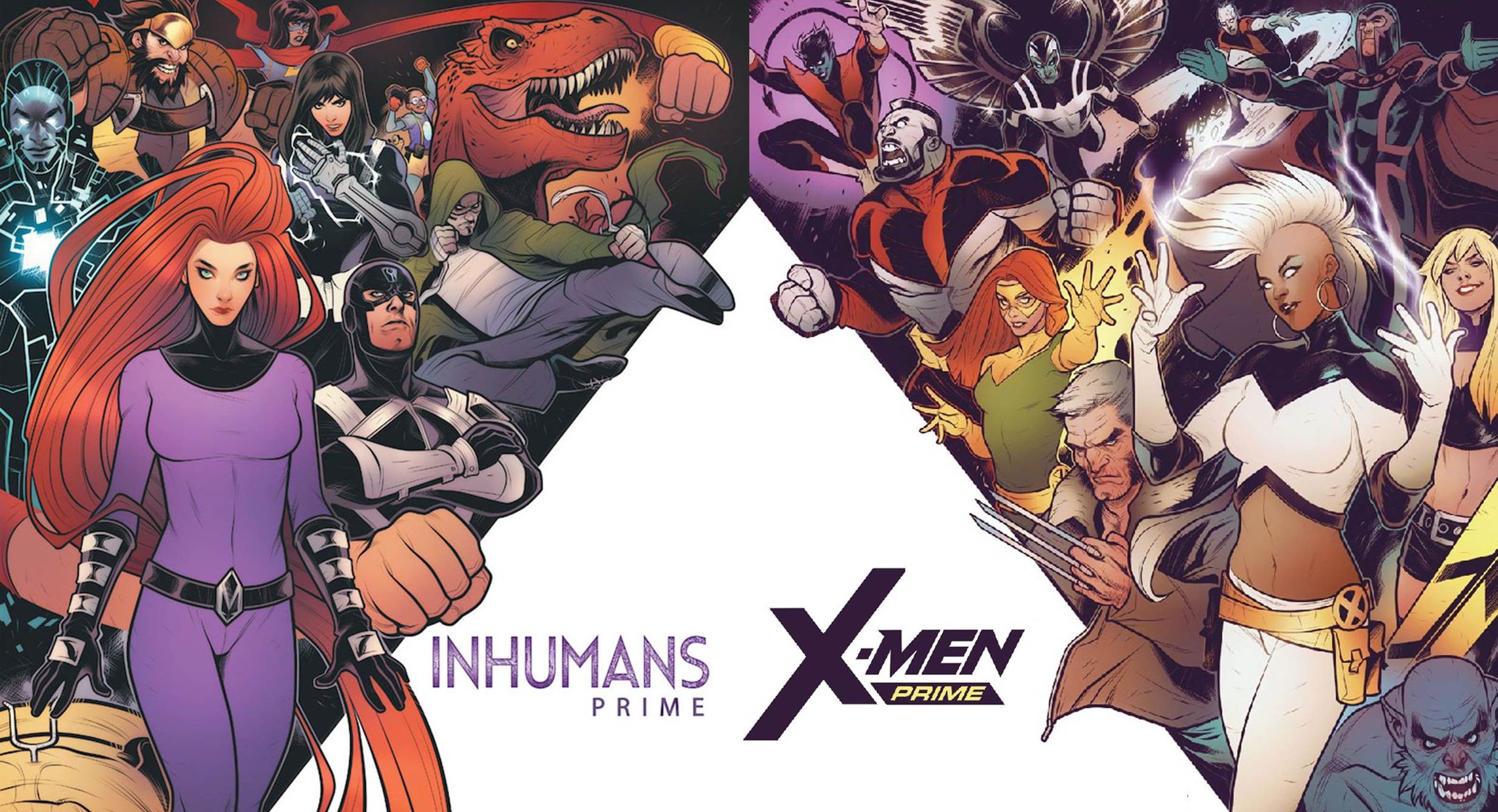
We’re in a brand new era for both the Inhumans and X-Men. This sea change has come even quicker than usual from the publisher. Secret Wars spilled into January 2017 and along with it came a new direction for both series. Almost less than a year and one more event later we’re hitting the ground running with new creative teams and voices for these series. We’re here to tell you if the reboot is going to stick and take a second look at Man-Thing this week on The Marvel Rundown…won’t you join us?
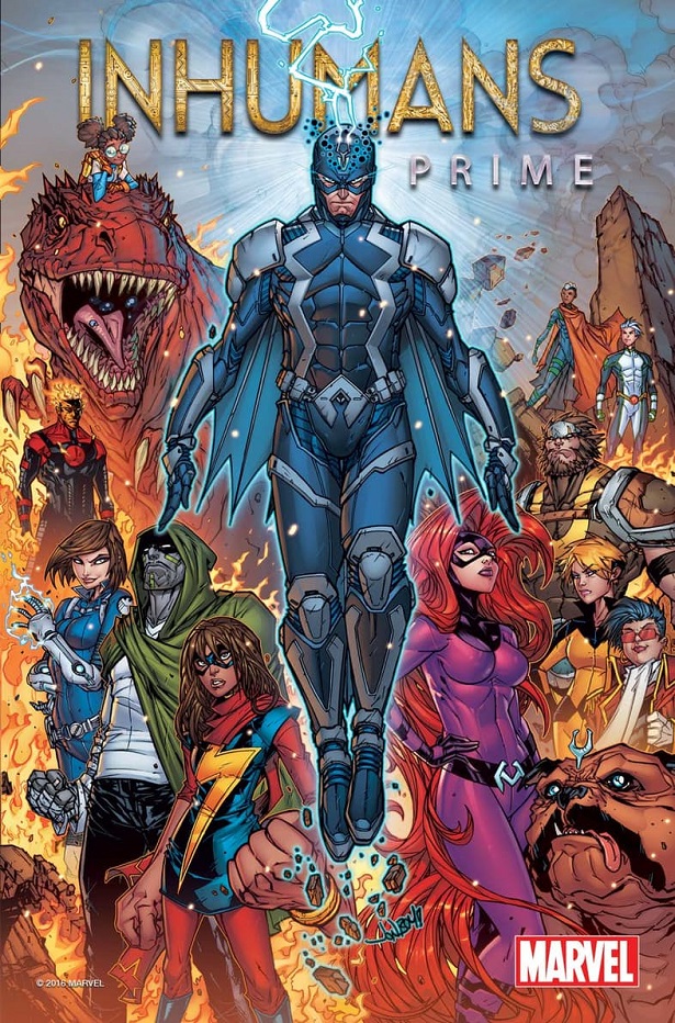
Writer: Al Ewing
Pencilers: Ryan Sook and Chris Allen
Inkers: Ryan Sook, Walden Wong and Keith Champagne
Colors: Paul Mounts
Letters: VC’s Clayton Cowles
Reviewed by Alexander Jones
Marvel has been constantly shuffling the status quo of the Inhumans, desperately trying to find something (or anything) that works for these characters. Inhumans Prime feels like Al Ewing is almost trying to go to back to basics while keeping lots of the past elements of the series. Ewing doesn’t seem to be introducing any new Inhumans into the fold here which is a gesture that I greatly appreciate. There has not been enough development with the huge amount of characters that previous Inhumans writer Charles Soule has introduced in the Marvel Universe. In order to get any of these characters to stick around creators are going to do have to work on them for decades.
In some ways this issue almost feels like a cheat as Ewing isn’t taking the series back-to-basics. The author clearly is trying to establish something with the newer Inhumans characters yet he also see be placing the Royal family center stage. the entire narrative gets really confusing when Ewing shows his cards and reveals to readers that the Royal family doesn’t even recognize themselves as the Royal family any longer. I was really hoping that the writer would be more committed to giving these characters a really clear sense of direction or hint at some kind of brand new foe, but this issue asks more questions than it answers. Who will the Inhumans elect to govern themselves? What will the Royal family do now? What’s going on with Maximus?
Ryan Sook and Chris Allen swap pages back-and-forth and the difference between the duo is noticeable. I’m not sure why the two switch pages so often, but this issue is an odd artistic mess. The pencillers don’t quite go together and are not divided cleanly into separate halves. The multiple inkers on the issue make Allen’s pencils look really different from one page to the next. At a point time where I’m trying to grasp what this comic means for the Inhumans as a whole, this art lacks the visual cohesion for me to try to interpret what this one-shot could mean. Isolated from each other, there’s some solid work with each individual artist with some great layouts and spreads from Ryan Sook who gets a beautiful last page. Chris Allen even gets his chance to shine with a huge double-page spread showing off his raw talent–I just don’t think that these pencillers work together in a way that benefits this particular comic. In fact, I would have preferred this issue to be delayed until one penciller could get the chance to finish an issue.
I was hoping that this Prime issue would really establish what could be next for the franchise as a whole but instead I’m just wondering what kind of content will be inside Royals #1 and what Ewing’s run on the Inhumans will be focused on. What lies ahead for these characters and will fans be invested in the next moves of the first Inhuman family?
Final Verdict: Browse. I have no clue what lies ahead for the Royal family and what this issue means for the Inhumans as a whole.
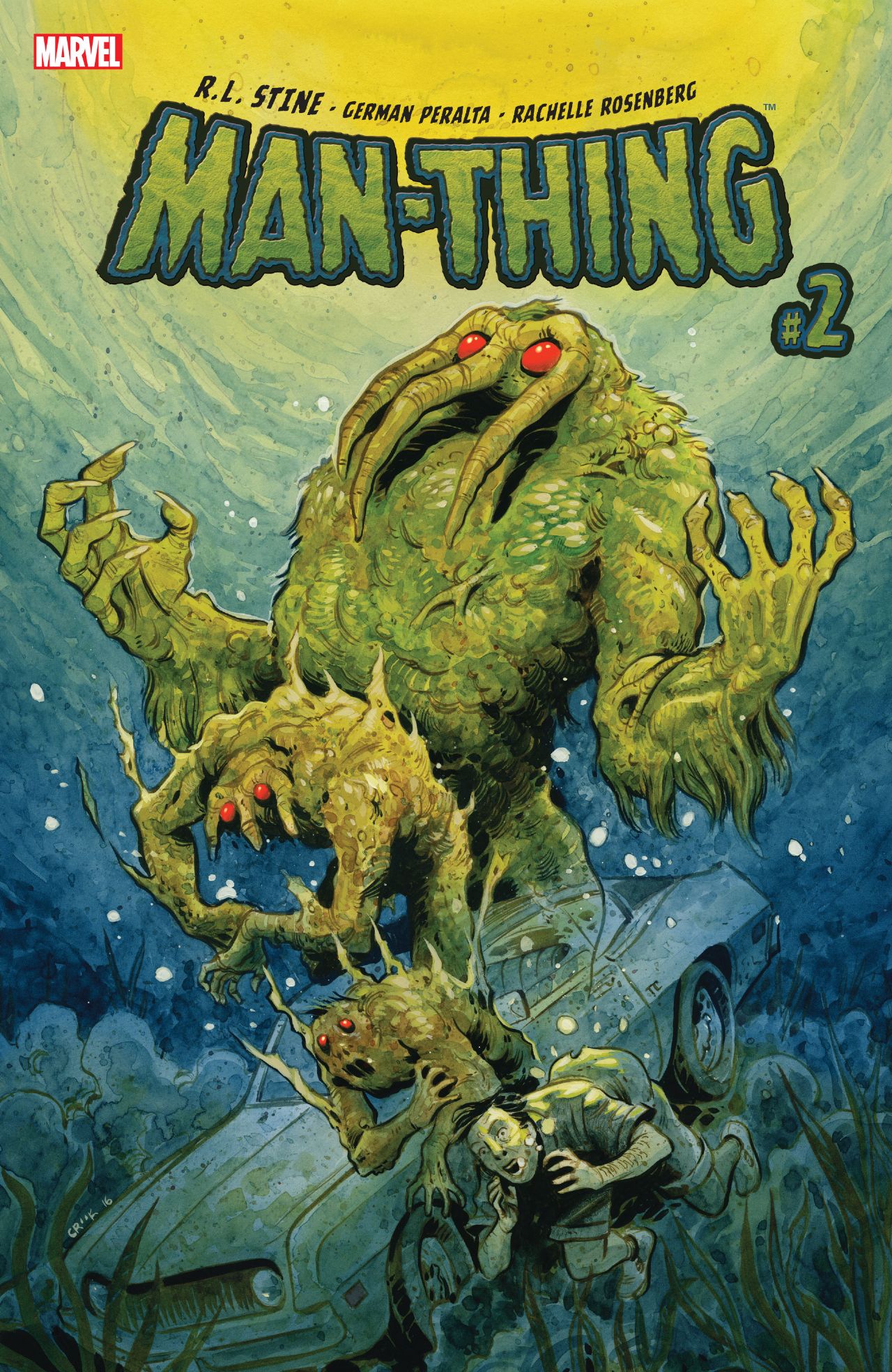
Writer: R.L. Stine
Artist: German Peralta and Christopher Mitten
Colors: Rachelle Rosenberg
Letters: VC’s Travis Lanham
Reviewed by A.J. Frost
I think for many readers, the first exploration of Man-Thing from renowned horror writer R.L. Stine was met with disappointment because it clearly wore it’s kitsch value on its sleeve. The editorial direction was too bought into the notion of Man-Thing B-movie aesthetic, with all the pulp lingo and attitude attached. It made for some amusing copy but was unsatisfying in a narrative sense because it was all empty exposition. Luckily, Man-Thing #2 sets its course back on a trajectory of being fun and aware of its premise, while still having some kinks laying beneath the surface. Yet, for the second go-around in this mini-series, the inclination towards self-referential twee is diminished and the road to a more fulfilling story comes to the fore.
Right away, we’re met with Man-Thing on the streets of Burbank fighting his normative doppelgänger; Man-Thing classique if you will. A hunkering brute versus Stine’s version who can articulate his thoughts as well as he can crack a (lame-ass) joke. But this is quickly remedied as the Man-Thing twins meet and merge into the familiar muskeg golem that we know and love. And pretty soon, the elements begin to take a sinister, surreal turn. Vultures camping out on the marshy trees, darkness at the break of noon, bats squeaking at all hours of the day, and, of course, monster gators, just to name a few of the strange occurrences happening out in the swamps of Florida. “No time to think about the scientific incongruity!” Stine writes.
Indeed…
To round out some of this non-science is a love-story that can’t help feel but a little tacked on, especially in the middle of Man-Thing’s silent, existential wanderings. It’s not bad by any means, but ancillary in scope. While Ted is still recovering from the pain of his transformation into a hideous monster, the means by which we explore his backstory have still only come off as awkwardly composed. I suppose it could get interesting at some point if the emotional investment is warranted, but we haven’t worked to that level yet.
While Stine’s writing is a throwback to an earlier era of disposable prose, German Peralta’s artwork continues to shine. It’s playful, and you can sense the almost child-like wonder her is when it comes to drawing the plethora of swamp beasts or the subtle facial tics of Man-Thing. It’s a highlight of the issue.
Also, a highlight is the back-up story, also written by Stine but with Christopher Mitten taking over the art duties. This supplemental yarn, titled “Drive The Horror Highway” fits more neatly within Stine’s familiar milieu of terror with a twist. It’s a harrowing tale to be sure, and one that ends in a manner that was quite different from where I thought it was going. What a dastardly surprise! It’s a delightful cap to an improving, but still not quite perfect but-almost-just, issue of Man-Thing.
Final Verdict: Browse
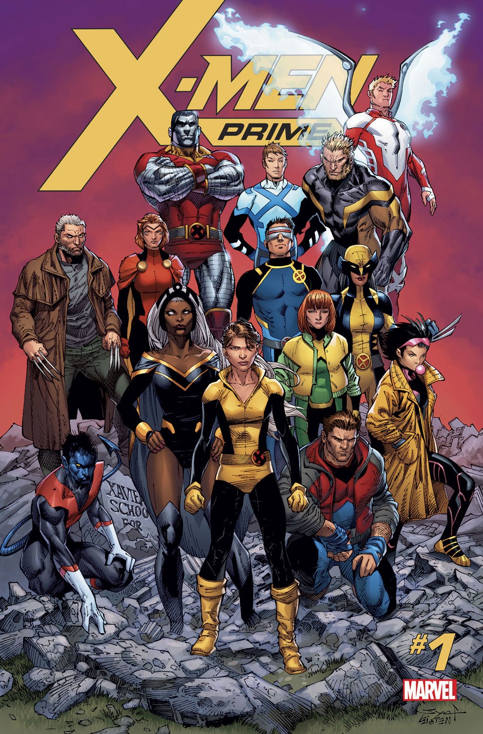
Writer: Marc Guggenheim, Greg Pak and Cullen Bunn
Artists: Ken Lashley, Ibraim Roberson and Leonard Kirk with Guillermo Ortego
Colors: Morry Hollowell, Frank D’Armata and Michael Garland
Letters: VC’s Joe Caramagna
Reviewed by Alexander Jones
“We’ve got too much work to do.”
That’s the last line in this issue centered around the X-Men, a group of characters that have been trying to find a clear sense of direction for years now. The full X-Men team has their work cut out for them as this issue which doesn’t quite offer up a central conflict pulling each member together. The issue leans heavily on establishing old relationships and long-lasting friendships between characters but only offers the slightest hint at what we can expect for this new era of X-Men titles.
Some of the big aspects of the X-Men status quo are established here, but these are cosmetic changes that may not mean anything if the series is rebooted again in less than a year. There are a few additional surprises that are interesting enough but readers that want to get a good taste of what the future of X-Men is going to look like should stick around for X-Men: Gold #1 and X-Men Blue #1. This issue is filled with teases at other titles, but these individual glimpses at could the books could be about are also vague with the amount of information revealed to readers.
While I appreciate the bold attention to detail in the continuity and relationships between these characters, the X-Men franchise has had a bad habit of paying off old plot threads instead of blazing the trail forward into the unknown in the past couple of years. This franchise could use a different flavor instead of offering up more of the same seen in here.
Ken Lashley’s art looks surprisingly similar to the vein of artists seen in Extraordinary X-Men. The creator turns in some solid, detailed work here but it is not to my taste. X-Readers feeling some fatigue with the way past X-Force series have looked may also not be too keen Ibraim Roberson’s pencils or Frank D’Armata’s strange color palette, but this art team is technically proficient as well, even if it doesn’t offer up anything new or exciting. Leonard Kirk’s pencils are pretty, but feel out of place in this issue. Lashley best tows the line between all the different artists and closes the issue out well. Even if all the styles here don’t quite mesh together, each individual artist hands in some strong work in these pages.
There’s something missing with the X-Men and Inhumans properties even after these Primer issues. I really hope that every creative team is able to find what makes them work and make me as excited as I was to read these characters in All-New X-Men or Paul Jenkins and Jae Lee’s Inhumans series. We still haven’t seen the first issues of any of these series yet so I’m going to cross my fingers and hope for the best.
Final Verdict: Browse. There’s a few status quo shifts and some nice art here, but I’m still looking for a reason to invest in these characters again.
That’s it for this depressing week of The Marvel Rundown–let’s see what the future holds for these franchises in the weeks to come!
