
by Zachary Clemente
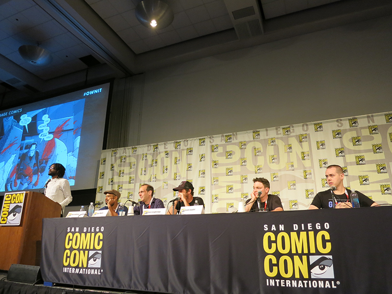 In the overzealously air-conditioned afternoon of the Saturday of San Diego Comic-Con 2015, Image Comics held their fourth panel highlighting their creators – this time focusing on the aesthetics of their comics and how their creators, a mix of writers, artists, and colorists own it. From left to right: David Brothers (moderator), Rob Guillory (Chew), Stuart Moore (EGOs), Lee Loughridge (Deadly Class), Scott Snyder (Wytches), Jaime McKelvie (The Wicked & The Divine), and the not-pictured Josh Williamson (Nailbiter).
Williamson kicked off the discussion, prompted by a panel from his ongoing series Nailbiter that humorously depicts “The Buckaroo Butcher” – a serial killer who only kills clowns – stuffing a tiny car with a clown corpse. He mentioned that the surprises that his collaborator, Mike Henderson leaves for him in the panels keep the work fresh and entertaining.
While describing his book EGOs, Moore found it absolutely necessary to ensure that his collaborator, Gus Storms (who he called his “scruffy Moebius”), receives 50% of the rights on the project, jokingly cursing his “fucking principles.”
Loughridge, colorist on Deadly Class with writer Rick Remender and artist Wes Craig, described the conversation with Craig to develop their palette, saying that he always shoots for simplicity whenever possible as the colors are often the first thing that really get seen on a page and need to echo the narrative tone.
McKelvie quickly talked about the variant cover for issue #14 of The Wicked & The Divine by musician Grimes – they started talking online as Grimes is a huge fan of Matt Wilson’s coloring work so they offered her a cover. Both Williamson and McKelvie noted that this kind of control over a property is exactly why they bring their works to Image.
Guillory recounted the pitching process for Chew – since writer John Layman was first pitching it to Vertigo, Guillory tried to work in a style that would suite the publisher as he was used to working in a variety of styles. Layman nearly fired him from the book, as he was looking for the specific style that Guilloy posted on his blog, but had never been commissioned to do. After redoing the pages in that unique style, it was off to the races.
Wytches, according to Snyder was always set up to reflect the style of series artist and long-time collaborator Jock. They did a lot of preparation, ensuring that monster designs were biologically viable – every bit of the design being present for a purpose. He and Jock agreed that the best of horror exists “half an inch off of reality […] almost realistic, but just twisted enough away.”
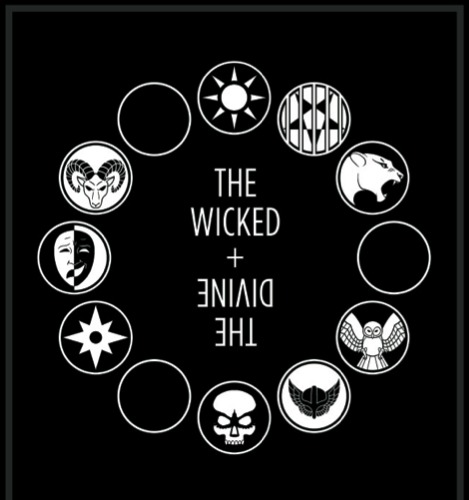
Interestingly, other than the Grimes cover, the only image displayed from The Wicked & The Divine was the last page of the latest issue, showing the wheel of the gods with their various icons. McKelvie explained that the design from cover to cover of their book is incredibly deliberate, coming from his and series writer Kieron Gillen’s need to control the reading experience. The icons making up the wheels that bookend each chapter each tell their own story about the represented gods and give context to their overall connections – carefully designed by a friend of the long-collaborating duo. Additionally, McKelvie explained the the reason the credits are at the end is so you know who to blame. Snyder jumped in to laud them for how their successful design in the book creates a narrative texture, heightening the emotional experience.
During the Q&A portion, the panelists were asked about their relationships with working both in creator-owned and on licensed properties. Snyder, current writer of DC’s Batman series, picked it up right away, describing his experiences. Firstly, he’s noticing that publishers such as DC and Marvel are calling a lot more for different kinds of stories which he directly attributes to the success and demand for creator-owned works and that it’s becoming easier to do unique takes on existing properties. Secondly, he dug into his process for writing pre-existing characters which is to treat them like everything you know and feel about them is your individual idea, as if you made the character up.
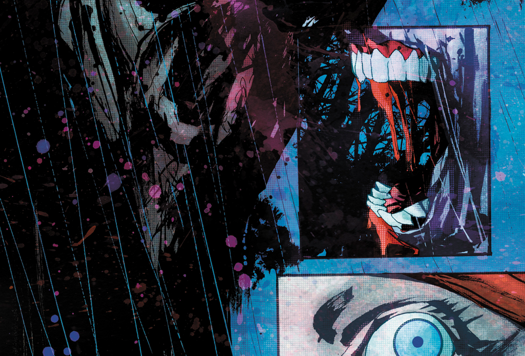
When asked about the splattering and filtering effects layered on the pages of Wytches, he attributed all of it to series colorist Matt Hollingsworth. Following in suit with Jock’s unique style, Hollingsworth wanted to extend into something very different on the series once Snyder described the process as looking for the worst or scary version of himself. Hollingsworth returned with the filtered and splattered layers as a way to obscure the truth and maybe convince the reader that they’re deterring themselves from seeking it out of fright.
For me, the big takeaway from this panel can be summed up in the consistent narrative from all of the panelists when talking about the creative teams they’re a part of. They always called their writers, artists, colorists, letters, and so forth as their “partners” or “collaborators.” They happily see their teams as essential to the success and aesthetic of their Image books.
Thanks for joining us for our coverage of San Diego Comic-Con 2015. It was a blast and we look forward to wrapping up out convention backlog over the coming week.


