
Scooby Apocalypse #1
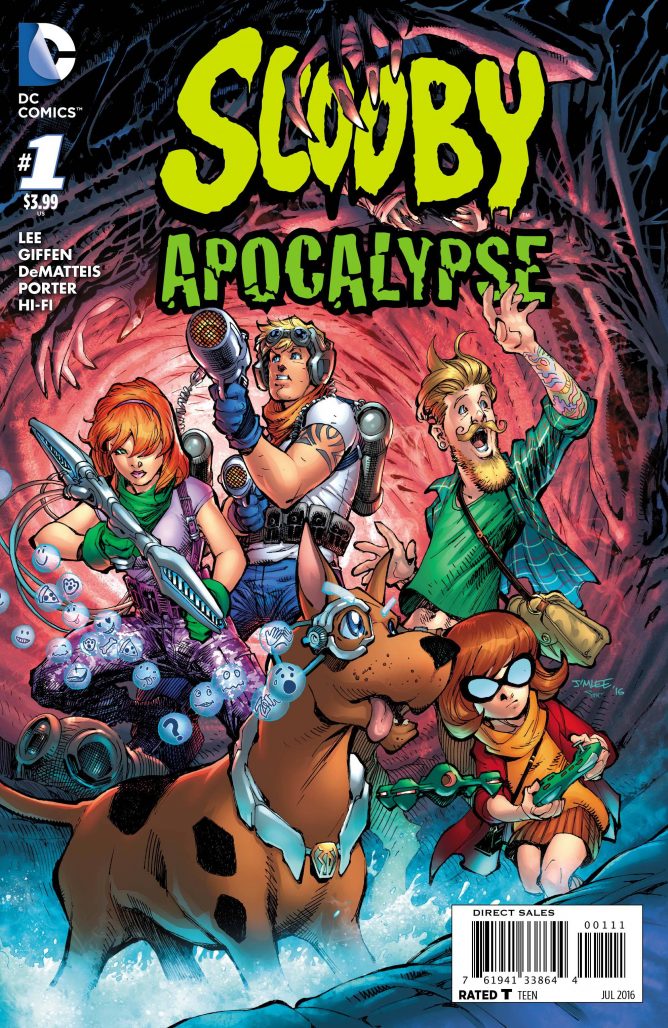 This past Wednesday saw the publication of Scooby Apocalypse #1, the second entry into DC’s new line of Hanna-Barbera titles reinterpreted for a modern audience. While last week’s Future Quest #1 was business as usual with a big crossover and a few remixed aspects of other books, Scooby Apocalypse was a wilder departure from the source material–one that is more polarizing than the original design of the characters. The title, billed as DC’s answer to adding some horror components to the Scooby Doo franchise has elicited a strong reaction from the readership, many of whom are worried that the tonal departure from the original cartoon series will extricate the elements of the property that they initially fell in love with. Are those worries warranted? Well, yes and no.
Scooby Apocalypse #1 takes a lot of time grouping the individual characters together before finally introducing a clear threat for the team to face. The outline of the plotting here is really shaky and doesn’t read like most of the expedient yarns Keith Giffen and J.M. DeMatteis are known for telling. They lampshade the heavy amount of dialogue in the comic itself, but it doesn’t excuse the plodding nature of the story. If the editors and writers noticed that there was too much exposition loaded into the middle of this messy reinterpretation of Scooby Doo and his pals, why didn’t they remove the scene so we could get to the titular apocalypse sooner? It seems like the painfully long middle of this book may have been included to explain certain concepts to a wider audience that may not be familiar with the Scooby Doo franchise, but the narration is too complex for young readers and unnecessary for older ones.
Much has been said about the inclusion of the brand new character designs in the story. Artist Howard Porter is limited by the complicated sci-fi costuming used in this story, which often obfuscate key facial features audiences use to connect with characters– most notably seen in Velma, whose glasses completely obscure her eyes much of the time. Porter’s pencils are technically strong, but the gritty and moody tone he imbues scenes with doesn’t endear readers to the story being told. Everyone always looks upset. Fred and Daphne sometimes look like they resent each other when their words and the mood of the scene reflect otherwise. Even Shaggy constantly wears a jaded and worn look on his face. Porter’s monster designs are great, but because of the huge amount of narrative set-up in this issue, he doesn’t get to feature any until the end of the comics. Ultimately, Porter’s work here is similar to Francesco Francavilla’s work on Afterlife with Archie, but instead of imbuing a classic property’s style with horror elements, Porter’s artwork in Scooby Apocalypse #1 eschews the original style entirely, replacing it with a generic sense of horror that loses what made the Scooby Doo cartoons so beloved.
The characterization of this incarnation of the Mystery Gang is a mixed bag as well. The close and fun dynamic between Shaggy and Scooby, which has always been the heart of the series, is charmingly preserved here. There are some weird choices– Shaggy is sometimes presented as a little too silly in comparison to previous incarnations of his character, which feels incongruent with how serious most of Scooby Apocalypse is. Also, Scooby’s emoticon technology is quite possibly the most confusing and unneeded aspect of any of these characters’ designs. Ultimately though, Shaggy and Scooby’s friendship adds a lot to the proceedings of this issue and makes me more hopeful for the future of this troubled series.
That said, we never get the opportunity to dig into their relationship more than we have in previous series or even start seeing how the interact with the rest of the team thanks to the huge aforementioned exposition dump. The creative team leaves no room to explore Velma’s dark inhibitions, which cause the Mystery Gang to unite in the story. Her reasoning and explanations feel hollow and mechanical, servicing the plot more than the character. Her motivations are unclear, which is especially apparent when you compare her scenes to Shaggy’s, as his motivations get a solid amount of shading. Fred’s and Daphne’s characterizations have the same problems as Velma does, ultimately making this the Shaggy-Scooby hour for better, or more likely, worse.
With this issue finally wrapping up the mass exposition littered throughout the story and jumping into some kind of horrific brawl between the heroes and monsters, maybe next issue will contain the characterization, plotting and intrigue that will really make readers interested in this property–but did the Scooby concept really need such a drastically new take on the concept in the first place? Or did Scooby need a back-to-basics approach à la the Archie and Future Quest reboots? Is anyone going to be able to stick around past this first issue to really figure out what speed this series will be regularly operating at?


While not as technically proficient as Future Quest, it more personality and was more fun to read for me.
I anxiously await the gritty, steampunk-infused comic reboot of Jabberjaw.
I really liked it.
This feels like yet another company’s race to be second. “Archie updated the classic characters? Let’s do that too!”
I realise Jim Lee is a comic god to lots of people, but for 20 years, his art has looked like the same schtick to me. I guess I should respect that Shaggy isn’t super-buff, and Velma isn’t 36 DD, but then Fred and Daphne are.
What I’m getting at is that this looked creatively bankrupt from the start. They don’t need to make great art, but they should at least have some interest in what they’re doing from the start, not just sit around a table saying, “Scooby-Doo! How can we sell it?!”
To paraphrase the Lee/Moebius graphic novel — if Jim Lee is God then I’m turning atheist.
It may not have been a great start, but I’m willing to give this series another issue or 2 before I stop reading it to see if it gets better.
Ruh-Roy says
“I anxiously await the gritty, steampunk-infused comic reboot of Jabberjaw.:
Perhaps it will be followed by a gritty, techno-noir Captain Caveman. Which can then be followed by a gritty, futuristic Speed Buggy.
There’s definately a great deal to know about this issue.
I really like all the points you made.
I’m loving this new version of the Scooby gang, and the artwork is fantastic. This comic is a lot of fun and better than most other titles DC have at the moment. Top of my list for the next while, for certain.
I work full time and am heading back to school. Does anyone have meal planning ideas that will allow my boyfriend to handle dinner (preferably just heating something up) with some variety and ease? I have a crock pot that I love to use but I know that if I cook something for him to eat all week long, the same thing, he will get board and just get burgers or piTzk.zhanas in advance.
I have exactly what info I want. Check, please. Wait, it’s free? Awesome!
Very interesting information!Ideal! just what I was looking for!
It’s actually a cool and helpful piece of information. I’m happy that you simply shared this helpful info with us. Please keep us up to date like this. Thank you for sharing.
This series is FANTASTIC. They took a chance at a remake and did it! This is the first new version since the original that I enjoy. I’ve got all issues and plan to keep it going.
I loved the first 2 episodes of The Beautiful Life which aired on The CW, & I'm so glad to hear they are going to give us a chance to see the rest of recorded episodes on YouTube! It's a very good show, & I hope that it will live again. It deserves to live.
If there was any concept I wanted to see hauled out and shot, it is the idea that "war improves the economy".No, it does not."But it got America out of the great depression!" some may claim, and I will argue that America was the only nation in the late 40s who's factories weren't either smoking rubble or uncleared jungle.
Comments are closed.