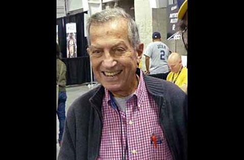
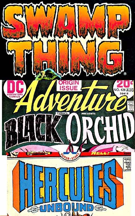
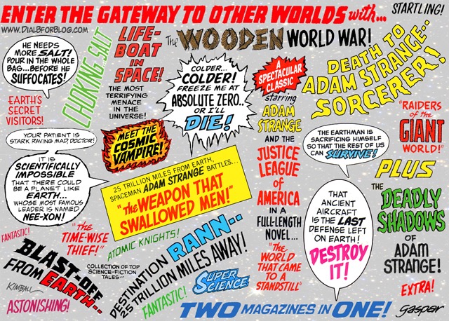
Gaspar Saladino, one of the greatest comic book letterers of all time, died yesterday at age 89, a few days short of his 90th birthday. Saladino was a mainstay of the Silver Age at DC, where he designed some of the best known logos ever, and at Bronze Age Marvel where his little stylized “G” was always a welcome site in the comics I read as a kid. he stayed active with some work for Image in recent years. IN partocular his work on the first Swamp Thing run, where his dripping lettering defined the muck monsters speech patterns, was a stand-out.
Todd Klein has been studying Gaspar’s logos at his blog for a while and that Saladino was his favorite letterer and role model; Klein ran a lengthy interview with Saladino here.
There’s another large study of his work here with many examples.
Tributes rained down from twitter and Facebook.
Paul Levitz
My words never looked better than when rendered in the careful calligraphy of Gaspar Saladino, and if I must say farewell to him, I won’t do it referring to him by his most frequent but inadequate title of ‘letterer.” Gaspar was an artist with design, creating logotypes that have endured and influence, ads that sent us running to the newsstand, and what he did with “simple” sound effects or words in balloons. His work on Len Wein & Bernie Wrightson’s SWAMP THING run established a new level for what lettering could do to add to storytelling in periodical American comics, bringing more drama with his innovative style.
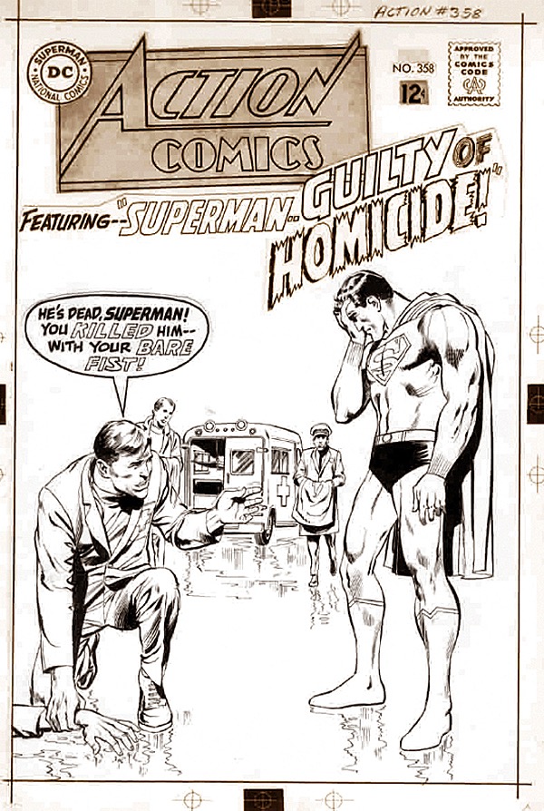
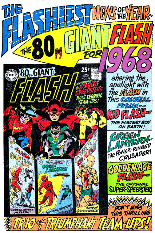
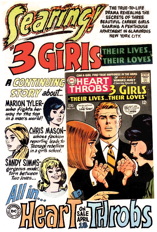
Until around 1966, Saladino was the second banana letterer at DC, the first being Ira Schnapp. Schnapp was a gifted calligrapher and designer who was responsible for most of the cover lettering, logo design and house advertising there for years. In ’66 when artist Carmine Infantino was brought into management (eventually becoming publisher), he attempted to modernize the look of DC by replacing Schnapp with Saladino. Thereafter, Gaspar did most of the cover lettering, logo design and house advertising. Schnapp left the company in 1968. Gaspar designed hundreds of logos for the company and as time permitted, worked on the insides. When Swamp Thing by Len Wein and Bernie Wrightson became both a financial and creative success for DC in the seventies, everyone agreed the comic wouldn’t be the same without Gaspar’s distinctive and expressive lettering. When he had to miss an issue, the point was proven. He also occasionally worked for Marvel, often under the name “L.P. Gregory” or merely “Gaspar,” and was called upon most times when MAD needed someone to do fancy lettering.
https://twitter.com/PatrickZircher/status/761426597752602624
https://twitter.com/PatrickZircher/status/761427742831235073
https://t.co/CQUwnCWMcG
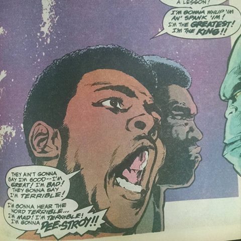
In the era of gorgeous digital lettering, Gaspar’s hand lettering genius and artistry are still unmatched. ook at this page from Superman vs Muhammed Ali (posted by Escape Pod Comics’ Menachem Luchin) that bends and changes size to reflect the rhythm of Ali’s speech patterns. And of course the eye-worm impact of his logos and design elements.
Gaspar helped define the pow bam era of comics – his great designs aided and enhanced the artists and characters and gave them a voice.




just plain the best of the best. from those who emulated his disciplined kookiness, to those who respected it but chose another aesthetic, we all work in his shadow. there’ll never be another Gaspar, but every letterer is better for his work. and a lot of us, me especially, got into the business because Gaspar showed us what it could be. rest well, dear friend.
Comments are closed.