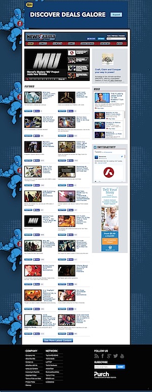
 |
 |
| Old | New |
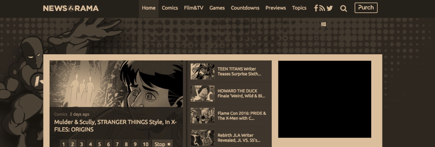
While I was running around last week, Newsarama rolled out its redesign, which isn’t really that different from the old site, as you can see above. Bigger pictures, more modern look. TBH, the navigation is actually a little better, so this gets the IMPROVED! rating from us. The funny symbol was just the jazzed up letter “A” which…well, it’s new and its the favicon, which doesn’t name sense but, okay.
CBR’s redesign remains a little confusing. If stories aren’t tagged correctly they just roll into the great stampede of stories. More navigation tools would help A LOT. On the plus side, I see that Brian Cronin’s posts (formerly found at Comics Should Be Good) are often “trending,” whatever that means, so probably moving them to the main body of the site got them more attention. ON the minus side, whenever you read a story (and some of the current stories are very good) it goes into that “infinite scroll” thing that’s designed to keep you on a site until they find your skeletal hand still clutching the mouse and looking for Axel in Charge.
It should be noted that ComicBook.Com kicked off the redesign frenzy over the summer, with a new, more modern look, and more navigation. They also purchased ComicbookDB.com earlier this year, and have launched more and more pop culture news.
However, a little bird tipped me off to yet ANOTHER COMICS NEWS SITE DEATH that took place in February without anyone really noticing, even though it is technically the #1 comics news site. Comics Vine, part of CBS’s GameSpot family of sites, was quietly merged with GameSpot, meaning there is no comcisvine.com any more, only comicvine.gamespot.com. I believe they folded in several other sites, but NOT the gaming offshoot Giant Bomb, because people actually LIKE video games. Around the same time, improvements to Comic Vine’s massive Wiki were also announced. I believe that’s the main reason that people go to the site, which is why no one really noticed the rebranding.
Over the summer both Comics Bulletin and Multiversity also had redesigns with cleaner, more modern looks, as af far as I’m concerned, Multiversity won the whole thing, because they have CIRCULAR image previews! If they hadn’t done it already I would just steal that damn theme.
UPDATED TO ADD: Oh and Also the late great Panels is now rebanded as Book Riot Comics. I brelieve if you set your feeds to this page it will work.
ALSO: Black Girl Nerds just had a redesign, with bigger pictures, cleaner interface, more modern look, etc etc etc. This is a real up and coming site that covers nerd culture in general, so if you’re despairing over the future of nerd writing, it isn’t dead yet.
HOWEVER, tangential to all this, there is yet more hand wringing over the future of newspapers, that quaint tradition of paying people to investigate and report on stories. In a piece at the NY Times, the recent disastrous automation of news curation at FB was mentioned:
Just look at what happened last week after that Goliath of the digital transformation, Facebook, pared back the team of “curators” and copy editors who oversaw the selection process for its “Trending Topics” feed. Instead, it gave more control over to an algorithm.
With less meddling from discerning humans, the algorithm promoted a news item about a man engaging sexually with a McChicken Sandwich, and it picked up a false report that Fox News was dropping its star anchor, Megyn Kelly, because she had come out in support of Hillary Clinton. She had done no such thing.
The Facebook program picked up the bogus story and the McChicken item because they were generating copious clicks on the internet — thus, they were “trending.” They represented worst-case examples of what happens when media companies race to give their readers what’s popular — which is more discernible than ever in an age of ubiquitous data measurement — at the expense of what’s true or informative.
I wondered why my poor auntie was suddenly sharing totally made up bullshit stories from a site called theguard1an. The veracity of my “news feed” plunged dramatically once the brainiacs gave it over to automation. It’s one thing to see a graphic claiming some outrageously partisan thing, another to see what looks like an actual news story that it 100% bullshit.
Unfortunately, the tech giants keep making “improvements” that have no basis in human interaction or even goddam common sense. Like the time Google tried to quantify what makes teams work and it turned out to be treating other team members with respect and decency. CRAZY, right? Or the time Apple said we don’t need a headphone jack. Where are you going to plug in your SQUARE reader now, smarty pants?
Allowing random human being to curate what interests them is always going to revert to the “lowest common denominator” very quickly, alas. That’s why they call it the LOWEST COMMON DENOMINATOR.
I’m not saying we need a return to rigid gatekeepers, but we should occasionally heed people who understand common sense, common decency and the fact that Usain Bolt spent his time after winning the Olympic medals banging super models and not giving all his money to a school, as a particularly popular fake story had it.
But that’s why you’re reading this site, isn’t it? You like a little curation and gatekeeper now and then, don’t you? Admit it. It’s okay. I’ll be here all week.
Has your site redesigned or rebranded lately? Show it off in the comments!






I don’t mind the website redesigns so long as they’re different and user-friendly. Easier navigation and clean access to the stuff you went there for in the first place is what Im looking for but when a number of sites started looking alike then it defeats the purpose of trying to “innovate.”
I’ve toyed with the design of my blog and settled on something that I think is clean and simple. It will probably change again but you want to make sure people can easily access the information you want to highlight. Change is inevitable, especially when sites get purchased by other entities. The most important thing is the quality of the content regardless of what the site looks like.
“Has your site redesigned or rebranded lately? Show it off in the comments!”
ComicList, purchased by GoCollect, and redesigned to be 100% less ugly.
I’m considering an overhaul and revival of GraphicNovels.info (known on Usenet and at the dawn of the Web as “Beek’s Books”) which has lain fallow for several years. I’ve gotten as far as clearing out the spam.
Yes, but what is this white symbol across the red “O” of NEWSORAMA’s logo? (And who’s this “newasrama”, sic, among your teasing tags?)
As for CBR, it looks like a rather botched migration. Many old links redirect to the homepage instead of the moved article or an equivalent page. They deleted the old categories without converting them into tags. (For instance, Greg Burgas’s “Comics You Should Own” was a category now deleted, so all these articles are still in there somewhere but without a tag-or-category archive to aggregate them.) And of course, the current CSS is “responsive” only to phones and tablets but ignores laptops and desktops.
> Apple said we don’t need a headphone jack
Well, to be fair to the arrogant Fruity Cargo Cult of St. Steve, there’s a Lightning/jack adapter for your Square reader or whatever… (I’m sure it’ll cost less than $150!)
P.S.: When you retool your theme, Heidi, thanks if you could consider: (1) Getting rid of the irregular two-column format on the homepage’s top half, either for a two-column grid or a single column as in its bottom half. (2) Making sure page 2+ of the site doesn’t repeat the whole first half of page 1, making it even more annoying (and possibly chasing away readers thinking page 2 doesn’t work). Regardless of design frills, these are functional UX impediments.
P.P.S.: I’ve rebranded my nonce!
We finally redesigned Speed Force after eight years (if by “redesign” you mean “saved the logo in a new color scheme and slapped it on top of a slightly more modern out of the box theme”). The split between mobile and desktop layouts, which got horribly confused on tablets, and the terrible readability of white text on dark red (seriously, what was I thinking?), finally reached the point where I didn’t care about making it look awesome anymore as long as it was clean enough to use.
While I was at it, I moved the site to all HTTPS. The admin area has been protected for a while, but the front of a site can still be vulnerable to session hijacking without it.
I continue to be impressed with Black Girl Nerds ( http://blackgirlnerds.com ) and I’m glad you mentioned them here, Heidi.
I rebranded howtolovecomics.com last year. This was mostly as the site was ugly, responsive design was broken and wanted to fix it before Google’s Mobilpocolis. I’ve a few tweaks here are there since.
> (And who’s this “newasrama”, sic, among your teasing tags?
It’s a new site specializing on comics inspired by Arthur C Clarke.
Comments are closed.