It seems that in response to long time rival CBR.com rebranding and getting a redesign and new logo, Newsarama.com is also getting a makeover starting with t anew logo, seen above.
Newsarama will not be updating until Tuesday morning, August 30th, but please come back then for a little newness…
And keep an eye on our Twitter and Facebook pages if anything big happens between now and then…
The new logo doens’t really look like an N. It looks more like…a short piece of wood talking to a tall piece of wood?
Or maybe an upside down “P” to stand for Purch, the company that owns Newsarama?
Or, in a bid to prove MacDonald’s Theorem – that any situation in life can be compared to something mentioned in The Lord of the Rings – the new logo is a reference to hyarmen, the bonus Tengwar from the Elvish alphabet, used to symbolize the sound “h” or “hy” and standing for “south.”
Newsarama does not quite have the same vocal community as CBR does, so the outcry and garment rending may not be as frantic as with CBR’s redesign last week.


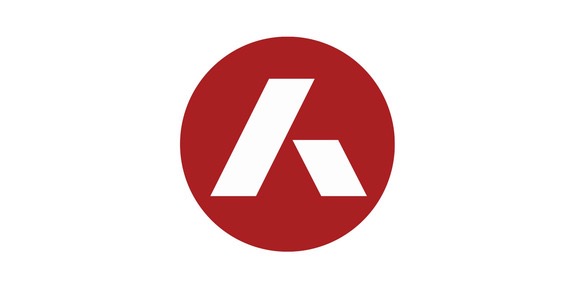






I think it’s suppose to be an “a,” just like their current logo uses a “Circle-a” as it’s logo.
Hopefully Bleeding Cool will follow next. Their front page is too busy. The first article image is often off-center, and the multiple video ads per article are annoying. Lately, I’ll look at BC’s homepage, and if something looks interesting, I’ll google the headline and read the article elsewhere.
Of course, what they need most of all is a proofreader.
Hopefully Newsarama will finally become mobile-friendly, just as it was also long overdue for CBR until its new redesign. :-)
That logo is identical to the one used by Ascension Collegiate Solutions. http://Www.4studenthealth.com or http://www.ascensionins.com. It’s a benefit management company.
CBR kind of sucks now so it’s all a bit of who cares
Wow… that logo is really quite similar to Ascensionin’s. The dimensions of the sides are slightly different, but otherwise it’s the same logo. I wonder if that’s based off a known font? That could explain how they both came up with the same thing. Take a unique strange looking font and put it into a circle.
Maybe the new branding will be “Arama”?
The new logo is a stylized “A”, just as the old was a lowercase one. It stands for “Access journalism”.
Talking about redesign, did you think about tweaking your own site? I noticed an RSS bug: posts held in moderation won’t show up on the feed once approved. (On other sites they do.)
Also, the frontpage’s two columns are quite annoying to read on a vertical scroll (especially as the cells are not the same height). Sorry to say, but such columns feel terribly old-media. Internet ain’t paper!
The Beat definitely needs a redesign! The current template is one I literally had to fix on the fly over the Thanksgiving holiday when the old one crashed the site. I am not a designer or a CSS expert so there are a lot of issues.
Thanks for sharing your thoughts, BTW. But I think cleared comments DO show up. They do in my feed anyway.
Anyway else have any Beat redesign requests?
I’d lie to see a single column with a de-emphasise on oversized graphics. On my iPad, it’s a mess visually speaking. My feel is that text over graphics is always a good thing on a new site.
While Newsarama doesn’t look any different yet, was their commenting always Facebook? It seems to be the same interface CBR uses now too.
@Drew, Newsarama’s been using Facebook comments for a while now.
That’s Why I Came 2 The Beat Heidi…:-)
Mobile friendly website a code word for click bait list articles and nothing else. Any articles requiring depth or more than 3 minutes to read are scrapped. Yep sounds like what happened to CBR.
Heidi, I just know RSS didn’t show me my two comments held under “CBR.com has new design”. Looking at it, that could be because your feeds only provide the last 10 comments.
I mean, when you eventually cleared my comments, I think it’s possible 10+ more had already been posted below, hiding mine beyond the RSS horizon.
That’s one reason for some sites (including the old CBR) to expose the last 20, when they expect some flurries of comments or know their mod(s) can be away for some time.
(If needed, that’s in Dashboard > Settings > Reading > Syndication feeds show the most recent [n comments]. If I’d change such setting, I’d keep an eye on the site’s bandwidth usage for one week to check it’s negligible.)
Comments are closed.