

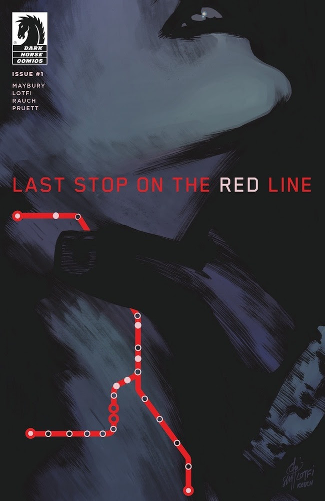
Last Stop on the Red Line isn’t your typical murder mystery. The upcoming series, about the investigation of a brutal killing on Boston’s subway, is part neo-noir, part supernatural thriller, and part character study of the Transit Authority detective investigating the murder and of the mysterious man with an otherworldly connection to the case. Writer Paul Maybury, artist Sam Lotfi, and colorist John Rauch present a side of Boston that is at times familiar, at other times unsettlingly different, and always completely fascinating.
I had the opportunity to chat with the creative team behind Last Stop to discuss how they came together on the series, what they view as the relationship between the two leads on the title, and the importance of shining a light on Boston’s under-represented communities.
Joe Grunenwald: Paul, you’ve mentioned elsewhere that you originally intended to draw Last Stop on the Red Line yourself. Why did you ultimately decide against that? Sam and John, how did you two come to team with Paul on this project?
Paul Maybury: The original pitch was done for a now defunct publisher. A saintly editor informed me of the writing on the wall and that the project might get tied up, or worse, shelved there. I decided to put Last Stop in my back pocket until the right opportunity arose. I felt that my art appealed to a more niche audience and I wanted to reach out further. Working with Sam as the artist brought the project into the realm of mainstream accessibility. Teaming up with Sam, came with the unexpected bonus of working with our colorist John, whose illustrative quality created a whole new layer to Sam’s work. Our letterer Adam, has also been instrumental in shaping the look of this series.
Sam Lotfi: I met Paul at a few local comic cons and when we had the chance we’d usually hang out after the shows to talk about projects. I was looking for something fun to draw that had elements of horror and monsters; when Paul asked if I’d be interested in drawing creepy subway trains and monsters, it was a no brainer. We’re both very particular about coloring in comics and have similar tastes, so I immediately thought of John. I first worked with John on a Doctor Fate story for DC Comics, it was a great team up then and even more so now on this book. John is fantastic at using color to push storytelling in both subtle and bold ways. I’m really glad he was available because our book would not be the same without him.
John Rauch: For me, it was just a career rule I set for myself. I had a really good experience working with Sam before and I like when things go well, so I’m not above riding coat tails. As it turns out, I met Paul in the process and he’s pretty damn good too, so why not?
JG: What about Last Stop on the Red Line made it a story you needed to tell, Paul? And Sam and John, what about the story drew you to it?
PM: As a native Bostonian and Person of Color, I’ve always been dismayed by the whitewashing of Boston’s image in film and literature. I’ve made it a point to showcase those that the media tend to forget in Last Stop. Beyond that, this story deals with some pretty weighty issues that are of personal importance to me that will come into focus as the series progresses.
SL: The chance to explore moody and suspenseful environments. I’m a big fan of classic black & white horror and thriller films, so the moodier the atmosphere, the better. I had a blast drawing an Ash vs. The Army of Darkness Halloween special for Dynamite in 2018, but I wanted to explore playing with mood in a longer story and Last Stop seemed like the perfect opportunity. All that plus the chance to create and draw some monsters was too good to pass up.
JR: To be fair, I probably would have been excited to see anything these two came up with, but what speaks to me is the juxtaposition of the real and the unreal. I love to find a theme like that early on and find ways to help illuminate it for the reader.
JG: The series focuses on Detective Migdalia Torres and a mysterious man named Yusef. How would each of you describe those characters and their relationship? What approach did each of you take in defining those two?
PM: Migdalia and Yusef are characters who both carry incredible guilt and pain. A shared tragedy connects them but it is good will that brings them together. Yusef is a homeless man who’s found a spot at a local shelter with his “friends”, Wolf and Zev. He suffers from visions of monsters in broad daylight and the real-life horrors of a recent string of murders that are mirrored in his dreams.
Migdalia is a Transit Detective who does what she can with the resources that she’s given. The deck isn’t always stacked in her favor but her unpredictable impulses serve her well in precarious situations.
SL: Migdalia is an engaging character in any given situation, she has a temper and can be crude, but she does her best to help others. For me, she’s a detective, mother and wife in that order and they all take their toll on her and those around her throughout our story. Yusef is a vagrant with a supernatural connection to Migdalia’s case. We first meet Yusef in one of his crazy visions that continue to take their toll on him and especially, his friends.
JR: From my point of view, Migdalia is the straight forward one so far. She’s the star of the show. She’s smart, capable, pretty, interesting. You can’t not notice her. Yusuf is where things get weird. Literally, actually. Every time I get a Yusuf scene, I know something surreal is about to happen in plain view. For me, their relationship is about harmonizing those two chords. That’s maybe a vague answer, but that’s what you get for asking a colorist.
JG: What was the process like when coming up with the visuals for the series, particularly in regards to the murderer? Were there character looks specified in Paul’s scripts or were those design and color choices left up to Sam and John?
PM: Sam and I mostly worked on getting Yusef’s look perfect. Migdalia’s design was settled in his first sketch. Before John was involved, I developed the core character’s color designs to have them reflect the various lines of the Boston MBTA subway system. When John came on board, I wanted to make sure that I wrote something that used his colors to push the narrative forward. With Adam’s lettering, we were trying to replicate the look of balloons found in Manga. When they’re translated to English, their vertical composition gives the text a wonderful spacious quality that I love. Lastly, I’m wearing the hat of designer on this series which I use as an opportunity to integrate some storytelling bits into the design itself. Dark Horse has been great about being hands off and letting us run wild with Last Stop.
SL: Paul wrote brief key descriptions and color notes in the script for the characters and monsters, but they were more like a loose guideline. Beyond that, I felt free to design the characters and monsters in a way that best fit into our story. For example, Paul wanted to focus on our main cast being people of various color and for the murderer / monsters to go through an evolution with each issue. I started with designing the monsters’ final stage of evolution and scaled it back from there with each issue. Sometimes they were done in advance and if the schedule didn’t allow for it, the evolutionary designs would happen on the page. I had a great time designing and pushing those elements in both subtle and bold ways as we moved into each next issue.
JR: Working with two other artists on this, a lot of color choices were actually made before I was involved, simply because they’re so integral to the story. For me, the challenge has been to figure out where my “moves” intersect with Paul and Sam’s and make sure my choices add to that, rather than take away.
JG: How was the decision made to include a deaf character in the form of Beatriz Torres, Migdalia’s daughter? Has it presented any unexpected benefits or challenges for the storytelling process?
PM: My daughter is taught ASL in school as part of her basic curriculum. This reminded me of my admiration of my deaf classmates back in high school and the challenges they faced. I became intrigued by the idea of featuring a deaf character in Last Stop. The subtitles will also tie into a larger point down the road. Logistically, it was a bit tricky having dialog react to text which you’ll in turn read at the bottom of the panel. You have to be mindful of the sequence in which people speak but after a while it becomes a fun challenge.
SL: That was in the script from the beginning. The only storytelling challenge was leaving enough room in the panels for Bea’s subtitles. Which could get tricky sometimes if you have multiple characters speaking in the same panel, but it worked out well overall. Drawing the hands in various signing positions was the easy part and fun, plus I leaned some ASL along the way.
JR: Nothing really different on my end. I do like having those little chances to help emphasize the visual story telling experience, but that’s what we’re doing all the time, right?
JG: The idea of people’s perspectives seems like it’s going to be a big part of this series. The opening sequence of the issue is presented from the perspective of a (soon-to-be) murder victim; Yusef literally sees things that other people don’t; and different people see Yusef in different ways, just to name a few instances. What appeals to you as creators about exploring that theme?
PM: This series is largely about perspective and power. Yusef is a tall, imposing man but in his dreams, he is powerless as he is forced to see through the eyes of female victims on the train. Migdalia is confident and authoritative at work, only to have that dynamic flipped in her home life. A power fantasy is a popular narrative. I chose to create a story about weakness which, in my opinion, is that much closer to home and dreadful.
SL: Every character’s unique perspective on the events could potentially play a part in solving the mystery. Migdalia and Yusef have to figure out which perspectives are relevant and we have fun exploring them in dramatic and horrific ways.
JR: Everything. I love being able to change the rules almost every scene. It’s impossible to get bored.
JG: Why is Migdalia’s husband such a dick?
PM: Warren and Migdalia have a complicated relationship, which we will reveal more about in subsequent issues. To me, he’s representative of a strict and dominant Latinx father archetype. He’s usually working or sleeping and cranky in between.
SL: We can all be that way sometimes, but I see him more as an overprotective father.
JR: *shrugs* Men?
JG: What’s your best pitch for readers who are on the fence about picking up Last Stop on the Red Line?
PM: If you’re looking to be pleasantly surprised by a creative team who you may not be entirely familiar with give this series a shot. It’s a mystery with thrilling visuals and a socially conscious heart. We’ve strived to give readers a good single-issue experience.
SL: It’s a psychological thriller that plays with classic monster archetypes in a fun and creepy way and flirts with mystery! Get ready to wade through the blood and clues in this horrific ride on the Red Line!
JR: I don’t believe they exist. Why would anyone still be on the fence?
Last Stop on the Red Line #1 arrives in stores on May 8th.


