

“Anatomy of Two Covers”
by Pornsak Pichetshote & Aaron Campbell
[editor’s note: as this is an image heavy post, there are a variety of galleries scattered throughout. Click any image to enhance.]
To promote its launch, series artist Aaron Campbell and I did a “Deep Dive” with Alex on the process of making our new creator-owned book INFIDEL. Here’s the thing about Aaron and I, we love talking process. So much so, that when we mentioned to Alex that the covers to issues 1 & 2 of INFIDEL had as interesting a process as any aspect of the book, he invited us to talk about it publicly to commemorate INFIDEL 2 hitting stores this week. And as a fan of process pieces, that was all the excuse I needed…
Especially when it comes to comics covers. Because while people say “you can’t judge a book by its cover,” anyone in comics knows that’s a complete lie. In comics – especially creator-owned ones – books are judged entirely by their covers. After all, that cover doesn’t just have to jump off the shelves of the store – it also functions as your book synopsis and trade ad all wrapped up into one. That cover is circulated more than any five words about your book will ever be. So while the covers for issues 3 on up can look cool, those first two covers have to do that on top of communicating what your book’s about in a single image. And INFIDEL editor Jose Villarrubia felt just as strongly as I did about first and second issue covers.
When art directing a first issue cover, I’ve always believed it helps to boil the book down to its key distinguishing themes. For INFIDEL, that was Islamophobia / xenophobia and horror. Keeping the number of ideas the book must represent that lean meant Aaron has more room to play with the cover’s conceptual ideas. And Aaron, being a rockstar, hit us with no less than nine ideas:
Aaron: This goes against all my instincts as an illustrator. I always try to give the least number of sketches possible to avoid decision overload. Plus, the more choices you give an editor the more likely they are to pick an idea you really don’t want to do. But I felt a special tie to this project from the get-go, so I went all in.
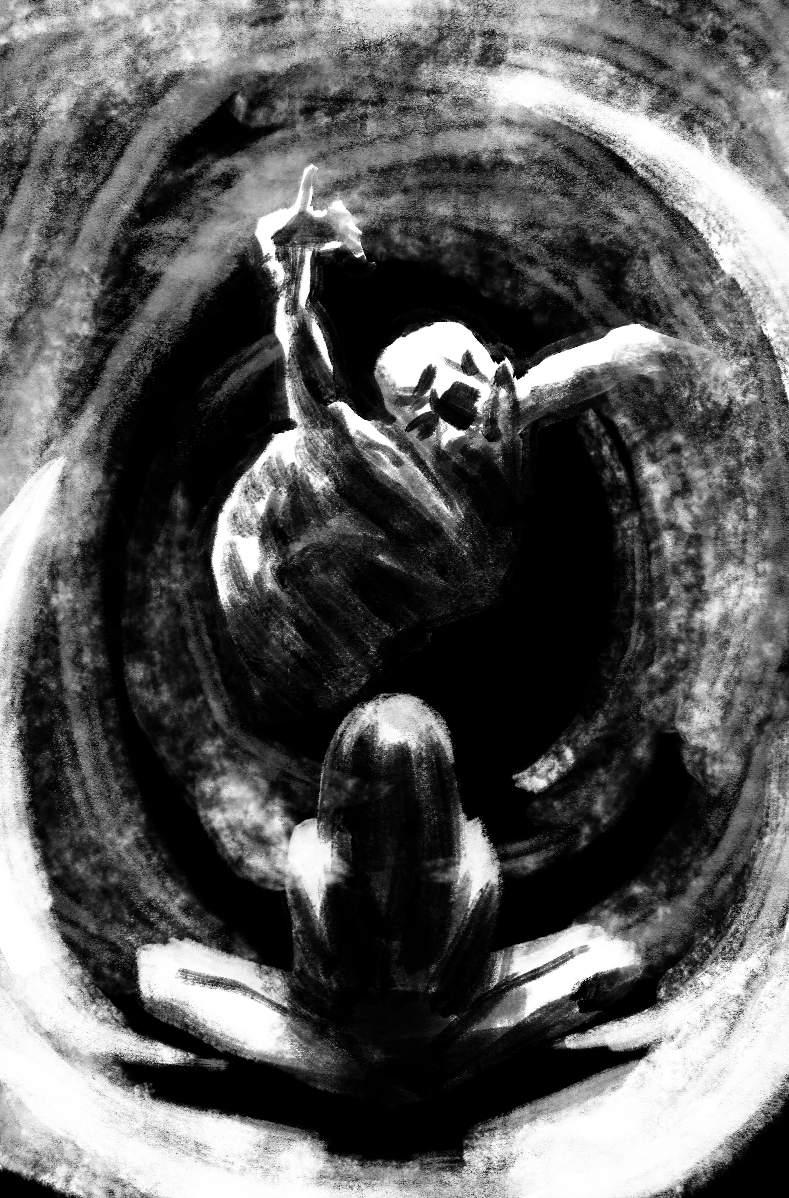
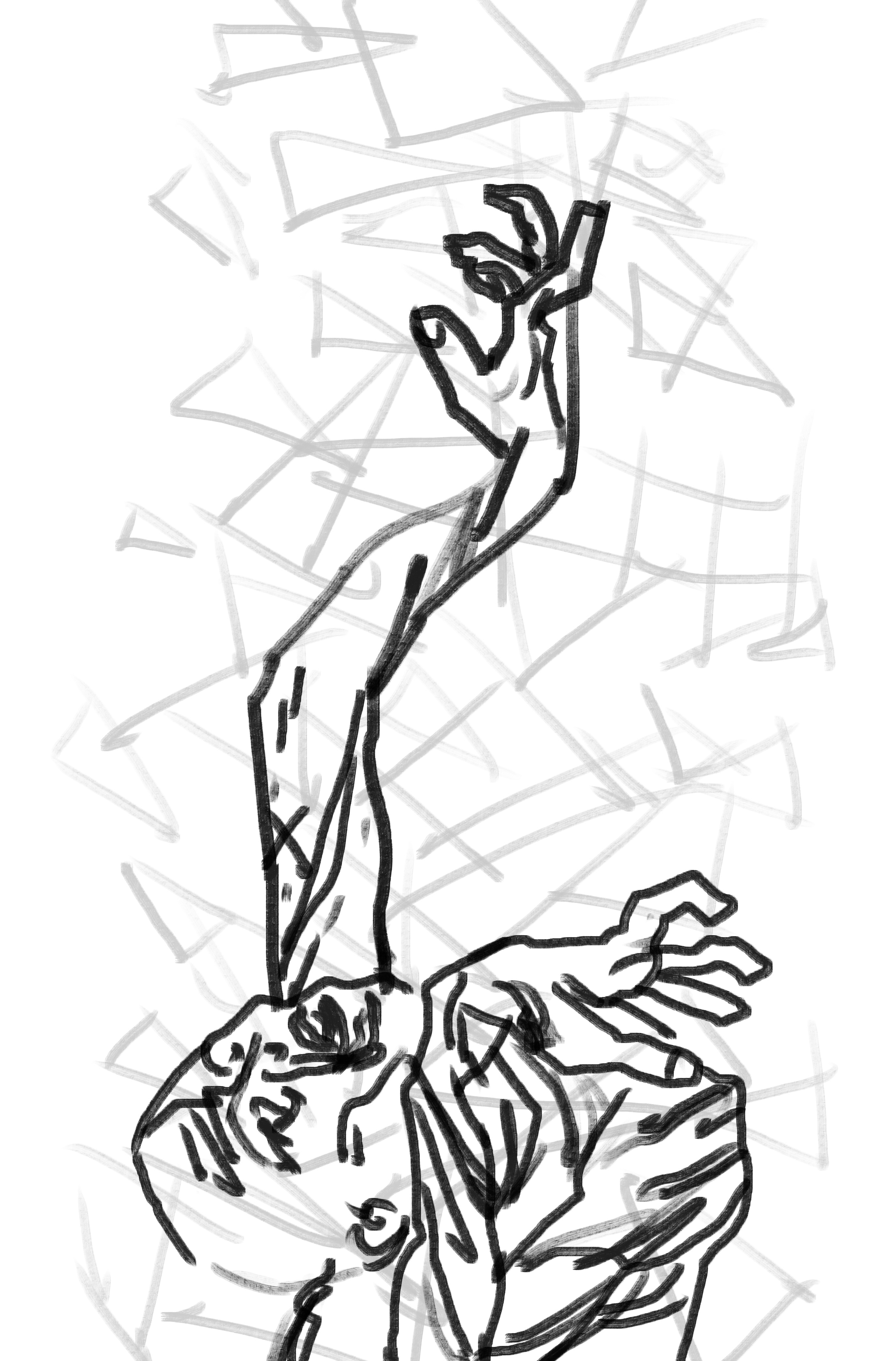
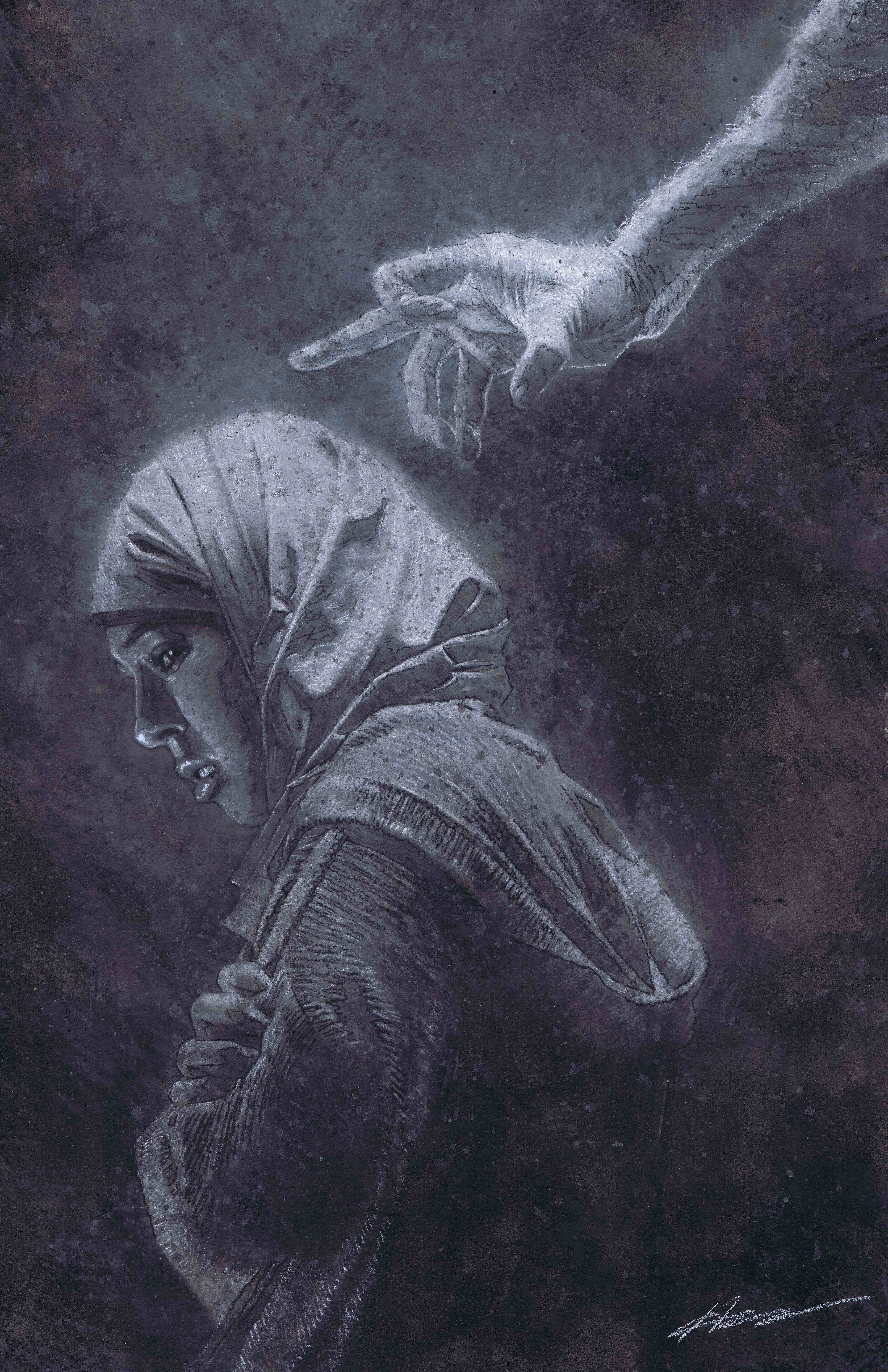
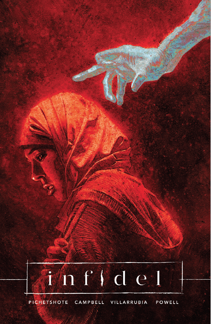
Pornsak: And you can definitely see that passion in the work. Jose and I instantly fell in love with the ghostly hand reaching out to Aisha, although both of us (being us) had our own little nitpicks. Jose felt stronger if the image was flipped so our eye would go left to right and see the arm as it was reaching out for Aisha. I felt strongly that we should see Aisha’s eye as she’s about to turn. From my own editing days, I’d learned nothing helps an audience empathize with a character’s emotional state more than eye contact, and I thought Aaron’s decision to have her almost in mid-turn when she made that eye contact was ingenious.
From there, Aaron proceeded to execute and man, did he. Here’s 3 of the 9 stages the cover went through before Aaron finished it.
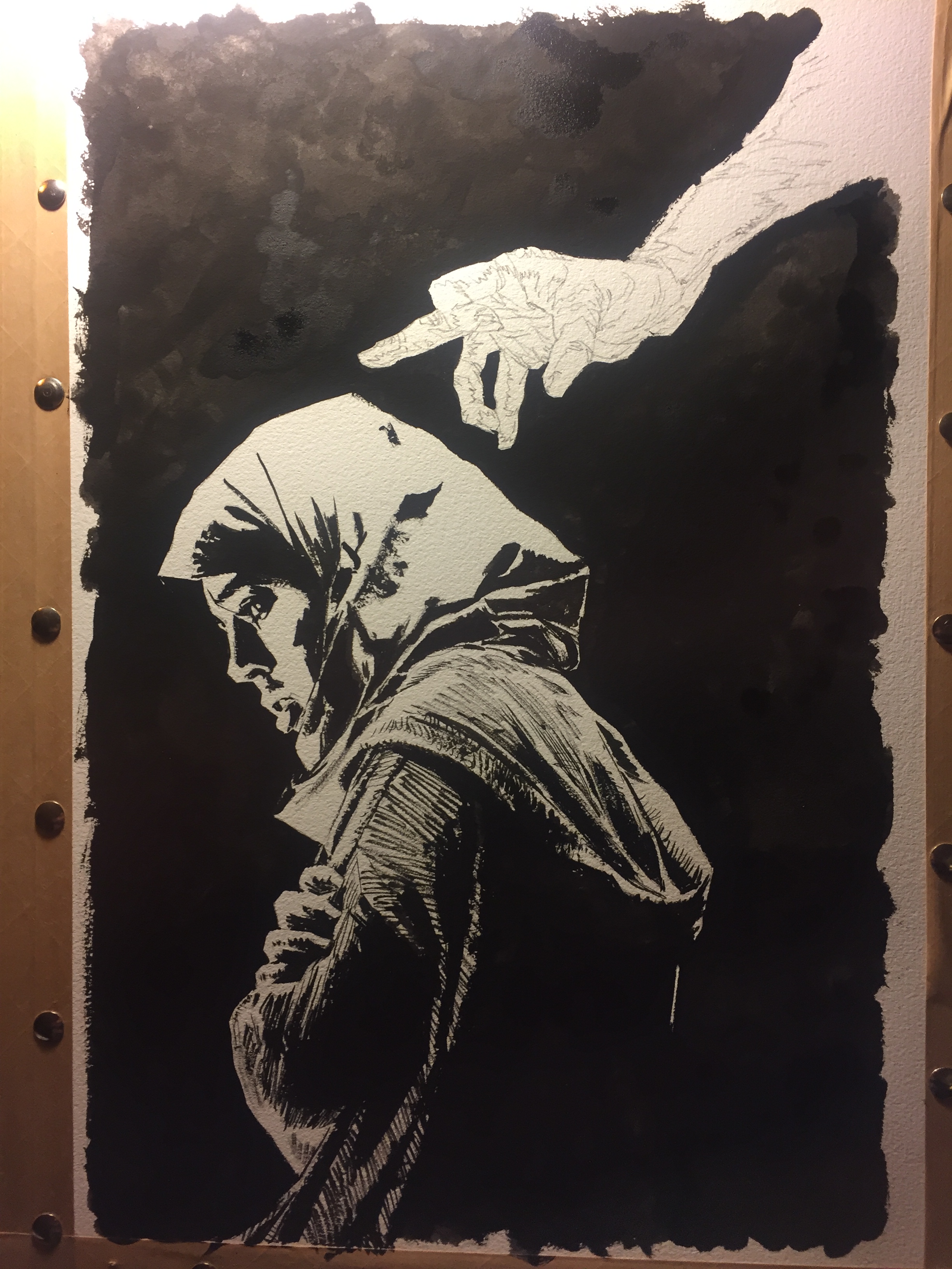
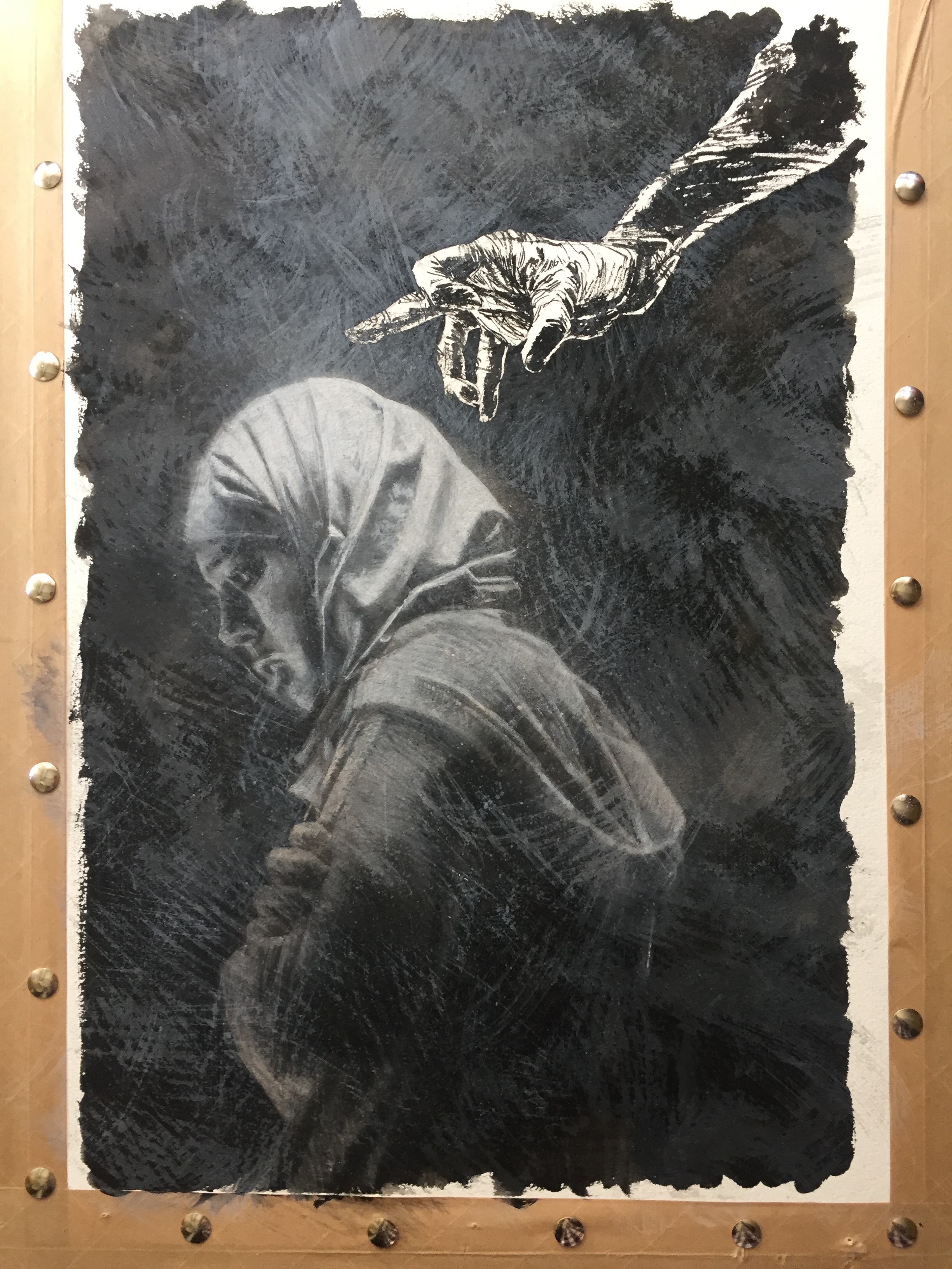
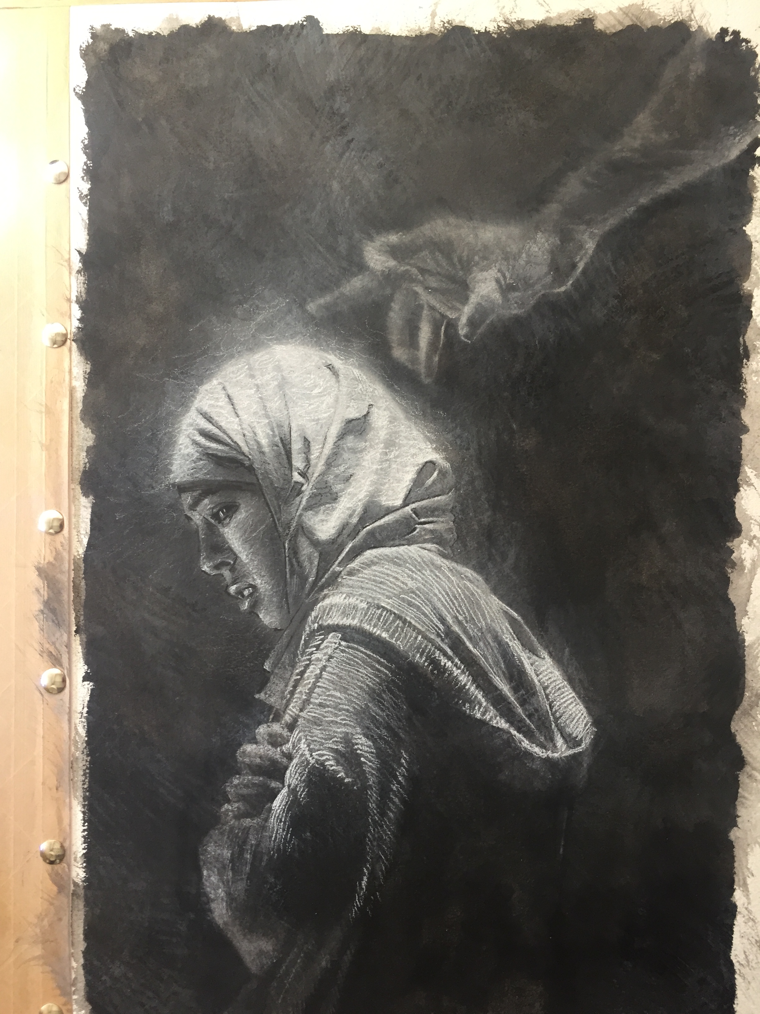
Aaron: This cover was a bit of a departure for me (well, the whole book is a departure). I decided to use similar techniques as I’m using for the supernatural elements in the series. So this was executed in a bunch of mixed media materials. There’s gauche, charcoal, colored pencil and several other media as well. I just wanted to stretch my artistic muscles and work towards something brimming with atmosphere and tension.
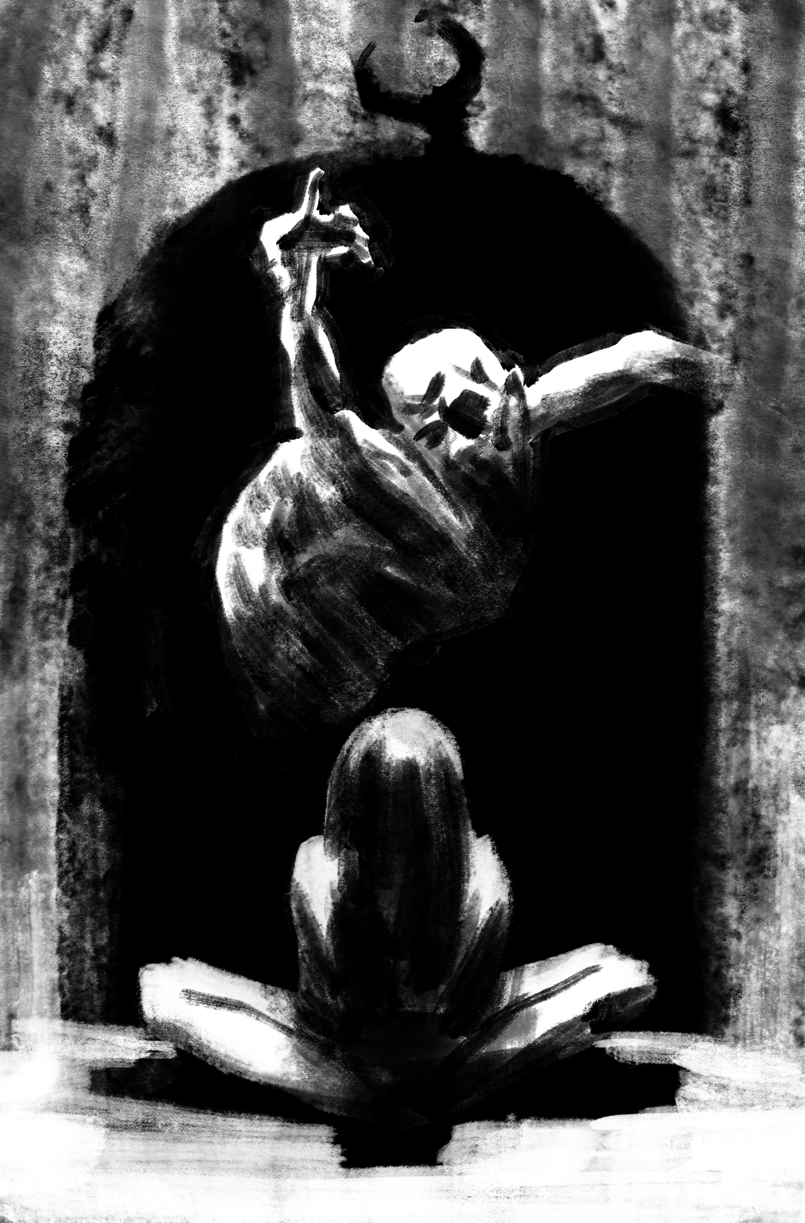
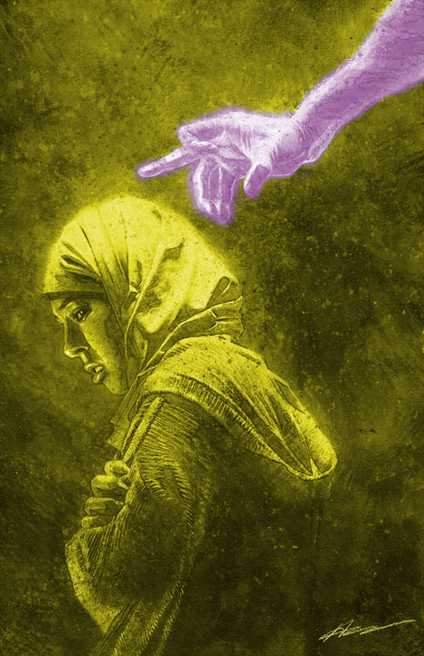
Pornsak: After Aaron finished the GORGEOUS piece above, Jose added his own graphic color treatment to it, wanting to make sure Aaron’s art leapt from the shelves:
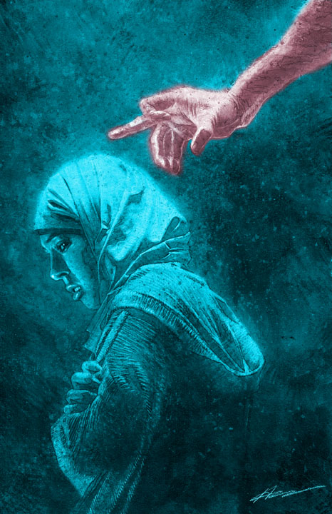
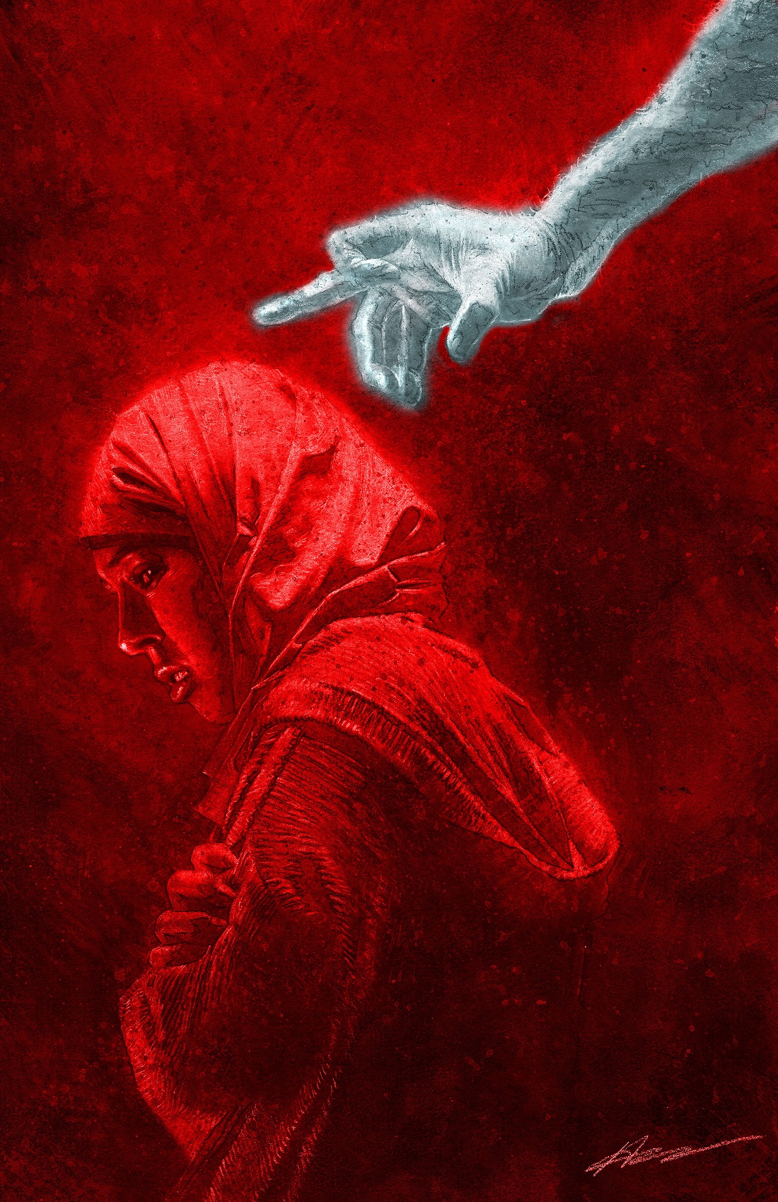
Pornsak: I believe it was Aaron and our designer extraordinaire Jeff Powell who cast the deciding vote for the red cover,
Aaron: Yeah, I really liked the coldness of the blue cover, but ultimately this cover needed to carry with it a warning: THIS BOOK IS NOT FOR THE FAINT OF HEART! So red it was!
Pornsak: From there, Jose did some further tweaks on it. Jeff then cropped the image slightly for impact while adding a logo he designed, that – while yeah, I’m biased – is one of my favorite logos on anything I’ve ever worked on:
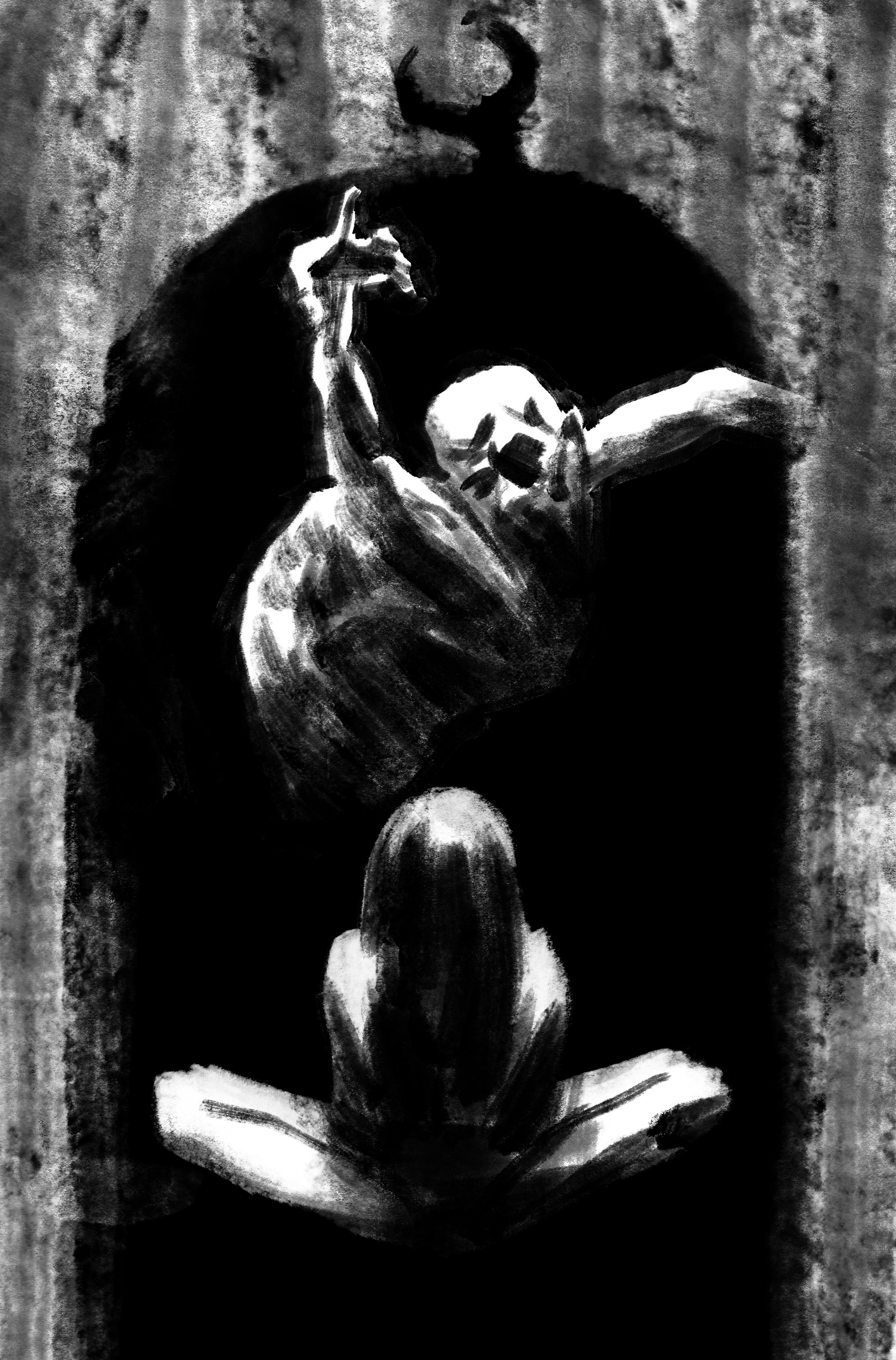
Pornsak: And voila! We had our cover, right?
Well… if you’ve seen the final cover of INFIDEL 1, you know, clearly not. One of the things we found after showing that cover to people (another trick I picked up from my editing days: Whenever I had a new issue 1 cover, I’d expose it to friends outside of comics and ask them if you saw this book cover, what would you think the book was about?).
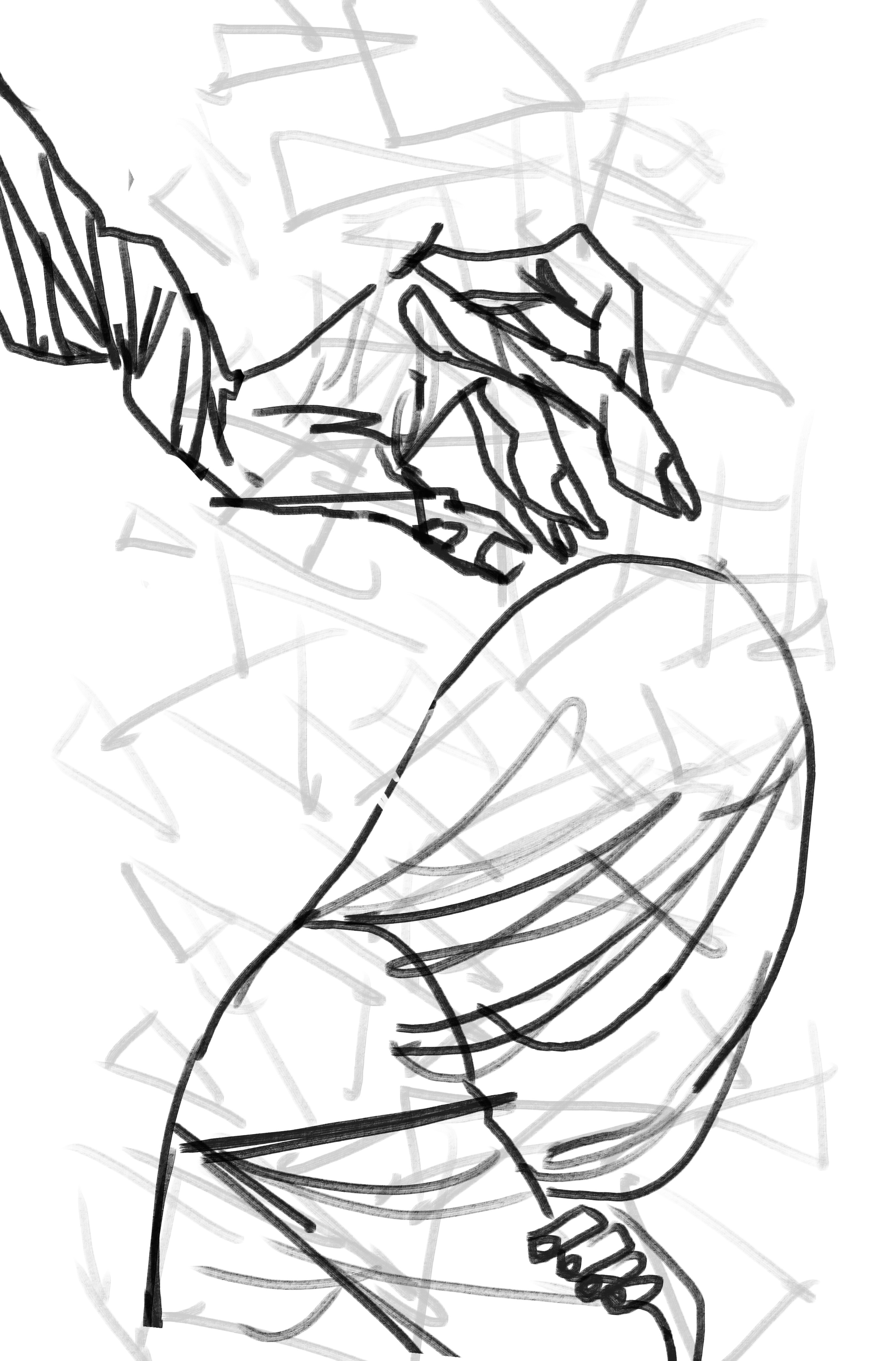
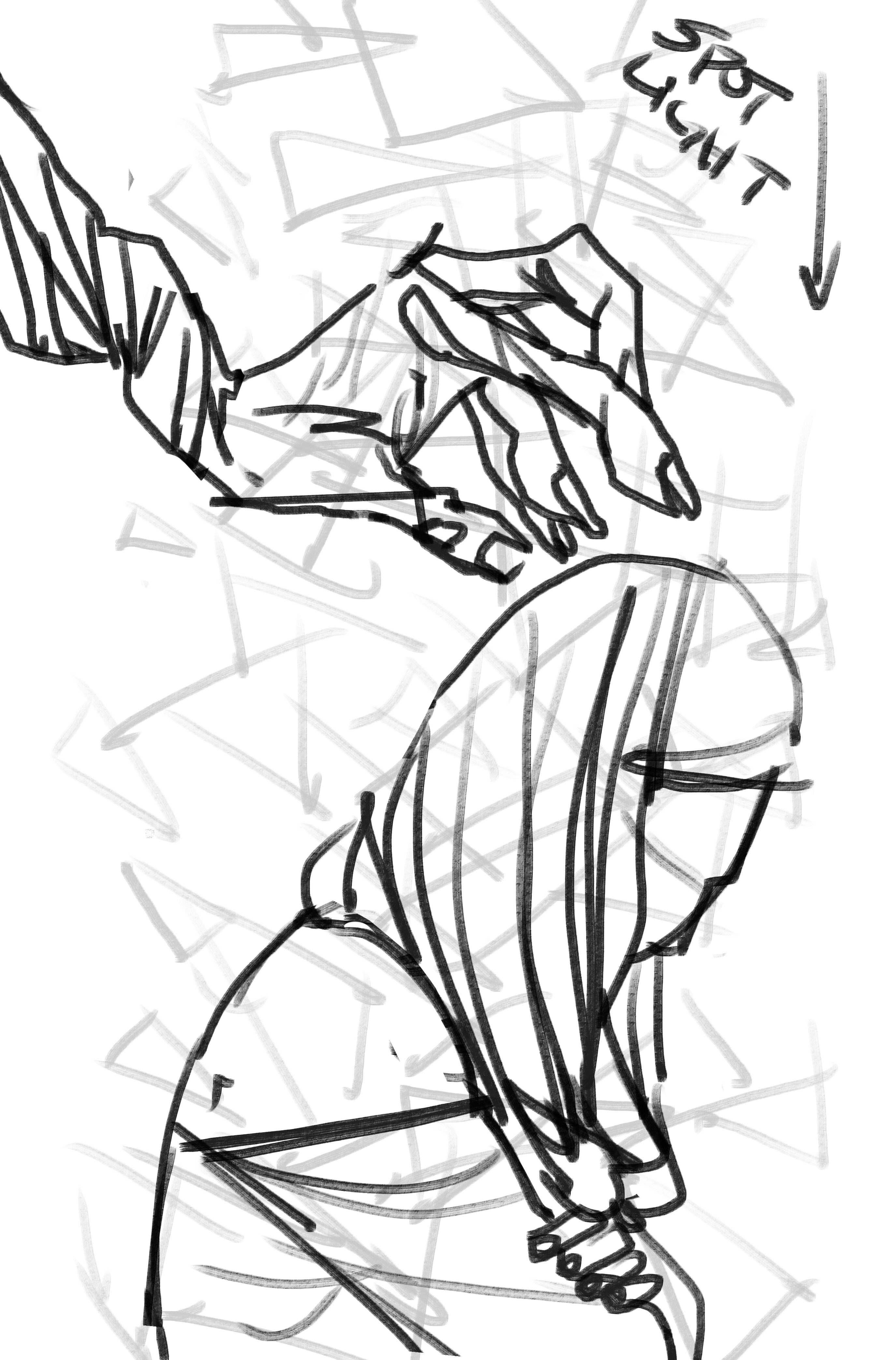
We were surprised to find that a good half of the people we polled didn’t realize it was a horror book. Jose was instantly on it – feeling the key was in that arm – playing around with no less than 15(!) different graphic treatments to give it a more horror-y vibe:
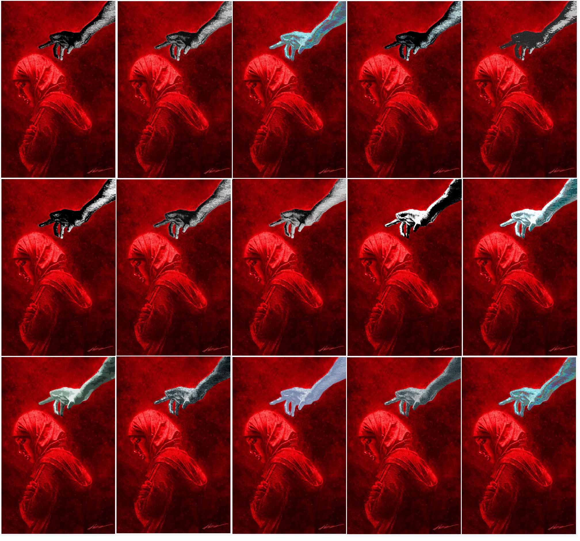
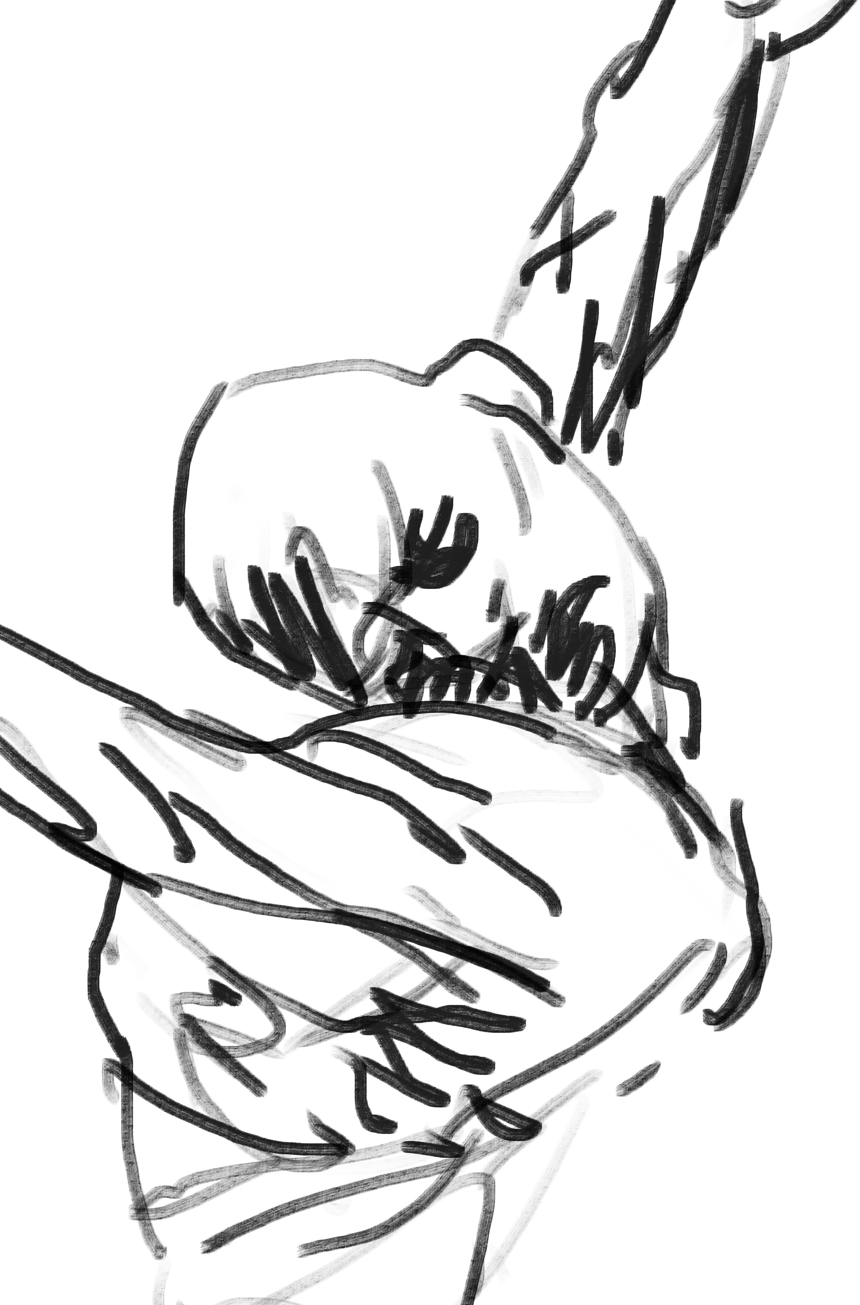
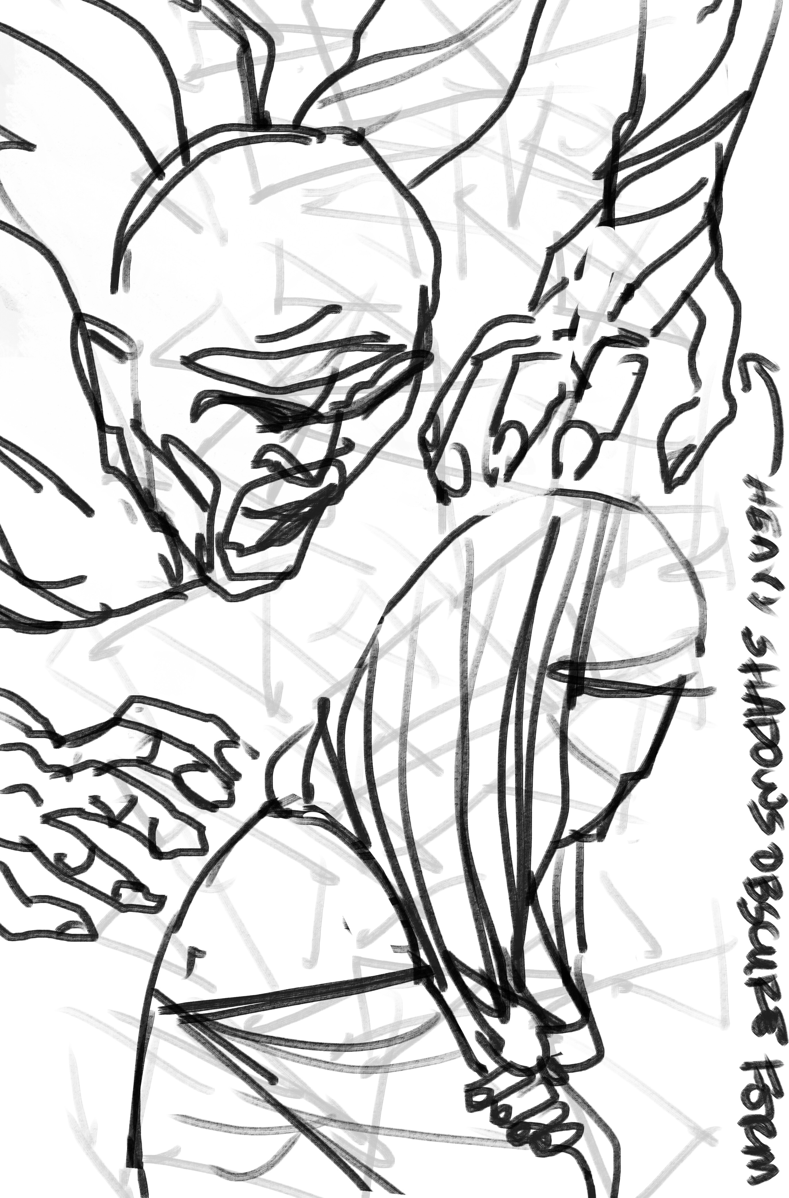
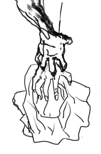
Pornsak: Ultimately, it was Aaron himself who felt that the horror feel of that arm had to be magnified separately from just rendering effects.
Aaron: Yeah, I realized that original hand was just too human. Even with the psychedelic coloring, it wasn’t foreign enough. I like how the new hand almost feels like an alien mouth opening to swallow Aisha. And the impact is really driven home for me by the little charred finger tips.
Pornsak: From there, he gave us a whole new version of that cover with a new arm, one that Jose again applied his color wizardry to.
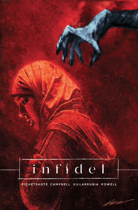
Pornsak: And now we had the cover that’s garnered us almost unanimous praise.
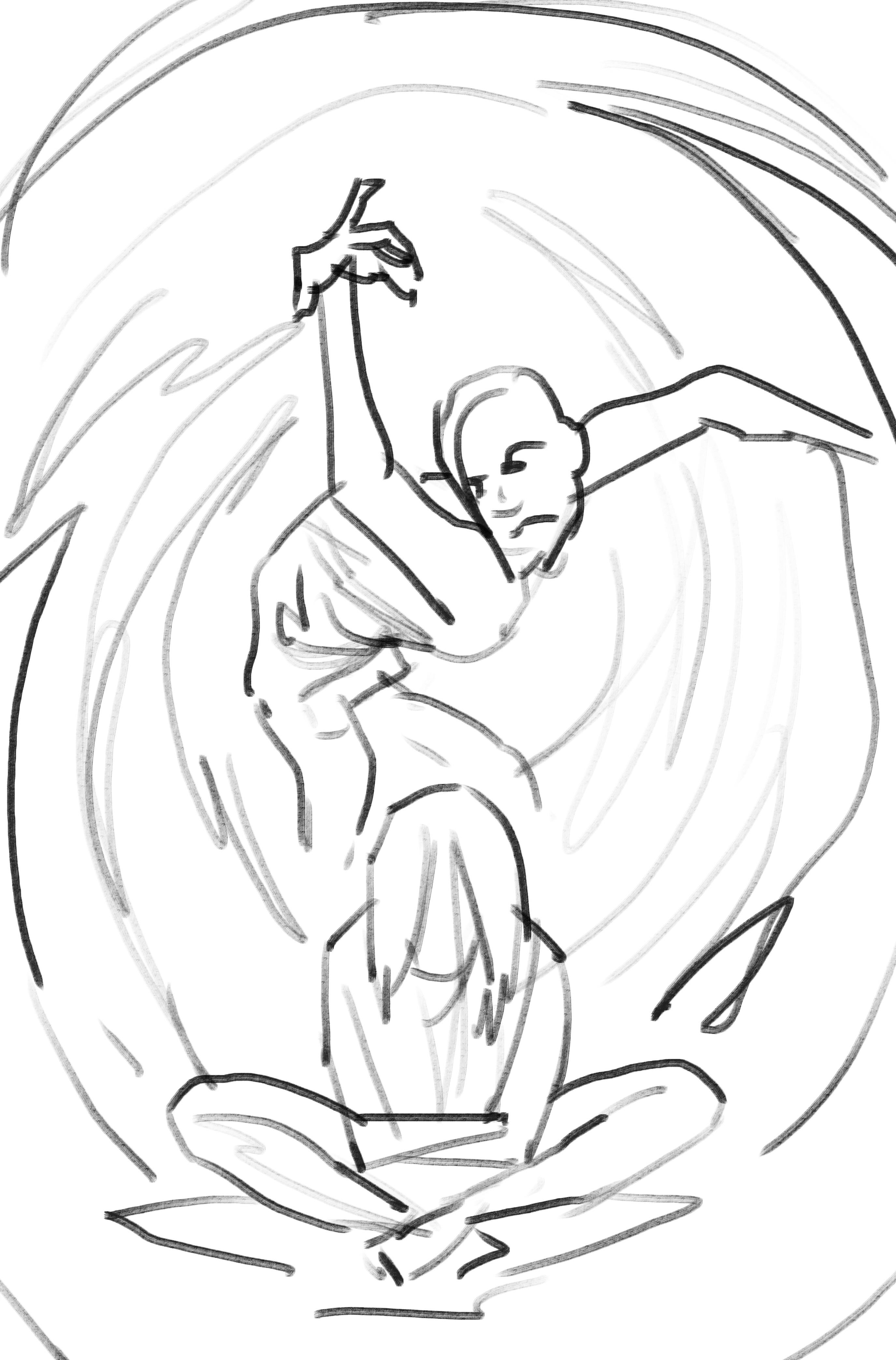
Having landed that first one, the process of finding the cover for INFIDEL 2 was a lot more straightforward… once we landed on the right design. Here’s a sampling of just six of the fifteen different cover sketches Aaron played with (who knows, maybe in a trade one day, we’ll reveal all fifteen)
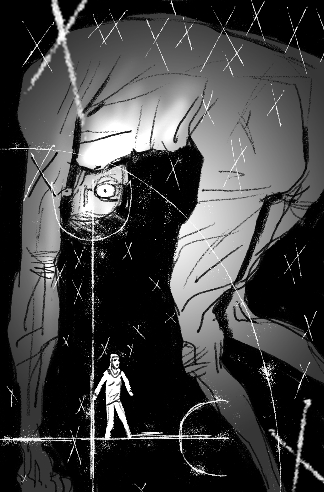
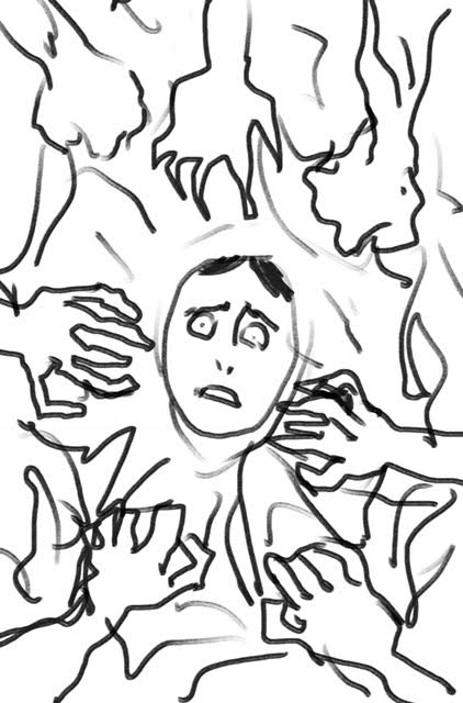
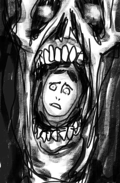
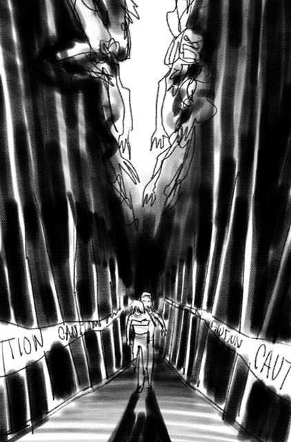
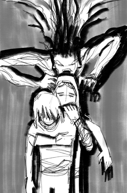
Pornsak: Obviously, there were some great stuff here. If I remember correctly, while we all loved the image with the two different hands reaching for the hijab, we relied on a monster-y arm so much with the previous issue that we needed a new take on the monster with this cover, leading to – in our eyes – one clear winner.
Aaron: I have the say, the sketch process for #2 kind of pushed me to the verge of an anxious breakdown. Too many sketches. TOO MANY SKETCHES! But yeah, I think we found the best solution in the end.
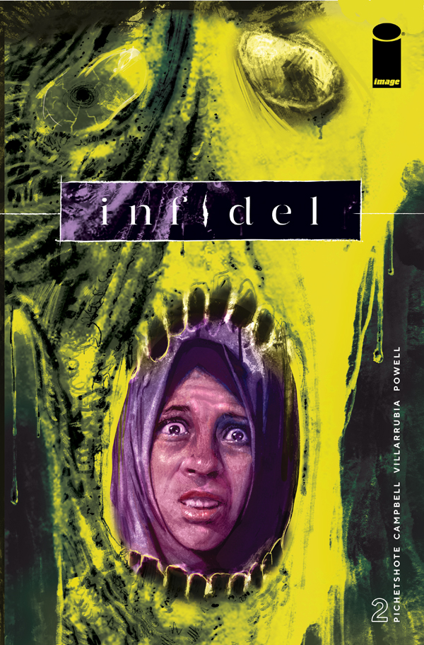
Pornsak: And now you can find it on sale this week at your LCS!
INFIDEL # 2 hits stores April 18th.


