


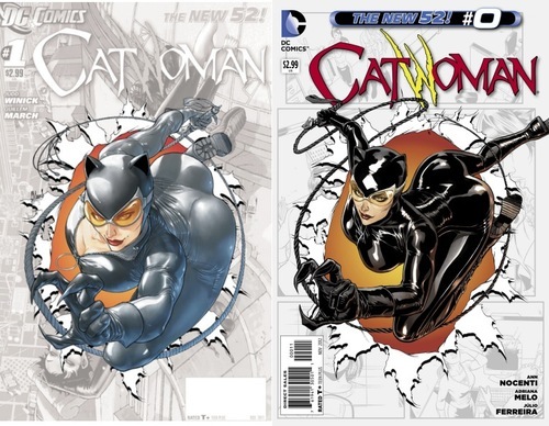
A few months ago, Guillem March’s cover for the CATWOMAN #0 issue was met with widespread scorn around the internet, including right here, and, sure enough, when the issue actually appeared, it was a bit different.
What I’m about to say may shock many but…I kind of liked the original one better.It was silly, yes, but it was trying to be different. If you look at the differences in all the Zero issues between solicitation and publication there were lots of changes, but how many boots to the face can you get? At least March was thinking outside the box. Maybe he got a little carried away, but he was being creative. And he took the ridicule with humor in return. He deserves a lot of credit for that.
(And yes, I did find the final panel of CATWOMAN #1 kind of icky, but more as part of the total package of “Let’s just show Batman and Catwomen ‘doing it'” juvenilia.)
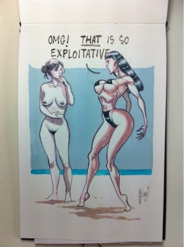
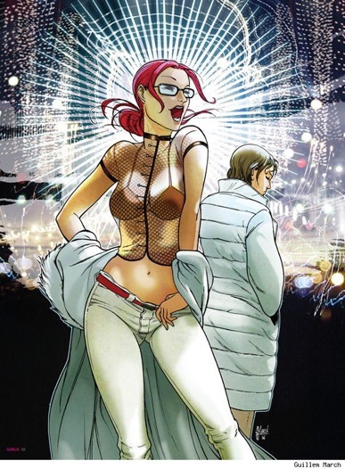
When not drawing comics, March is also known as a pin-up artist. He has a book of sexy drawings out from Image, and a new book he’s trying to crowdfund. His art isn’t that sexy to my tastes—it has that kind of hard plastic look so common in the post-Internet porn era and and he’s clearly looked at a little more Milo Manara than is entirely healthy. But he’s also clearly trying to break out of the standard brokeback poses. His anatomy is often daring; the CATWOMAN cover was pushing it a little too far.
On the page for his new project, he writes:
My muses. When I draw for pure fun, almost always I end drawing the female figure. I try them to be suggestive, not in an explosive way, just natural. I´ve tried to work over several beauty standards, a wider range from what I show in my more commercial work. This book doesn´t include any kind of sex between characters or pornography, but those are tricky concepts, so please be aware of what to expect: several female nudity, maybe including a very minority of explicit poses. Obviously this is an adults-only book. All drawings are not painted from life, but based in my own style and capabilities as artist.
If you look at his art blog, it’s obvious March likes drawing women and sexy girls, but there’e some awareness about it.
And he can even draw women standing up:
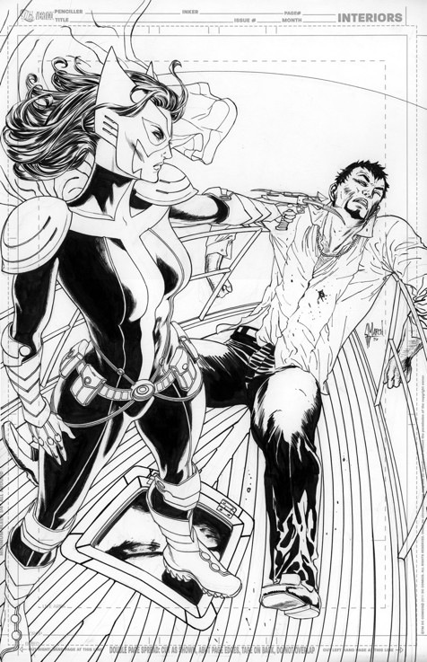
(Although they’re not exactly standing on the ground in this image, but…you get my point.)
Funnily enough, when I was googling for images, I found this post from 2009 by J. Caleb Mozzocco called…In defense of Guillem March. So the controversy has raged for a while. Catwoman has always been a sexy character, and she shouldn’t always zip up her catsuit all the way to her chin. The first CATWOMAN #0 cover really got swept away by the streams of taste and other external factors, but isn’t being creative something that we should extol? I hope March keeps trying to push the boundaries of his art…there isn’t much room for that in today’s corporate comics.
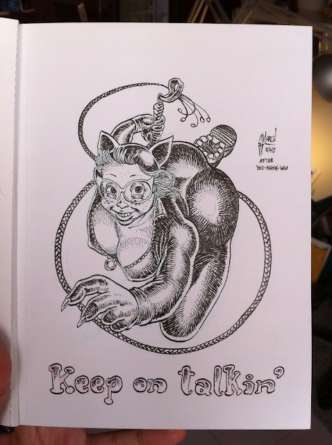
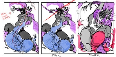
Some more sketches from his blog and elsewhere:


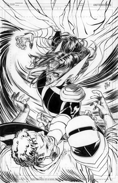
In neither version does Catwoman look as if she’s just burst through the torn page behind her.
I think it’s cool you’re trying to stick up for him, but I’m not sold. I think the blame needs to fall on editorial for wanting an exploitation style cover. March was probably trying to deliver what they wanted more than anything else.
I thought Scott Morse’s Catwoman design was crazy creative. Ever since, every one has drawn the same costume with more cleavage showing.
He ain’t no Milo Manara, that’s certain.
Also,
>The first CATWOMAN #0 cover really got swept away by the streams of taste and other external factors, but isn’t being creative something that we should extol?
It was the “streams of taste” that made the idea of such putrid cover to appear on the first place. The whole controversy appears to be aimed at the ridiculousness of the drawing, not about its attempt at bending graphic conventions by defining impossible postures. That’s one of the many commonalities in super hero comics. This cover became a sort of joke because of the extroverted usage of such exploitative conventions—boobs and contorsions—and the lack of a context to imagine its an ironic proposition seems to imply that, well, it’s only a tasteless cover, but a funny one because of how crappy it looks, at least.
But hey, I guess we can still defend the model of “boobs with an attitude” women in superhero comics, right? That’s cool.
I do think March draws really well & that unfortunately his talents are used on some mediocre ideas.
I liked the Crumb drawing, I thought that was a great way to handle the situation –but he lost me when he posted this bullshit (in response to Cameron Stewart’s poking fun at him http://yfrog.com/j2mmtogj–
“You are a fanboy/fangirl. You´ve got the right to criticize my work. That´s the game. Cool.
You are a colleague artist. You shouldn´t do that. Because doing good art is not enough to be a good artist. ”
I feel like colleague/artist words have real weight and we need to talk about each others work in real ways and not just ignore something because we’re now in some secret order of dudes who work in their underpants.
I like there being a place in comics for whatever cheesecake art, (I draw a fair amount myself) I think some of the reactions to March’s cover for way overblown but hopefully by talking about what was silly or dumb or offensive about Catwoman we can create a more aware environment that pushes art in new directions. “Because doing good art is not enough to be a good artist.”
Been my opinion for a while that he has great skill, but not in high flying, kung-fu action. Which is necessary in his line of work. The overhead shot of Selina in disguise in issue one was gorgeous.
The critics I read did acknowledge that the #0 cover pose was incredibly difficult. I agree with the idea of supporting him pushing himself. But don’t support DC thinking that cover was okay.
But hey, I guess we can still defend the model of “boobs with an attitude” women in superhero comics, right? That’s cool.
“Boobs with an attitude” sounds like a hair metal song from the 80’s.
Am I the only one who thinks that the anatomy in the original is okay? If you attempt to show both T and A and still be anatomically correct you get bizarre foreshortening. The “fixed” cover is much worse, her back looks like it’s dislocated halfway up her rib cage.
Yeah, I like the first cover better too.
I absolutly loved Gillem March work on Azrael. There was no bimbo fell to it: it was powerful, beautiful and it served the story and the character so well.
Perhaps this ia a crucious time for him. Does he really wants to be known an loved mostly because he’s drawing women the way he’s drawing them or does he wants to impress people another way?
I don’t know for how long Guillem March has been working in the field, but it seems to me a little early for him to confine himself in the kind of good girl art he has been doing since he stopped doing Azrael. He probably has to think about it. It’s not too late at all, he hasn’t done that much good girl art at DC.
From my personal point of view, and as a customer, I think that would be a waste of its talent to closet him in this kind of comics. it’s not as if there wasn’t already tons of comic book artists doing it.
What was particulary disapointing about this Catwoman cover was that it so blallantly claimed that DC want to turn back the Cat<oman character to the empty state he was before Ed Brubaker turned it into this beloved character we are missing.
Frankly, I'm ok with Guillem March drawing what he wants to draw, but should every comics he would draw from now on be an excuse to draw this kind of oversexualised women, first I would probably not bought them and second, I would really be disapointed because i feel he has so much more to give.
If it's his choice, that's OK but please, DC, do not overused him on comics featuring this kind of in-your-face graphic woman character.
I like the new cover a little better than previous one because, being the owner of a very fat cat, I know for a fact that a catwoman that generous coudln't leap at all… :p
A non-issue.
I like his art but the first one was goofy. The new cover is really, really nice. I think he did a great job.
http://24.media.tumblr.com/tumblr_ma7gut3bVz1r0zb46o1_250.jpg
She looks more like a milkbone than before.
I prefer the new cover. Her figure is less distorted, and the shine on her costume is nicely treated.
When are we going to have some more conversations about the exploitation film “Magic Mike” around here? Or did we ever have them?
Or, more importantly, more shots of Henry Cavill’s crotch with commentary about how “After years of binding and CGI smoothing, Superman was finally getting super where it counted.”
I mean, haven’t we beaten this brokeback BS to death yet?
I don’t like either cover. Neither is particularly dynamic, neither looks like she’s jumping out of the torn page, neither is “sexy” to me. Oh sure, it has all the hot-button things for “sexy”: the wet-look vinyl costume, tits, ass, impossible bending action. They just look uncomfortable.
Both sacrificed too much in order to show T and A at the same time. You can do a lovely, sexy, dynamic drawing with just one of those things. Manara may not always be my cup of tea, but he produces some very sexy imagery without feeling the need to pile on every body part in a jumbled mess of broken anatomy just to make sure EVERYTHING fits in there.
But in a larger context, the reason this cover in particular really bothered me is because the book really bothers me. The entire comic is over-sexualized and even insulting. Catwoman spends most of her time crying and whining. The sex scenes with Bats and Cats limply, disinterestedly, passively sprawled AT each other were confusing and the anti-thesis of erotic (why aren’t they engaged with one another?). Catwoman strips to her bra and unzips her pants in a men’s room just to beat a guy up. She gets tied to chairs and either beaten or watches her dwindling supporting cast get beaten. She ends up curled in the fetal position, crying in a box.
I judged this cover hard because it was not created in a vacuum. This wasn’t an outlier. It’s indicative of the problems with the current comic. Farcically over-the-top sexualization, lack of personality for the character besides “sexy,” and a willingness to sacrifice making good work in order to hit all the “sexy goalposts” along the way.
Well, the outcry worked.
DC had to commission (and pay) March to do a whole new drawing and painting to replace the original cover drawing.
The new drawing is much more clear in expressing the pose (adhering to the maxim that if one would turn the whole figure in a black shadow, one should be able to make out what that figure is doing) rather than som dodgy foreshortening. The coloring is also much starker in contrast.
What I wonder though, is why the DC cover art director approved the first cover to let March finish it with all that work done?
Surely they have a cover art director…? Someone with knowledge about cover design…? Surely, it was not approved by an editor with a literary education?
I’m sorry, but what exactly was wrong with the first cover?
While neither cover is great. The first one is better. In the second one Catwoman’s left leg is about eight times longer than her right one.
I still think covers should actually have something to do with the story inside though, and the concept of every comic on the stands for a month should have essentially the same cover illustration is just bonkers.
I think both covers have problems.
While the first one has an impossible curve, the second one is broken in a 90° angle and the left leg’s thigh is way too long.
I hardly think that he was pushing his art by doing that cover, but he’s hardly the devil some people wanted him to be.
Somehow Darwyn Cooke attempted the same a few years back and he did it a little bit better.
http://www.primaryignition.com/wp-content/uploads/joblo.com_.jpg
Comments are closed.